
Hello. Today’s short post is part of a series in which I try to present to you my knowledge about the CSS Grid tool. So far, I have introduced some basic and general principles about the purpose and operation of this tool. With today’s post, I would like to show some real examples of how to carry out the first stage of creating a layout, i.e. how to define a grid.
This article is part of my CSS Grid introduction series. If you want to check out my previous posts, here you can find the whole table of contents.
Marking an item as a grid container.
The basic operation that must be performed to enable work with the CSS Grid is to mark the selected DOM element as a grid-container. This can be done in CSS using the display property. There are two values this property accepts: grid and inline-grid. The value of the grid means that the future grid-container will be an element of the block type. Similarly, the value of inline-grid means an element of type inline.

Determining the size of the grid.
After marking the selected DOM element as a grid-container, we can proceed to the definition of the grid. The obligatory action here is to determine its size. In my previous post, you can read that a grid is a collection of vertical and horizontal grid-lines that form rows and columns. We define the size of the grid by specifying the width of each column (row) using the grid-template-columns/grid-template-rows properties. In their basic variant, they accept length values corresponding to the widths of respective columns or rows, starting from the left column and the top row.
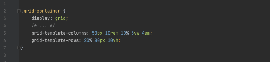

The width of the columns and rows can be determined by using all known length values that are available in the CSS language (such as px, em,%, etc.). We also have at our disposal special length units, keywords, and functions. These are methods that are only available in CSS Grid, and you can find out more about them in my future posts.
The size of the defined grid may be less than or equal to the size of the containing grid-container. In some circumstances, it is possible to define a grid larger than a container, however, the grid overflows only in the horizontal dimension.

The dimensions of the grid can be fixed or variable. If the width or height is variable, it may depend on the sizes of the container or viewport. We can also limit the variability (or immutability) of the grid dimensions only to a certain range. This is possible thanks to the previously mentioned features available only in CSS Grid.

Giving your own names to grid-lines.
Each grid-line element has a minimum of two default names that are used to identify it. Each default name is unique to a given line. Line names are especially important when defining the grid-areas — necessary elements for the layout creation process. Default names are assigned automatically as consecutive positive numbers (counting from the left and top edge of the grid) or consecutive negative numbers (counting from the right and bottom edge of the grid).

In addition to the names assigned automatically, it is possible to give the lines optional custom names. We can give any number of custom names for each line. Here, the grid-template-columns/grid-template-rows properties will come in handy again. Names are placed in square brackets between the widths of individual columns or rows. They are assigned from the left edge of the grid to the right (for vertical lines) and from the top edge to the bottom (for horizontal lines). Custom names do not have to be unique, we can assign the same names to many lines.


Defining the space between columns/rows.
Finally, I would like to tell you about the possibility of defining gaps between adjacent rows or columns inside the grid. Importantly, we can only define the spaces between columns (rows), not between the edge of the grid and the column (or row).
Gaps are defined with the column-gap/row-gap property. They take a single value that defines the size of the gap described in units of CSS length. In this case, it is not possible to use special CSS Grid length units, keywords, or functions. If we define gaps in both directions at the same time, it is worth using the property gap, which merges the previous two properties into one.


Thank you for reading this short article. If you want to read more content like this you can follow my dev.to or twitter account. Also, feel free to give me any form of feedback. I'd love to read any comments from you. See you soon in my next article!
PS. If you would like to support my work, I will be grateful for a cup of coffee. Thank you. ❤️


Top comments (0)