How to construct boxplot of univariate data.
The boxplot is used to summarize data succinctly, quickly displaying if the data is symmetric or has
suspected outliers. It is based on the 5-number summary. In its simplest usage, the boxplot has a box with lines at
the lower quartile (basically Q1), the Median(Q2), the upper quartile (basically Q3) and whiskers which extend to the minimum and maximum value of the data set.
To make box and whisker plot, you have to make use of the boxplot() function. Before we take a look at different example on it let me explain some arguments the function takes.
- data: this is your data set,it can be in the form of a data.frame (or list) from which the variables in formula should be taken.
main: this is use to write the Headings or Title of our graph.
xlab, ylab: these are x- and y-axis annotation, they are used to label the x and y-axis respectively. To use them just assign your labels to them.
col: it is used to give the box of the plot color. you can assign any color you like to beautify the graph.
border: this is used to give border coloran optional vector of colors for the outlines of the boxplots. The values in border are recycled if the length of border is less than the number of plots.
horizontal: logical indicating if the boxplots should be horizontal. it is FALSE by default which means vertical boxes. if assigned to be TRUE then we experienced horizontal boxes.
width
a vector giving the relative widths of the boxes making up the plot. it is usually used when you are comparing two or more plot.outline: this take only TRUE or FALSE as its value. if outline is FALSE, then outliers are not drawn.
plot: this is the whole boxplot graph it is TRUE by default
If change to FALSE, the summaries which the boxplots are based on are returned while the graph will not be display.notch: if notch is TRUE, a notch is drawn in each side of the boxes.
Now let's start taking a look at example to see how it works.
Example1
draw a box plot for the following data showing the score of 25 student in statistics.
24 46 16 33 16 13 28 19 47 49 8 56 20 26 28 29 30 18 19 15 47 32 14 25 14 .
Codes>>
scores=c(24, 46, 16, 33, 16, 13, 28, 19, 47, 49,  8, 56, 20, 26, 28, 29, 30, 18, 19, 15, 47, 32, 14, 25, 14)
boxplot(scores)
Result>>

As you can see we just plot simple boxplot. However to beautify our graph let us make use of the next three agument(main,xlab and ylab,color) listed above. copy and study the following codes.
scores=c(24, 46, 16, 33, 16, 13, 28, 19, 47, 49,  8, 56, 20, 26, 28, 29, 30, 18, 19, 15, 47, 32, 14, 25, 14)
boxplot(scores,main="THE SCORE OF STUDENTS IN STATISTICS",xlab='The box-plot', ylab='Scores',col="red")
Result>>
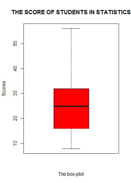
as you can see through the graph that exactly what was assigned to each of them reflect on the graph. let us apply more argument to the codes.
How to add border-color and draw horrzontal boxplot
here instead of vertical box we would have horizontal, also we would also have a value assigned to border. take a look at the following codes.
Codes>>
scores=c(24, 46, 16, 33, 16, 13, 28, 19, 47, 49,  8, 56, 20, 26, 28, 29, 30, 18, 19, 15, 47, 32, 14, 25, 14)
boxplot(scores,main="THE SCORE OF STUDENTS IN STATISTICS",xlab='Scores', ylab='The box-plot',col="black",border='green',horizontal=TRUE)
Result>>

Now I beleived you should be able to understand what is going on here. I have changed the color if you check the codes, Also the labels have been swapped because the box is now horrizontal.
let us see the useful of more parameters.I will be implementing width, outline and notch consider the following example.
Example
construct box plots to show the comparison between the following data showing the score of mathematics students and physics students in sta114.
Mathematics Student: 34, 44, 25,44, 29,46, 59, 40, 33, 45,27,34, 44, 28, 49.
Physics Students: 44, 56, 35, 49, 39, 22, 49, 20, 60, 39, 50, 55, 51, 30, 39.
maths=c(34, 44, 25, 44, 29,46, 59, 40, 33, 45, 27,34, 44, 28, 49)
physics=c(44, 56, 35, 49, 39, 22, 49, 20, 60, 39, 50, 55, 51, 30, 39)
boxplot(maths,physics,main="THE SCORE OF STUDENTS IN STATISTICS",ylab='Scores', xlab='The box-plot',col="black",border='green',horizontal=FALSE)
Result>>
all the argument used in the graph above are what you already know however let's make use of some others. observe the following codes
maths=c(34, 44, 25, 44, 29,46, 59, 40, 33, 45, 27,34, 44, 28, 49)
physics=c(44, 56, 35, 49, 39, 22, 49, 20, 60, 39, 50, 55, 51, 30, 39)
boxplot(maths,physics,main="THE SCORE OF STUDENTS IN STATISTICS",ylab='Scores', xlab='The box-plot',col="black",border='green',horizontal=FALSE,width=c(1,2),notch=TRUE)
Result>>

the notch you we used has cut off some part of the box and make a zigzag shape as you can see. the width here we assigned means one ratio two. and if you observed the graph you will realized that the second graph width is twice the first one. if you have 3 boxplot you should provide 3 value inside the vectors.
For outline and plot let us take a look at the following example.
Example
represent the following height of 15 male measure in Kg in box plot
4,8 24, 19, 18, 15, 22, 21, 24, 25, 23, 24, 23, 18, 17.
Codes>>
height<-c(4,8, 24, 19, 18, 15, 22, 21, 24, 25, 23, 24, 23, 18, 17)
boxplot(height,main="THE HEIGHT OF FIFTEEN MEN",ylab='Scores', xlab='The box-plot',col="green",border='black')
Result>>

the small circles you are looking below the box is what we called outlier. the indicate extremely small or large observation in the data set. to avoid this in our plot we will make use of the outline. like below
Codes>>
height<-c(4,8, 24, 19, 18, 15, 22, 21, 24, 25, 23, 24, 23, 18, 17)
> boxplot(height,main="THE HEIGHT OF FIFTEEN MEN",ylab='Scores', xlab='The box-plot',col="green",border='black',outline=FALSE)
Result>>

can you see how interesting it is?? now let disabled the plot using plot argument.
codes>>
height<-c(4,8, 24, 19, 18, 15, 22, 21, 24, 25, 23, 24, 23, 18, 17)
> boxplot(height,main="THE HEIGHT OF FIFTEEN MEN",ylab='Scores', xlab='The box-plot',col="green",border='black',outline=FALSE,plot=FALSE)
Result>>
$stats
     [,1]
[1,] 15.0
[2,] 17.5
[3,] 21.0
[4,] 23.5
[5,] 25.0

$n
[1] 15

$conf
         [,1]
[1,] 18.55227
[2,] 23.44773

$out
[1] 4 8

$group
[1] 1 1

$names
[1] ""
I hope you find this article helpful?? consider to share to somewhere else who might interested.Please support and like to motivate me to write more. Chat me up if you have any questions on 09153036869you can also drop me a comment. Feel free for to ask anything.
Thanks
Happy Coding :)

Oldest comments (0)