
Overview
Introduction
Data Science is an inter-disciplinary field that uses statistics, scientific computing, scientific methods, processes, algorithms and systems to extract or extrapolate knowledge and insights from noisy, structured and unstructured data.
Data Science encompasses many steps and activities.
The main data science steps are:
- Business understanding
- Data collection
- Data Exploration
- Data Modelling
- Model Evaluation
- Model Deployment
We will dive deep into exploratory data analysis commonly referred to as EDA.
Exploratory Data Analysis (EDA)
What exactly is EDA?
EDA generally mean the process of exploring the data to gain insights, identify trends, patterns and various relationships between various features in the data.
To demonstrate various activities in the EDA phase of Data Science we'll use Python programming language.
If new to to Python here is a link to an earlier article about python for data science, it targets beginners to programming and gradually introducing the relevant concepts for Data Science.
Exploratory data analysis is often used to see what the data can reveal beyond formal modelling or hypothesis testing and provides a better understanding of data set variables and the relationships between them.
Aim
The main aim of EDA is to help look at data before making any assumptions.
Exploratory Data Analysis Tools
Specific statistical functions and techniques you can perform with EDA tools include:
- Clustering and dimension reduction techniques, which help create graphical displays of high-dimensional data containing many variables.
- Univariate visualization of each field in the data.
- Bivariate visualiation and summary statistics that allow you to asses the relationship between each variable in the dataset and the target variable.
- K-means Clustering is a clustering method in unsupervised learning where the data points are assigned into K groups.
- Predictive models, such as linear models, use statistics and data to predict outcomes.
Types of exploratory data analysis
- Univariate non-graphical: It is simple since we just consider one variable/feature. The primary goal is to know the underlying sample distribution and make observations about the population. Outlier detection is also part of the analysis:
- Central Tendency: The commonly useful measures of central tendency are mean, median and sometimes mode.
- Spread: It's an indicator of what proportion distant from the middle we are to seek out the info values.
- Skewness and Kurtosis: Skewness is a measure of symmetry. A dataset is symmetric if it looks the same to the left and right of the center point. Kurtosis is a measure of whether the data are heavily-tailed or light tailed relative to a normal distribution.
Multivariate Non-graphical
It's an EDA technique that won't show the connectin between two or more varivables within the sort of either cross-tabulation or statistics.Univariate Graphical
They involve a degree of subjective analysis
- Histogram: They are used to describe a feature/variable in terms of frequency/distribution (central tendency, spread, outliers)
- Boxplots: They oftenly used to describe measures of central tendecy and show robust measures of location and spread, symmetry.
- Multivariate graphical: They display relationships between two or more features/variables(columns).
***Examples of multivariate graphics are :
Scatterplot:
Heatmap: It's a graphical representaion where values are depicted by color.
Exploratory Data Analysis is a continuous loop.
A Practical Approach in EDA
Libraries
We will use the following libraries in EDA
-
numpy: it's a Python library used for working with arrays. It also has functions for working in domain of linear algebra, fourier transform and matrices.
Installing numpy!pip install numpy
Check the official documentation numpy
-
pandas: It's a Python library used for working with datasets. It has various functions for manipulating the data.
installing pandas!pip install pandas
Official documentation pandas
-
matplotlib: It's a comprehensive library for creating static, animated and interactive visualizations in Python.
installing matplotlib!pip install matplotlib
Offical documentation matplotlib
EDA Example
We are going to explore EDA using a housing dataset.
Here's a link
We want to predict the prices of houses based on certain factors like:
- area - the area of the house in square feet
- bedrooms - the number of bedrooms in the house
- bathrooms - the number of bathrooms
- stories - the number of floors (story building)
- main road - nearness to the main road; yes if near to, no if not.
- guestroom - yes if present, no if isn't
- basement - no if absent, yes if present
- hot overheating - yes if present, no if absent
- airconditioning - yes if present, no if absent
- parking - the number of vehicles the parking can accomodate
- prefarea - yes if the locality of the house is of much preference to many, no if it isn't
- furnishingstatus - furnished, semi-funished
1.1 Importing packages
This importing the necessary packages and modules required.
import matplotlib.pyplot as plt
import numpy as np
import pandas as pd
1.2 Loading Dataset
Loading the dataset to conduct EDA... My data set is local but one may pass an URL if the data is hosted online.
housing_data = pd.read_csv("Housing.csv")
2. Exploratory Data Analysis
2.1. Preprocessing
View the first n rows of the data set in order to get a general idea of how the data looks like
housing_data.head()

2.2. Checking the shape of the dataset
housing_data.shape
![]()
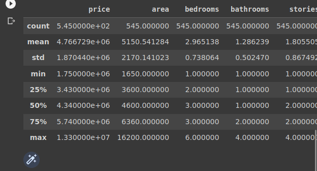
2.3. Checking the the statistical metrics of the dataset
housing_data.describe()
2.4. Checking the info about the data
housing_data.info()

The dataset at hand is already cleaned so no need of performing the cleaning phase.
Univariate Analysis
As we said earlier, in univariate analysis you analyze the data of just one variable.
A variable refers to a single feature/column.
Some visual methods include :
- Histograms: Bar plots in which frequency of data is represented with rectangle bars
- Box-plots: The variable values are represented in form of boxes
Let's make a histogram of the price column
plt.title("House Prices")
plt.xlabel("Prices")
plt.ylabel("Frequency")
plt.hist(housing_data.price)
plt.show()

from the image we realize that the house price is positively-skewed. This is because more values are plotted on the left side of the distribution.
Most houses have a price range of 3 million and 4 million
Area
plt.title("House Area")
plt.xlabel("area")
plt.ylabel("Frequency")
plt.hist(housing_data.area)
plt.show()

The house area are positively skewed by having majority of the house areas range from 4000 square feet and below.
The mode area is 3000 square feet having 200 houses in total having the area
bedrooms
plt.title("Number of Bedrooms")
plt.xlabel("Bedrooms")
plt.ylabel("Frequency")
plt.hist(housing_data.bedrooms)
plt.show()

From the image we can infer that the house are normally distributed.
Majority of the houses have 3 bedrooms.
bathrooms
plt.title("Number of Bathrooms")
plt.xlabel("Bathrooms")
plt.ylabel("Frequency")
plt.hist(housing_data.bathrooms)
plt.show()

The histograms shows that most of the houses have only one bathroom
stories
plt.title("Number of Stories")
plt.xlabel("Stories")
plt.ylabel("Frequency")
plt.hist(housing_data.stories)
plt.show()
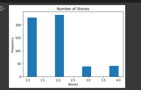
The histogram shows that majority of the houses are one or two stories
mainroad
plt.title("Nearness to Main Road")
plt.xlabel("Near main road")
plt.ylabel("Frequency")
plt.hist(housing_data.mainroad)
plt.show()
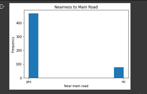
The histogram shows that many of the houses are near the main road
guestroom
plt.title("guest room presence")
plt.xlabel("Guest room")
plt.ylabel("Frequency")
plt.hist(housing_data.guestroom)
plt.show()
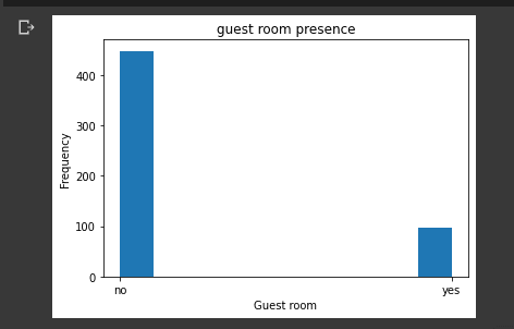
This histogram reveals that a majority of the houses have no guest room
basement
plt.title("Basement presence")
plt.xlabel("basement")
plt.ylabel("Frequency")
plt.hist(housing_data.basement)
plt.show()
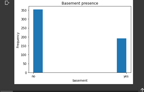
The histogram shows that more houses have no basement as compared to those that have.
hotwaterheating
plt.title("Hotwater heating presence")
plt.xlabel("hotwater")
plt.ylabel("Frequency")
plt.hist(housing_data.hotwaterheating)
plt.show()
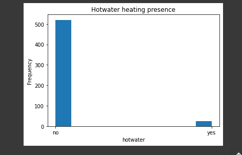
This histogram reveals that more houses do not have hot-water-heating that those that have.
airconditioning
plt.title("airconditioning presence")
plt.xlabel("airconditioning")
plt.ylabel("Frequency")
plt.hist(housing_data.airconditioning)
plt.show()

The histogram shows that more houses do not have air conditioning than those that have
parking
plt.title("parking size (no. cars)")
plt.xlabel("no. of cars")
plt.ylabel("Frequency")
plt.hist(housing_data.parking)
plt.show()

Many houses have no parking
prefarea
plt.title("prefarea")
plt.xlabel("prefarea")
plt.ylabel("Frequency")
plt.hist(housing_data.prefarea)
plt.show()

This histogram reveals that majority of the houses are not in the area of preferrence
furnishing status
plt.title("Furnishing Status")
plt.xlabel("furnishing")
plt.ylabel("Frequency")
plt.hist(housing_data.furnishingstatus)
plt.show()
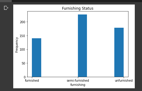
There are three states of furnishing (furnished, semi-furnished, unfurnished)
Majority of the houses are semi-furnished
Bivariate Analysis
As we discussed earlier, Bivariate analysis is a kind of statistical analysis in which two variables are observed against each other. One variable will be dependent and the other is independent.
Using Bivariate analysis we will see how the various features relate to house price:
We'll use various visualizations to uncover the relationships, some are:
- scatter plot
- bar charts etc
1.1 area vs price
Let's plot a scatter plot of area and price.
plt.title("Area vs price")
housing_data.scatter(housing_data.price, housing_data.area)
plt.xlabel("Price")
plt.ylabel("Area")
plt.show()
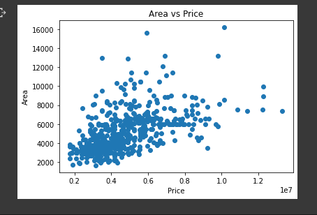
from the image result we can infer that most of the houses that are 6 million and below have an area of 8,000 square feet. Thus the cheaper the house the smaller the area.
Some houses that are expensive even though the area is small and vice versa... This could either be :
- an outlier
- affected by other features
We will uncover this later as we look for correlation between the variables.
1.2 bedrooms vs price
Let's try to understand house the number of bedrooms affect the price of a house.
plt.title("bedrooms vs price")
plt.xlabel("Price")
plt.ylabel("Bedrooms")
plt.bar(housing_data.bedrooms, housing_data.price)
plt.show()

From the graph we can observe that the lesser the number of bedroom. But the relationship is not that linear like in regression, the most expensive houses are 4-bedrooms. We would expect that houses with 5 and 6 bedrooms to be more expensive. Some factors could be affecting this assumption.
Let's see the same graph using a scatter plot:
plt.title("bedrooms vs price")
plt.xlabel("Bedrooms")
plt.ylabel("price")
plt.scatter(housing_data.bedrooms, housing_data.price)
plt.show()

We can now see how the prices are distributed for each number of bedrooms.
if we look closely we can see that 3-bedroom houses are many compared to 4-bedrooms.
1.3 bathrooms vs price
Let's see how the price of the houses compare to the number of bathrooms
plt.title("bedrooms vs price")
plt.xlabel("Bathrooms")
plt.ylabel("price")
plt.scatter(housing_data.bathrooms, housing_data.price)
plt.show()

From the graph above we can infer the following observations:
- Most of the houses have 1 or 2 bathrooms a total of 534 houses, majority having 1 bathroom (401)
1.4 stories
Let's explore the relationship between the number of stories and the price of the house
plt.title("Stories vs Price")
plt.xlabel("Stories")
plt.ylabel("Price")
plt.scatter(housing_data.stories, housing_data.price)
plt.show()
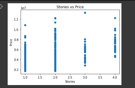
We can observe that many have 1 or 2 strories.
- Some outliers can be viewed such as in houses with 3 stories.
- The number of stories can be seen affecting the price of the house
- There must be a drive that makes people to opt to 1 or 2 story houses. If we view a bar graph for the same relationship we see that the lesser the number of stories the more the range of prices ... This indicates there are various factors that still affect the price of the house such as furnishing and maybe nearness to the main road.
1.5. main road
Nearness to the main road definitely affects the price of the house. It also affect the number of houses available.
Let's dive into visualization and see the relationship between the prices of the houses to the distance to the main road.
plt.title("Nearness to mainroad vs price")
plt.xlabel("Near main road")
plt.ylabel("Price")
plt.bar(housing_data.mainroad, housing_data.price)
plt.show()

We can see that houses that are near to the more expensive than those that are not.
Such insights could have many conclusions but we'll dive into that since the project scope is still minimal.
1.6. guestroom
Shows if a house has a guest room or not.
We want to view the relationship between houses having a guest room or not and the price for each accord.
plt.title("Guest room present vs Price")
plt.xlabel("Guest room")
plt.ylabel("Price")
plt.scatter(housing_data.guestroom, housing_data.price)
plt.show()
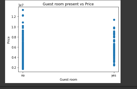
from the graph we can infer that most of the houses have no guest room.
This does not mean that they are cheap, other metrics could be making the houses to be expensive.
We will see in the correlation graph.
The houses that have no guest room have a wider range of prices as compared to those that have a guest room.
1.7. basement
Having a basement may make the house price go up. We'l, explore on the effect of a house having a basement to the price of the house
Let's have a visual view of the relationship:
plt.title("Basement present vs Price")
plt.xlabel("Basement Present")
plt.ylabel("Price")
plt.scatter(housing_data.basement, housing_data.price)
plt.show()

The graph shows the distribution of houses in respect to it having a basement or not.
We see also that more houses do not have a basement as compared to those that have.
The price range of houses in respect to having a basement is wider in those that do not have a basement as compared to those that have.
1.8. hot overheating
Houses that have hot overheating can have an influence in the price of the house. Let's check on how the hot overheating feature affect the price or how it relates to price.
plt.title("Hot Waterheating present vs Price")
plt.xlabel("hotWaterheating Present")
plt.ylabel("Price")
plt.scatter(housing_data.hotwaterheating, housing_data.price)
plt.show()
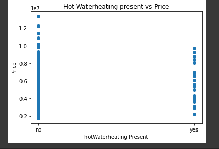
From the graph above we can clearly see that most houses do not have the hot water heating feature.
The range of price for the houses without the hot water heating feature is much greater than that of the houses that do have the feature.
The wide range for the houses without the hot water heating feature are probably affected by other features since the price ranges are not majorly related.
1.9. aircondtitioning
Airconditioning feature is either present in a house or absent. This presence or absence of airconditioning can affect the price of houses.
Let's explore the relationship between the airconditioning feature and house prices
plt.title("Airconditioning present vs Price")
plt.xlabel("aircondtioning Present")
plt.ylabel("Price")
plt.scatter(housing_data.airconditioning, housing_data.price)
plt.show()

By looking at the graph we can infer that the houses are almost evenly distributed.
But those houses with air-conditioning have a wider range of prices.
2.0. Parking
Various houses have a whole number of vehicles that can be accommodated. Houses that have 0 parking value mean that the houses do not have any parking space.
Let's explore the relationship between the parking and the price of the houses.
plt.title("Parking vs Price")
plt.xlabel("parkig")
plt.ylabel("Price")
plt.scatter(housing_data.parking, housing_data.price)
plt.show()

We can infer from the graph that there are 4 categories of parking:
- 0 parking - no parking space
- 1 vehicle parking space
- 2 vehicle parking space
- 3 vehicle parking space
The price ranges are large in all the 4 categories.
There may be a factor affecting this which we will uncover when checking for correlation.
The houses with 1 parking space can be viewed as closely distributed.
2.1. prefarea
Houses can be either be in an area of preference or not. We might want to uncover the relationship between preference and the price of the house.
Let's compare the prefarea to the price of the house
plt.title("Prefarea vs Price")
plt.xlabel("prefarea")
plt.ylabel("Price")
plt.scatter(housing_data.prefarea, housing_data.price)
plt.show()
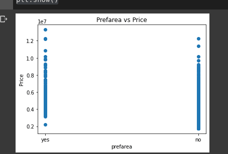
From the graph we can infer that majority of the houses are not in the preferred area. These houses (not preferred area) have a wider range in distribution as compared to those that are preferred.
Seemingly the houses that are the preferred area are much higher in the price as compared to those that are not.
2.2. furnishing status
A house can either be furnished , semi-furnished or unfurnished.
This may have an effect in the pricing of the house.
We will use a scatter plot to uncover insights about the relationship between furnishing status and the price of the houses.
plt.title("Furnishing Status vs Price")
plt.xlabel("furnishing stats")
plt.ylabel("Price")
plt.scatter(housing_data.furnishingstatus, housing_data.price)
plt.show()
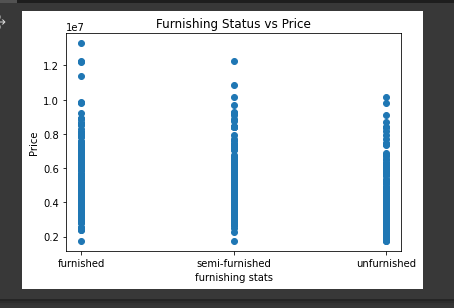
from the graph we can se that the houses are almost even;y distributed in terms of numbers per category.
We can also see that the furnished status of the house has a wide range in prices and also recording the highest prices.
I will add an update to cater for correlation between every feature.

Top comments (0)