
Character limits are used on text fields to indicate the maximum amount of characters that can be entered into that field.
These components are important as they provide immediate feedback to the user when they fill in a form. If you're a fan of usability heuristics, you'll know this trait relates to the heuristic: visibility of system status.
Character limits provide important feedback to the user, so it's important they are designed correctly.
With that in mind, I have put together this article to share with you my knowledge of character limit components including how they work, and design best practices.
Existing Design Patterns For Character Limit Components
If you are learning about a new design component, it's a good idea to look at real-world examples.
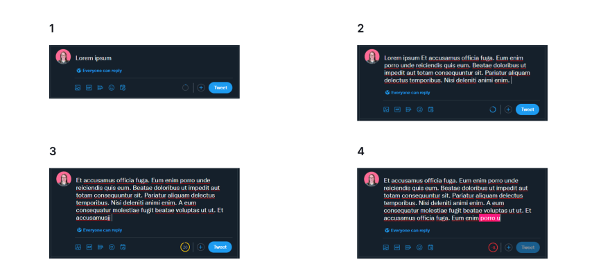
Twitter has a good example of a character limit UI.
Here's how it works:
1 As you start typing a tweet, a progress indicator appears showing you how far away you are from the character limit.
2 As you continue typing, the progress indicator continues to fill in.
3 Once you reach 20 characters before the limit, the indicator will change color and show you exactly how many characters you have left.
4 When you go over the character limit you're still allowed to keep writing. However, you're shown in red how many characters you're over the limit by. Additionally, the Tweet button is disabled so you can't publish the tweet.
5 Best Practices For Designing A Character Limit UI
Now that we've looked at a real-world example of a character limit component in action, it's time to cover the best practices when designing one for yourself.
Here are 5 best practices for designing a character limit UI:
1 Show the character limit right from the start of the interaction
Indicate the max number of characters allowed right from the start of the interaction.
This gives immediate feedback to the user so they know what to expect when interacting with this component.
There's nothing worse than being in the middle of typing something, only to find you've reached the character limit and now you have to edit down everything you've typed.
2 Keep the user informed
As a user continues typing they should know how far they are from reaching the character limit.
You can show this with a progress indicator like Twitter or you could simply display the remaining number of characters.
3 Let the user know when they've reached or exceeded the character limit
When the user reaches or exceeds the character limit they should be made aware of it.
Here are some things to incorporate into your design:
Change the input border to red
Display an error icon next to the input field
Display a clear error message: "Maximum 280 Characters (20 too many)"
Any text that is over the limit should be a different color or be highlighted in some way to visually show the user where they've gone over.
Any Action or Submit button should be disabled to prevent submission.
Immediate feedback using the design elements described above allows the user to easily see what's going on. With this information, they can quickly determine the cause of the issue (too many characters) and quickly take steps to resolve things.
4 Visualize the character limit for the user
It's hard to visualize just what 100, 280, or 500 characters look like on-screen, so it's important to highlight this to the user.
Make use of visual cues like changing the text that's over the limit (mentioned in the previous item) to convey this.
Another visual cue is to make the size of the input box roughly the size that represents the max character limit. This will give users a better sense of the limit.
5 Don't limit the number of characters a user can type
When the user exceeds the character limit, don't prevent them from typing.
This prevents users from finishing the flow of what they are trying to write.
Additionally, some users may be pasting in some text from elsewhere. If there is a limit, some of this text will get cut off causing frustration.
Instead, put visual cues in place (like the ones mentioned above) but prevent the action/submit button from being pressed until the character limit is resolved.
Example Character Limit Component
I put together a simple Codepen snippet to show a character limit UI in action. Feel free to check it out:
https://codepen.io/mishacreatrix/pen/rNWwMZa
This article was originally published over on my website: UI Design Patterns - Character Limits

Top comments (0)