Here are three random CSS features that I didn't know about and was happy to learn that they exist.
1. caret-color
You can change the color of the blinking bar in input fields by simply using the caret-color property.
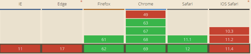
⚠ Support for the caret-color property is not so great:
2. nth-child(odd) & nth-child(even)
Those values are pretty well-known, but I only found out recently about them. They can come in handy, e.g. for alternating background colors in lists:
3. Gaps in Flexbox!
This is a truly awesome feature. In CSS grid, we can use the gap property to specify the gaps (gutters) between rows and columns. "Now" we get the same power with Flexbox!
However this feature is only supported by Firefox 63, which at the time of this writing hasn't been released to the wider public. I hope that the other vendors will implement it soon.
If you only see a big green block in the second example in the codepen above, it means that your browser does not support it.

Top comments (3)
Personally I'm a bigger fan of
parent child:nth-of-type(odd)rather thanparent:nth-child(odd)... (e.g.tbody tr:nth-of-type(odd)) just in case you have some extra elements in there somewhere that aren't the list elements/table rows.Very cool. I've often used
margin-leftfor gaps in (row) flex containers beforeIt's probably better to set margin for all sides & negative margin on flex container so gaps are displayed correctly when flex children are wrapped to another row.
codepen.io/tplk/pen/wEZbxM