ถ้าใครชอบแนว CSS แนว Tailwind ก็ลองเล่นกันดูผมเองก็ยังไม่ค่อยประสา จะคล้ายๆ Bootstrap ภาค CSS
ตัวอย่าง code
Demo
Install
yarn add tailwindcss@npm:[@tailwindcss/postcss7-compat](http://twitter.com/tailwindcss/postcss7-compat)
เนื่องจากตัว vue-cli จะใช้ postcss อยู่แล้วและยังเป็น version 7 อยู่ทาง tailwind แนะนำให้ติดตั้งด้วยคำสั่งด้านบนแทน
สร้าง config postcss.conf.js
module.exports = {
  plugins: {
    tailwindcss: {},
    autoprefixer: {}
  }
}
สร้าง tailwind config
npx tailwindcss init
ปรับแต่ง config
module.exports = {
  purge: [],
  darkMode: false, // or 'media' or 'class'
  theme: {
    container: {
      center: true
    },
    fontFamily: {
      sans: ['Prompt'],
      serif: ['Prompt'],
      display: ['Prompt'],
      body: ['Prompt']
    },
    extend: {}
  },
  variants: {
    extend: {}
  },
  plugins: []
}
เพิ่ม google font ใน public/index.html ผมใช้ Prompt ใน config
<link rel=”stylesheet” href=”[https://fonts.googleapis.com/css2?family=Prompt:ital,wght@0,100;0,200;0,300;0,400;0,500;0,600;0,700;0,800;0,900;1,100;1,200;1,300;1,400;1,500;1,600;1,700;1,800;1,900&display=swap](https://fonts.googleapis.com/css2?family=Prompt:ital,wght@0,100;0,200;0,300;0,400;0,500;0,600;0,700;0,800;0,900;1,100;1,200;1,300;1,400;1,500;1,600;1,700;1,800;1,900&display=swap)” />
import css ใน src/main.ts
import { createApp } from 'vue'
import App from './App.vue'
import router from './router'
**import 'tailwindcss/tailwind.css'**

createApp(App).use(router).mount('#app')
ลอง start dev server
yarn serve
ลองเปิดดูบน browser
remove css ตัวอย่างที่ติดมาใน src/App.vue
เพิ่ม ครอบใน src/App.vue
<div class=" **container mx-auto text-center**">
...
</div>
หน้าตาเว็บก็จะกลับมาเหมือนตัวอย่างที่ vue-cli สร้างให้ :P

ลองเพิ่ม UI กันบ้าง
ลองใส่ Navigator
<nav class="bg-gray-800">
      <div class="max-w-7xl mx-auto px-4 sm:px-6 lg:px-8">
        <div class="flex items-center justify-between h-16">
          <div class="flex items-center">
            <div class="flex-shrink-0">
              <img class="h-8 w-8" **src="@/assets/logo.png"** alt="VueJs" />
            </div>
            <div class="hidden md:block">
              <div class="ml-10 flex items-baseline space-x-4">
                **<router-link
 v-for="menu in menus"
 :to="menu"
 class="px-3 py-2 rounded-md text-sm font-medium text-gray-300 hover:text-white hover:bg-gray-700"
 active-class="bg-gray-700"
 :key="menu.name"
 >
_`{{ menu.name }}`_
 </router-link>**
              </div>
            </div>
          </div>
          <div class="-mr-2 flex md:hidden">
            <!-- Mobile menu button -->
            <button
              class="bg-gray-800 inline-flex items-center justify-center p-2 rounded-md text-gray-400 hover:text-white hover:bg-gray-700 focus:outline-none focus:ring-2 focus:ring-offset-2 focus:ring-offset-gray-800 focus:ring-white"
              [**@click**](http://twitter.com/click) **="menuToggle = !menuToggle"**
            >
              <span class="sr-only">Open main menu</span>
              <svg
                **:class="[menuToggle ? 'hidden' : 'block', 'h-6 w-6']"**
                xmlns="[http://www.w3.org/2000/svg](http://www.w3.org/2000/svg)"
                fill="none"
                viewBox="0 0 24 24"
                stroke="currentColor"
                aria-hidden="true"
              >
                <path stroke-linecap="round" stroke-linejoin="round" stroke-width="2" d="M4 6h16M4 12h16M4 18h16" />
              </svg>
              <svg
                **:class="[menuToggle ? 'block' : 'hidden', 'h-6 w-6']"**
                xmlns="[http://www.w3.org/2000/svg](http://www.w3.org/2000/svg)"
                fill="none"
                viewBox="0 0 24 24"
                stroke="currentColor"
                aria-hidden="true"
              >
                <path stroke-linecap="round" stroke-linejoin="round" stroke-width="2" d="M6 18L18 6M6 6l12 12" />
              </svg>
            </button>
          </div>
        </div>
      </div>

<div **:class="[menuToggle ? '' : 'hidden', 'md:hidden']"**>
        <div class="px-2 pt-2 pb-3 space-y-1 sm:px-3">
          **<router-link
 v-for="menu in menus"
 :to="menu"
 class="block px-3 py-2 rounded-md text-sm font-medium text-gray-300 hover:text-white hover:bg-gray-700"
 active-class="bg-gray-700"
 :key="menu.name"
 >
 `{{ menu.name }}`
 </router-link>**
        </div>
      </div>
    </nav>
ใส่ code ใน script
<script lang="ts">
  import { defineComponent, ref } from 'vue'
  export default defineComponent({
    name: 'App',
    setup() {
      **const menus = [{ name: 'Home' }, { name: 'About' }]**

return {
        **menus,
 menuToggle: ref(false)**
      }
    }
  })
</script>


เป็นยังไงกันบ้าง ตาลายดีไหมครับ ถ้าใครติดนิสัยใช้พวก vuetify , primevue มาก่อนก็จะท้อๆ หน่อย ฮาๆ
Custom Component
ปิดท้ายด้วยการลองเขียน Dialog Component ขึ้นมาใช้เองโดยการ copy code จาก ตัวอย่างมาใช้
สร้าง Class สำหรับ Button มาใช้งาน
ผมจะใช้ info, success, warning และ error สำหรับ Dialog
แก้ไข file tailwind.conf.js
colors
theme: {
colors: {
      ...colors,
      info: colors.cyan[500],
      success: colors.green[500],
      error: colors.red[500],
      warning: colors.orange[500]
    }
}
plugin
plugins: [
    function ({ addComponents }) {
      const buttons = {
        '.btn': {
          padding: '.5rem 1rem',
          borderRadius: '.25rem',
          fontWeight: '600',
          margin: '.05rem .2rem'
        },
        '.btn-primary': {
          backgroundColor: colors.blueGray[600],
          color: colors.white,
          '&:hover': {
            backgroundColor: colors.gray[600]
          }
        },
        '.btn-secondary': {
          backgroundColor: colors.blue[600],
          color: colors.white,
          '&:hover': {
            backgroundColor: colors.blue[400]
          }
        },
        '.btn-error': {
          backgroundColor: colors.red[500],
          color: colors.white,
          '&:hover': {
            backgroundColor: colors.red[600]
          }
        },
        '.btn-info': {
          backgroundColor: colors.cyan[500],
          color: colors.white,
          '&:hover': {
            backgroundColor: colors.cyan[600]
          }
        },
        '.btn-success': {
          backgroundColor: colors.green[500],
          color: colors.white,
          '&:hover': {
            backgroundColor: colors.green[600]
          }
        },
        '.btn-warning': {
          backgroundColor: colors.orange[500],
          color: colors.white,
          '&:hover': {
            backgroundColor: colors.orange[600]
          }
        }
      }

addComponents(buttons)
    }
  ]
Class Dialog
import { reactive } from 'vue'

export class SysDialog {
  type: string
  message: string
  active: boolean

constructor() {
    this.type = 'info'
    this.message = 'แจ้งเตือนจากระบบ'
    this.active = false
  }
  get title() {
    const titles: Record<string, string> = {
      info: 'แจ้งเพื่อทราบ',
      error: 'เกิดข้อผิดพลาด',
      success: 'ดำเนินการสำเร็จ',
      warning: 'แจ้งเตือน'
    }
    return titles[this.type]
  }

datas(message: 'แจ้งเตือนจากระบบ', type: 'info') {
    this.type = type
    this.message = message
    this.active = true
  }
}

const dialog = reactive(new SysDialog())
export default dialog
สร้าง Vue Component src/components/Dialog.vue
template
<template>
<div class="fixed z-10 inset-0 overflow-y-auto" :class="$dialog.active ? '' : 'hidden'">
<div class="flex items-end justify-center min-h-screen pt-4 px-4 pb-20 text-center sm:block sm:p-0">
<div class="fixed inset-0 transition-opacity" aria-hidden="true">
<div class="absolute inset-0 bg-gray-500 opacity-75"></div>
</div>
<span class="hidden sm:inline-block sm:align-middle sm:h-screen" aria-hidden="true">​</span>
<div
class="inline-block align-bottom bg-white rounded-lg text-left overflow-hidden shadow-xl transform transition-all sm:my-8 sm:align-middle sm:max-w-lg sm:w-full"
role="dialog"
aria-modal="true"
aria-labelledby="modal-headline"
>
<div class="bg-white px-4 pt-5 pb-4 sm:p-6 sm:pb-4">
<div class="sm:flex sm:items-start">
<div
:class="`bg-${$dialog.type}`"
class="mx-auto flex-shrink-0 flex items-center justify-center h-12 w-12 rounded-full sm:mx-0 sm:h-10 sm:w-10"
>
<svg
class="h-6 w-6 text-white"
xmlns="[http://www.w3.org/2000/svg](http://www.w3.org/2000/svg)"
fill="none"
viewBox="0 0 24 24"
stroke="currentColor"
aria-hidden="true"
>
<path stroke-linecap="round" stroke-linejoin="round" stroke-width="2" :d="types[$dialog.type]" />
</svg>
</div>
<div class="mt-3 text-center sm:mt-0 sm:ml-4 sm:text-left">
<h3 class="text-lg leading-6 font-medium text-gray-900" id="modal-headline">{{ $dialog.title }}</h3>
<div class="mt-2">
<p class="text-sm text-gray-500">
{{ $dialog.message }}
</p>
</div>
</div>
</div>
</div>
<div class="bg-gray-50 px-4 py-3 sm:px-6 sm:flex sm:flex-row-reverse">
<button
type="button"
:class="`bg-${$dialog.type}`"
class="w-full inline-flex justify-center rounded-md border border-transparent shadow-sm px-4 py-2 text-base font-medium text-white focus:outline-none focus:ring-2 focus:ring-offset-2 sm:ml-3 sm:w-auto sm:text-sm"
[@click](http://twitter.com/click)="$dialog.active = false"
>
รับทราบ
</button>
</div>
</div>
</div>
</div>
</template>
script
<script lang="ts">
  import { defineComponent } from 'vue'
  export default defineComponent({
    name: 'Dialog',
    setup() {
      return {
        types: {
          info: 'M13 16h-1v-4h-1m1-4h.01M21 12a9 9 0 11-18 0 9 9 0 0118 0z',
          success: 'M9 12l2 2 4-4m6 2a9 9 0 11-18 0 9 9 0 0118 0z',
          warning:
            'M12 9v2m0 4h.01m-6.938 4h13.856c1.54 0 2.502-1.667 1.732-3L13.732 4c-.77-1.333-2.694-1.333-3.464 0L3.34 16c-.77 1.333.192 3 1.732 3z',
          error: 'M10 14l2-2m0 0l2-2m-2 2l-2-2m2 2l2 2m7-2a9 9 0 11-18 0 9 9 0 0118 0z'
        }
      }
    }
  })
</script>
ตั้งค่า Global config ใน src/main.ts
import { createApp } from 'vue'
import App from './App.vue'
import router from './router'
**import Dialog from '@/state/Dialog'**
import 'tailwindcss/tailwind.css'

const app = createApp(App)
app.use(router)
**app.config.globalProperties.$dialog = Dialog**
app.mount('#app')
file main.ts ผมปรับนิดหน่อยเพื่อให้เขียนเพิ่มเข้าไปง่ายหน่อย
ผมเพิ่มตัวอย่างใน src/views/About.vue
<template>
  <div class="about">
    <h1>This is an about page</h1>
    **<button class="btn btn-info"** [**@click**](http://twitter.com/click)**="$dialog.datas((message = 'แจ้งเพื่อทราบ'), (type = 'info'))">Info</button>
 <button class="btn btn-success"**[**@click**](http://twitter.com/click)**="$dialog.datas((message = 'สำเร็จสิ้น'), (type = 'success'))">Success</button>
 <button class="btn btn-warning"**[**@click**](http://twitter.com/click)**="$dialog.datas((message = 'เราเตือนคุณแล้วนะ'), (type = 'warning'))">Warning</button>
 <button class="btn btn-error"**[**@click**](http://twitter.com/click)**="$dialog.datas((message = 'มีอะไรบางอย่างไม่ถูกต้อง'), (type = 'error'))">Error</button>
 </div>**
</template>
ตัวอย่างหน้าจอ


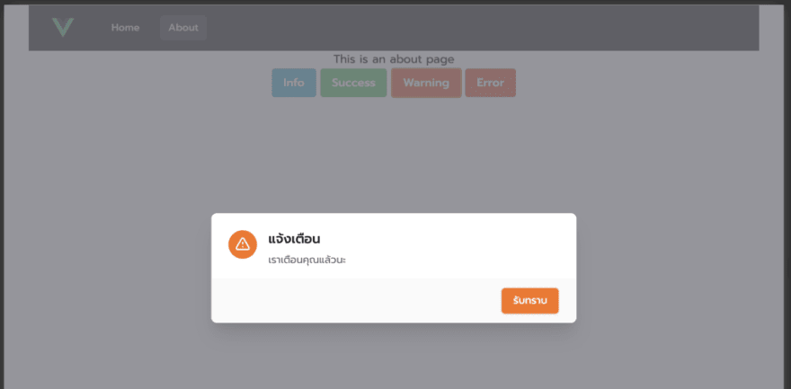

ยอมรับเลยว่าเขียนแนวนี้เหนื่อยมาก ฮาๆ แต่ถ้าใครชอบผมว่าน่าสนใจนะลองเล่นกันดู
Build Production
หลังจาก build production ผมพบว่าถ้าเราเปิดการใช้ PurgCSS พวก class ที่เราเรียกแบบ dynamic ใน template จะถูก remove ออกทำให้การทำงานไม่ถูกต้อง มีทางเลือกคือ
กำหนด safelist ไว้
purge: {
    content: ['./public/ **/*.html', './src/** /*.vue'],
    options: {
      safelist: ['bg-info', 'bg-success', 'bg-warning', 'bg-error']
    }
  },
หรือตามคำแนะนำในคู่มือคือให้เขียนแบบชื่อเต็มในเงื่อนไข อันนี้ผมมองว่ายากมากในบางครั้ง ทำให้ลำบากพอสมควร

Top comments (0)