Toast is an easy and convenient way to display a short message to user. Its implementation is as short as one line of code as shown below:
Toast.makeText(this, "Toast Message", Toast.LENGTH_SHORT).show()
However, did you ever explore other features other than simply showing up a sentence? Developer can actually customise Toast by setting a custom layout and define the location within the app window. Furthermore, there is a trick on vision accessibility handling (Talkback)!
This article will cover totally four functions to the following attributes of Toast:
- Custom layout
- Duration
- Position with offset
- Horizontal and vertical margins
*In Android 11 Preview 2, there are new updates on customising Toast and the presentation limitation. You can understand more here:

Android 11 Toast Updates. What has been updated in Android 11… | by Myrick Chow | ITNEXT
Myrick Chow ・ ・
 itnext.io
Property 1: Custom Layout
<?xml version="1.0" encoding="utf-8"?>
<layout>
  <TextView
    ...
    android:id="@+id/titleTextView"
    android:drawableStart="@drawable/correct"
    android:text="This is the message"
    android:textStyle="bold"/>
</layout>
class CustomToast(context: Context) : Toast(context) {
  init {
    // Inflate <View> By LayoutInflater
    val view = LayoutInflater.from(context).inflate(R.layout.widget_toast, null)

    // Inflate <View> By DataBindingUtil
    val view = DataBindingUtil.inflate<WidgetToastBinding>(LayoutInflater.from(context), R.layout.widget_toast, null, false)

    // Set custom view
    setView(view)
  }
}
setView(view: View) can be used to set a custom view of a Toast. Custom layout can be inflated by either:
LayoutInflater-
DataBindingUtil(if you are using DataBinding)
Property 2: Duration (2.0s Vs 3.5s)
class CustomToast(context: Context) : Toast(context) {
  init {
    // ...
    duration = Toast.LENGTH_LONG // 3.5s (3500ms)
    duration = Toast.LENGTH_SHORT // 2.0s (2000ms)
  }
}
{"mode":"full","isActive":false}
Duration of Toast is limited to either LENGTH_SHORT and LENGTH_LONG.

Line 70–73 of Toast source code
Although there is no documentation about the definition of the above two choices, the NotificationManagerService source code indicates the length clearly. (Thank you for StackOverflow information)
Line 75–78 of NotificationManagerService source code
Property 3: Gravity + Offset
Gravity can be imagined as a force pushing a views towards that direction. It is in Integer type and can be set to be any bitwise combination of the following 7 constants:
-
Gravity.START/Gravity.LEFT -
Gravity.END/Gravity.RIGHT Gravity.TOPGravity.BOTTOMGravity.CENTERGravity.CENTER_VERTICALGravity.CENTER_HORIZONTAL
Example codes for showing at top left corner:
class CustomToast(context: Context) : Toast(context) {
  init {
    // ...
    val gravity = Gravity.START or Gravity.TOP
    val horizontalOffset = 0
    val verticalOffset = 0
    setGravity(gravity, horizontalOffset, verticalOffset)
  }
}
Here is a full list of mapping between Toast position and the corresponding gravity bitwise combination:

So, what is the meaning of the horizontalOffset and verticalOffset used in the setGravity function?

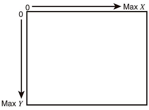
illustration of the coordinate system in Android
In Android, the origin of coordinates system is always the top left corner. Horizontal axis is represented by x value which increases from left to right. Vertical axis is represented by y value which increases from top to bottom.
Thus, these values can be set to move the Toast from its original position. See below as an example:
illustration of the horizontal and vertical offset in Toast
Property 4: Margins
class CustomToast(context: Context) : Toast(context) {
  init {
    val horizontalMarginPercentage = 0.1f
    val verticalMarginPercentage = 0.2f
    setMargin(horizontalMarginPercentage, verticalMarginPercentage)
  }
}
At first glance, it is easy to overlook at the unit of the parameters used in the setMargin function. Unlike the ViewGroup.MarginLayoutParams , it does not uses pixel as the unit. It actually represents the percentage of the container width or height.
setMargin shows a similar behaviour as the horizontal and vertical offset used in the setGravity function shown above. However, it applies on bi-direction, i.e. both top and bottom / both left and right.
The following extension functions can help you a lot on calculating the correct percentage:
// Conversion from dp to px
fun Int.toPx(): Int {
  val metrics = Resources.getSystem().displayMetrics
  val px = this * (metrics.densityDpi / 160f)
  return Math.round(px)
}

// Get screen dimension
fun Context.screenDimension(): Point {
  val windowManager = getSystemService(Context.WINDOW_SERVICE) as WindowManager // Either getting WindowManager from Activity or Application context
  val display = windowManager.getDefaultDisplay()
  val size = Point()
  display.getSize(size)
  return size
}
fun Context.screenWidth(): Int = screenDimension().x
fun Context.screenHeight(): Int = screenDimension().y
Usage:
// Calculate percentage of horizontal margin
val horizontalMarginInDp = 16
val horizontalMarginPercentage = horizontalMarginInDp.toPx() / screenWidth()

// Calculate percentage of vertical margin
val verticalMarginInDp = 16
val verticalMarginPercentage = verticalMarginInDp.toPx() / screenHeight()

setMargin(horizontalMarginPercentage, verticalMarginPercentage)
{"mode":"full","isActive":false}
Vision accessibility issue
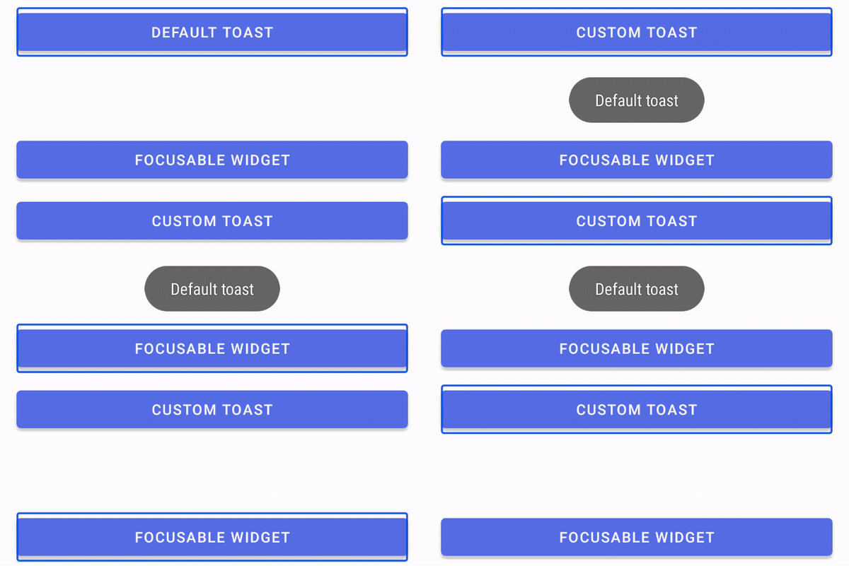
According to the Google official documentation, Toast cannot be focused by any means. In other words, visually impaired cannot be notified about the Toast message by Android TalkBack Accessibility Tool, which is also named as “Voice Assistant” in some devices.

To learn more about Talkback, please read the this Android official documentation.
Limitation of Toast
Toast is a super simple widget and there are no listeners to notify developer about its state. For example, unlike DialogFragment, Toast does not have a onCancelListener() to notify when Toast is faded out from the screen. Below is the onCancelListener documentation of DialogInterface that is used in DialogFragment.
Link to the Android official documentation of
DialogInterface.OnCancelListener
Conclusion
Toast has many features other than simply displaying a message.
Toast can be:
- Shown with a custom layout, for example with an
ImageView - Shown with two different durations, i.e. 2.0s and 3.5s
- Shown with a custom position at the screen with a combination of its
gravityandx-y offset - Shown with bi-direction margins
Toast cannot :
- Be focused or clicked. This makes a huge inconvenience to visually impaired.
- Notify application about its current status, e.g. the callback of dismiss
Further readings:
- Android 11 Toast Updates
- Toast class overview
- Toast function and attribute definitions
- Toast open source code
You are welcome to follow me at Twitter@myrick_chow and Medium@myrickchow for more information. Thank you for reading this article. Have a nice day! 😄


Top comments (0)