
In today’s web ecosystem, websites or tools play a significant role, and their presentation layer is powered by CSS (Cascading Style Sheets). A fascinating website can inevitably bring in more customers or viewers, which you can use in different ways to enhance the product’s effectiveness.
Web developers can leverage some of the best CSS frameworks to create user-friendly and browser compatible websites and web pages. The main benefit of using the CSS framework is that it saves time, as you don’t need to begin from scratch.
CSS Framework provides a solid foundation for developers to build upon and can save time and effort in the development process. This article will discuss some of the best CSS frameworks for 2023.
Run your Jest testing automation in massive parallel across multiple browser and OS combinations with LambdaTest, Read more.
What is CSS Framework?
CSS frameworks make styling websites incredibly simple for developers and designers. They provide easy-to-reuse style definitions that have been tested and verified. The best CSS framework ensures your website looks great on all popular browsers and mobile devices. Thanks to responsive design, which is crucial for mobile surfing.
Different CSS frameworks take different approaches to complete their tasks. While some only utilize JavaScript, and some even employ specific JavaScript frameworks, others only use pure HTML and CSS.
Advantages of using CSS Frameworks
A CSS framework is used to provide a starting point for building websites. They offer fully prepared CSS and HTML files, which expedites and simplifies the process of building a website.
Here are some advantages of using CSS Frameworks:
Saves Time: One of the main advantages of using a CSS framework is that it saves a lot of time. Developers are not required to start from scratch with every style and component.
Consistency: CSS frameworks offer predefined styles and components to ensure a consistent look and feel across many web pages or applications.
Responsive Design: Several CSS frameworks are meant to be responsive, meaning they can adapt to multiple screen sizes and devices. This might save developers a lot of time and effort in designing a responsive design from the start.
Cross-Browser Compatibility: To ensure cross-browser compatibility, CSS frameworks are frequently tested on many platforms and browsers. This can let developers test their code across several platforms more quickly and efficiently.
Easy Customization: CSS frameworks offer pre-defined components and styles, but they are also made to be simple to modify. The framework is simple for developers to change and add their styles, allowing them more control over the project’s look.
Primary Goals of CSS Framework
The primary goals of the CSS framework are:
Separate presentation from content: This allows developers to keep a website’s presentation different from its HTML content, making it easier to maintain and modify.
Consistency: Establish a consistent look and feel across all website pages.
Accessibility: Provide ways to make websites accessible for users with impairments.
Browser compatibility: Ensure that websites are displayed consistently across different browsers and devices.
Maintainability: Make it easier to maintain and update the styling of a website over time.
Performance optimization: Improve website performance by reducing the size and complexity of CSS files.
Best CSS Frameworks to use in 2023
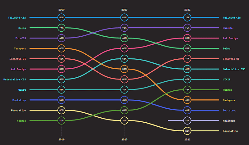
With several CSS frameworks available, it can be hard to find the best CSS frameworks. Therefore, this list of the best CSS Frameworks is based on the satisfaction ratio ranking presented by the State of CSS report for 2021.
Let’s begin with our CSS framework list.
Test your website or web app online for iOS browser compatibility. Perform seamless cross browser testing on the latest Simulator iPhone tester. Try for free.
Tailwind CSS
Tailwind CSS is a utility-first CSS framework that provides a low-level design system for building fast and responsive web interfaces. Instead of pre-designed UI components, the Tailwind CSS framework offers a set of CSS utility classes that can be combined to create custom designs.

These utility classes cover a wide range of design needs, such as layout, typography, colors, spacing, and more, and are highly customizable. Tailwind CSS is built with PostCSS, is well-documented, easy to use, and integrates with popular front-end frameworks like React and Vue.js. The utility-first approach allows for a highly optimized and efficient workflow, making Tailwind CSS Framework a popular choice for performance-conscious developers.
Benefits of using the Tailwind CSS framework:
Speed and Performance: Tailwind CSS is highly optimized for performance and generates small, concise CSS classes that are easy to understand and maintain.
Responsive design: It provides a responsive grid system and utility lessons for building flexible and adaptive layouts that work on all devices.
Low-level styling: Tailwind CSS provides low-level styling options for elements such as colors, spacing, and typography, making it easy to create custom designs.
Customizable: It has a large set of variables and plugins, making it easy to customize the framework to meet specific design requirements.
Productivity: Tailwind CSS provides a large group of utility classes that can be combined to create complex designs, reducing the need for custom CSS and making it easier to build web interfaces quickly.
Accessibility: It has accessibility features built-in, such as focus states, hover styles, and contrast ratios, making it easier to build accessible web interfaces.
Pure CSS
Pure CSS is a minimal and responsive CSS framework that provides a basic set of styles for creating fast-loading and mobile-friendly web pages. It is built with a mobile-first approach and includes a responsive grid system for creating flexible and adaptive layouts.
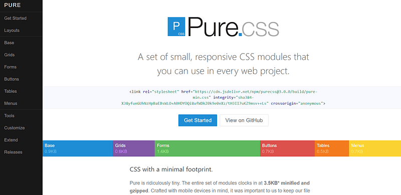
It provides a small set of styles for common UI elements, such as buttons, forms, and tables, but does not include JavaScript components or a comprehensive design system. Pure CSS is lightweight, fast, and well-documented, making it a good choice for small projects or as a starting point for custom design work.
Benefits of using the Pure CSS framework:
Lightweight and fast: Pure CSS is a lightweight CSS framework optimized for performance, making it fast-loading and ideal for websites with limited resources.
Minimalist design: It has a minimalist design philosophy, providing only the necessary styles for essential web interface elements, making it easy to create custom designs.
Responsive design: Pure CSS provides a responsive grid system and utility classes for building flexible and adaptive layouts that work on all devices.
Easy to learn: It has a simple syntax, making it easy to learn and use, even for developers with limited CSS experience.
Modular architecture: Pure CSS is built with a modular architecture, allowing developers only to include the styles they need and reducing the size of their CSS files.
Compatibility: It is compatible with many browsers and devices, ensuring that designs work consistently across different platforms.
Online Selenium Grid to run your browser automation testing scripts on cloud infrastructure containing 3000+ desktop and mobile browser environments. Perform Selenium Testing on a cloud automation testing grid that scales along with your tests.
Ant Design
Ant Design is a UI design system and React-based implementation for enterprise-level products. It provides a comprehensive set of UI components that adhere to the Ant Design design language, such as buttons, forms, icons, and more.

It also includes development tools and resources, such as a Sketch library, React hooks, and TypeScript support, to make it easier for developers to build high-quality products. Ant Design is highly customizable and can create a wide range of web applications, from small internal tools to large-scale enterprise platforms. The design system and implementation are well-documented and widely used by developers, making Ant Design a popular choice for building professional-grade web applications.
Benefits of using the Ant Design framework:
Comprehensive UI components: Ant Design provides a complete set of UI components, including forms, buttons, data tables, and more, that are designed to be easy to use and customizable.
Consistent design: It provides a consistent and unified design system, making creating a cohesive and visually appealing user interface easier.
User-centered design: Ant Design is designed with user experience in mind and provides a set of best practices for creating user-friendly interfaces.
Customizable: It provides a set of pre-designed themes and allows easy customization of colors, CSS Typography, and other visual elements.
Performance: Ant Design is optimized for performance, providing fast-loading and responsive UI components that can handle large amounts of data.
Accessibility: It provides accessibility features, such as keyboard navigation and screen reader support, making it easier to build accessible web interfaces.
Community Support: Ant Design has a large and active community of developers who contribute to its development and provide support, making it a reliable and well-supported framework.
Bulma
Bulma is a modern framework based on the CSS Flexbox layout. It provides a set of UI components and styles, such as buttons, cards, forms, icons, and more, that are designed to be flexible and customizable. Bulma uses a simple and easy-to-learn syntax for its class names and does not use JavaScript for its core styling.

Instead, it relies on the capabilities of modern browsers to provide dynamic behavior, such as responsiveness and transitions. Bulma is lightweight, fast, and well-documented, making it a good choice for building fast and elegant websites and web applications.
Perform live interactive Bulma testing of your Bulma websites on LambdaTest.
Benefits of using the Bulma framework:
Responsive design: Bulma provides a responsive grid system that makes it easy to create flexible and adaptive layouts that work on all devices.
Modular architecture: It is built with modularity in mind, and its components are designed to be easily composable, making it easier to create custom designs.
Lightweight: Bulma is a lightweight framework with a small file size and fast performance, making it a good choice for web applications that need to be fast-loading and efficient.
Well-documented: It has comprehensive documentation, including examples and tutorials, making it easier to learn and use.
Community support: Bulma has a growing community of developers who contribute to its development and provide support, making it a reliable and well-supported framework.
Easy to customize: Its modular architecture and extensive use of variables make it easy to customize and create custom styles that meet specific design requirements.
Modern features: Bulma uses modern CSS features, such as flexbox and CSS Grid, and supports recent browsers, making it a good choice for building cutting-edge web interfaces.
Perform browser automation testing on the most powerful cloud infrastructure. Leverage test automation cloud for faster, reliable and scalable experience on cloud.
Semantic UI
Semantic UI is a CSS framework that uses human-friendly HTML to create responsive and customizable user interfaces. It utilizes class names, rather than design patterns, to apply styles to elements and includes over 2000 UI elements and themes. Semantic UI is well-documented, easy to learn, and integrates with popular JavaScript frameworks such as React, Angular, and Vue.js.

Perform Semantic UI testing on the LambdaTest platform and deliver pixel-perfect Semantic UI-based web experience.
Benefits of using the Semantic UI framework:
User-friendly: Semantic UI is designed with user experience in mind, providing a set of best practices for creating intuitive and user-friendly interfaces.
Comprehensive UI components: It provides a complete set of UI components, including forms, buttons, data tables, icons, and more, that are easy to use and customize.
Consistent design: Semantic UI provides a consistent and unified design system, making creating a cohesive and visually appealing user interface easier.
Performance: It is optimized for performance, providing fast-loading and responsive UI components that can handle large amounts of data.
Accessibility: Semantic UI provides accessibility features, such as keyboard navigation and screen reader support, making it easier to build accessible web interfaces.
Easy to learn: It has a simple syntax, making it easy to learn and use, even for developers with limited CSS experience.
Materialize CSS
Materialize is a CSS framework inspired by Google’s Material Design guidelines. It provides a comprehensive set of UI components and CSS styles that adhere to the material design principles, such as buttons, cards, forms, icons, and more.

It is built with Sass and includes a responsive grid system, allowing for quickly creating mobile-friendly layouts. It also includes JavaScript components for adding dynamic behavior to web pages, such as models, dropdown menus, and toasts. Materialize is easy to use, well-documented, and supports popular front-end frameworks such as React and Angular.
Perform Materialize testing of apps on the LambdaTest platform and deliver pixel-perfect Materialize-based web experience.
Benefits of using the Materialize CSS framework:
Material design: Materialize CSS is based on Google’s Material Design, providing a clean and modern design that can improve the visual appeal of a website.
UI components: It provides a comprehensive set of UI components, including forms, buttons, data tables, icons, and more, that are easy to use and customize.
Responsive design: Materialize CSS provides a responsive grid system and UI components that can adapt to different screen sizes, making it easier to create responsive designs.
Cross browser compatibility: It is designed to work across many browsers and devices, ensuring that designs work consistently across different platforms.
Easy to learn: Materialize CSS has a simple and intuitive syntax, making it easy to learn and use, even for developers with limited CSS experience.
Performance: It is optimized for performance, providing fast-loading and responsive UI components that can handle large amounts of data.
UIkit
UIkit is a lightweight, modular, front-end CSS framework for building responsive and fast web interfaces. It provides a comprehensive set of UI components and styles, such as buttons, forms, navigation, and typography, that are designed to be flexible and customizable.
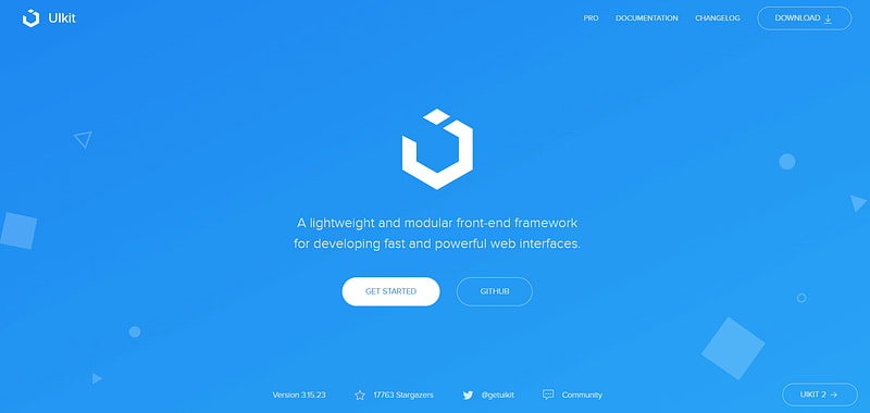
It uses a modular architecture, allowing developers only to include the components they need in their projects, helping to keep file sizes small. UIkit also includes JavaScript components for adding dynamic behavior to web pages, such as models, dropdown menus, and toasts. UIkit is well-documented, easy to use, and integrates with popular front-end frameworks like React and Vue.js.
Benefits of using the UIkit framework:
Clear architecture: UIkit has clearly defined conventions and clean code, which contributes to a clear architecture.
Availability of ready-to-use themes: You can choose the theme of your choice from the drop-down menu of the website by downloading its LESS CSS or SASS file. There is a wide variety of ready-to-use themes to select from.
Modular: Designing every aspect of the UIkit is done so that designers can easily select different components for adding to their stylesheet. Thanks to the frontend framework being extremely modular, they don’t have to worry about damaging the site’s overall style.
Highly customizable: Designers can easily create new looks thanks to the high customizability of the UIkit. The built-in animation features add to the creativity of a site.
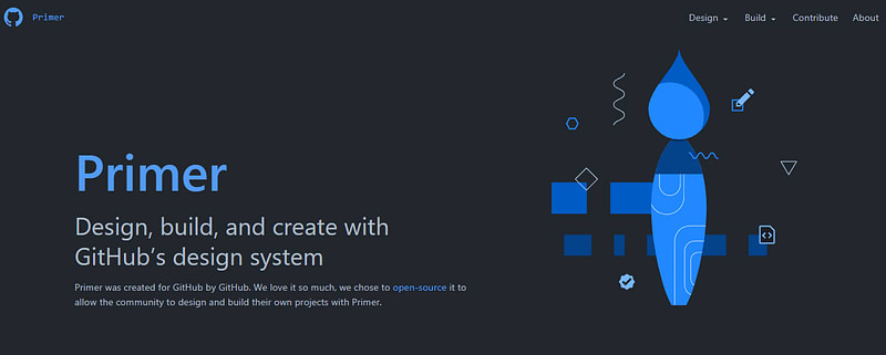
Primer
Developed by GitHub, Primer is an open-source framework accessible for the public to use in their projects. It uses color, typography, and spacing consistently and systematically. Along with its excellent features and functionalities, it is also clear and concise. Therefore, it is regarded as one of the best CSS frameworks among developers and non-developers.
Benefits of using the Primer framework:
Customizable typography: Primer offers font styles in various sizes and weights. This enables developers to create styles that enhance the readability of a site and make it look appealing.
Great color scheme: It has a great color scheme to add to the clarity of the content. Color utilities and variables also offer developers thematic styling options without having to be tied to a specific structure.
Composable spacing Scale: The highly composable base-8 spacing scale works well with GitHub’s content density. Padding spacers and margins provide consistency to the horizontal and vertical rhythm.
Tachyons
Tachyons are a functional CSS framework that provides a low-level design system for building fast-loading and highly-readable web interfaces. It uses an active and atomic CSS approach, where styles are written as small, single-purpose classes that can be combined to create complex designs.

It provides a comprehensive set of CSS styles for layout, typography, colors, spacing, and more and is highly optimized for performance. Tachyons are easy to use, well-documented, and integrated with popular front-end frameworks like React and Vue.js. The functional CSS approach allows for efficient and maintainable styles, making Tachyons a popular choice for performance-conscious developers and teams building large-scale web applications.
Benefits of using the Tachyons framework:
Speed and performance: Tachyons is optimized for performance, generating small and fast-loading CSS styles.
Productivity: Tachyons provides a large set of utility classes that can be combined to create complex designs, reducing the need for custom CSS and making it easier to build web interfaces quickly.
Mobile-first design: It is built with mobile-first design philosophy, providing optimized styles for smaller screens and ensuring that designs are responsive and adaptable to different devices.
Easy to learn: Tachyons has simple syntax, making it easy to learn and use, even for developers with limited CSS experience.
Modular architecture: It is built with a modular architecture, allowing developers only to include the styles they need and reducing the size of their CSS files.
Need a great solution for Safari Windows on browser testing? Forget about emulators or simulators — use real online browsers. Try LambdaTest for free.
Bootstrap
Bootstrap is a popular CSS framework for building responsive, mobile-first websites and web applications. It provides a comprehensive set of UI components and styles, such as buttons, forms, navigation, and typography, that are designed to be flexible and customizable.
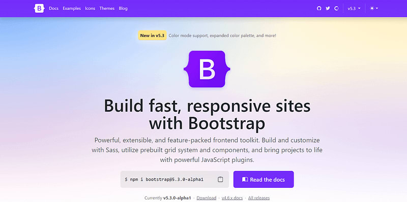
Perform live interactive Bootstrap testing of your websites on the LambdaTest platform.
Benefits of using the Bootstrap framework:
Responsive design: Bootstrap is built with a responsive design, providing a flexible grid system that can adapt to different screen sizes and devices.
UI components: It provides a comprehensive set of UI components, including forms, buttons, data tables, icons, and more, that are easy to use and customize.
Cross browser compatibility: Bootstrap is designed to work across many browsers and devices, ensuring that designs work consistently across different platforms.
Ease of use: It has a simple and intuitive syntax, making it easy to learn and use, even for developers with limited CSS experience.
Customizable: Bootstrap provides a high level of customization, allowing developers to fine-tune designs to meet specific requirements.
Performance: It is optimized for performance, giving fast-loading and responsive UI components that can handle large amounts of data.
Consistency: Bootstrap provides a consistent design language, making it easier to maintain a consistent look and feel across a website or application.
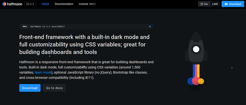
Halfmoon
Halfmoon is a front-end framework that can be used to build user interfaces that are responsive, modern, and flexible. It is based on CSS and comes with a library of predefined elements and layouts to assist you in creating consistent and adaptable user interfaces. The main characteristics of Halfmoon are its customizable design, assistance with dark mode, and compatibility with other front-end frameworks, including Vue and React.
Benefits of using the Halfmoon framework:
Design that is easily adaptable: Halfmoon allows developers to quickly change the appearance of their user interfaces, creating designs that represent their brands and satisfy their specific requirements.
Easily integrate: It is designed to integrate seamlessly with other front-end frameworks making it simple for developers to add to their already-existing projects.
Time-saving: Developers can save time and effort when designing user interfaces with Halfmoon’s predefined classes and styles, which makes it simple to design standardized and responsive user interfaces.
Predesigned layouts and components: Halfmoon has a library of pre-designed layouts and components that can be used to build complex user interfaces quickly. This frees developers to concentrate on creating functionality rather than design and layout.
Foundation

Foundation is a responsive front-end framework for building websites and web applications. It offers a set of CSS, JavaScript, and design patterns for creating responsive, mobile-first projects on the web.
It provides
A flexible grid system.
Pre-designed UI components.
Interchange for serving up different image sizes based on device characteristics.
It is built with Sass and is highly customizable to fit the unique needs of each project.
Foundation is a solid choice for developers who want a responsive front-end framework with a strong emphasis on accessibility and customization. It has a large and active community of users and contributors, providing support and new features.
Benefits of using the Foundation framework:
Responsive design: Foundation is built with responsive design in mind, providing a flexible grid system that can adapt to different screen sizes and devices.
UI components: It provides a comprehensive set of UI components, including forms, buttons, data tables, icons, and more, that are easy to use and customize.
Accessibility: Foundation provides accessibility features, such as keyboard navigation and screen reader support, making it easier to build accessible web interfaces.
Cross browser compatibility: It is designed to work across a wide range of browsers and devices, ensuring that designs will work consistently across different platforms.
Community support: Foundation has a large and active community of developers who contribute to its development and provide support, making it a reliable and well-supported framework.
Customizable: It provides a high level of customization, allowing developers to fine-tune designs to meet specific requirements.
Performance: Foundation is optimized for performance, providing fast-loading and responsive UI components that can handle large amounts of data.
Open-source: It is an open-source framework, making it freely available to anyone who wants to use it and allowing developers to contribute to its development.
PrimeNG
PrimeNG is a UI library for Angular applications that provides a comprehensive set of UI components for building rich and dynamic web interfaces. It includes over 70 UI components, such as buttons, forms, data tables, charts, and more, that are designed to be easy to use and customizable.

It also includes a set of pre-designed themes and offers support for theming and styling. The library is well-documented, regularly updated, and widely used by Angular developers, making it a popular choice for building complex and feature-rich web applications.
PrimeNG integrates with Angular animations and forms and is compatible with modern browsers, making it a good choice for building fast and user-friendly web interfaces.
Benefits of using the PrimeNG framework:
Comprehensive UI components: PrimeNG provides a complete set of UI components, including forms, buttons, data tables, charts, and more, that are designed to be easy to use and customizable.
Consistent design: It provides a consistent and unified design system, making creating a cohesive and visually appealing user interface easier.
User-friendly: PrimeNG is designed with user experience in mind and provides a set of best practices for creating user-friendly interfaces.
Performance: It is optimized for performance, providing fast-loading and responsive UI components that can handle large amounts of data.
Accessibility: PrimeNG provides accessibility features, such as keyboard navigation and screen reader support, making it easier to build accessible web interfaces.
Integration with Angular: It is explicitly designed for Angular, making it easy to integrate with existing Angular projects and providing a seamless user experience.
Skeleton
Skeleton is a minimalist and responsive CSS framework that provides a basic set of styles for creating fast-loading and mobile-friendly web pages. It includes a responsive grid system for building flexible and adaptive layouts and basic techniques for typography, forms, and buttons.
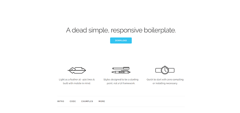
It is lightweight, fast, and well-documented, making it a good choice for small projects or as a starting point for custom design work. The minimalist approach of Skeleton allows for easy customization and integration with other CSS frameworks and libraries, making it a popular choice for developers looking to create simple and streamlined web interfaces.
Benefits of using the Skeleton framework:
Lightweight: Skeleton is a minimalist CSS framework that provides only the necessary styles for essential UI components, making it a lightweight option for web projects.
Easy to start: It provides a simple syntax, making it easy to learn and use, even for developers with limited CSS experience.
Responsive design: Skeleton provides a responsive grid system that makes it easy to create adaptive and flexible layouts that work on all devices.
Speed: It is designed for performance, providing fast-loading styles that can improve the overall speed of a website.
Customizable: Skeleton provides a minimal set of styles that can be easily customized to meet the specific needs of a project, allowing for greater control over the design.
Compatibility: It is compatible with many browsers and devices, ensuring that designs work consistently across different platforms.
Blueprint
Blueprint is a CSS framework that provides minimal styles for typography, forms, buttons, and other interface components. Blueprint is an attractive option for developers who want to quickly prototype a user interface or create a simplistic website because it provides a straightforward approach to styling.
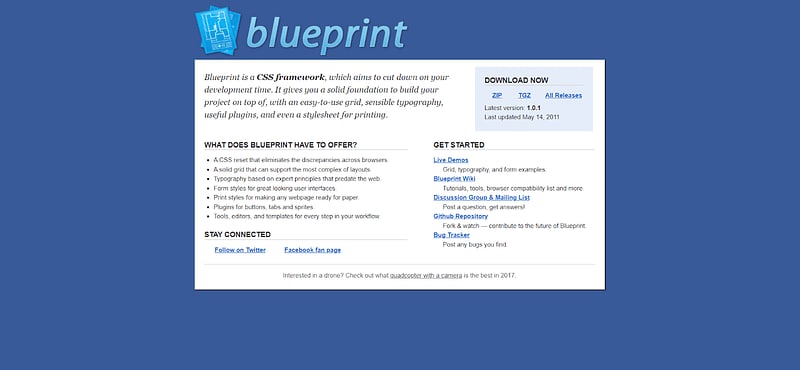
It is a well-liked option among web developers because of its minimal file size and simplicity of customization. In addition, Blueprint includes a vast selection of basic styles and plugins that can be utilized to create more intricate user interfaces.
Benefits of using the Blueprint framework:
Simple and easy to use: The framework provides a simple approach to styling, making it a good choice for developers who want to prototype a user interface or build a simple website quickly.
Customizable: It has a wide range of basic styles and plugins that can be used to build more complex user interfaces, and it is also easy to customize.
Responsive: Blueprint provides a responsive layout, making it a good choice for building websites and web applications that look good on different screen sizes.
Well-documented: It is well-documented and has a growing community of users, making it easy to get started and find help when needed.
Browser compatibility: Blueprint supports a wide range of browsers, including the latest versions of Chrome, Firefox, and Safari.
Fast performance: Blueprint’s lightweight and optimized design results in fast page load times and good overall performance, making it a good choice for building fast and responsive web projects.
Elemental UI
Elemental UI is a popular Vue-based UI framework used to produce unique and functional user interfaces. It offers a variety of user interface (UI) elements, such as forms, buttons, navigation, modals, and more.
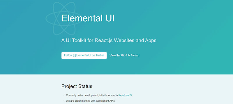
The components are designed to be readily adaptable and have a sleek, contemporary style. Element UI has a vast and active community, making it simple to get started and receive support when needed. Its small file size and good performance make it a fast and efficient choice for building modern web applications.
Benefits of using the Element UI framework:
Wide range of UI components: Element UI provides a wide range of UI components, including forms, buttons, navigation, modals, and more, making it a good choice for building complex user interfaces.
Responsive design: It is designed to adapt to various screen sizes, making it a good choice for building responsive websites and web applications.
Good performance: Element UI has a small file size and good performance, making it a fast and efficient option for building modern web applications.
Well-documented and supported: It is well-documented and has a large and active community, which makes it easy to get started and finds help when needed.
Form validation: Element UI provides built-in form validation, making it easier to validate user inputs and provide feedback to users.
Data management: It provides helpful features for data management, such as data filtering and pagination, making it easier to manage and display large amounts of data.
Spectre.css
Spectre.css offers a fundamental set of styles for buttons, forms, typography, and other interface elements. It is quick to load and responsive. It is designed to be a starting point for building custom user interfaces rather than a full-featured UI library.

It is also a well-documented framework with a growing community of users, making it easy to get started and find help when needed. It also supports many browsers, including the latest versions of Chrome, Firefox, and Safari.
Benefits of using the Spectre.css framework:
Simple and easy to use: The framework provides a simple approach to styling, making it a good choice for developers who want to prototype a user interface or build a simple website quickly.
Customizable: Spectre.css has a wide range of basic styles and plugins that can be used to build more complex user interfaces and are easy to customize.
Responsive: It provides a responsive layout, making it a good choice for building websites and web applications that look good on different screen sizes.
Well-documented: Spectre.css has a growing community of users, making it easy to get started and find help when needed.
Browser compatibility: It supports a wide range of browsers, including the latest versions of Chrome, Firefox, and Safari.
Fast performance: The lightweight and optimized design of Spectre.css results in fast page load times and good overall performance, making it a good choice for building fast and responsive web projects.
Flexibility: Spectre.css is designed to be a starting point for building custom user interfaces. It provides a flexible framework that can be easily adjusted to meet the specific needs of each project.
Blaze UI
Blaze UI is a CSS framework that offers a range of pre-designed CSS components and styles to assist developers in quickly and simply creating responsive and contemporary web interfaces. It is a simple framework that emphasizes simplicity, performance, and accessibility.

Blaze UI provides several easily customizable and integrable components, including buttons, forms, navigation menus, cards, and modals. The framework is also made to be responsive, ensuring that elements work and look great on various screens and devices.
Benefits of using the Blaze UI framework:
Accessibility: The framework offers WCAG 2.1 compliant accessible components, facilitating the development of inclusive and accessible web interfaces.
Performance: Blaze UI is a lightweight framework that focuses on performance. It is designed to be fast and efficient, ensuring that web pages load quickly and smoothly.
Dark Mode: Blaze UI includes a built-in dark mode feature, making it easy to switch between light and dark modes. This is becoming increasingly relevant as more users select the dark mode for their interfaces.
Open-Source: Blaze UI is an open-source framework available on GitHub. This means that it is free to use and can be customized to meet the needs of any project.
Minimalism: Blaze UI follows a minimalist design philosophy, providing only the essential components and styles needed to create modern and responsive web interfaces.
Vanilla Framework
Vanilla is a CSS framework that aims to provide a simple and lightweight solution for creating responsive web interfaces. It is intended to be simple to use and doesn’t call for a deep knowledge of CSS or time-consuming setup procedures.
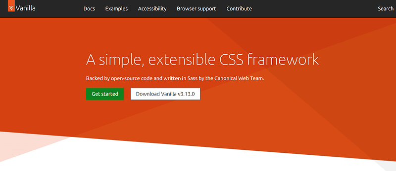
The framework’s modest design is reflected in the name “Vanilla.” It offers a basic collection of designs and elements, such as grids, typography, forms, buttons, and menus. These components can be modified by developers to meet the unique requirements of their projects because they are made to be flexible.
Benefits of using the Vanilla framework:
Simpleness: Vanilla offers a primary collection of components and styles that are simple to alter. This enables the developers to look for a simple and user-friendly solution for their projects.
Flexibility: Vanilla does not impose rigid design patterns or styles. Instead, it offers a versatile set of parts and designs that are simple to customize to match a variety of applications and design requirements.
Easy to use and learn: Vanilla is an excellent alternative for developers and beginners who want to quickly prototype a project without investing a lot of time in CSS.
Community support: Vanilla has a growing developer community that contributes to the framework’s development and offers assistance via forums and online resources.
Scalability: Vanilla can handle projects of any size, from modest websites to big online apps. Its modular design allows developers to add or remove components as needed, making it a flexible and adaptable solution for a wide range of tasks.
Milligram
Milligram is a lightweight and responsive CSS framework designed to help developers quickly create modern and visually appealing web interfaces. With an emphasis on simplicity, Milligram provides a selection of features and designs that can be quickly tailored to meet the demands of a specific project.

Milligram’s responsive grid system and typography styles ensure that web interfaces appear great on all devices and platforms. At the same time, its modular design and use of Flexbox make it simple to construct complicated layouts with fewer lines of CSS code. Milligram is also open-source and accessible on GitHub, which makes it a fantastic choice for developers who want to prototype a project or build a one-of-a-kind web interface quickly.
Benefits of using the Milligram framework:
Lightweight: Milligram is a minimal CSS framework, weighing in at just 2KB when minified and gzipped. This prevents needless bloat from being added to a project’s CSS, which can improve efficiency and load times.
Responsive: Milligram has a grid system that enables developers to design layouts that can adjust to various screen sizes and devices. Because of this, web interfaces made with Milligram look great and function correctly on various platforms and gadgets.
Typography: Milligram offers a variety of fonts intended to be readable and aesthetically pleasing. To suit the requirements of a particular project, these styles are easily customizable.
Flexbox: Milligram uses the Flexbox layout framework, which makes it simple to construct sophisticated layouts with less CSS code. This can speed up development and reduce the time needed to write CSS.
Modularity: Milligram is created with modularity in mind, with each part and style separated into its file. This makes it simple to add or remove elements as necessary, which can aid in maintaining an ordered and manageable structure for CSS files.
Open-source: The open-source framework Milligram is accessible on GitHub. It can be used for both personal and business purposes because it is released under the MIT License.
Testing for browser compatibility with CSS Framework
It’s safe to assume that CSS for web design is here to last. All frameworks mentioned above have their own set of pros and cons. Of course, your business circumstances have a major impact on which one you end up choosing.
Depending on the requirement of your project, you can select the CSS framework accordingly. Also, you need to make sure that you perform thorough cross browser testing on this different CSS framework to make sure that there are no browser compatibility testing issues.
Although all the modern CSS frameworks provide strong cross browser compatibility support, a developer always needs to test the front end’s functioning and run various tests to ensure there are no cross browser compatibility issues. A cloud-based testing platform like LambdaTest can be of great use while testing the CSS framework’s implementation. You can test your CSS-based projects across multiple 3000+ browsers and operating systems combinations.
LambdaTest is a continuous testing platform that allows you to check your CSS-framework-based projects across desktop and mobile for cross browser compatibility. It lets you perform manual and automated testing on an online browser farm of 3000+ real browsers, devices, and operating systems combinations.
Upload your app for testing within seconds using the LambdaTest cloud and perform mobile app testing right away. Find bugs early on, improve performance, quality, user experience and make the most of mobile application testing on LambdaTest.
Shown below is an example of LambdaTest’s Real Time Testing that checks browser compatibility of The Verge website built using Tailwind CSS.

Skim the below tutorial to learn more about LambdaTest’s Real Time Testing.
Subscribe to LambdaTest YouTube Channel and get detailed tutorials around Selenium automation testing, Cypress testing, Appium, and more.
In addition to browser compatibility testing, you can also use a free Chromium-based LT Browser 2.0, offered by the LambdaTest platform, to test your website responsiveness built using CSS frameworks across 53+ pre-installed device viewports for mobile, tablet, desktop, and laptops.
Conclusion
CSS frameworks are an essential tool for front-end developers, offering a variety of benefits, including improved design consistency, faster development times, and responsive design. Whether you’re building a small personal website or an extensive enterprise application, there’s likely a CSS framework that can help simplify and streamline your development process.
There is a range of CSS frameworks available, each with its unique features, benefits, and drawbacks, so it’s essential to choose the one that best fits the specific needs of your project. Some popular CSS frameworks include Bootstrap, Foundation, Materialize CSS, Semantic UI, and Tailwind CSS.

Top comments (2)
Сongratulations 🥳! Your article hit the top posts for the week - dev.to/fruntend/top-10-posts-for-f...
Keep it up 👍
Nice article. I would like mention another honorable CSS framework here: