
How to change size
To make size changes work accurately, we need to handle the size of all inner components (like ripple, label, touch area, etc.) respectfully for a mat-button in our example.
Angular Material library provides an easy way to do it. Its called density.
Density
Density mixins includes styles related to the size and spacing of elements in your application. These style should be included at least once in your application.
In Angular Material, Density can have maximum value as 0 and minimum value as -3, which translates to height of 36px and 24px respectively.
Please note that density only takes care of size and spacing of element, not the font-size, for font-size you will have use typography mixin.
Typography
This mixin includes styles related to the fonts used in your application, including the font family, size, weight, line-height, and letter-spacing. These style should be included at least once in your application.
Creating a size variant
Now assuming that you have already setup your project with Angular Material and keeping all things about density and typography in mind, lets create a smaller size variant for Angular Material button.
1. Create a file for size
Create a file src/styles/sizes/_index.scss with below content:
// src/styles/sizes/_index.scss
@use "@angular/material" as mat;
$regular-font-family: "'Inter', sans-serif";
$sm-typography: mat.define-typography-config(
  $font-family: $regular-font-family,
  $button:
    mat.define-typography-level(
      $font-size: 14px,
    ),
);
$sm-theme: mat.define-light-theme(
  (
    typography: $sm-typography,
    density: -2,
  )
);
.sm {
  @include mat.button-density($sm-theme);
  @include mat.button-typography($sm-theme);
  @include mat.progress-spinner-density($sm-theme);
  @include mat.progress-spinner-typography($sm-theme);
}
Few points to observe in above code:
We are creating a $sm-typography config, only with $button option. And we are giving 14px font-size to it. Note that we are also providing $font-family, if we do not provide, it will take default font-family, which is Roboto.
We are creating a $sm-theme with $sm-typography as typography config and -2 as density, which will give 28px base height to the button and it will also adjust the respective sizes
We are creating a .sm class and including mixins for density and typography for button and progress-spinner components
2. Import size file
The last step is to import size file in main styles file:
// src/styles.scss
@use "./styles/sizes";
// rest remains same
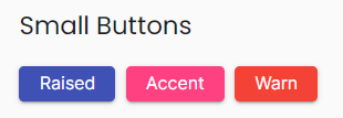
And then you simply wrap Angular Material buttons in sm class, you will see the small variants:
Conclusion
For more details, visit my course on angular-material.dev. Code is available on Github at Angular-Material-Dev/course-md-ng-my-app.

Top comments (0)