
Are you tired of adhering to predetermined styling concepts? Do you find yourself lost in a spaghetti plate of CSS specificity? Well, this article will teach you how to stick it to the man! approach styling from a components perspective, just like we do with React!
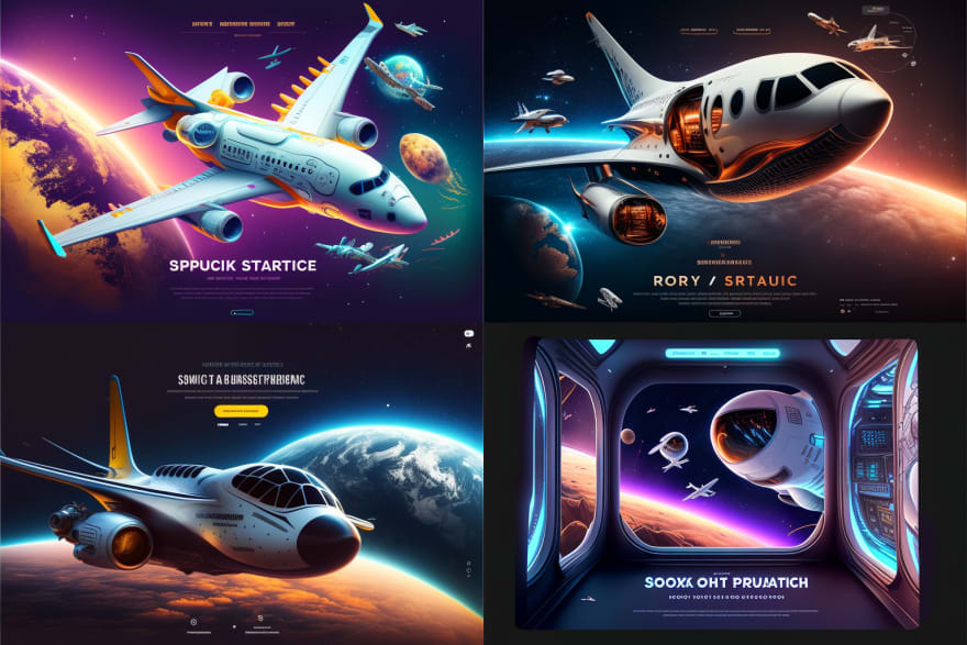
Don't get me wrong, I greatly appreciate the ease of use provided by UI libraries, not to mention the massive amount of effort that goes into creating and maintaining those libraries. The majority of these libraries even offer some way to customize the appearance of the various components they offer. But lets say you and/or your design team have a specific vision for your application that you simply cannot achieve with the available UI libraries. Let's say, for example, you make use of an AI tool to generate some ideas for your application, as I did for my capstone project at the Flatiron School. The ideas generated for you can be very dramatic and complex. If we were to try to implement these designs with an off-the-shelf UI library, straight CSS or with inline styling, we may end up adding far too much complexity to our code making it the opposite of DRY (Don't Repeat Yourself) and very difficult to maintain.
Styled Components addresses some of these issues. However, if you don't take the time to really plan out the design of your application, you may end up in a bowl of WET (Write Everything Twice) component soup, as I did on my first attempt using Styled Components.
Alright, enough chit-chat, let's get to work.
Installation
Installation of Styled Components is done through npm. Go ahead and install Styled Components with this:
npm install --save styled-components
With that out of the way, let's move on to setting up our application to make use of our future components.
Create Global Style and Theme Components
With Styled Components we want to import global styles and a theming provider into our App component. Per the Styled Components documentation, the theme provider utilizes the context API to inject theming to all components underneath it in the component tree. This will provide us with an easy way to set our applications color scheme. Global Styles will make use of a helper function called createGlobalStyle to generate a special component that will control the general styling of our application. For example, we typically put body styling at the top of our CSS file. However, with Styled Components, we put body styling in the Global Styles component.
Global Style Component
As I mentioned previously, the Global Style component will house styling for our overall application (e.g. the '*' selector, our body as well as general primitives styling). Styling for specific parts of our application, like buttons, will be implemented later in their own styled component. The way I've been doing it for months (I'm a new software developer after all...) is by adding a 'styles' directory under the 'components' directory. Go ahead and create empty Global.js and Theme.js files within the new 'styles' directory.
src
│
└───components
|   |
│   └───styles
|       |   Global.js
|       |   Theme.js
|
|   App.js
Open the new Global.js file now, we're going to add some basic styling here. When working with the Global Style, think about what you want all text to look like in your application. What should the spacing be like for the body class? Remember, our applications color scheme will be applied with the ThemeProvider where all of the colors will be set an actual color value (e.g. hex, rgb, hsl, etc.). So in the Global Styles file lets just set the margins and padding of our application. First, we need to import the createGlobalStyle helper function from styled-components. Then we can add our GlobalStyles component with whatever global styling we want inside of it.
import { createGlobalStyle } from "styled-components";

const GlobalStyles = createGlobalStyle`
* {
  box-sizing: border-box;
  margin: 0;
  padding: 0;
}

body {
  background-color: ${({theme}) => theme.bgColor};
  color: ${({ theme }) => theme.color};
  font-family: sans-serif;
  display: flex;
  justify-content: center;
  align-items: center;
  min-height: 100vh;
}`

export default GlobalStyles;
Notice that we're making use of the Theme Provider prop to assign our various CSS colors. Cool! We'll get to that later...
Save those changes, then open up our new Theme.js file. Here, we don't need to import anything. When we tie all of this in with our application we'll be importing the Theme Provider from styled-components into our App.js file. Instead, we'll just assign some colors here for our theming.
const primary = "#2ECC71";
const secondary = "#333";

export const theme = {
  bgColor: secondary,
  color: primary,

  button: {
    bgColor: primary,
    color: secondary,
  },
};
That was pretty easy! Let's get this new stuff tied into our application.
Setting up application-wide context
In the App component, lets add our new global style and theme components to our application.
We need to remove the CSS file that React imports by default,
import "./App.css". It will conflict with our Global Styles component, otherwise.Import GlobalStyles from our Global.js file.
Import the Theme Provider from the
styled-componentslibrary.Import
themefrom ourtheme.jsfile.In the return block for App, add the
ThemeProviderwith athemeprop pointing to thethemecomponent we imported.Within the
ThemeProvider, add theGlobalStylescomponent in a self-closing tag.
The GlobalStyles component is inside the ThemeProvider because our global styles are using values set within the theme component (e.g. color: ${({theme}) => theme.primaryColor}).
import GlobalStyles from "./components/styles/Global";
import { ThemeProvider } from "styled-components";
import { theme } from "./components/styles/Theme";

function App() {
  return (
    <ThemeProvider theme={theme}>
      <GlobalStyles />
      <div className="App">

      {/* Application components go here */}

      </div>
    </ThemeProvider>
  );
}

export default App;
That's it! If you're using React Router, the <BrowserRouter >...</BrowserRouter> component is placed after (e.g. sibling-of) <GlobalStyles />.
The Fun Part
Let's make a custom component now! We're going to make a custom button that will use our theme colors and it will grow a little bit when we hover over it. After we create this button, we can import into any component that will use this style of a button.
Back in our
src/components/stylesdirectory, add a new file titledButtons.styled.js. I learned that by addingstyledto the file name, we can more easily determine that styled components reside within the file. As far as I know, it doesn’t serve any other purpose. So you could omit that part of the file name if you want, I suppose.Inside Buttons.styled.js, import
styledfromstyled-components.Create a new exported component called
PrimaryButtonand assign it to
styled.button``
. This assignment is what allows us to create a custom button component.Inside the two backticks (
) is where we’ll add our CSS styling for the button. We can also add our hover pseudo-class to handle hovering over the button.
import styled from "styled-components";

export const PrimaryButton = styled.button`
  cursor: pointer;
  border-radius: 0;
  border: none;
  font-size: 2em;
  margin: 0.5em;
  padding: 0.5em 1em;
  background-color: ${({ theme }) => theme.button.bgColor};
  color: ${({ theme }) => theme.button.color};

  &:hover {
    opacity: 0.9;
    transform: scale(1.02);
  }
`;
Let's go back to App.js and add our styled button.
import GlobalStyles from "./components/styles/Global";
import { ThemeProvider } from "styled-components";
import { theme } from "./components/styles/Theme";

// 👇 Import our new styled component
import { PrimaryButton } from "./components/styles/Buttons.styled";

function App() {
  return (
    <ThemeProvider theme={theme}>
      <GlobalStyles />
      <div className="App">

        {/* 👇 Add an instance of our new button here */}
        <PrimaryButton onClick={console.log("You clicked me!")}>
          Submit!
        </PrimaryButton>
      </div>
    </ThemeProvider>
  );
}

export default App;
There we go! We've successfully created our first styled component.

Conclusion
Styled Components is a great tool to have in your toolbelt. As long as you make an appropriate amount of effort to really plan out your reusable components, Styled Components may can help make use of one of Reacts strongest appeals, the use of reusable components.
Photo by rovenimages.com: https://www.pexels.com/photo/yellow-bokeh-photo-949587/

Top comments (0)