
Overview
Initially, my website (https://www.nishantwrp.com) was a simple vue application where almost everything was hardcoded. I didn't take advantage of Vue at all.
But recently I revamped my site and some of the major changes I made are
-
Migrated To Gridsome - I used Gridsome which is a static site generator for Vue. Doing this had many benefits like
- SEO Friendly site
- Easier to integrate with content management systems
- Faster Site
- Using a CMS - I started using Contentful as a CMS to manage content easily.
- PWA - Because PWAs are cool!
Tech Stack
- Gridsome - I have used gridsome as the main framework.
- Contentful - I have used Contentful as the CMS for this site.
- Vue Js - Well this is obvious by the fact that I'm using Gridsome.
- Vuetify - I have used Vuetify as the UI framework.
- Gitalk - I used gitalk as a commenting system for my posts.
Things I Learnt
This was my first time working with a Static Site Generator. And I totally loved the experience and plan to use Gridsome in my future projects as well.
This was my first time using an external CMS as well. I really liked how a CMS can make things organized.
Feedback
I would really like to hear some feedback about this site.
PS: Thanks to the awesome people who gave feedback on the site here https://dev.to/nishantwrp/website-feedback-55bd

Top comments (6)
What specifically do you want feedback about? Do you have some questions? or prompts? or specific goals that the site should accomplish?
I don't have any questions but anything you think that can be improved.
So, this might be a different way of thinking - but we believe that without a defined goal - that there is no way to prove if a design is successful or not. Our feelings - about how we 'feel' about your site (although real) - aren't what matters most.
Here's a generic goal example based on a guess:
That's probably what most websites 'should do'- and so, we just take that for granted as "is the website good?" - but that tangles up the differing mental models. If you use a list like this as a framework, then you can leave out the egos - and just find out if the project is a success or not / based on facts.
If you ask these questions - people will be forced to answer them - instead of answering "do you like it" - "what do you think I can fix" - right? Those happen to be the wrong questions (at this phase)
So, with your permission - I'll use this list to help figure out where you can improve:
1. you want your site to work well (so people can access it)
One way to check this - is to just "use it." It feels super smooth. No flashes or glitchy things. In the transitions - there are a few little clunks like the github icon popping in there.
Another way - is to check with lighthouse. Running your score (in an incognito window to avoid extention/plugin confusion) you get 57/97/100/98 (or something/will be slightly different each time). 57/100 for performance isn't great. An employer might see that - and wonder - "maybe their a great developer - but just don't pay attention to that type of detail on their own site" - which is fair / but also - you should just have it be 90+.
2. You want your site to look at least nice enough that people don't get hung up on that
Given your question: "How can I improve my site" - this is probably where most people will gravitate. The problem is - that it's subjective!
So - your site / how do you break it down? The first thing we think is that the typography hierarchy isn't very defined. There are really long lines of text (this is a classic dev thing/shy away from learning type). That's the first thing. The second thing is the general layout and white-space feels a bit unintentional. Your photo - could be a better photo! (You look nice - but we have fancy cameras all around us these days. Time for an update). The next thing we notice - is that the thumbnail images seem to have no padding - or arbitrary padding. It feels like this is a pre-made theme. The margin around the text and the 'tags' and images are all well 'bad' or haphazard - for lack of a better word.
The site as a whole is a bigger item - but the problems that it has as far as rhythm and the little details - can all be explored in this card component:
and
These little considerations are what our subconscious picks out. Our brains WANT to see some sort of 'rule' if not the golden ratio. This means that spacing needs to be built with blocks of margin in a organized and thoughtful way.
If you can address these cards - then you can start to take those considerations site-wide. We're happy to help. Part of it also has to do with how you design and produce the thumbnail images - and not just the code. Not all programmers want to learn about visual design. WE HIGHLY RECOMMEND THAT THEY LEARN at least this much. But they don't often want to - and that's ok! BUT - if you don't want to do it - then you'll need to pay someone else to mock up the designs - or do the front end, right? It's great to have other dev friends! : )
3. you want to show your work and prove your value
You do have some work - but the general feel is that you are student. It appears that you are excited about JamStack and have been trying all the new things / and that also have experience with Django. We're not left with a lot of confidence though. Pages like this one: nishantwrp.com/posts/vue-and-grids... feel very sparce - and this goes back to typography. Why is this important? What did you learn? What is it that you "do"? What should we hire you for - specifically?
4. you want your site to go beyond practical and even look a little 'fancy'
The transitions are fancy / so - just up the visual design stuff and you'll be good - (but you can always create little mini apps in your site for fun!)
Also - PWAs ARE COOL! and that's a big win for us.
5. you want to explain what you want to do
We can't tell. "Get money for coding work?" - well, that's not very memorable. Who are you? jonathanstark.com/daily/20170911-s...
6. you want to entice people to call you and pay you to do that exact thing
We aren't going to call you - (so far). But maybe if we needed Django - and we knew you personally from a meetup - and you were inexpensive? But - that is NOT how you want to be perceived.
7. you want all of these things to add up to the visitor trusting you and being confident in your mastery of whatever domain you claim to be a master of (this includes just "feeling good" about the site)
So far - things are adding up - but they seem to add up to "average dev person" (most websites are in the same boat.)
So, is that helpful? Are are we just jerks? Everywhere we go lately - we try and share our love of design and design thinking and programming - but seem to just come off as jerks? What's your take?
We're always happy to hop on a call and chat about this stuff. We can't wait to see what you do with the site next. One fun thing to do - is take screen shots of it now - and then after changes - use the before and after in a case-study on your portfolio. : ) (don't forget mobile and desktop screenshots)
This was a very detailed response - I found it helpful as a random bystander! 😅
Thanks a lot @perpetual.education. That's a very descriptive and informative review.
These are common reactions. You'll have to weigh - if this webpage is at a place where it is 'helping' you - or 'hurting' you.
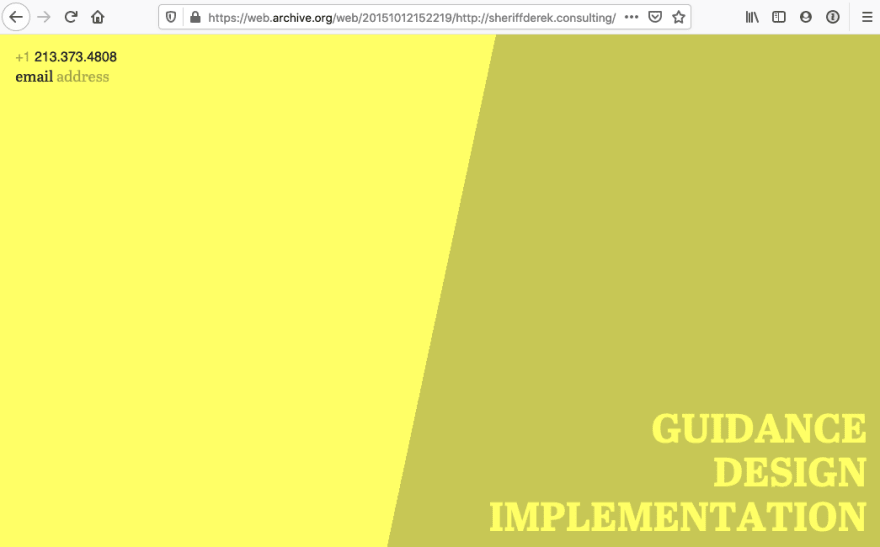
You can look at Derek's website. It's really simple - and not fancy at all: sheriffderek.consulting - but also there isn't anything overtly broken - or much to worry a visitor.
We often start our client projects with just a contact page and some simple typography. Less can be more when you're dealing with clients. Then from there - we build out a style-guide (behind the scenes) / here's a simple example: Gold collective website - with all the modules on one page / and then work out the type on all screen sized etc. THEN - when it's all ready - and we've tested it out with users, we'll make it live.
One time a while back, Derek got a 135k+ job - with just his name and an email address in the top left corner of a really bright website.
Just some things to think about!
"Hi, I'm ___________________ and I really LOVE working on ____________________. Hire me. It'll be fun."