

I'm designing a logo for an app I'm building. I'm a developer, not a designer so have that in mind :P
Context:
App for tracking my climbing. Tracks the climbs I have done, and when/where. Also tracks how many attempts/sessions it took (this is called redpointing in climbing lingo). Additionally it will provide the climber with stats, so he can evaluate his progress.
Now, which one do you prefer:
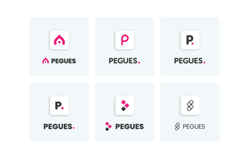
I'm open to any kind of feedback!!


Top comments (8)
I agree that the top right one has a nice clean aesthetic and the font is approachable. The logo itself is very simple and somewhat lacking in my opinion.
I really like the first logo's shape and it's integration of a circle/point, as well as how it somewhat looks like a mountain or peak. Maybe combine the third's font with the first logo's design? Good job attempting some design!
Thanks man!
Yeah, I agree the top right one is kinda simple, the top right 2 where the first ones I did, and did not like them that much. So I did some more iterations.
I will try that!
Thanks for the feedback!
It's not a bad idea at all, I will try
text is fine but none of the logo looks like what functionality you are giving, like tracking of climbing action it should represent to make it look catchy. 3rd and 4 th font is really nice according to me.
Good Luck!
Valid point, I was expecting someone to point that out.
The only thing that kinda relates to climbing and what the app does is the dot (as in redpoint, this is a commonly used term, referring to working and trying a climb until you complete it)
I struggled to reflect the functionality of the app, so decided to go with a more minimalistic and modern approach.
I modified the 3rd font, it's kinda custom, I do like it quite a bit as well!
Thanks for the feedback ❤️
I like top middle one.
Top Middle