Large datasets can be overwhelming when trying to analyze data in a spreadsheet. Managing and gaining insights from such vast amounts of data can also overwhelm. Scrolling through thousands or even millions of rows and columns can make it hard to locate specific insights or trends. With pivot tables, however, life as a data analyst can get easier.
In this article, we will look at how to create and use pivot tables to analyze data. Firstly, you need to know what a pivot table is and why it is an essential tool for every data analyst before we can proceed.
What is a Pivot Table?
A pivot table is a spreadsheet function that can store, analyze, and summarize data in just one table. A pivot table has columns, rows, pages, and data fields that can be arranged to help you group, sum, filter, expand, and visualize data simultaneously. With a pivot table, you can spot the differences in massive data quickly.
How does it work?
A pivot table transforms the header of each column in a data field into options that the user can manipulate. The user can then remove, add, or move data from the newly modified columns. A pivot table lets the user summarize these columns in averages and frequencies.
Benefits of using pivot tables
- Pivot tables enable you to summarize and analyze large amounts of data.
- Pivot tables are easy to use and navigate. This ease makes analyzing data simple.
- Pivot tables can help you find any possible patterns in your data. This is useful during data forecasting.
- Pivot tables aid manual reporting. They also help you reference your work because they have links to external sources.
- Pivot tables update automatically when the existing data is altered or new data is added. You do not need to update your tables manually.
Getting Started with Pivot Tables
Prerequisites
To get the most out of this guide, you will need some basic knowledge of spreadsheet software like Google Sheets or Microsoft Excel. You should be comfortable entering data into a spreadsheet, creating new sheets, and navigating within your chosen spreadsheet software. If you are unfamiliar with these, I recommend taking some time to familiarize yourself before proceeding. You will also need a dataset that you can analyze.
Creating a basic pivot table
Now that you have a basic understanding of pivot tables and their use, let us learn how to create them. As stated earlier, you can create pivot tables in any spreadsheet software. In this guide, however, we will be using the Microsoft Excel. We will also generate our data from scratch to keep things simple.
Step 1: Enter your data
To create a pivot table, you need a basic table. Enter the values seen below into a set of columns and rows.

On our basic table, we have a list of people, their marital status, and the kind of pets they own. We can draw several insights from this data. For instance, we could find out the number of single people who own cats. To do this, we need to create a pivot table.
Step 2: Insert your pivot table
This is the easiest step in our procedure. To insert, you have to:
- Highlight your data
- Click 'Insert' in the top menu
- Select 'Pivot table'

Note: You might find ‘Pivot Tables’ under the ‘Data’ or ‘Tables’ sections if your Microsoft Excel is an old version.
When you select 'Pivot table', a dialog box will pop up. This box shows an option to import data from an external source (We will ignore this for now). For where you want the pivot table to be placed we will choose A new worksheet.

Now, double-check the dialogue box, then click OK.
You will get an empty table like this:

This is your ‘Pivot Table’.
It starts to get a little intimidating from here but stay with me. We will break every process, bit by bit.
Pivot Table Fields and Areas
Now that we have a skeleton of our pivot table, it is time to fill it up. On the right of your screen, you will see a pane that allows us to edit the fields of our pivot table.

With this pane, we can take any of our existing table fields (For our example, our fields are First Name, Last Name, Marital Status, and Pets) and turn them into:
- Rows,
- Filters,
- Columns, or
- Values.
Note: When you select a field, it is added to a default area. Numeric fields are added to ‘Values’, date and time hierarchies are added to ‘Columns’, while non-numeric fields are added to ‘Rows’.
Rows
You can add any field to your pivot table by ticking the field name checkbox in the pane. We will start with the First Name and Last Name fields.

As you can see, these fields are automatically added to the Row Labels
Filters
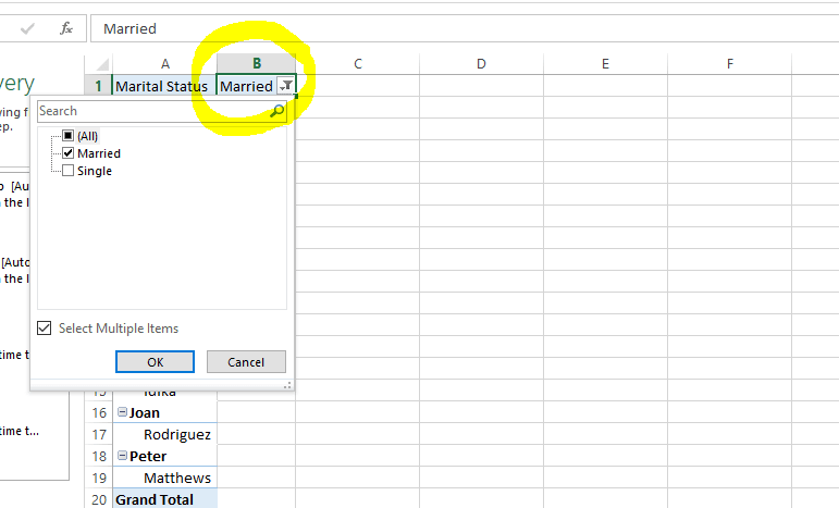
The pivot table filter works just like the usual spreadsheet filter. It helps you segment data by turning the chosen field into a filter at the top. For this article, we will filter by 'Marital Status'. To do this, drag the Marital Status field to the filter area.

Now you can filter your pivot table from ‘married’ to ‘single’, and vice versa. Click on the filter icon at the top of your table. Then select OK.
Columns
The columns table field presents your data in a vertical format. We will use it to find the number of pets each individual owns in our example. To do this, drag the ‘Pets’ field to the ‘Columns’ area.
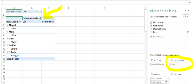
A filter icon comes with the Column Labels, as seen in the image above. This allows you to find individuals with dogs, cats, or those with none.

Values
The ‘Values’ area of your pivot table helps you summarize your data by giving them numerical values. You can count, sum, subtract, average, and do many basic calculations thanks to this feature. In our example, we will find the number of individuals that own dogs. To do this, we drag the Pets field to the Values area on our pane.

As shown in the image above, nine individuals own dogs.
You can filter your pivot table to reveal the number of individuals with cats, and the number of individuals with no pets.
You can answer numerous questions by dragging the fields to the areas on your ‘Pivot table’ pane.
Some questions you can answer include:
- How many married people own dogs?
- How many single people own cats?
- How many individuals do not own any pets?
- How many individuals own cats? You get the idea!
Tips for efficient pivot table creation
We know that pivot tables can help us analyze and summarize data. However, there are some tips you need to know for efficient pivot table creation. They include:
Clean and Organize Your Data:
Before creating a pivot table, ensure that your data is clean and well-organized. Remove duplicates, correct errors, and format your data consistently.
Use Descriptive Headers:
Give your columns clear, descriptive headers. Pivot tables use these headers to identify and group data.
Select the Right Data Range:
Highlight the data range you want to include in your pivot table. Ensure you select all relevant data and leave out any extraneous information.
Consider Data Types:
Be mindful of the data types in your columns. Ensure that Excel or Google Sheets correctly interprets your data as numbers, dates, or text.
Use Meaningful Names for Pivot Tables:
Give your pivot tables meaningful names to make them easy to identify later, especially if you have multiple pivot tables in a single worksheet.
Sort Your Data:
Sort your data in the order you want it to appear in the pivot table. This can make the final pivot table easier to read.
Group Data:
You can group date or numeric data in a pivot table to make it more manageable. For example, group sales data by month or quarter.
Choose the Right Row and Column Fields:
Select the appropriate fields for the Rows and Columns sections of the pivot table. Think about how you want to cross-tabulate the data.
Refresh Your Data:
If your source data changes, make sure to refresh your pivot table to reflect the latest information.
Be Mindful of Data Size:
Large data sets may slow down your pivot table. If you're working with a substantial amount of data, consider summarizing or aggregating it before creating the pivot table.
Experiment and Explore:
Don't be afraid to experiment with different field placements and options. Pivot tables are highly customizable, and you can refine your analysis by trying various configurations.
By following these tips, you can create more efficient and effective pivot tables that enable you to gain insights from your data quickly and accurately.
Conclusion
When it comes to data analysis, pivot tables are invaluable. They help us aggregate, summarize, and visualize large sets of data. They can also help to group, ungroup data, and sort data.
Pivot tables not only enhance data analysis but also provide flexibility, allowing users to experiment with different configurations and layouts to improve data reporting. Features like conditional formatting, report layouts, and interactive tools such as slicers and timelines also make pivot tables a versatile data analysis tool.
In this guide, we looked at using Microsoft Excel to create pivot tables. You can also experiment with Google Sheets in your spare time.
To learn the different features and functionalities of pivot tables, I recommend the Google Data Analytics Professional Certificate course. Never stop learning!

Top comments (0)