I've decided to start documenting my journey as the CTO of Grow. Here is the first build log (build log 1#) where I discuss in detail the development process of our landing page.
What is Grow?
This is a tweet from our CEO at Grow describing what Grow is.

In this build log we'll talk about the decisions I made, the tech stack I used and the obstacles I faced when building the landing page of Grow. But to make this article more orderly. I'll list them into categories.
- Tech stack: the technologies and dependencies used in this project and the particular roles they played.
- File structure: how I arranged my folders and files.
- Messiest Bug: the bug that took the longest to fix.
- Engineering corner: for my software engineering nerds, in this category I talk about any best practice or framework-specific design pattern i applied in this build.
- Something new: here I'll talk about something new I learned or used when building this project.
- Don'ts: here I'll talk about the things I didn't like I did when building.
- Performance: Lighthouse scores ;)
Tech stack
- Next.js: Next.js is a React framework with great DX, the main one being SSG. I decided to use Next.js because of;
- its routing system. (I'm not a fan of react-router, routing should be abstracted to a decent point where I don't have to worry about it, and Next.js has helped with that immensely)
- its built-in components e.g the
Linktag helps me transition to different routes on the client and theImagetag with built-in performance optimization which is very convenient. In particular, thepriorityprop optimized the LCP of my home page which was the hero image.- and other mini perks like its smooth integration with Vercel.
However, using a JavaScript heavy framework for a landing page is pretty overkill. Although, Next.js tries its best to get you a very optimized build ( e.g per-router code-splitting ), we are still dealing with JavaScript. I would've taken the Svelte route, but as of that time, I had no prior knowledge of Svelte. And we needed to get a landing page up and running fast.
- Tailwind: Tailwind is a CSS framework that gives me the convenience of inline-styling my components with predefined utility classes.
- Nextauth: Nextauth is a library that provides an authentication layer for your Next.js apps. I created a dashboard behind the website so I used Nextauth's Google provider to authenticate users (using their Gmail) that have registered to get access to the dashboard.
SPOILER ALERT: We decided to build the dashboard in another project entirely so the authentication was not needed. But I still left the integration ( I have instincts ), and just commented on the initiation of the authentication flow ( which is just a line of code. Amazing! )
- Chakra UI: This is a React UI library that equips you with accessible,modular and reusable UI components. I used Chakra UI only for the registration forms UI, I could've built the UI from scratch, but we needed the site done urgently at that time.
- Firebase/Firestore: Firebase for hosting and Firestore for storing registered user data.
-
Framer Motion: This is a React animation library. Partially a fan. I don't like how much code I have to write just for a simple text fade-in. But I blame the nature of React. It's pretty hard to abstract animating a react component because of Reacts rendering behavior.
Folder Structure
As cliche as it may sound, I take folder structure very seriously. I always try my best to improve my folder structure game by checking out similar projects on Github, however, this is a landing page so its folder structure would be very simple.

let's break them down briefly and go by them one by one
components this is where I put all my components.
I categorized the components into the two pages that had the most going on. Which was;
- The home page
- The registration form page
And yes, I had other pages. But they didn't have components that needed unique layouts or styling. So in building those other pages ( e.g the pricing page ), I reused the components used in the landing page. I tweaked the styling a little and changed the content.
hooks this is where I keep all my custom hooks.
let's go into each of them and see what they do. BRIEFLY.
useFetchStudentProgress hook
this hook allows me to fetch data on how far a student has completed his/her course.
Let's now go through it line by line
-
line 1: I import the type used for the
setDocmethod of Firestore. -
line 2: I import the
fireStorefunction I created in theAPIfolder that abstracts the API methods from firebase for me to use across the app. -
line 7: inside the
useFetchStudentProgressfunction i declare a state variable by calling useState, calling the variable studentProgress and the setter setStudentProgress. -
line 8: inside the
initFetchStudentProgressfunction, student data is fetched from firestore using thefireStoreapi i created. Then updatesstudentProgressstate. -
line 13: the
useFetchStudentProgressfunction exposes the fetch functioninitFetchStudentProgressand also the state variable of that student data
Now for the second custom hook
useScrollPosition
This isn't my code. I won't take credit for this. I got this answer from a blog. It returns the number of pixels from the top edge of the document. I used the value of scroll position on line 18 as part of a conditional statement to check whether the user has scrolled or has not scrolled to conditionally add styles to the navigation bar. ( scrollPosition > 0 ) to see the actual code check out the repo here.
Messiest Bug
This wasn't necessarily a bug but a performance issue I was manhandling for hours. I deployed my site on two hosting platforms, firebase hosting, and Vercel. Why? 2 reasons
- Gideon (my awesome co-founder) wanted the site to be deployed on Firebase hosting because of the default domain Firebase provides ( .web.app ), Vercel's
vercel.appdomain name was terrible. Why? we had a problem with migrating our custom domain for the site of another project we worked on before Grow, so we had to remain with the .web.app domain name that firebase provided for that project. The domain registrar we used could not be recognized by Firebase. Check out the project site here. - I still wanted to use Vercel because of its wonderful DX and the tools they provide like its deployment log interface.
Now on the bug. I added an animation feature to the site. It was a fade-in animation when in the viewport. I used Framer motion. So I pushed the changes and pushed them to prod on vercel and firebase. The two sites had an issue.
-
on the firebase deployed site: All the texts on the home page were not showing. I inspected them and they all rendered. But they were all mysteriously set to hidden.
-
on the vercel deployed site: everything was fine and the texts showed. But it took way too long for the texts to render.
these are the things I tried but they all didn't work
- npm installed 400 times and removed npm cache 300 times
- previous deployments on vercel and firebase were working fine, so it had to be a framer motion problem
- reinstalled the package
- suspected a caching problem, so I tried chrome incognito but still nothing.
- Googled the problem, but nothing I saw online was similar to my problem.
The solution
I saw that the vercel deployed site was showing text but it just took too much time to show the text so I suspected a network issue. So I tried it on another network and found out that the two sites worked perfectly well, rendering and showing the site perfectly. I concluded that my network problem affected framer motion from working well because I later found out that the elements that were integrated with framer motion were the ones affected, not only the text.
Engineering corner
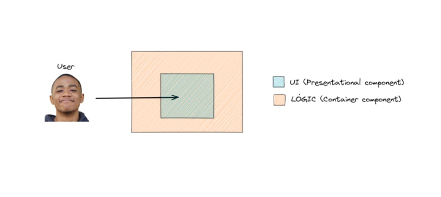
Presentational and Container Components
This is a pattern in React I use to separate concerns. I find myself using this pattern when I want to separate two things
- What the user sees. (Presentational Component)
- The logic behind it. (Container Component)
This is an oversimplified description of the Presentational and Container Component. If you want to learn more check out Dan Abramov's article here.

Where did I apply this?
Disclaimer: the implementation of this pattern in this use case was pretty low-level. Check out a more thorough guide on how to leverage this pattern in your React apps here.
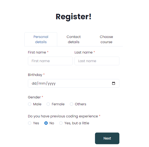
In the registration form, where interested visitors can register with their credentials and later get feedback from our team, there are three phases to the registration.
NOTE: Chakra UI and a little Tailwind were used to create the UI.
-
Personal details

-
Contact details

-
Choose course

These phases had dedicated components with dedicated files.

In summary, the only logic that was needed for these components was storing the user state and input validations. Those were handled in a single component (Container component) which also contained the ChooseCourse, ContactDetail, PersonalDetail components which each contained the three registration phases respectively.

I'll briefly explain the function of those props that are passed down to those components.
loading prop data: this handled the loading state for when the user submits the form.
formData prop data: This is the state variable which is an object that contained the input values as properties. This was used to persist what the user inputs in the input fields.


setFormData prop data: This is the setter function for the formData state object. Use to update the state object.
handleSliderChangeBtn prop data: this is a function that handles the tab transitions by clicking the buttons.
Like I said before, this was just a low-level implementation of this pattern. So if you want to learn more on how you can leverage this pattern check out this article written by a core team member of React, Dan Abramov here.
Something new!
Formspark
Formspark provides me with a backend and an API for form submissions. It has a React plugin that is very intuitive. I used it for my form submissions. It was actually a replacement for a similar product called Formspree, but their React integration was way too rigid when it came to customizing behaviors in my form submission flow.
Dont's
Overiding Chakra UI
This was my first time using Chakra UI, so I wasn't too familiar with what it could do and I didn't have enough time to really check out the docs because I had to ship this quick. So when I came across certain in-built styles or behaviors Chakra-UI presented that I didn't want, I would override them with custom styles using Tailwind. It got the job done, but it was really messy. As of the time the article was published got my hands a bit dirty in the library, and even made some contributions to docs correction.
Performance
Not really a fan of Lighthouse because the performance metric highly depends on your network connection. So if you have a shitty network your performance score will drop drastically. But the other metrics are independent of the network connection. When it comes to a proper performance score you can measure, it'll be your bundle sizes.

Conclusion
This is the first of my build log series. If this build log was beneficial to you in any way, comment how. Thanks for reading.
Here is the link to Grow's landing page. Click here
If you wanna stay updated on our progress. Here is Grows twitter handle. Here!


Top comments (0)