
This is originally posted on my blog. I am going to post the first section here and the rest can be found on my site. It takes quite some time to format my article to work here, I am doing my best!
It is no secret just how powerful SVG is, with wide support and a navigable document there is little we can’t do. SVG filter has been a concept that I never could wrap my head around but this past weekend I made it my mission to learn as much as I could.
This post will be broken up into two, the first part will focus on the theoretical side while the second part will delve into an example so we can put filters to use (on my site). A lot of my knowledge (if not all) came from the brilliant Sara Soueidan, so be sure to check out her work and articles.
This post presumes you have a basic understanding of SVG & CSS, once you have this you can understand everything discussed.
Support wise, SVG filters are pretty well supported. Bear in mind that the filter may be applied differently across different browsers.
CSS Filters
I am sure a lot of you out there reading this post have used a CSS filter in some sort of capacity. Funnily enough, CSS filters actually come from SVG - they are essentially a less powerful version.
For those of who you haven’t used CSS filters before they basically work like this.
Take the above image, we can apply a filter on this image called blur which will essentially just blur the image.
img {
  filter: blur(5px)
}

We could also apply a grayscale to this image.
img {
  filter: grayscale(100%)
}

There is no doubt that CSS filters are easier to use than SVG, but they only offer a fraction of the power so let’s now get into the meat of this post which is SVG Filter.
SVG Filter
Now that we know what a CSS filter is, we can focus on the SVG filter. Above, we used the blur function, in SVG they are not called functions, rather they are called primitives. This was initially quite confusing to me but it will start making more sense as we delve into using some primitives.
“SVG filters are capable of creating Photoshop-grade effects in the browser” - Sara Soueidan
There are currently 16 primitives that we can use, we will use some in this article but I like to use them as I need them rather than try to learn them all at once and have a panic attack! 🤯
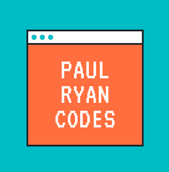
The image we will use for our example is the Paul Ryan Codes logo (vain much?)
Using that image, we can have a look at the core syntax for an SVG filter:
<svg width="500" height="500">
  <filter id="paulsFilter">
    <!-- primitives live in here -->
  </filter>

  <image xlink:href="https://assets.codepen.io/1464352/profileimage.png"    width="100%"
         height="100%" x="0" y="0"
         filter="url(#paulsFilter)"></image>
</svg>
So as you can see the syntax isn’t too alarming, the main thing to note is we gave our filter an id of paulsFilter and on our image we set the filter attribute equal to url(#paulsFilter).
This will give us a blank screen as we have no primitives in our filter.
We can now use our first primitive which is feFlood.
The attributes we are going to use from feFlood are:
- flood-color - we can give this a color to flood our image with
- flood-opacity - the opacity of our flood
- result - this is the name we are going to give the output of our primitive
So putting this all together we have:
<svg width="500" height="500">
  <filter id="paulsFilter">
    <feFlood flood-color="blue" flood-opacity="1" result="FLOOD" />
  </filter>

  <image xlink:href="https://assets.codepen.io/1464352/profileimage.png"
         width="100%"
         height="100%"
         x="0"
         y="0"
         filter="url(#paulsFilter)"></image>
This will give us the following:

We can use the feBlend primitive to blend our image in. Here are the attributes we will use:
-
in - this is what we will pass into the blend, in our case, this is
SourceImagei.e. the image we are using -
in2 - we will also pass in our primitive
FLOOD -
mode - there are various modes you can use but we will use
color-burn - result - not necessary but always good practice to have a name for the output
So putting this all together our final code will look like the following:
<svg width="500" height="500">
  <filter id="paulsFilter">
    <feFlood flood-color="blue"
             flood-opacity="1"
             result="FLOOD" />
    <feBlend in="SourceGraphic"
             in2="FLOOD"
             mode="color-burn"
             result="BLEND" />
  </filter>

  <image xlink:href="https://assets.codepen.io/1464352/profileimage.png"
         width="100%"
         height="100%"
         x="0"
         y="0"
         filter="url(#paulsFilter)"></image>
</svg>
Our final image after the filter is applied:

This may seem like a bit of a silly example, but it gives us the foundation of how we can chain filters together to create a cool output.
Complete Codepen can be found here.
Conclusion
You can head over to my site for the full post where we will create a spotlight effect building on the above knowledge.
Any questions on the above, feel free to contact me on my socials! ❣️

Top comments (0)