
This is the final article dedicated to testing my demo website. This time, we will set up testing using Storybook.
Setting up Storybook
Setting up the theme
To install Storybook, you can follow the official guide.
Since we use theme switching via CSS variables, we need to additionally configure the wrapper that will change the value of the data-theme attribute in the root html tag. For this, we will create a special decorator:
// .storybook/decorators/uiThemeDecorator.tsx
import { DecoratorFn } from "@storybook/react"
import React from "react"
import { setUiTheme } from '../../src/assets/utils/setUiTheme'
import { ThemeColorSchema } from '../../src/assets/types/ui.type'


export const uiThemeDecorator: DecoratorFn = (Story, options) => {
  const { UiTheme } = options.args

  if (UiTheme !== undefined && UiTheme in ThemeColorSchema) {
    setUiTheme(UiTheme)
  } else {
    setUiTheme(ThemeColorSchema.dark)
  }

  return (
    <Story { ...options } />
  )
}
The decorator takes the value of the theme to be set and calls the setUiTheme method, which is responsible for changing the theme in our application.
We add this decorator to the preview.js file.
// .storybook/preview.js

import { uiThemeDecorator } from './decorators/uiThemeDecorator'
import '../src/assets/styles/_styles.css'

...
export const decorators = [uiThemeDecorator]
Styles are imported to make sure that the theme switching works correctly.
Also, let's create a utility to make it easier to add theme selection to component props later:
// src/utils/storybookUiThemeControl.ts
import { ThemeColorSchema } from "../types/ui.type"

export const UiThemeControl = {
  UiTheme: {
    options: ThemeColorSchema,
    control: { type: 'radio' },
  }
}

export type UiThemeType = { UiTheme: ThemeColorSchema }
Viewport configuration
n the same file, we'll add screen resolutions that we're interested in. Since we only have one breakpoint at 800px, we add only 2 resolutions. We set them in the customViewports variable and add to parameters.viewport. Finally, the file looks like this:
// .storybook/preview.js

import { uiThemeDecorator } from './decorators/uiThemeDecorator'

import '../src/assets/styles/_styles.css'


const customViewports = {
  desktop: {
    name: 'Desktop',
    styles: {
      width: '801px',
      height: '963px',
    },
  },
  mobile: {
    name: 'Mobile',
    styles: {
      width: '800px',
      height: '801px',
    },
  },
}


export const parameters = {
  actions: { argTypesRegex: "^on[A-Z].*" },
  controls: {
    matchers: {
      color: /(background|color)$/i,
      date: /Date$/,
    },
  },
  viewport: {
    viewports: customViewports,
  },
}


export const decorators = [uiThemeDecorator]
Creating Stories
Now everything is ready to create the first story. As an example, let's take the WorkSingle component responsible for displaying a single work item. We'll create a new file WorkSingle.stories.tsx for this purpose.
// src/components/PageMain/WorkList/WorkSingle/WorkSingle.stories.tsx

import React from 'react'
import { Meta, Story } from '@storybook/react'

import WorkSingle from './WorkSingle'
import { WorkSingleProps } from './WorkSingle'
import { Work } from '../../../../assets/types/work.type'
import { UiThemeControl, UiThemeType } from '../../../../assets/utils/storybookUiThemeControl'
import { ThemeColorSchema } from '../../../../assets/types/ui.type'

export default {
  component: WorkSingle,
  title: 'MainPage/WorkSingle',

  argTypes: {
    ...UiThemeControl,
    work: {
      name: 'Single works props',
    }
  },
} as Meta<WorkSingleProps>
...
Here is the main configuration:
-
titleof the story is defined, using the / character for grouping related stories. This story is part of the MainPage group. -
argTypesspecify the customizable properties of the component that the user can interact with. Here we included a theme switcher and added a work property (I couldn't find how to work with nested component properties in Storybook, so we will just use a JSON representation of the property here).
Then, a Template is created to display the component with default argument values, and a base Default component is defined to accept these values.
const Template: Story<WorkSingleProps & UiThemeType> = (args) => {
  return (
    <WorkSingle { ...args } />
  )
}

const defaultWork: Work = {
  title: 'First work',
  publishDate: '22.11.2022',
  description: 'Description of working with highlighting of keywords. It should work for all words in the text, whether it is a single word or several.',
  keywords: ['слов'],
  links: {
    devto: 'https://dev.to',
    vcru: 'https://vs.ru',
    local: 'https://petrtcoi.com'
  }
}

export const Default = Template.bind({})
Default.args = {
  work: defaultWork,
  UiTheme: ThemeColorSchema.dark,
}
Default is our first story, based on which we can create other stories. To do this, it is enough to change the parameters of interest to us.
export const Without_DevTo_Link = Template.bind({})
Without_DevTo_Link.args = {
  ...Default.args,
  work: {
    ...defaultWork,
    links: {
      vcru: 'https://vs.ru',
      local: 'https://petrtcoi.com'
    }
  }
}

export const With_Two_Keywords = Template.bind({})
With_Two_Keywords.args = {
  ...Default.args,
  work: {
    ...defaultWork,
    keywords: ['word', 'work']
  }
}
Starting Storybook
Run the command npm run storybook and the Storybook panel will open at http://localhost:6006/.
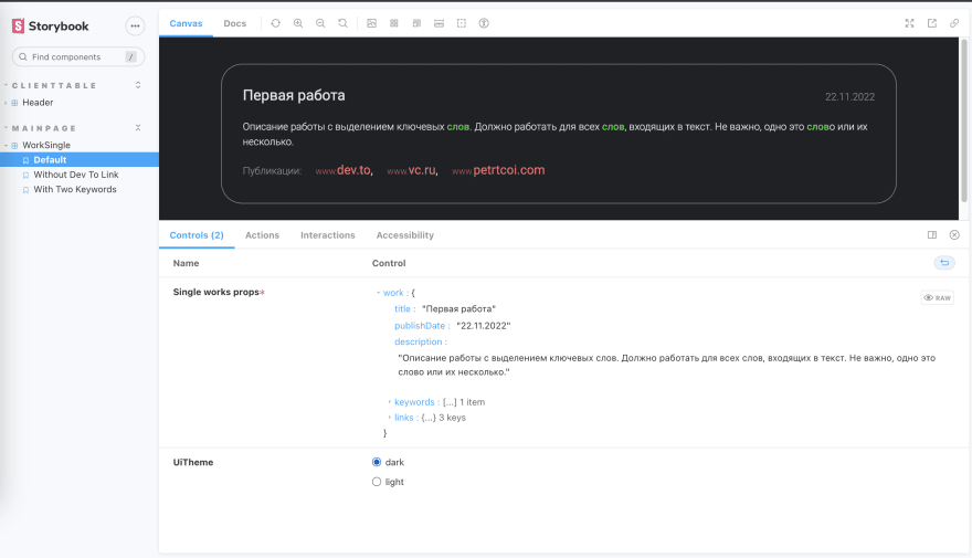
In the left part of the screen, you can see stories grouped according to their title: 'MainPage/WorkSingle' designation, as well as their variations: Default, Without Dev To Link, With Two Keywords.
In the center of the screen, the actual component is displayed, and below are the settings we defined for it earlier. It is possible to change them and see how the component will look.
Testing with Storybook
The ability to view each component's work separately, check its behavior with different parameters, can be very useful when working with complex interfaces containing hundreds of components. Now they can all be easily accessible for study.
But Storybook can also be used for automated testing. For this, the components we created in **.stories.tsx can be used in regular unit tests by rendering pre-configured components immediately. However, I did not find much benefit in this approach: it adds work and test logic is scattered across different files, which, in my opinion, is not compatible with the idea of small and lightweight tests.
The second use case of Storybook, on the contrary, seemed very attractive to me. It is about visual testing. This is the same screenshot test as in playwright, but at the level of individual components.
The Chromatic is recommended as such a tool on the Storybook website. It is a paid tool, but there is a free limit, which is sufficient for a small hobby project. There are also free libraries that perform the same function.
Setting up Chromatic is straightforward, and its free level is sufficient for me, so I used it. After registering on the service and installing it as described in the instructions, just run the npm run chromatic command.
As a result, images of all stories and their variations will be rendered and generated. The obtained images will be compared with the previous ones. And if, for example, we somehow violated the appearance of the component, Chromatic will definitely indicate this to us, highlighting the differences in green. We either have to accept the changes if they correspond to what we intended, or make corrections to the code.

This type of testing allows you to identify errors that are "invisible" to basic unit tests based on @testing-library.
Conclusion
Storybook is a powerful tool for testing application components. It is ideal for teams working on large projects with dozens or hundreds of components. The ability to view each component separately in different modes and to perform quick visual testing significantly simplifies the work.
At the same time, Storybook is more of a complement to existing tests and is not recognized as independently covering the main testing tasks.

Top comments (0)