
Since ajax was introduced we've been familiar with circular loading spinners, dot-dot-dot animations, crazy logo transitions and more, all in place to distract the user while the application requests more data to present back.
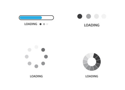
Loading indicators are typically displayed when a page/component mounts or when a user interacts with the application (ie. submitting a form, searching for something, etc). These are essential to the overall user experience of an application as it visually lets the user know something is happening.
⚠️ This blog post is staged around Client-Side Rendering (CSR) where static pages mount components which in turn fetch dynamic content during the page load cycle. It is not intended for you to replace all other loading indicators.
Contents
What's the problem?
The problem with circular loaders is they don't set the scene or express well enough on how the content will be rendered in the UI once it has finished loading.
A few problems can arise from this but I'd like to focus on the following:
- The user has to analyse and discover the revealed content, inevitably increasing the user's cognitive load.
- Cumulative Layout Shift (CLS).
Problematic Examples
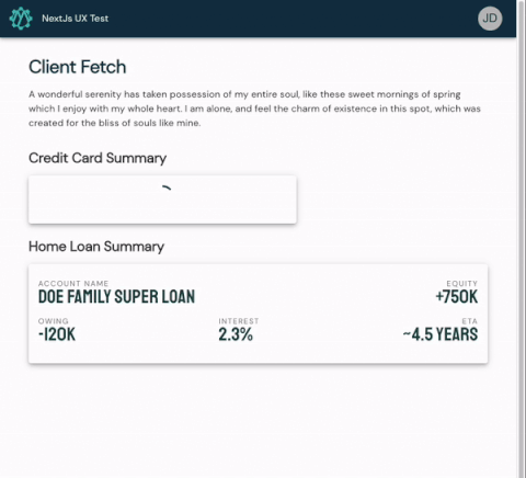
Circular Loader with no appropriate dimension
The following gif animation shows 1 Credit Card box using the circular loading indicator; once the content is ready the loading indicator immediately gets removed and the true Credit Card box's content gets revealed. You'll notice this pushed the below content down, hence the degradation to our CLS score.
💡 Why CLS matters:
Have you ever been to a site on either a desktop or mobile phone, got presented with some content, found a link to click on but just as you did the link jumped away from you? Worse yet, you ended up clicking something else completely irrelevant! This is occuring more often than none and the experience is frustrating! This is why performance tools like Lighthouse are increasing their weight (penalty) of CLS more and more.
Circular Loader with an appropriate dimension
This is the same implementation as the above with the addition of the developer ensuring the circular loading indicator fills out to the default size of a rendered Credit Card box.
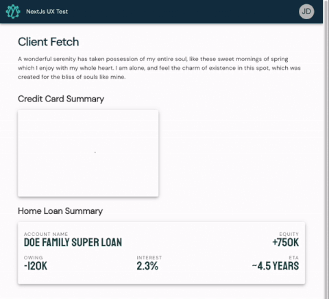
This is starting to feel a bit better but I'm having to cognitively re-read everything in the box to make my next move.
How Skeleton Loaders Can Help
Skeleton loaders force the developer to think about the content which it is emulating in a much more heuristic manner as they would have to take some time to think about the content's:
- box model: position, height, width, padding...
- content layout: rows, columns, flex direction, justify content...
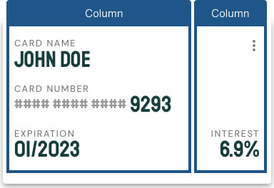
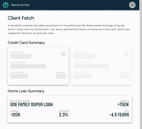
Let's use the following screenshot as our example.
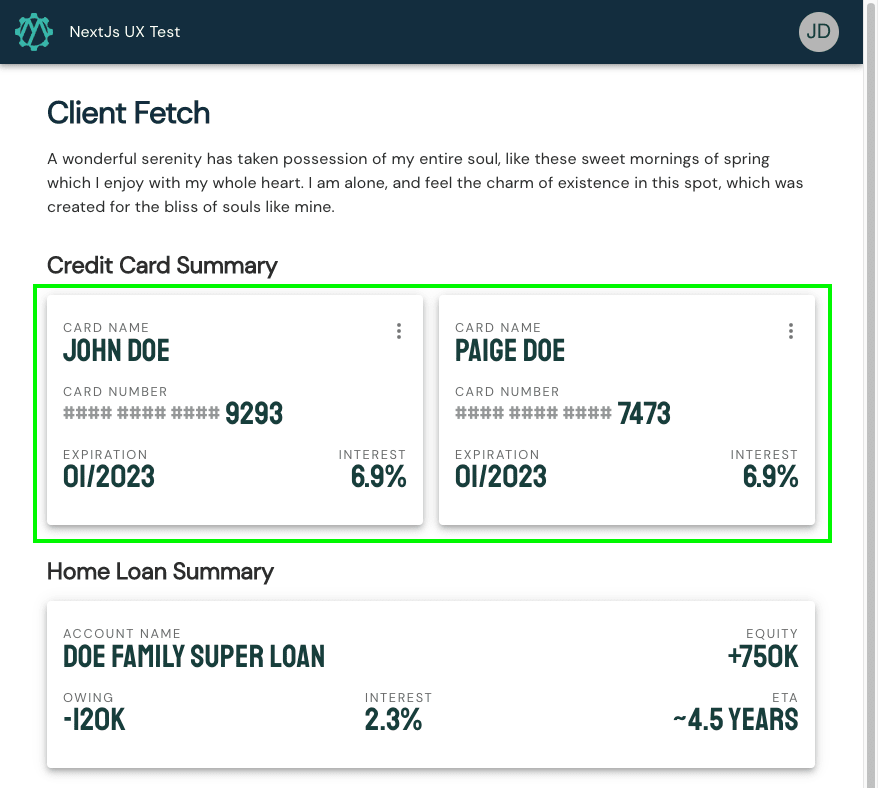
Our task is to create a skeleton for the "Credit Card Summary" cards. The goal is to style the skeleton close enough to the design so there are no surprises when the content renders.
I will be using MUI's Skeleton component to construct our new
<CreditCardSkeleton> component. MUI's Skeleton component expose 3 variants: Text, Circular, Rectangle.
Like most things when developing from a design it's best to develop from the outside in. I tend to follow these steps in my head:
1: Figure out the root node's layout constraints. Ask yourself what direction the content flows, does the content wrap, what spacing is between each item?

2: Figure out the content type. Is it a card, body text, table, video, image?
3: Figure out the inner content layout. In our case there are 3 rows 2 columns
Rows

Columns
4: What are the key landmarks for the inner content? You decide how simple or complex your skeleton should be
Simple
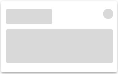
Complex

We now have enough information to construct our skeleton and here's what we should end up with:
A few things to note:
- I chose to implement complex landmarkings as it better transitioned when the true content was revealed.
- A second skeleton in the horizontal list was added to let the user know there may be more than one Card after the loading finishes.
- Consecutive skeletons have their opacity lowered to emphasise there may/may-not be more than one card after the load has completed.
Conclusion
When skeletons are implemented correctly you'll not only make your application look and feel better, but deliver a more intuitive experience to your users as they will now have a better understanding of page layouts and content landmarks before the true content has even loaded.
Don't be shy, get in touch with us!


Top comments (0)