
In this quick tutorial, you’re going to learn how to create different types of toggle buttons such as:
- Toggle a single class inside a single button
- Toggle two classes inside a single button
- Toggle a single class between two different buttons
Toggle A Single Class Inside A Single Button
In the Vue template, I’ve a simple button with some Semantic UI CSS framework classes: ui button toggle, which are just for visual purposes.
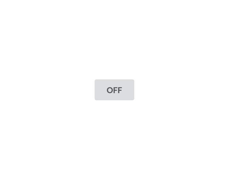
<button class="ui button toggle">OFF</button>
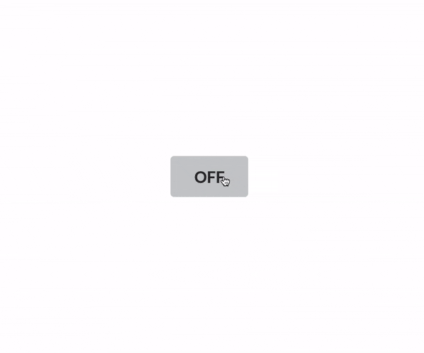
At this stage, the button has a grey background color like the screenshot below.
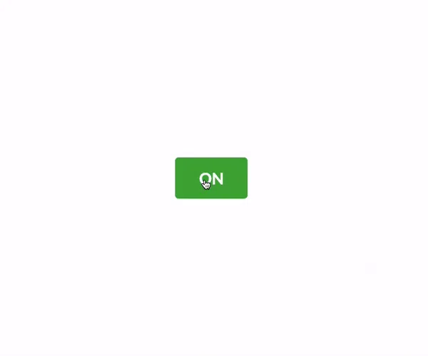
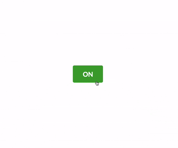
At this stage, toggling the active class to the button will change the background color from grey to green and vice versa.
Pretty straight forward.
To do that, we need to have a property that has a boolen value and inside every button click we need to change the state of that property.
Based on that, we can determine when the active class should be added to the button.
Let’s define a property called isActive inside the data() model.
export default {
  data() {
    return {
      isActive: false,
    };
  },
};
Then, attach a click event to the button so that we can change the state of the isActive property on every click.
<button class="ui button toggle" @click="toggle">OFF</button>
Invoke the toggle() callback function inside the methods object.
Set the isActive property to true if it’s false and vice versa.
There is more than one way to do this.
The naive approach would be like this:
toggle() {
  if (!this.isActive) {
    this.isActive = true;
  } else {
    this.isActive = false;
  }
},
The reason I am checking first to see if this.isActive is false is because this is it’s initial value.
But a ternary operator would make it less cluttered.
toggle() {
  this.isActive = this.isActive ? false : true;
},
This is fine, but we can still make it better.
toggle() {
   this.isActive = !this.enable;
},
That looks nice.
You can actually add this code inline to the button like in the code below.
<button class="ui button toggle" @click="isActive = !isActive">OFF</button>
Toggle The Active CSS Class
Based on the isActive property, let’s toggle active class in the button element by adding an object to the :class.
<button class="ui button toggle" :class="{active:isActive}" @click="isActive = !isActive">OFF</button>
The active class, which is the key of the object, will get added to the button when isActive is set to true which is the value of the object.
Nice.
Toggle Button Text
Let’s swap the text between OFF and ON depending on the value of the isActive property.
<button
class="ui button big toggle"
:class="{active:isActive}"
@click="toggle"
>{{isActive ? 'ON' : 'OFF'}}</button>
Toggle Two Classes Inside A Single Button
Lets say you want the button to have a red background color when it’s OFF and green when it’s ON.
In that case, all we have to do is add an array instead of an object to the :class.
<button
  class="ui button big"
  :class="[isActive ? 'green' : 'red']"
  @click="toggle"
>{{isActive ? 'ON' : 'OFF'}}</button>
In that array, we can use a ternary operator to swap two classes based on the value of the isActive property.
Toggle A Single Class Between Two Buttons
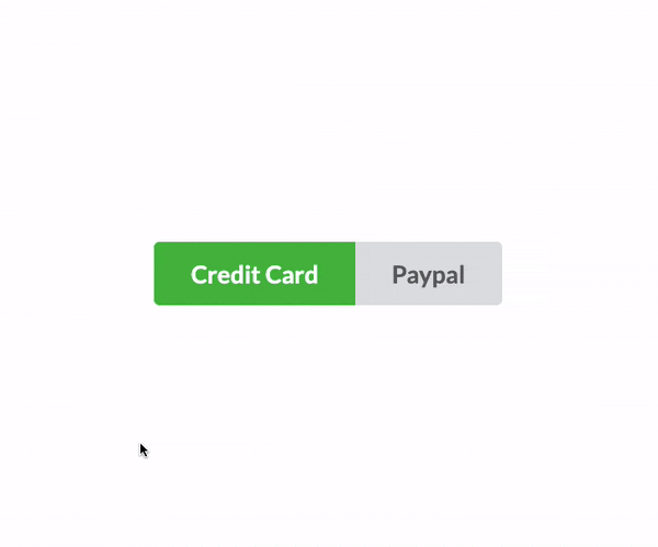
Let’s say you’ve a payment page that has two options; either pay by credit card or Paypal.
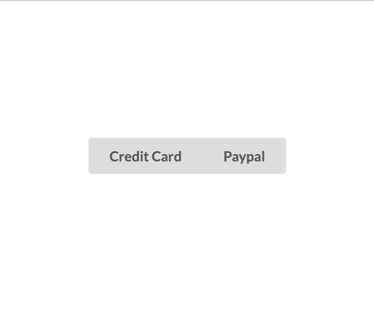
I’ve two buttons with some Semantic UI CSS classes and attached a click event to both with the callback function called toggle().
<div class="ui buttons big">
  <button
    class="ui button toggle"
    @click="toggle"
  >Credit Card</button>
  <button
    class="ui button toggle"
    @click="toggle"
  >Paypal</button>
</div>
Now, declare a property called showCreditCard inside the data() model.
Then, change the state of the showCreditCard property every time any button is pressed.
export default {
  data() {
    return {
      showCreditCard: true,
    };
  },
  methods: {
    toggle() {
      this.showCreditCard = !this.showCreditCard;
    },
  },
};
When the showCreditCard property is set to true, the active class will be added to the credit card button, otherwise, to the Paypal button.
<div class="ui buttons big">
  <button
    class="ui button toggle"
    @click="toggle"
    :class="[showCreditCard ? 'active' : '']"
  >Credit Card</button>
  <button
    class="ui button toggle"
    @click="toggle"
    :class="[!showCreditCard ? 'active' : '']"
  >Paypal</button>
</div>
There you have it!
Let me know by commenting below if you want to add anything that’s missing in this article.
Happy Coding!

Top comments (0)