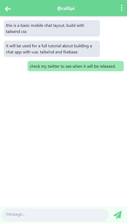
This will be a very quick tutorial today. I will show you how easy it is and with how little effort you can build a mobile chat layout like whatsapp or telegram with just html and tailwindcss.
Let's get started.
We will build the basic html structure first. I commented the different parts of the layout, so it should be pretty clear what each section does.
<html>
  <header>
    <title>Mobile Chat Layout</title>
    <link rel="stylesheet" href="https://unpkg.com/tailwindcss@1.0.5/dist/tailwind.min.css" />
  </header>
  <body>
    <div>

      <!-- HEADING -->
      <div
      >
        <!-- back button -->
        <a href="#">
          <svg
            xmlns="http://www.w3.org/2000/svg"
            viewBox="0 0 24 24"
          >
            <path
              d="M9.41 11H17a1 1 0 0 1 0 2H9.41l2.3 2.3a1 1 0 1 1-1.42 1.4l-4-4a1 1 0 0 1 0-1.4l4-4a1 1 0 0 1 1.42 1.4L9.4 11z"
            />
          </svg>
        </a>
        <div>@rallipi</div>
        <!-- 3 dots -->
        <svg
          xmlns="http://www.w3.org/2000/svg"
          viewBox="0 0 24 24"
        >
          <path
            fill-rule="evenodd"
            d="M12 7a2 2 0 1 1 0-4 2 2 0 0 1 0 4zm0 7a2 2 0 1 1 0-4 2 2 0 0 1 0 4zm0 7a2 2 0 1 1 0-4 2 2 0 0 1 0 4z"
          />
        </svg>
      </div>

      <!-- MESSAGES -->
      <div>

        <!-- SINGLE MESSAGE -->
        <div>
          <div
          >this is a basic mobile chat layout, build with tailwind css</div>
        </div>

        <!-- SINGLE MESSAGE 2 -->
        <div>
          <div>It will be used for a full tutorial about building a chat app with vue, tailwind and firebase.</div>
        </div>

        <!-- SINGLE MESSAGE 3 -->
        <div>
          <div>check my twitter to see when it will be released.</div>
        </div>
      </div>
    </div>

    <!-- MESSAGE INPUT AREA -->
    <div >
      <textarea
        rows="1"
        placeholder="Message..."
      ></textarea>
      <button >
        <svg
          aria-hidden="true"
          focusable="false"
          data-prefix="fas"
          data-icon="paper-plane"
          role="img"
          xmlns="http://www.w3.org/2000/svg"
          viewBox="0 0 512 512"
        >
          <path
            fill="currentColor"
            d="M476 3.2L12.5 270.6c-18.1 10.4-15.8 35.6 2.2 43.2L121 358.4l287.3-253.2c5.5-4.9 13.3 2.6 8.6 8.3L176 407v80.5c0 23.6 28.5 32.9 42.5 15.8L282 426l124.6 52.2c14.2 6 30.4-2.9 33-18.2l72-432C515 7.8 493.3-6.8 476 3.2z"
          />
        </svg>
      </button>
    </div>
  </body>
</html>
As you can see, I already inluded the tailwind styles in the header. We will use its classes later.
Then we define the heading area with a back button, a title and a menu button.
Right after the heading we create the area for messages with 3 hardcoded messages in it.
And at the bottom we create the message input area with a textarea and a button to send the message.
It will look something like that now:
Let's add styling now:
<html>
  <header>
    <title>Mobile Chat Layout</title>
    <link rel="stylesheet" href="https://unpkg.com/tailwindcss@1.0.5/dist/tailwind.min.css" />
  </header>
  <body>
    <div style="overscroll-behavior: none;">

      <!-- HEADING -->
      <div
        class="fixed w-full bg-green-400 h-16 pt-2 text-white flex justify-between shadow-md"
        style="top:0px; overscroll-behavior: none;"
      >
        <!-- back button -->
        <a href="#">
          <svg
            xmlns="http://www.w3.org/2000/svg"
            viewBox="0 0 24 24"
            class="w-12 h-12 my-1 text-green-100 ml-2"
          >
            <path
              class="text-green-100 fill-current"
              d="M9.41 11H17a1 1 0 0 1 0 2H9.41l2.3 2.3a1 1 0 1 1-1.42 1.4l-4-4a1 1 0 0 1 0-1.4l4-4a1 1 0 0 1 1.42 1.4L9.4 11z"
            />
          </svg>
        </a>
        <div class="my-3 text-green-100 font-bold text-lg tracking-wide">@rallipi</div>
        <!-- 3 dots -->
        <svg
          xmlns="http://www.w3.org/2000/svg"
          viewBox="0 0 24 24"
          class="icon-dots-vertical w-8 h-8 mt-2 mr-2"
        >
          <path
            class="text-green-100 fill-current"
            fill-rule="evenodd"
            d="M12 7a2 2 0 1 1 0-4 2 2 0 0 1 0 4zm0 7a2 2 0 1 1 0-4 2 2 0 0 1 0 4zm0 7a2 2 0 1 1 0-4 2 2 0 0 1 0 4z"
          />
        </svg>
      </div>

      <!-- MESSAGES -->
      <div class="mt-20 mb-16">

        <!-- SINGLE MESSAGE -->
        <div class="clearfix">
          <div
            class="bg-gray-300 w-3/4 mx-4 my-2 p-2 rounded-lg"
          >this is a basic mobile chat layout, build with tailwind css</div>
        </div>

        <!-- SINGLE MESSAGE 2 -->
        <div class="clearfix">
          <div
            class="bg-gray-300 w-3/4 mx-4 my-2 p-2 rounded-lg clearfix"
          >It will be used for a full tutorial about building a chat app with vue, tailwind and firebase.</div>
        </div>

        <!-- SINGLE MESSAGE 3 -->
        <div class="clearfix">
          <div
            class="bg-green-300 float-right w-3/4 mx-4 my-2 p-2 rounded-lg clearfix"
          >check my twitter to see when it will be released.</div>
        </div>
      </div>
    </div>

    <!-- MESSAGE INPUT AREA -->
    <div class="fixed w-full flex justify-between bg-green-100" style="bottom: 0px;">
      <textarea
        class="flex-grow m-2 py-2 px-4 mr-1 rounded-full border border-gray-300 bg-gray-200 resize-none"
        rows="1"
        placeholder="Message..."
        style="outline: none;"
      ></textarea>
      <button class="m-2" style="outline: none;">
        <svg
          class="svg-inline--fa text-green-400 fa-paper-plane fa-w-16 w-12 h-12 py-2 mr-2"
          aria-hidden="true"
          focusable="false"
          data-prefix="fas"
          data-icon="paper-plane"
          role="img"
          xmlns="http://www.w3.org/2000/svg"
          viewBox="0 0 512 512"
        >
          <path
            fill="currentColor"
            d="M476 3.2L12.5 270.6c-18.1 10.4-15.8 35.6 2.2 43.2L121 358.4l287.3-253.2c5.5-4.9 13.3 2.6 8.6 8.3L176 407v80.5c0 23.6 28.5 32.9 42.5 15.8L282 426l124.6 52.2c14.2 6 30.4-2.9 33-18.2l72-432C515 7.8 493.3-6.8 476 3.2z"
          />
        </svg>
      </button>
    </div>
  </body>
</html>
It should look like this now:
Not too muched changed. We just added some classes and it looks beautiful now :-)
Let's go through it:
The heading uses the full width, is fixed to the top, and is a flex container which positions its children with the same space between every element. It backgroundcolor is set to green and it has a little shadow.
For the buttons we're setting the size, some margin and the color.
The messages area only gets some top and bottom margin.
Every single message item is wrapped with the clearfix class. We need that to reset the float-right that we want to apply to some messages. We also set the background color, the width, some margin and padding and the border radius of each message element.
The input area is fixed to the bottom, uses the full width and distributes its children the same way as the heading does.
The textarea gets some padding, a background and text color and rounded borders.
The button, like the buttons in the header get a fixed size, a color and some padding.
That's it.
If you want to see it in action, here is a Codepen with the finished layout.
I think tailwindcss makes styling web pages a lot easier. I really like the philosophy behind it.
If you like this kind of quick tutorials, check out my twitter. I share more stuff like that there.


Top comments (0)