
I'm excited to announce the release of sweet-alert v7.0.0, the latest version of our popular alert library for Laravel.
This release includes several new features and bug fixes that make it easier and more customizable than ever before.
Here are the highlights:
ConfirmDelete Function
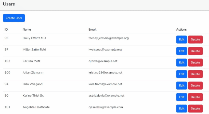
One of the most requested features from our users has been the ability to add a confirm delete dialog to their applications.
With v7.0.0, i've added the confirmDelete function that makes it easy to create a dialog that asks users to confirm before deleting an item.
This function is fully customizable, allowing you to choose the text, buttons, and icons that appear in the dialog.
Usage
To use the confirmDelete function, you need to call it in your controller method in my case its index , passing in the required parameters.
For example:
<?php

namespace App\Http\Controllers;

use App\Models\User;
use Illuminate\Http\Request;

class UsersController extends Controller
{
    public function index()
    {
        $users = User::latest()->paginate(10);

        $title = 'Delete User!';
        $text = "Are you sure you want to delete?";
        confirmDelete($title, $text);
        return view('users.index', compact('users'));
    }
}
This allows the confirmation alert to be displayed after a clicking the delete button.
In your view, you can add the data-confirm-delete attribute to the delete button to trigger the confirmation popup.
The confirmation popup will use the configuration options set in the session flash data.
For example:
<a href="{{ route('users.destroy', $user->id) }}" class="btn btn-danger" data-confirm-delete="true">Delete</a>
The following environment variables can be used to customize the confirm alert:
SWEET_ALERT_CONFIRM_DELETE_CONFIRM_BUTTON_TEXT
This variable sets the text of the confirmation button. Default is Yes, delete it!.
SWEET_ALERT_CONFIRM_DELETE_CANCEL_BUTTON_TEXT
This variable sets the text of the cancel button. Default is Cancel.
SWEET_ALERT_CONFIRM_DELETE_SHOW_CANCEL_BUTTON
This variable sets whether to show the cancel button in the popup. Possible values are true or false. Default is true.
SWEET_ALERT_CONFIRM_DELETE_SHOW_CLOSE_BUTTON
This variable sets whether to show the close button in the popup. Possible values are true or false. Default is false.
SWEET_ALERT_CONFIRM_DELETE_ICON
This variable sets icon of the popup. Default is warning.
SWEET_ALERT_CONFIRM_DELETE_SHOW_LOADER_ON_CONFIRM
This variable sets whether to show a loader in delete button of the popup. Possible values are true or false. Default is true.
You can customize the configuration options of the confirmation popup by setting the environment variables in your .env file.
Themes Customization Option
i've also added a new customization option that allows you to choose from a selection of themes for your alerts. Whether you want a light or dark theme, a bold or subtle design, or anything in between, sweet-alert v7.0.0 has you covered.
You can choose a theme by setting the SWEET_ALERT_THEME environment variable in your .env file.
The available themes are dark, minimal, borderless, bootstrap-4, bulma, material-ui and wordpress-admin.
Usage
Dark
The dark theme is a dark-themed alert box with white text. To use this theme, add the following environment variable to your .env file:
SWEET_ALERT_THEME="dark"

Minimal
The minimal theme is a simple alert box with minimal styling. To use this theme, add the following environment variable to your .env file:
SWEET_ALERT_THEME="minimal"

Borderless
The borderless theme is a simple alert box with no border. To use this theme, add the following environment variable to your .env file:
SWEET_ALERT_THEME="borderless"

Bootstrap 4
The bootstrap-4 theme is a theme that mimics the look and feel of Bootstrap 4 alerts. To use this theme, add the following environment variable to your .env file:
SWEET_ALERT_THEME="bootstrap-4"

Bulma
The bulma theme is a theme that mimics the look and feel of Bulma alerts. To use this theme, add the following environment variable to your .env file:
SWEET_ALERT_THEME="bulma"

Material UI
The material-ui theme is a theme that mimics the look and feel of Material UI alerts. To use this theme, add the following environment variable to your .env file:
SWEET_ALERT_THEME="material-ui"

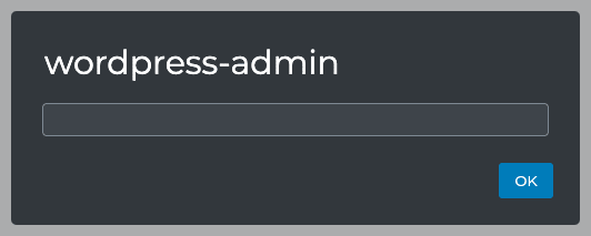
WordPress Admin
The wordpress-admin theme is a theme that mimics the look and feel of WordPress admin alerts. To use this theme, add the following environment variable to your .env file:
SWEET_ALERT_THEME="wordpress-admin"
Upgraded sweet-alert to Latest Version
As always, i've upgraded sweet-alert to the latest version to ensure maximum compatibility and performance.
This means that you can be confident that your alerts will work seamlessly using the latest versions of SweetAlert2 JavaScript library.
Bug Fixes
i've also fixed several bugs and issues that were reported by our users, including issues with text alignment and responsiveness.
I take user feedback seriously and strive to create the best possible experience for everyone who uses sweet-alert.
Docs Updated
Finally, i've updated our documentation to reflect the new features and changes in v7.0.0.
Whether you're a new or experienced user of sweet-alert, our documentation is the best place to start to learn how to use the library to its fullest potential.
Overall, I'm thrilled with the new features and improvements in sweet-alert v7.0.0, and I hope that you are too.
Thank you to all of our users for your support and feedback, and I look forward to continuing to improve and develop sweet-alert in the future.

Top comments (0)