Mobile First has been a mantra of both the mobile web and mobile native development communities for a while. Articles go on with statistics about mobile use in North America, Europe, and Asia before diving into the “next billion users”, the parts of the world that only have access to stable internet connections through a cellular network. Every talk and blog post begins with a graph: “Here’s the current percentage of users who access services from a mobile device”, typically followed closely by “and this is how much revenue is left on the table when the user doesn’t find a good mobile experience”. I don’t dispute these numbers or the importance of mobile in modern UI and UX design. Mobile has had a profound effect on the software industry. Nothing chases mobile users away faster than a bad experience on the small screen.
Within the binary of mobile platforms, iOS is noted for its integration with with its desktop counterpart Mac OS. Gone are the days of using iTunes to sync content between the device and the computer, as Apple released iCloud to sync Contacts, Calendars, Photos, Email, and much more, culminating in the release of the current “Handoff” feature-set: Quick access to whatever you were doing on the phone at the desktop and vice versa. This was what “The Cloud” promised: your content on any screen at any time, and an easy transition between devices at any time.
Apple’s Handoff system is exemplifies this well, assuming you have bought into a completely Apple hardware and software ecosystem. Google has experimented with the idea of Chrome OS as a full-blown OS on and off for years, but part of what makes Android so refreshing on mobile is the lack of influence from desktop-oriented platforms — it is not only mobile-first but rather mobile-only in design. Google had a major presence for webapps and services, but Android is one of the first times they have released a whole platform as a consumer-facing product. The lack of a Google-specific desktop system was a benefit because Android (and Google services running on it) were platform-agnostic: You could use Mac, Windows, or Linux computers equally with your Android device — Google’s products were all browser based, and aside from pushing you to download Chrome every chance they got, desktop platform didn’t matter.
One of my favorite Android apps has always been Google’s Hangouts chat platform. Coming from Google Voice, I was already accustomed to a basic level of continuity across mobile and desktop for my SMS and phone use. Hangouts, as it gained features, looked like the perfect replacement — bringing Voice and Gchat together into a single messaging platform that worked perfectly everywhere. On mobile I had a well designed app that showed chat and SMS together in one inbox and on desktop the Hangouts extension in Chrome provided a simple, out-of-the way messenger that existed only as a series of small windows docked to the bottom of the screen that showed up when needed, with a chat, inbox, or phone dialer and nothing else. Even better, all of this was handled by Google on the backend, not pushed from my phone like Apple’s equivalent system, so I never had to post the classic Facebook status: “My phone’s dead, message me on here instead of texting” — a common theme of the separation between mobile and desktop user experiences.
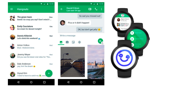
Google Hangouts
This setup served me well until Google decided to discontinue the Hangouts extension in Chrome. Sure, they released a Chrome App instead (the new technology they were trying to push at the time), but the Chrome app was lacking functionality: All chats were displayed in a single window, no longer able to be individually docked to the bottom of the screen. In fact, on OS X, Chrome Apps confused the app switcher, so any attempt to switch to Chrome would take the user to the open Hangouts app window. The webapp version was slightly more tolerable, it at least didn’t mess up the switcher, but required an always-open browser tab. Finally, the catalyst for writing this rant, the Chrome App was retired, leaving no actual desktop option for Hangouts — an app that has stopped showing signs of progress since Google shifted its focus to their newer Android messenger (creatively named “Messenger”) and Allo.
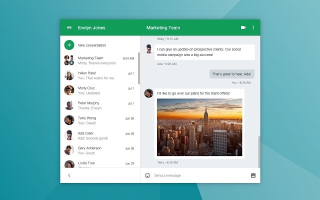
Google Hangouts (Chrome App)
Desktop apps used to exist in a world of APIs and customizability. Years ago I ran Adium, which allowed me to keep chats on gchat, Twitter, Facebook, AIM, and plenty more in one place. The new model is to lock users into first-party clients. If the desktop client is well designed (for example, Slack), it has all of the functionality of the mobile app (and then some), stands free of the browser, and feels like a continuous experience between devices. If it isn’t, you get Google Calendar: The new webapp redesign looks really nice, but the user still can’t create (or put off) goals, nor can they provide an event location that the mobile app will render a nice map background image of.
How can we bring back the promise of The Cloud: Seamless user experience across devices with content continuity? As developers, we can try to not forget desktop development. A mobile first paradigm can help us design simple, easy-to-use UIs and good offline states, but what will your user’s experience be if their phone is not charged? Or completely broken for a few days? Will your product feel the same or will they try to find an alternative service due to the frustration?
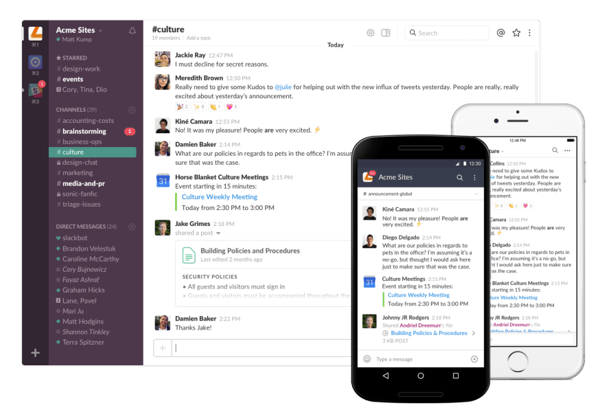
Slack: A consistent look and experience across platforms
One of Google’s own design principals for Android calls for “enchanting” user interactions. This may be an Android issue, but your app can lose a lot of enchantment from interactions that don’t even happen on the Android platform. This attention to design and interaction for mobile has driven a huge boom in the use of mobile devices, not just due to the ease of use, but also for the enjoyment of well-built mobile apps. Mobile First has helped reach many more users and use-cases than ever before. But like any design philosophy, it is important to think about what isn’t covered by this approach. Just as there are many users who access a service only through mobile, there are also many who use mobile for only part of their digital workflow.
Go ahead and design for mobile first. But don’t let your app exemplify that other design philosophy: Desktop Never.

Top comments (2)
I like this article. Actually, a while ago, I guess that "mobile first" has gotten quite a bit off track and been misinterpreted as "build for smartphones and tablets only". Expectation rather would be: "Working mobile" means that I can work with the device at hand right now and have "my" configuration, data, environment around and available no matter which device (class) I'm using, which network I am on, ... . That doesn't necessarily mean apps. ;)
🙏🙏 I've been saying this for so long 🙏🙏
It's a shame seeing so many sites that look fabulous on a small phone but then lose everything when put onto the big screen.