
Note: This article is only intended to explain how I am loading my site. These steps may change as per your use case (Building an E-Commerce website with Vanilla JavaScript is not a great idea)
Hi, everyone!
So my old portfolio used to load in 4.2 seconds and had a performance score of 43 so I decided to rebuild (and redesign) my portfolio site and now it loads in 1.6 seconds and has 100 lighthouse score! (the link to the website is at the end of this article)
It is built using Vanilla JavaScript and does not use any external script or stylesheet (except the one for google font).
Here are performance insights from lighthouse

TLDR
So for better performance, I am :
- Using
rel="preload"
<link rel="preload" href="assets/css/index.css" as="style" media="all" onload="this.onload=null;this.rel='stylesheet'">
- Split CSS into
index.css&mobile.cssand loadingmobile.cssin mobiles only
<link rel="stylesheet" href="assets/css/mobile.css" as="style" media="screen and (max-width:768px)">
- Lazy loading images
- Using CDN (I'm using Cloudinary It also provides me a way to change the width of the image in request time so I load the image of the same size of the one to be rendered.)
- Using OffScreen Canvas (to be honest don't use it, its experimental and only works in chrome. I managed to do some workarounds that ignore the offscreen canvas and load the same file as a normal script in unsupported browsers)
Here's how I improved the performance
Table of Content
Preloading Resources
When you hit a link in your browser, the browser starts parsing index.html file but by default browsers halt the parsing when they come across <script>, <link>, <style> tags as they can alter the paint of the document. Thus blocking the initial paint.
By preloading the resources you can load the file without blocking the first paint. So the loading of these files starts as usual but the paint is created before the CSS or scripts are loaded.
Super cool right? well, with great power comes great responsibility!
You don't want your website to look like this on the first load no?

Since we are painting screen without loading CSS, This is how the website will appear for first few milliseconds.
How to handle this?
This is how I do:
When the user loads my website all I want to show is a blue screen then load the content when CSS is loaded
index.html
<head>
    <!-- Other head tags -->
    <link rel="preload" href="assets/css/index.css" as="style" media="all" onload="this.onload=null;this.rel='stylesheet'">
    <style>
        html,body{
            background-color: blue;
        }
        .lazyload, .main-container{
            display:none;
        }
    </style>
</head>
<body>
    <header>
        <!--Header content -->

        <h1 class="lazyload">Hi, I am Saurabh welcome to my website!</h1>
    </header>
    <main class="main-container">
        <!-- Main Content -->
    </main>
    <!-- Remaining HTML -->
</body>
This keeps the main-content and some text from header hidden
Then in index.css I do.
.lazyload, .main-container{
    display: block !important;
}
which overwrites the rules in <style> and displays the content
I am not exactly using the same code as I explained above. I do some animations to make the text appear so the output looks kind of different than what it would look with the code above

Splitting CSS
If your media query for the mobile is too large, it makes sense to have a separate file for it since the code is completely useless to load on desktops.
<link> tag provides us option to load css file only in the device that matches the media attribute value
<link rel="stylesheet" href="assets/css/index.css" as="style" media="all">
<link rel="stylesheet" href="assets/css/mobile.css" as="style" media="screen and (max-width:768px)">
With this mobile.css file will only load in the device that matches screen and (max-width:768px)
Image Optimization
Lazy loading
Fun fact: Browsers will soon have loading="lazy" attribute in IMG tag. Till then this is what I'm doing:
<img id="projectimage-1" src="placeholder.webp">
<img class="lazyimage" data-cover="projectimage-1" style="display:none;" src="actualimage.webp">

<script>
function loadProjectImage(e){
    const image = e.target;
    document.getElementById(image.dataset.cover).src = image.src;
}
document.querySelectorAll('.lazyimage')
    .forEach(imgEl => imgEl.addEventListener('load', loadProjectImage))

</script>
Using CDN
CDN or Content Delivery Network respond faster with the image than your usual server.
Apart from this advantage, there are some customizations that Cloudinary (CDN that I use) provide that helped me in faster optimizations.
Having .webp extension is good for websites since it provides better image optimizations, with cloudinary you can simply change .png or .jpg in image URL with .webp and it generates webp image for you!
Also, cloudinary provides a way to resize images by passing parameters in the URL
This is how a cloudinary image URL looks like:
https://res.cloudinary.com/saurabhdaware/image/upload/c_scale,w_300/v1552455020/saurabhdaware.in/projects/eotm-portfolio.webp
In this, w_300 represents the image with width 300. Changing the value will give you an image with that width. So you can dynamically change this value in JavaScript to load the image exactly of the same size of your render.
And Hey, Cloudinary! if you're reading this, please pay me :3
Bonus
Also, apart from these factors, I've used OffScreenCanvas to render header animations in the web worker but since it is an experimental feature I don't really think so it is the right time yet to have it in your production.
And I won't say that not using libraries made it fast. But yes, Not using framework allowed me to have better control over files so I could decide which files to preload and when to load which file and how to bundle them together.
However, You can use libraries and still load the website fast. You just need to handle it properly but yes in case of small websites like portfolio, it does make sense to avoid having these huge libraries which are larger than your whole website itself.
And DONE 🎉💃
I hope you liked the article!
My Portfolio Link: https://saurabhdaware.in
(Hovering or tapping on some elements in the website may create surprising results 😉)
I would love to receive some feedback on my portfolio site🌻
Oh, and I also redesigned my website logo

Thank You!

Oldest comments (84)
Refreshing to hear about someone only using vanilla JS for a site. Nice!
Thank you! and yes I am actually super impressed with where the vanilla is heading. In the website the astronaut is a web component and the blue tshirt guy is just the same component with different styles. also, I love how much control you get when you work in vanilla of any language🦄 Thank you for reading the article🌻
Glad to see other people worrying about performance! My portfolio site gets around 800ms, I'm pretty proud of that.
My one concern about your method is loading mobile css once it's determined it's needed. If you're gonna split the css, I think it makes more sense to just load mobile at first, since a pc is more likely to be able to take the extra processing/network loads.
That's just my opinion on the matter.
Yes, I do mobile first which loads everywhere, and responsive.css for desktops and tablets
Hi, yes that's a good point, I think it is totally a right approach when you have a mobile first css. In my case, I wrote it for desktop first since a lot of recruiters and even developers use desktop for surfing but I will totally go for your approach when I make a mobile first site.
Thank you for sharing and reading this article🌻 and loading site in 800ms is so coool you should totally be proud of yourself🦄
And it's the opinion of most others!
What happens if a potential employer receives your application on their mobile device, opens your site and has a really bad experience?
I do get the point but I think it depends on one's use-case. In my case my mobile.css is 100 lines long and plus I'm minifying it so the final production size of my mobile.css is 2kb.
Also, I cared about my comfort and I am personally more creative when I think about desktop first and then turning it into mobile view is just a few adjustments (and especially since it is a portfolio I just wanted to be as creative as I can 🦄)
I have made websites where I had to write mobile-first CSS and I totally get the point of having that extra CSS file for PCs rather than mobile but yes the topic is too broad to talk about since other parameters like the size of your files, the eventual aim of the website, Your comfort, your team's comfort matter as well.
Oh, and do let me know if you have different views on this, Thank you🌻
That makes sense. I didn't look at the source ;)
Reading the article, the way you emphasised separating mobile.css as a step towards reducing the overall payload gave the impression it was a large file.
oh my bad and yes now I feel like it would've made sense to have it in the same file as well since it is not adding much content to it. Initially I just didn't know how much it will grow so I went with two files.
800ms? Are you willing to share your techniques?
Thanks for sharing! You can also use f_auto and q_auto for automatic format and quality selection.
Oh, thank you so much! I will try out f_auto and q_auto🦄
Also, you guys are doing great job🌻
Well done! Its always nice to squeeze some extra load time out of a website 👍🏼
That is so Nice! Im a new dev and making things work and not so slowly are ok by now for me, but Im always looking for the best :)
Hi, That is totally a right approach 🌻 Good luck with your journey 🕺
This is good stuff.. although, the stylesheets still load, even with a media attribute. Combining css into fewer sheets/links, and keeping the media queries in the stylesheet, is proving to be the fastest way to load.
Hi Mark, I just checked my network tab and
mobile.cssis not really getting any request when I turn to desktop view.Mobile view

Desktop View
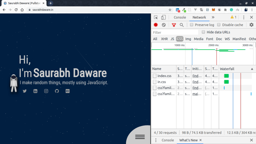
I'm not really sure about the browser support or for any gotchas in this but apparently this is how it works in new browsers.
Thank you for reading the article 🌻
I have a question on that matter.
If a user loads the website on phone in landscape that has more that 768px,
then rotates the screen into portrait, will the mobile.css file be loaded and applied?
That could make a big difference in my work. I could try that on my next project.
No, it won't be loaded by default since the media is checked on the loading time. However, you can actually call a javascript function which will add that link to head dynamically when a user rotates the screen but it depends if it fits your project needs
Nice!
Nice work!!.
What tool did/do you use to track your lighthouse score?
You can check your score on web.dev or chrome developer tools have the option of "audit" where you can check the score directly.
Lighthouse also has a CLI so you can run the performance insights from your command line
I know this tools. Thanks.
But I didn't know about web.dev possibility to login and save audits over time.
Nice feature to see improvements :)
My site renders in 200ms, if it's throttled to 4g it'll render in 1.6s. That's the power of statically generated sites :)
omg haha, 200ms is soo cool! that's literally less than my server's response time.
I dunno if i would bother splitting css even if it was 50kb
I agree, For my current use-case it would've worked to have a single file. Initially I just had no idea how big it would get. I'm not sure if having this extra file will cause any issues though since it is anyway loaded dynamically and does not block render.