
If you have a basic understanding of HTML and CSS and want to learn to create great-looking user interfaces in the browser, look no further! In this article, you'll boost your UI design skills by learning about the following seven fundamentals:
- white space
- alignment
- contrast
- scale
- typography
- color
- visual hierarchy
This article builds on a free Scrimba course created by the brilliant Gary Simon, also known as DesignCourse. The course offers a set of interactive tutorials that you can take at your pace and even redo to really embed your learning.
So if this short guide leaves you with wanting more, be sure to check out the course by clicking here or on the image below.

And if you like the free course, you can also leave your email on the waitlist for the upcoming 10+ hour UI Design Bootcamp.
But first, let's see if we can teach you the seven UI design fundamentals in record speed! 👇
White Space
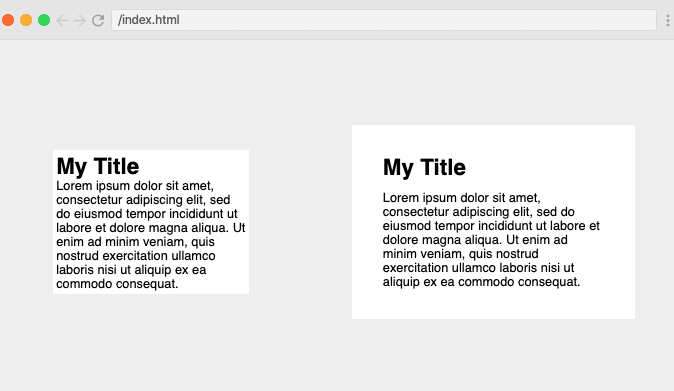
The first design fundamental we'll look at is White Space, also known as negative space which, as the name suggests, is the space between elements on the page.
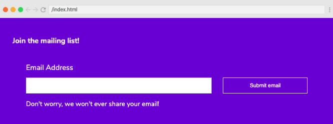
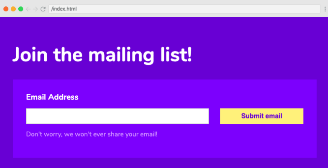
Elements which are squashed up on a page with no white space not only look unattractive but are also difficult to navigate and tricky to read. We can adjust white space in various ways including padding, margin and line-height. Check out the before and after image below to see what a difference effective white space can make.
Alignment
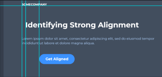
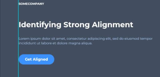
Next up is Alignment - this is the process of ensuring that every element is positioned correctly in relation to other elements, for example by ensuring that columns are aligned down the page.
As you can see from the following images, the first page with elements in numerous different columns (weak alignment) is far less attractive and readable than the second, which has strong alignment
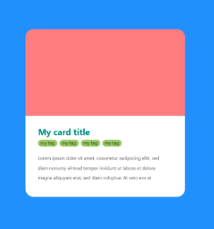
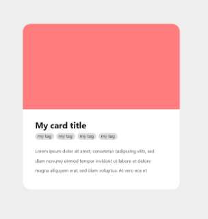
Contrast
It's important to also consider Contrast when building a page or application. Contrast is the difference between colors which appear next to each other on the page.
As you can see from this example, pages with poor contrast are difficult to read and the elements do not stand out.

Pages with good contrast, like the one below, not only look much better but are more user-friendly and accessible.

To help you get your contrast just right, the WCAG (Web Content Accessibility Guidelines) suggest a minimum (AA) contrast ratio of at least 4.5:1, or 3:1 for large text, or an enhanced (AAA) contrast ratio of 7:1 or 4.5:1 for large text. There are a range of plugins or websites to check this.
Scale
Scale is also an essential part of the UI, so consider the size of every element carefully. For example, elements should be big enough in relation to the page (so no large gaps) and elements with higher importance, such as headlines, should be larger than those of less significance.
Take a look at the before and after images below, and notice how much better the page looks when it is scaled correctly.
Typography
Typography also has a big impact on the UI. There are many ways to adjust this, including font choices, font size, alignment, letter spacing, line height, font styles, color and contrast.
As a general rule, use no more than 2 font families on a single page and ensure the different aspects work together in order to establish the order of importance. This is known as visual hierarchy, which we'll cover in more detail below.
If you follow these tips, your page will look as good as this:
And not confusing and unreadable, like this:

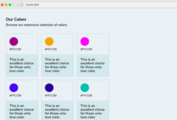
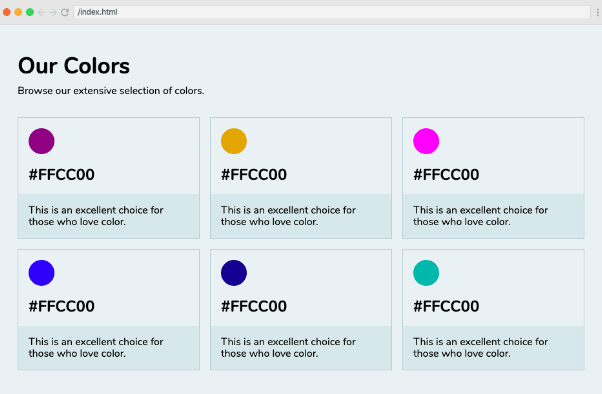
Color
The UI design fundamental which first shapes a user's experience is color. Color psychology means that each color elicits a meaning to certain people - for example, red can signify danger, while white can evoke cleanliness and serenity.
Be careful with color, though. Meanings vary across cultures, so always do your research and consider your target audience when selecting colors.
It's also important to remember that too many colors can create a bad UI and colors you choose to use should complement each other. As a rule of thumb, you can't go wrong with using lighter or darker variations of the same hue next to each other. Just look at how much easier on the eye the second page below is compared to the first!
Visual Hierarchy
The final item on our Design Fundamentals list is Visual Hierarchy. Some elements of a UI are more important than others. Visual hierarchy allows us to establish this importance. This can be done with position, contrast, color, scale, style or a combination of the above, as shown in the second image below, which has a much better visual hierarchy than the first.
Wrap up
In this article we have covered the seven main design fundaments; white space, color, contrast, scale, alignment, typography and visual hierarchy, which are all equally important to the UI - if one of these elements is lacking, the entire user experience will suffer, so make sure you consider them all when creating your UI designs.
Coming soon: The UI Design Bootcamp
Now if you'd like to reach a professional level in this subject, we're going launch a full UI Design Bootcamp over at Scrimba in March. Leave your email in the waitlist and you'll get exclusive sneak peeks and the very best price when it launches.

The bootcamp will feature hours of tutorials and interactive challenges to help build up the muscle memory you need to help you become a great UI designer, create new designs from scratch and improve your existing designs.
In the meantime, happy designing! :)

Latest comments (9)
These are great tools that so many developers don't have an eye for yet! But are they really "interaction" points?
Very Helpful tips and advice, Thanks Per!!
Hi Desire,
I hope you will also love to Best Practices for Designing Staggering Conversational UI
this is basic guide that is about the need of compelling and attrative UI in present designing word.
Thanks
Thanks for the post.
Would it be possible to tell what is the meaning of the ratio for the accessibility guideline part because I am kinda lost there
Ver well written!🙌🏻🎉
Nice article about UI.