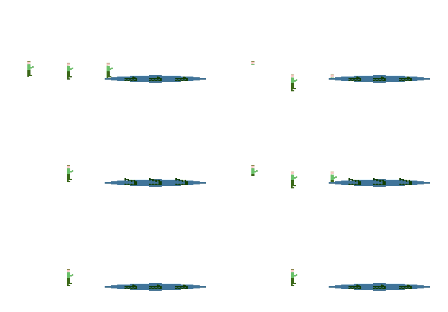
This is a continuation of my previous post Having fun with CSS where I attempted to extract some joy while learning some neat CSS and JavaScript animations. While I have been using the 1982 Activison game Pitfall! as a way to make this fun, gaming is not the only application for these skills. I have some animations that I wrote for my capstone project that sprung from this exercise.
Last time around I introduced three different types of animations:
Animating a Sprite using CSS
Animating Element movement using JavaScript
Animating Element movement using CSS
This time we are going to look at
Combining a JavaScript and CSS animation
I have added a new sprite sheet to the project, created using Piskel. It is a sprite sheet with crocodiles in water.
Just like last time we are going use, along with our sprites, 3 files; index.html, script.js and style.css.
The html file looks like this now:
<!DOCTYPE html>
<html lang="en">
<head>
    <meta charset="UTF-8">
    <title>Jump Guy 2</title>
    <link rel="stylesheet" href="style.css">
</head>
<body>
    <div id="game">
        <div id="character">
            <div id="harry"></div>
        </div>
         <div class="crocAnimation" id="croc-lake"></div>
    </div>
<script type="module" src="script.js"></script>
</body>
</html>
I have added a div element for the crocodiles and attached the crocodile animation as a class. This is appropriate because the crocodiles should always be chomping. I have also added a div with the id of "harry" that resides inside of our "character" div.
Combining a JavaScript and CSS animation
This change is necessary because applying two different animations simultaneously to a single element does not work. So we will be applying all movement to the character div. I like to think of this as Harry's car. He is the occupant of the character div and goes wherever it goes. The running sprite animation and our new vanish animation will be applied independently to the harry div.
We have some logic that will trigger this animation combination whenever the character walks or jumps into the water.
function checkDead(){
    characterLeft = parseInt(window.getComputedStyle(character).getPropertyValue("left"));
    characterTop = parseInt(window.getComputedStyle(character).getPropertyValue("top"));

    if (((characterLeft>390)&&(characterTop===400))&&((characterLeft<890)&&(characterTop===400))){
         character.classList.add("descend")
         harry.classList.add("vanish")
         setTimeout(dead, 900)
    }
}
The first part of the animation is just character movement.
@keyframes sprite-descend{
    0%{top:400px;}
    25%{top:443px;}
    50%{top:485px;}
    75%{top:527px;}
    100%{top: 570px;}
}

.descend{
    animation: sprite-descend 2000ms linear;
}
We are pushing the character down with this animation. This would be sufficient if we split the water into two pieces and added background to hide our character using z index but I didn't want to do that. Instead I am using clipping to create the illusion of Harry sinking under the water.
@keyframes sprite-vanish{
    0%{clip:rect(0px, 128px,170px,0px)}
    25%{clip:rect(0px, 128px,127px,0px)}
    50%{clip:rect(0px, 128px,85px,0px)}
    75%{clip:rect(0px,128px,42px,0px)}
    100%{clip:rect(0px,128px,0px,0px)}
}

.vanish{
    animation: sprite-vanish 1000ms linear;
}
The difference in animation time is due to the scaling we applied to the character div. The vanish and descend are occurring at the same rate.
This post was a little briefer than I had but planned but this is my final week of software engineering boot camp. I do plan on part 3 in the near future. Here is a preview:
Here are some blog posts that inspired this one:
https://blog.logrocket.com/build-a-game-with-html-css-javascript/
https://blog.logrocket.com/making-css-animations-using-a-sprite-sheet/


Top comments (0)