I found my self seeing many development folks doing #100daysofcode on Twitter. I attempted this a few years back and lasted a week. It’s difficult to consistency code something amazing everyday when you’ve got a busy family life. When I saw Frontendmentor.io, I knew this was something I wanted to try. I didn’t have to be committed a few months to this challenge and could get it done within a week. I wanted to share my thought process behind every website design I develop.
Challenge Details: https://www.frontendmentor.io/challenges/myteam-multipage-website-mxlEauvW
GitHub files : https://github.com/shashilo/frontendmentor-myTeam
Live Preview: https://shashilo-frontendmentor-myteam.netlify.app
My thought process for developing a new website design
I’ve had the privilege to build many websites using a CMS, for a mobile application, and static pages. This is my usual thought process when dealing with responsive designs. For this project, I wanted to build it as a Pure CSS solution.
Get an understanding of the design artboard settings
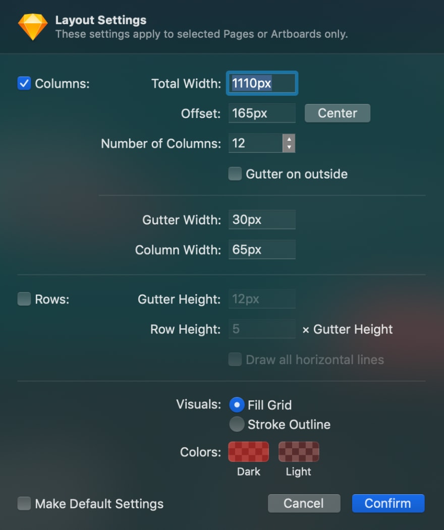
Take a deep look at the document file settings. It will tell you a lot about what the designer wants for the design. If you look at a Sketch artboard, you can look at its layout settings. This will give you information on container max-width size, number of columns, gutter width, etc. Talk about being pixel perfect, this is the foundation that will setup you up to doing just that.
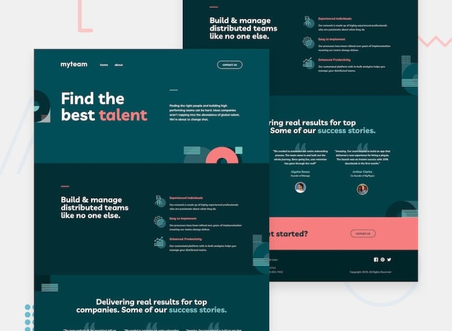
Visually check if the design will all be contained in a single wrapper or if it needs to be sectioned
Look at the design and you’ll see if it requires fluid backgrounds for each section. This is a clear indication that you need to create separate sectioned containers. It’s a lot harder to create negative margins, padding, positioning, etc. of a fluid element once you contain it. Therefore, it’s much easier as a developer to control the styles if you create individual containers within sections. For simple designs, you’ll see that the designer used a simple background for the entire page. This is when you can container the entire page into a single container.
View component styles
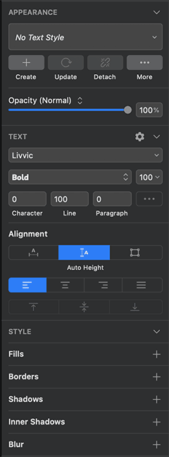
Make this a habit to click at every component you are styling in the art file. There are settings like font size, letter spacing, line-height, border-radius, box-shadow, opacity, and more. Our human brains cannot translate every bit of information when our eyes play tricks on us. The designer has trusted us to perfect their design to the best of our abilities. All the information is in the document, we just need to look at the details.
Mobile first
I do my best to construct my CSS making the mobile styles the default. If there’s a variation between breakpoints, I use min-width for the breakpoint that’s needed. This way the styles for the larger screens will remove once the user is on smaller breakpoints. Also, manipulating DOM elements to fit mobile is much more difficult than for desktop.
CSS > JS
There’s nothing wrong with Javascript, I just enjoy making things pure CSS as possible. For me, maintaining something in CSS is a lot easier than in Javascript. It may take some extra steps, but it’s rewarding when you didn’t need to rely on Javascript to implement a feature. I’ve done some research on performance, but there’s no clear indication that one or other would provide a greater performance gain than the other.
CSS directory structure
I’ve found that having a decoupling your styles into separate files is very useful. It doesn’t just keep it organized, but also trains you to not create large files. I follow the 7–1 pattern quite closely. Obviously, you want to alter the way you group your files and how you name them according to your project. Not every project will need the exact CSS file structure as the other one.
CSS naming convention
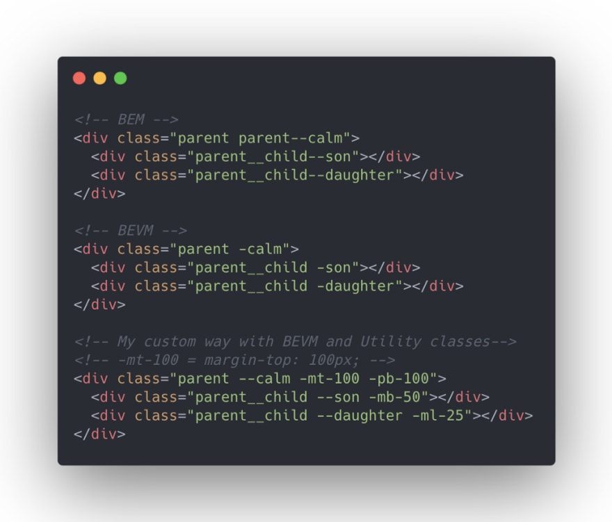
If you’re familiar with BEM, you’ll understand the pain points. It’s a good naming convention, but gets very repetitive the deeper you get into your styling. I was getting used to using BEVM, a variation of BEM, but soon found myself tweaking my naming convention. While Tailwind is one of the most popular CSS frameworks to date, I only like it for prototyping purposes. I don’t see the benefit of using Tailwind to maintain a large scale application or a website. The utility classes are great, but not when you have to use them to style every bit of your element. Therefore, in the project, I used a variation of BEVM and utility classes. Sounds like this would be a good idea for another blog entry at a later date.
I created something interesting
In the process of building this challenge, I found myself reusing a lot of CSS Grid styles. I’ve used Flexboxgrid in the past, and really enjoyed it’s simplicity. So, I create a SCSS library for CSS Grid using Bootstrap naming convention. While using it for this challenge, it was quite helpful. The design has many screen size variations. It presented many challenges because tablet and mobile screens didn’t use the same grid layout. There was an element that spanned 12 columns on desktop, 10 on tablet, but back to 12 on mobile. It wouldn’t be an issue with Flexbox because you can center things very easily, but no with CSS Grid. You have to explicitly call out where you want the element to start on the grid. I’m not sure if this is useful for anyone else, but I created some examples on Codepen.
https://medium.com/media/12043c59a1195c4b8895d51c46d6b31b/href

Top comments (0)