
Introduction
When you browse online and see cool, highly interactive, and aesthetically pleasing charts, probably those charts are powered by D3 Js. Charts were built way before the internet came along. The first chart was made in 1644 by Florent Van Langren. He was an astronomer in an attempt to represent statistical data visually.
In this age of the internet, the need to represent data on web browsers is essential. Visual representation of complex data is achieved by using javascript libraries like D3 Js.
D3 js library
The term “D3” stands for Data-Driven Documents. The library creates dynamic and interactive charts and renders them on Scalable Vector Graphics (SVG). It was developed by Mike Bostock in 2011. Over the years the library has grown from a single library to a collection of smaller and modular libraries that developers can use independently.
These smaller libraries can be categorized into:
1.Data manipulation
This category deals with preparing and manipulating data to fit a desired format before feeding it to various d3 functions. Data manipulation can include handling arrays, fetching data, and formatting. Some of these data manipulation utilities includes d3-array d3-dsv d3-fetch d3-format d3-random d3-time d3-time-format
2.Visualization utilities
Charts have common elements such as axes and scales. The library caters to these needs by providing utility functions to handle the creation of these chart elements. For example d3-axis d3-chord d3-color d3-interpolate d3-contour d3-delaunay d3-force d3-geo d3-hierarchy d3-path d3-polygon d3-quadtree d3-scale d3-scale-chromatic d3-selection d3-shape
3.Animation
Animations in d3 come with utilities such as d3-ease d3-timer and d3-transition. They ensure transitions are smooth when interacting with a chart.
4.Interactive
D3 js charts implement interactiveness through the library utilities such as d3-brush d3-dispatch d3-drag d3-zoom.This is achieved through tooltips, hover-effects etc.
Why is d3 js so popular
There is a multitude of libraries that handle the creation of charts over the web. D3 Js belongs to the elite part of this group. The library is well-loved and revered by data scientists, and data journalists among other professionals.
1. Highly customizable charts
D3 allows users to build chart elements such as scales to their liking. Highly skilled d3 developers can build custom charts such as racing bar charts to knowledge charts. Other libraries such as Highcharts give complete charts with little chances for customization.
2. Highly interactive charts
When working with complex data, interactivity improves data presentation compared to static charts. Users have an opportunity to discover correlations and trends that would be hidden otherwise.
3. Gives data-driven charts
D3 js charts are data-driven. The library manipulates DOM elements based on provided data. This allows users to track statistical changes on a given dataset.
How does it work
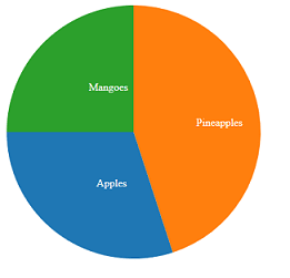
D3 JS takes in data and outputs a chart. The library has functions that take in data and give end users a chart with meaningful insights. For example, if you feed d3 js with the following data it will output a pie chart on SVG or Canvas.
D3 js takes statistical data and mirrors it on SVG elements. For example, D3 js will take the population size of a country, use a scale, and output it as an SVG rect element. Changing population size can increase the width or height attribute of the rect element. The end users will note population trends by observing these rect attributes.
Input data
// Sample data for the pie chart
    const data = [
      { label: "Apples", value: 30 },
      { label: "Pineapples", value: 45 },
      { label: "Mangoes", value: 25 }
    ];
Output (Pie chart)
Transformation of data to charts
This is where the magic happens, D3 takes data and manipulates DOM elements to give chart information of SVG or Canvas. This gives power and allows developers to build custom charts.
Data input
In this simple chart, data is presented as a simple array. In real-world applications, data comes from APIs, CSV, and JSON files. D3 has utilities such as d3.fetch d3.csv and d3.json.
    // Sample data for the pie chart
    const data = [
      { label: "Apples", value: 30 },
      { label: "Pineapples", value: 45 },
      { label: "Mangoes", value: 25 }
    ];
DOM element
Through d3.select, d3 picks a DOM element to hook the chart.
<div id="pie-chart"></div>
Here we set the chart dimensions and select the DOM element for the chart.
    // Set up the dimensions and radius for the pie chart
    const width = 400;
    const height = 400;
    const radius = Math.min(width, height) / 2;

    // Create a color scale
    const color = d3.scaleOrdinal(d3.schemeCategory10);

    // Set up the SVG container
    const svg = d3.select("#pie-chart")
                .append("svg")
                .attr("width", width)
                .attr("height", height)
                .append("g")
                .attr("transform", "translate(" + width / 2 + "," + height / 2 + ")");
Bringing in data
After setting the stage by selecting the DOM element and adding dimensions, the next stage is bringing in the data for d3 to generate a given chart.
D3 has functions that turn data into SVG elements such as paths and lines.
    // Set up the pie chart layout
    const pie = d3.pie()
                .value(function(d) { return d.value; });

    // Generate the arcs for the pie chart
    const arcs = pie(data);

    // Draw the pie slices
    const path = d3.arc()
                 .outerRadius(radius - 10)
                 .innerRadius(0);

    const arc = svg.selectAll(".arc")
                 .data(arcs)
                 .enter()
                 .append("g")
                 .attr("class", "arc");

    arc.append("path")
       .attr("d", path)
       .attr("fill", function(d) { return color(d.data.label); });

    // Add labels to the pie slices
    arc.append("text")
       .attr("transform", function(d) { return "translate(" + path.centroid(d) + ")"; })
       .attr("dy", ".35em")
       .text(function(d) { return d.data.label; })
       .style('fill', 'white');
There is along going on the above code and I will just highlight the most significant parts.
d3.pie allows d3 to calculate necessary angles based on provided data. All data provided to this function will share the 360-degree (full-circle). This function allocates angles for various pie segments.
Feeding a simple object will transform it. For example
//simple object
{ label: "Apples", value: 30 }
Transformed object
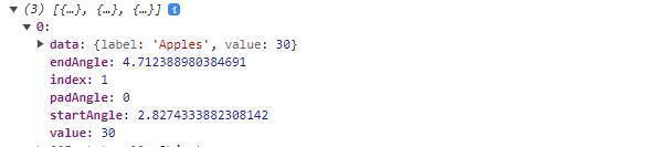
d3.arcutlity returns path generator functions for drawing a pie chart. It makes use of startAngle and endAngle provided by d3.pie.
Drawing the chart
All this process aims at generating a path which is an SVG element.
   const arc = svg.selectAll(".arc")
                 .data(arcs)
                 .enter()
                 .append("g")
                 .attr("class", "arc");

    arc.append("path")
       .attr("d", path)
       .attr("fill", function(d) { return color(d.data.label); });
Final code
<!DOCTYPE html>
<html lang="en">
<head>
  <meta charset="UTF-8">
  <meta name="viewport" content="width=device-width, initial-scale=1.0">
  <title>D3.js Pie Chart</title>
  <script src="https://d3js.org/d3.v6.min.js"></script>
  <style>
    .slice {
      stroke: #fff;
      stroke-width: 2px;
    }
  </style>
</head>
<body>
  <div id="pie-chart"></div>

  <script>
    // Sample data for the pie chart
    const data = [
      { label: "Apples", value: 30 },
      { label: "Pineapples", value: 45 },
      { label: "Mangoes", value: 25 }
    ];

    // Set up the dimensions and radius for the pie chart
    const width = 400;
    const height = 400;
    const radius = Math.min(width, height) / 2;

    // Create a color scale
    const color = d3.scaleOrdinal(d3.schemeCategory10);

    // Set up the SVG container
    const svg = d3.select("#pie-chart")
                .append("svg")
                .attr("width", width)
                .attr("height", height)
                .append("g")
                .attr("transform", "translate(" + width / 2 + "," + height / 2 + ")");

    // Set up the pie chart layout
    const pie = d3.pie()
                .value(function(d) { return d.value; });

    // Generate the arcs for the pie chart
    const arcs = pie(data);
    console.log(arcs)

    // Draw the pie slices
    const path = d3.arc()
                 .outerRadius(radius - 10)
                 .innerRadius(0);

    const arc = svg.selectAll(".arc")
                 .data(arcs)
                 .enter()
                 .append("g")
                 .attr("class", "arc");

    arc.append("path")
       .attr("d", path)
       .attr("fill", function(d) { return color(d.data.label); });

    // Add labels to the pie slices
    arc.append("text")
       .attr("transform", function(d) { return "translate(" + path.centroid(d) + ")"; })
       .attr("dy", ".35em")
       .text(function(d) { return d.data.label; })
       .style('fill', 'white');
  </script>
</body>
</html>
D3 js application
1. Interactive dashboards
D3 works with other web technologies such as frontend frameworks like React JS to create interactive dashboards. Business organizations leverage the power of D3 to show users crucial performance indicators and other metrics to end users.
2. Geospatial data visualization
D3 has proven a useful tool in creating interactive maps and visualizing geospatial data. It helps create maps and create interactive capacity allowing users to understand geospatial data with ease.
3. Data journalism
The power is used by data journalists to create interactive, data-driven stories. Media houses such as the New York Times and Reuters utilized D3 to create interactive visualizations to tell stories based on collected information.
conclusion
D3 is a powerful tool for visualizing data on the web. In situations where you need highly interactive charts on the web, D3 is the right tool. It has common building blocks for various charts and has high flexibility.
Thank you for your time.

Top comments (0)