The new semester is another new starting point. React Suite is welcoming the release of version 4.0. Since the design of the V4 version in March 2019, after more than six months of development and testing, discussions and disputes, I have finally completed all the plans.
In this harvest season, we have prepared a series of updates for everyone, are you ready?
1, migrate from Flow to TypeScript
First of all, thanks to Flow for supporting the entire V3 release, the component library can easily have static type checking. With the wider use of TypeScript and the problems that Flow has exposed, we have abandoned Flow in this release and refactored all the code with TypeScript. Make the code more readable and maintainable.
2, accessibility improvement
To support the new browser features, we abandoned IE9 in the previous version of V3. But we still hope that the Web application developed with React Suite will be used by as many people as possible and better. We try to reach more people in terms of accessibility.
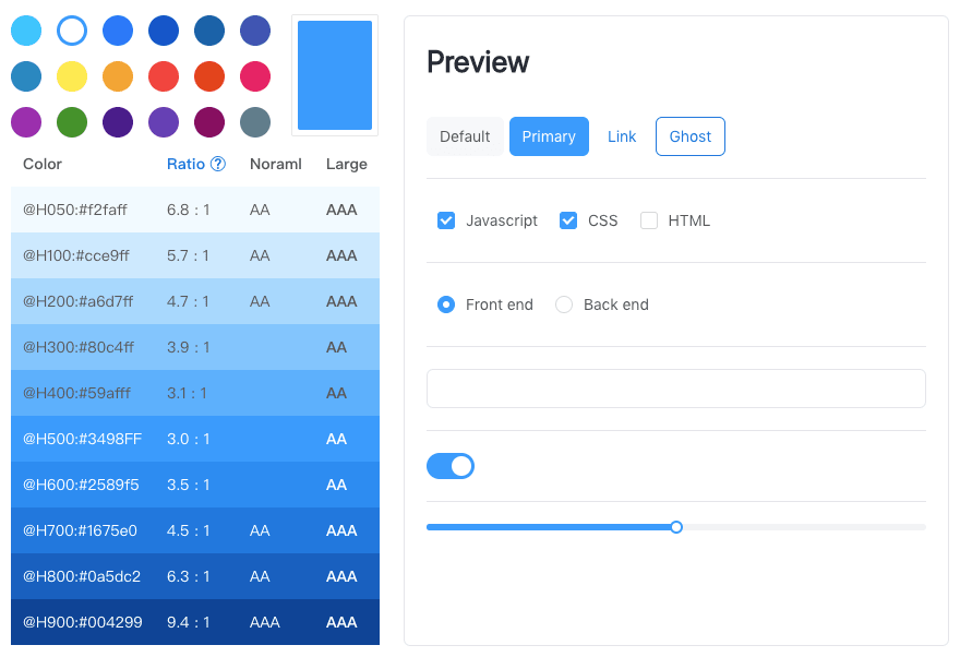
2.1 Color contrast improvement
There are many people with low vision in the world, and the display used by these users is often uneven. The contrast between text and background becomes the most basic functional problem for users. As a thoughtful UI component library, how can you not take care of the user's eyes?
According to the requirements of the 《Web Content Accessibility Guidelines (WCAG) 》, the color of the text, the thickness of the font, we have improved the contrast, and adjusted the algorithm of the swatch, the purpose is to make your product more accessible.
2.2 Support dark mode
In the electronics around us, night mode is supported from the operating system to browsers, editors, and various readers. It is a high-contrast, or reverse-color display mode. If your users need to use your product for a long time, having a night mode can effectively alleviate eye strain and make it easier to read.

The Dark Mode theme has been added to the default theme, and provides a full customizable option. When developing, you only need to import the corresponding style file:
import 'rsuite/lib/styles/themes/dark/index.less';
More on topic related settings can be referenced: custom theme
3、Added some components
The component is the smallest unit provided by React Suite. As Web applications become richer and more diverse, we will continue to offer a richer set of components.
3.1 Support for List
The List component is used very much on the mobile side, but in the mid- and back-end products, it has always been a component that is not well standardized. The required representations in different business scenarios will be different, so that we implement it in this version. List In addition to customizing the content of each item, we provide drag and drop sorting by default.

3.2 Support for Placeholder
In the front-end industry, everyone knows the word "skeleton screen". Its function is similar to that of Loader. It is a state displayed to the user before the application is not loaded, telling the user that the current data is being loaded. The advantage of the "skeleton screen" is to give the user a general structure of the page before the data has not been loaded, and enhance the sensory experience.
Placeholder is such a component that provides a rough structure of data. The general structure of the content area can be drawn by lines, rectangles, and circular outlines.

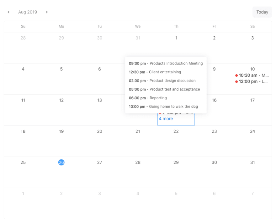
3.3 Support for Calendar
Calendar is a simple calendar panel that displays data for the calendar. Two usage scenarios are provided. One is to display a large calendar panel full of containers by default, which can display data for one month. The other is to provide a small, compact, small calendar panel that we often encounter in some systems' sidebars for data filtering.
3.4 Support Avatar and Badge
Support for Avatar components for displaying an avatar or trademark.
Support for Badge components for buttons, numbers next to icons, or status markers.


4、Breaking changes
We hope that each update will be most compatible with the historical version. But there are still some breaking changes, such as the use of new React features, or improvements to previously unreasonable designs.
4.1 Less than React 16.6 version is not supported
Some of React's new features are used in this release. For example, the new context API, which started to support the Class component static contextType property in React 16.6.0 #13728, uses this feature. So to use React Suite 4.0, you must upgrade react and react-dom to >=16.6.
4.2 Less compatibility change
In this release, support for the Dark theme has been made, and the introduction address of the Less file has been adjusted.
3.x version
import 'rsuite/styles/less/index.less';
4.x version
import 'rsuite/lib/styles/themes/default/index.less'

// or
// import 'rsuite/lib/styles/index.less';
The version of Less needs to be upgraded to the >=3.0 version.
4.3 TreePicker and CheckTreePicker discard the expandAll attribute
The TreePicker component and the CheckTreePicker component deprecated the expandAll property and added the expandItemValues property to expand the specified node.
4.4 Adjusted the values of Dropdown, Whisper, and all Picker components placement properties
The placement attribute is the position that the configuration selector displays after it is opened. To make the parameters more readable, the values are adjusted as follows:
type Placement4 = 'top' | 'bottom' | 'right' | 'left';
type Placement8 =
| 'bottomStart'
| 'bottomEnd'
| 'topStart'
| 'topEnd'
| 'leftStart'
| 'rightStart'
| 'leftEnd'
| 'rightEnd';
type PlacementAuto =
| 'auto'
| 'autoVerticalStart'
| 'autoVerticalEnd'
| 'autoHorizontalStart'
| 'autoHorizontalEnd';
Compatible with 3.x version
5、Bugfix and improvement
5.1 All Picker components support size
We have a very complete Picker series of components in the data entry component, which is often used in some data filtering columns, in addition to being used in forms. Considering that the Input and Button components have a size attribute that can be resized, the size attribute is also added to all Pickers to accommodate more scenarios.

5.2 Overflow protection for Whisper and Picker components
All Picker components and Whisper components are pop-up floating layers at a specified location, but sometimes because the size of the floating layer exceeds the extent of the container, some floating layers are not blocked. You can set a preventOverfow property at this time. The relative position of the floating layer display is adjusted according to the free space of the container, and the floating layer is displayed on the page as much as possible.

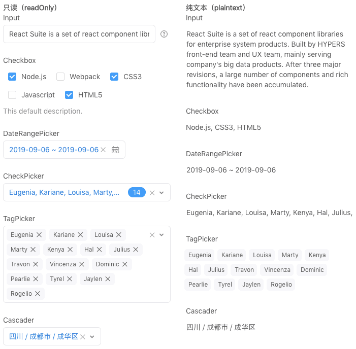
5.3 FormControl component read-only and plain text
FormControl adds 2 props support:
-
readOnlymakes the form component read-only and cannot be edited. -
plaintextlets the form components be displayed in plain text.
When these two properties are set on the Form component, all the form components in the form are globally set. In many cases, we need to add a data detail page to the completed form. At this time, we need to add a new module and display the data. To improve code reusability, you can turn a form into a data detail panel by setting a plaintext property on the Form component.
5.4 DatePicker and DateRangePicker support display weeks
<DatePicker showWeekNumbers />
<DateRangePicker showWeekNumbers />
If you need to view the number of weeks in your business in your business, you can set the showWeekNumbers attribute on the calendar, and the number of weeks in the current line will be displayed on the left side of the calendar.

5.5 Form combination Schema supports asynchronous check
Asynchronous verification is a basic requirement, and in this release Schema starts supporting Promise. Here are a few of the improvements to the form:
- Set the
checkAsyncattribute on<FormControl>that requires asynchronous validation. - The validation rules for asynchronous validation add an object with a return value of Promise via the ʻaddRule
method ofschema`. - The check can be triggered manually by calling
checkAsyncandcheckForFieldAsyncof<Form>.
Model
In the example we need to asynchronously verify that an email address already exists on the server. When adding a rule to Modal, we return a Promise object via the addRule method.
`js
function asyncCheckEmail(email) {
return new Promise(resolve => {
// Asynchronous processing logic
// resolve(true);
});
}
const model = SchemaModel({
email: StringType()
.isEmail('Please input the correct email address')
.addRule((value, data) => {
return asyncCheckEmail(value);
}, 'Email address already exists')
});
`
Form
Set the declared model on Form and set a checkAsync property for the component that needs to be verified asynchronously.
`js
const formRef = React.createRef();
function render(){
return (
)
}
`
Form provides the check() method by default, and the checkAsync() method is called if it is an asynchronous check.
`js
formRef.current.checkAsync().then(result => {
console.log(result);
});
`
5.6 Alert and Notification support close method
Both Alert and Notification support the close and closeAll methods, closing the last message and closing all messages, respectively. In some business situations, you need to turn off the warning message on the page after performing an operation. You can do the following:
`ts
Alert.close();
Alert.closeAll();
Notification.close();
Notification.closeAll();
`
5.7 FlexboxGrid supports responsive
The Col component in the Grid layout is configurable for responsive layouts, but it doesn't have some features for Flex layouts. To make the two layouts fused, we can make FlexboxGrid.Item and Col Combined, combined with FlexboxGrid and with Flex layout features, and responsive configuration-related properties.
html

<FlexboxGrid.Item componentClass={Col} md={6}>

  content

</FlexboxGrid.Item>
5.8 All Picker new open and close methods
In some cases, you need to open or close a Picker by performing an action. For example: a cascading operation, you want to quickly select after closing a Picker, the default is to put a next Picker. We provide a open and close method on Picker:
`ts
const pickerRef = React.createRef();
function render() {
return ;
}
// open
pickerRef.current.open();
// close
pickerRef.current.close();
`
5.9 Other fixes
- Fixed a Uploader upload file larger than 1GB display issue.
- Fixed compatibility issue with Input on IE browser display.
- Fixed an issue where InputPicker on the keyboard Delete key would clear the input worth.
- Fixed an issue where Dropdown set the
toggleComponentClass={Button}background style error. - Fixed an issue where styles were missing when introduced on demand.
- Fixed an issue where DatePicker disabled days were inconsistent with disabled months.
- Fixed an issue where the scrollbar position was not updated after the Table data was updated.
- Fixed the Table property expandedRowKeys update value is not controlled.
- Fixed a callback parameter for the Table property onRowClick missing event.
- Fixed support for focus events by the Form component.
- Modified the default separator for Breadcrumb.
- Fixed an issue where the position of the handle was not updated after the Slider changed from hidden to display state.
6、At last
I hope that our growth will bring a better experience to more developers.If you like React Suite, you can show your support by either
- Starring this repo.
- Leaving a comment here if you are using RSUITE in your project
- Becoming a backer on OpenCollective
This project exists thanks to all the people who contribute.


Top comments (1)
I want this for Vue :) Looks amazing.