This is the final chapter of a 4-post series, taking you through a website refactoring process using tachyons.
On the menu
- Why re-write in the first place?
- What even is functional CSS?
- The refactoring process, step by step
- The aftermath: key learnings and recommendations (you are here! 👋)
Chapter 4: The aftermath - key learnings and recommendation
In this final post, I try to share some insights about things I have learned throughout the refactoring process. Things I learned while working with functional CSS and hanging around this specific ecosystem.
I'll start by addressing a few doubts or pain points that people seem to have quite often.
1. How do you deal with the repeating classes and overwhelming, "ugly" HTML markup?
Nobody likes to type the same classes over and over, or copy/paste things around. Besides being time consuming, it's the opposite of being DRY. It can put you in a world of pain when you decide to make some global changes to your UI.
Template abstractions to the rescue.
When working with functional CSS, I strongly recommend you bring a templating language of some kind to your workflow. It makes a world of difference.
As soon as you find a repetitive class pattern - and trust me, you will! - abstract it away in a variable. I like to refer to this process as the creation of "class combo" helpers.
Show me how!
Let's take some code straight from the tachyons.io component library section.
The component in question is a "contact list" and looks like so:
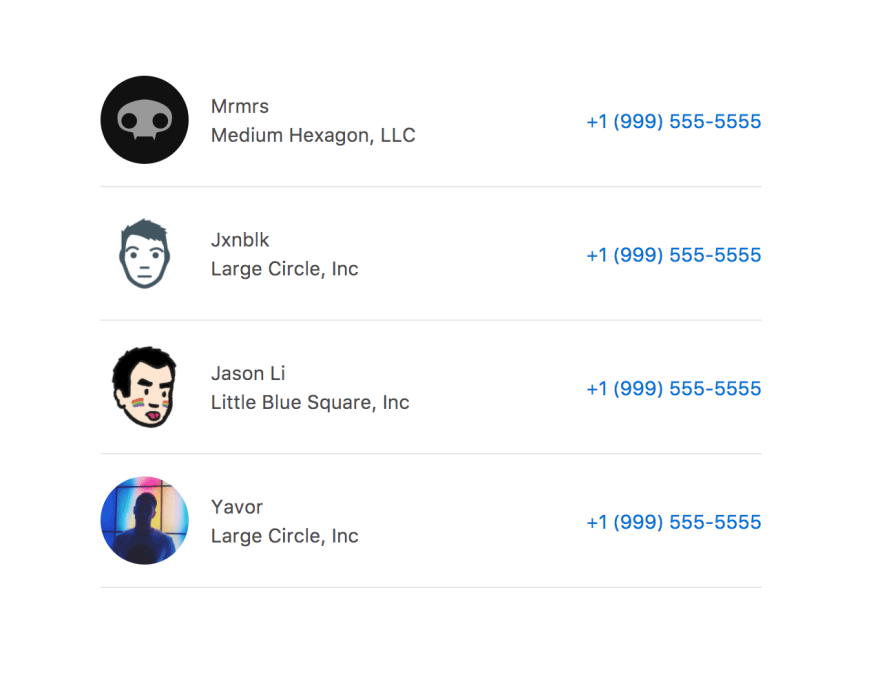
Let's have a look at the raw HTML + tachyons markup. Yes, it may look ugly to you:
Whoaaaa. My eyes!!
There are a lot of classes here. Trust me, there can be many more, depending on what you're building.
Assuming we may use this component in multiple places across our project, we have many good reasons to want to make this HTML cleaner and modular.
Building class combos.
Time to abstract away some of that repetitive markup.
You can do this with any templating language of your choice. In this case, I'll use Twig, since this was the language used during the refactoring. If you don't know Twig, you should still be okay to follow.
Don't worry too much about the syntax, focus on the concepts.
Deciding what classes to abstract away is a whole other topic, which I'll touch on later. For now we'll just take the relatively long class combinations and store them within a combo object:
This allows us to output the long string wherever we want by reaching for the object property, like so:
<li class="{{ combo.listItem }}">
Let's implement that in our HTML:
What?! Isn't that besides the point? You just lost the declarative aspect of functional CSS!
Hold your thoughts for a second. Let me clean this code up a bit more and then address this very valid point.
This next step is not related to functional CSS, but is a good idea to implement whenever working with repeating blocks of HTML.
We can clearly see a repeating pattern within each <li> element. Let's fix that by first extracting the data from the markup.
I'll set an array of contacts like so:
We can now rewrite our entire component in a pretty compelling loop that outputs one block of HTML for each index in the contacts array, making the code much tighter, readable:
Well done, champ. You've just recreated semantic classes. Way to chase your own tail! 😒

You are right. We went full cycle. Why not just write semantic class names in the first place?
Well, while the HTML now looks somewhat similar to what you would get with a regular CSS approach, there is a huge difference in the way the styles are applied.
Instead of styling my listItem with its own CSS declarations, the styles are composed from multiple helper classes. I can create dozens, hundreds of components with this method, without having to write a single extra line of CSS.
This is still functional CSS under the hood.
Trade-offs, again.
This technique is definitely not a silver bullet. Like everything you do in web development, you need to be evaluating trade-offs and see what works best for you.
Here's a mini break down of trade-offs I can think of with this abstraction technique:
Pros
- makes code cleaner, faster to write
- improve consistency, using same styling in multiple places
- greatly improves ease of global modifications. Change in one place, update everywhere
Cons
- takes away the declarative nature of style classes
- somewhat couples classes together, killing some of the "one-thing-only" ideology (I learned the hard way!)
Lesson learned with class combo abstraction
I fell in love with this technique. It gave me the power of building web components that are self-contained, highly reusable and consistent.
In the excitement, I possibly went a bit overboard, and got a bit too "abstraction-happy".
Looking back, here's a rule of thumb that could be very useful to you, if you're going down that route:
Don't abstract the outside vertical spacing!
In other words, feel free to abstract away the background-colour, border-radius, padding of a given module, but leave things like margin-bottom out of the equation.
Same for a headline. Abstract things like font-size, line-height but don't you touch the vertical padding / margin around it.
See my example below if this is not clear.
What about consistent vertical rhythm?
Even if you feel like the bottom margin is part of the module and should be consistently applied, it somehow belongs "outside" the module. And should be treated separately.
You'll run into edge cases where you need to display the same module without a bottom margin, because of the specific context you're trying to display it in.
You could override your margins by applying different margins before your combo, but that's starting to get messy.
This lead me to a fair amount of refactoring. I ended up removing vertical spacing from my go-to style combos, and started applying them in addition to the class combo.
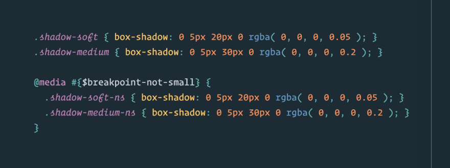
Here's what it looks like
In the below example, the margin-top and margin-bottom are "hard-coded" within the combo:
Instead, I suggest you leave these margins outside of the combo:
That's a good example of a good trade-off balance. We keep a degree of modularity / composition, while abstracting away the majority of the repeating classes. I could leverage my combo class in two different scenarios, and it's quite readable and declarative.
2. How do you customise tachyons?
There is an important concept to grasp: tachyons is not an "all or nothing" solution. It's not a UI framework like Bootstrap or Foundation.
Tachyons is a systematic, consistent methodology to write functional CSS classes. In that sense, it is virtually infinitely flexible.
Tachyons proposes a consistent naming convention, and encourages you to follow the lead.
Here are a two important things you need to know when working with tachyons:
You can and should turn off the parts you don't need, extend the parts you want to push further.
There is no right or wrong way of extending tachyons - the key is to understand the implications of whatever method you choose to adopt.
The way I did it.
After some good amount of thinking and tinkering, I decided to not touch any of the core tachyons files. Even if the author of the library invites you to dig into it and "make it your own".
Why? This makes sure implementing updates is never an issue.
Instead, I opted to create a tachyons-extend folder that I load after the core tachyons modules. Here's what my Sass pipeline looks like (I am using the tachyons-sass version of the toolkit, which also exists in different flavours).

In tachyons-extend, I can write brand new tachyons-like modules for areas of the CSS spec that are not (yet) covered by the toolkit.
Extending a module
In some cases, I just want to extend a core module. An example is the max-widths module, where we needed more flexibility.
I created a file with the same name in my tachyons-extend folder, and just added more declarations following the same naming convention:

As a result, I can access any class of the core max-widths module, as well as the extensions I created, without ever touching the core code.
Rewriting a module
Sometimes, a specific module is needed doesn't really do what you need, or does too much. Extending on top of it doesn't make sense in that context.
When that happens, I usually comment that module out in the core pipeline, and recreate a custom version of it in my extend folder.
I have done this for the box-shadows module - which styles I mostly didn't plan to use, but still needed box-shadow helpers:
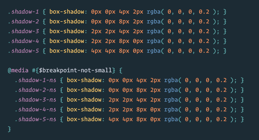

Again, I modify the behaviour / usability of tachyons, without touching any of the core files. The only modification I do is comment out some partials in the master tachyons file.
3. What about good ol' regular, non-functional CSS?
This is one thing that often confuses people. There are many discussions about this around functional CSS.
Let's make it clear: functional CSS does not prevent you from writing regular CSS in parallel.
It is absolutely okay to write non-functional CSS styles. Actually, there will probably be places where you need to.
Tachyons doesn't really impose anything on you. All it tries to do is give you ways to avoid repetition and limit the creation of custom CSS to a very small minimum.
Write your own CSS when needed. But keep this in mind:
Specificity is almost non-existant in functional CSS. By design. It's a feature of the system.
But is also has an implication. You need to think critically before write any custom CSS. The minute you bring a degree of specificity, you'll start overriding your functional classes.
If you know exactly what you're doing and why you want global styles in specific areas, by all means go ahead.
It's up to you to find the right balance of global CSS and functional classes that works best with your system. Trade-offs, again.
Pfeeew, that was a lot! Hopefully you're not asleep yet.

We're almost there. The last thing I want to share with you is answering the two questions: Would you do it all over again? What would you do differently?
Would I do it all over again?
To say the least, this refactoring was a bit of a gamble.
I did spend some time reasoning about the benefits of using tachyons before going ahead, but certainly not long enough to foresee some major problems it might lead us to.
As mentioned in my introduction, refactoring was not an option. There is only so much a human brain can cope with.
Would I do it again? Absolutely. I am yet to hit a wall or reach a point where I see my handle on the codebase slip away. I feel like I can take any BAU or new design and implement it very quickly without adding much complexity, if any.
Learning tachyons classes can be done in a weekend. Once you master them, building stuff is so straightforward it straight-up feels like a joke. Bringing a team up to speed with a tachyons codebase is as smooth as it can get.
What would I do differently the second time?
Here's an important bit of advice for you. This is probably the biggest mistake I made in the entire process:
Build mobile-first components, from the get go. Don't wait.
When working with functional CSS, you're spending 99% of your time in HTML. You're productivity is incredibly high, because your brain doesn't need to handle any context switching between markup and stylesheet.
You stay in the same file, lock in and get stuff done.
You're working so fast, it becomes far too easy to get caught in the "let's build it on desktop first, then go through it again at different breakpoints" approach.
Making this mistake lead me to a fair amount of time going through the entire website again on mobile, doing tweaks everywhere.
And here's the real twist: tachyons is written in a mobile-first architecture. Base class names apply to everything - and mobile by default. Extended, responsive class names for larger screens override the base classes, by design.
They are not more specific, they are just loaded after the base classes in each module, and therefore win the battle by "just enough".
Why is this such a big deal?
Say you've used a consistent vertical spacing of mv5 across the site, between sections.
The mv5 class applies vertical margins like so:
.mv5 {
    margin-top: 8rem;
    margin-bottom: 8rem;
}
You build the whole desktop site thinking it's a good vertical rhythm base for your project.
Later, you look at it on mobile and realise that in this context, this vertical spacing is way too big.
The thing is you cannot override that class with a mobile-specific class. You need to do it the other way around (there are valid reasons for that).
You need to transform the classes in all the places where you used mv5 to something that declares the mobile spacing first, then modifies that spacing on bigger screens.
You go from:
<section class="mv5">
    ...
</section>
to:
<section class="mv4 mv5-ns">
    ...
</section>
We now apply a vertical margin of level 4 on the modular scale for mobile, and level 5 for the not-small breakpoint and up.
The CSS output would be equivalent to this:
section {
    margin-top: 4rem;
    margin-bottom: 4rem;
}
@media(min-width: 40rem) {
    section {
        margin-top: 8rem;
        margin-bottom: 8rem;
    }
}
Such a small change doesn't seem like a big deal. At large scale, it will be.
If you effectively wrote the entire desktop site in mobile classes, you're up for some refactoring to transform your code to responsive.
Again, the use of templates and re-usable components can limit the damage of this mistake to a minimum.
But here's a good final lesson. Think mobile-first, right away.
Closing words
If you've been reading all along up to this point, congratulations and thank you!
I hope that throughout this series, I was able to make a case for the valid benefits of using a library like tachyons.
If anything, take this as a real-life case study of what I'd call a successful website refactoring. Ever since we moved to tachyons, I feel like I have a real cognitive grasp on the codebase, and am able to handle day-to-day business requests and changes with incredible ease.
Functional CSS is not a fit for every taste and every team. In our particular context, I personally found it to be bringing an incredible amount of benefits, without showing any signs of major drawbacks.
If you're aware of a huge drawback of functional CSS I failed to discover up to now, I'd love to hear about it.
Let's start a discussion!

Top comments (0)