
Unlike its counterpart Flexbox, Grid is a bit more complex and more interesting to learn as it gives access to build more complex designs on your websites. This blog is a quick walk-through of the property. So let’s dive in!
TOC:
- What is Grid?
- Important Terminology
- Grid Container and Grid Items
- Properties of Parent (Grid Container)
- Properties of Children (Grid Items)
What is Grid?
- Grid is a really important and handy property of CSS. It’s a two dimensional system in contrast to flexbox which is largely one dimensional system.
- Grid essentially helps in reducing the number of lines of code as well as making more complex designs accessible. Instead of a long process of style hacking with tables, floats, positioning and in-line block and later flexbox, Grid solves all these problems (Example- vertical centering). Thus reducing the hacks we have been doing using the mini-properties that are mentioned above.
Grid Container and Grid Items
Grid Container is the element on which display: grid property is applied. It is also called as the 'parent'.
Grid Item is the 'child' of the grid container. These are the elements that are placed inside the grid.
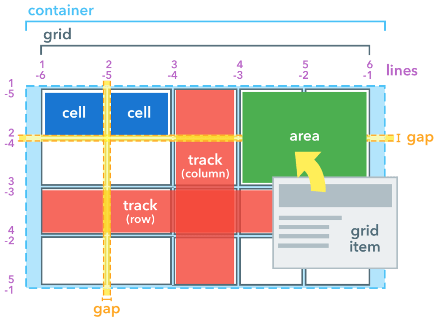
Important Terminology
Along with Grid Container and Grid Item there are some more essential terms that one should be aware of while learning 'grid'.
- Grid Line: The lines that create the structure of grid container are called as grid lines. The lines could be horizontal or vertical depicting rows and columns respectively.
- Grid Cell: The space between two adjacent columns is a single ‘’unit of grid or cell.
- Grid Track: The space between two adjacent grid lines is called as the grid track.
- Grid Area: A space that is surrounded by four grid lines is called a grid area. A grid area may contain any number of grid cells.
A Powerful weapon
The weapon is the 'fr' unit. It allows us to set the size of the track as a fraction of space of the grid container. This helps us make up the extra space left after the items are placed or if it’s a flexible item then manipulate it accordingly. However if there is a non-flexible item then the 'fr' unit kicks in only after the non-flexible item’s position is assigned.
Properties of Parent (Grid Container)
- display: It defines the grid container and establishes a new grid layout for its items.
.container{
   display: grid | inline-grid;
}
- grid-template-rows and grid-template-columns: It defines the columns and rows with a space-separated list of values.
The rows and columns can be assigned in two ways:
- Leave an empty space between track values (length, percentage, or a fraction of space using ‘fr’ unit) and the grid lines are automatically assigned positive or negative values.
- We can explicitly assign names to the lines. The names are bound inside square braces ‘[ ]’. Furthermore we can assign more than 1 name to a row/column.
.container {
  grid-template-columns: 40px 50px auto 50px 40px;
  grid-template-rows: 25% 100px auto;
}
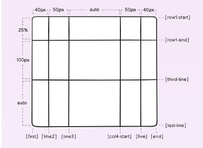
.container {
  grid-template-columns: [first] 40px [line2] 50px [line3] auto [col4-start] 50px [five] 40px [end];
  grid-template-rows: [row1-start] 25% [row1-end] 100px [third-line] auto [last-line];
}

- grid-template-area: Similar to the above property, this one defines the grid template by referencing the names of grid areas created using
grid-areaproperty. Syntax:
.container{
    grid-template-area: none | . | <grid-area-name>;
}
We are not naming the lines with this property, just the area. The lines are automatically named depending on the area name. Example- foo is the area name then the lines will be foo-start and foo-end.
- grid-template: This is a shorthand for grid-template-rows, grid-template-columns and grid-template-area. Syntax:
.container {
  grid-template: none | <grid-template-rows> / <grid-template-columns>;
}
- column-gap/row-gap: It is used to assign space between the columns and rows. But one thing to remember is that it does not assign a free space the the outer edges.
.container {
  column-gap: <line-size>;
  row-gap: <line-size>;
}
- grid-gap: This is a shorthand for the column-gap and row-gap property. If you do not mention the row-gap then it assigns the column-gap to it.
.container {
  grid-gap: <grid-row-gap> / <grid-column-gap>;
}
- justify-items and align-items:
justify-itemsproperty aligns the grid items along the inline or row axis whilealign-itemsproperty aligns the grid items along the block or column axis. The value assigned is applied to all the items inside the container. Syntax:
.container{
        justify-items: start|end|center|stretch;
        align-items: start|end|center|stretch;
}
- place-items: It is a shorthand for both
align-itemsandjustify-items. If the justify-items value is not mentioned then the align-items value is assigned to both properties. Syntax:
.container{
    place-items: <align-items> / <justify-items>;
}
-
justify-content, align-content and place-content:
When the total size of grid might be less than the size of grid container, the alignment of grid within the container is necessary. It usually happens when the items are set by non-flexible units.-
justify-contentaligns the grid along inline (row) axis. -
align-contentaligns the grid along block (column) axis. -
place-contentnaturally, it is the shorthand for the above properties. Syntax:
-
.container{
        justify-items: start|end|center|stretch|...;
        align-items: space-around|space-evenly|space-between|...;
        place-content: <align-content> / <justify-content>;
}
- grid: And finally the ultimate shorthand which can substitute
grid-template-rows,grid-template-columns,grid-template-areas, grid-auto-rows, grid-auto-columns and grid-auto-flow.
Properties of Children (Grid Items)
Note: float, display: table-cell|vertical-align|inline-block and column-* properties have no effect on grid items.
- grid-column and grid-row: By referring grid lines, the position of grid items is determined inside the grid using this property. It’s a shorthand for grid-column-start, grid-column-end, grid-row-start, and grid-row-end.
Syntax:
.item {
  grid-column: <start-line> / <end-line> | <start-line> / span <value>;
  grid-row: <start-line> / <end-line> | <start-line> / span <value>;
}
- grid-area: It’s used to give a name to an item which can be referenced by a template created using
grid-template-areas. It can also be used as a shorter shorthand for the grid-column-start, grid-column-end, grid-row-start, and grid-row-end. Syntax:
.item {
  grid-area: <name> | <row-start> / <column-start> / <row-end> / <column-end>;
}
- justify-self, align-self and place-self:
-
justify-selfaligns the grid along inline (row) axis. -
align-selfaligns the grid along block (column) axis. -
place-selfnaturally, it is the shorthand for the above properties.
-
Syntax:
.item {
justify-self: start | end | center | stretch;
align-self: start | end | center | stretch;
place-self: <align-self> / <justify-self>;
}
References:
CSS-Tricks
MDN Docs
W3Schools
Interactive way to learn:
Grid Garden
Well there’s the ending. Damn it’s long and if you read till the end, Thank you very much! Do let me know your thoughts and follow my Twitter and LinkedIn.

Top comments (0)