If you’re anything like me, you started out your design career at an agency. In an agency environment, the kinds of projects you work on are things like brand websites, marketing campaigns and occasionally an interesting business problem – interesting, but generally discrete and short-lived.
I moved from an agency into product, client-side, as they say, and it’s a different ball game. You own or work on a small part of a larger product, and the challenges include consistency across teams. In my case, there was an excellent rhythm of design and feedback, and though I was focusing on a small slice of a large (banking) application – it was deeply focused rather than at a high level. I was able to chat to end users each week and gained a real understanding of their needs and challenges.
At Sonalake, I design B2B and enterprise level software. The design challenges in this space are unique to it and certainly different from those I encountered in my previous roles. In this post, I want to share some of the challenges, and some of the things I’ve learned along the way.
The Customer is Often Not the User
Our clients’ customers are not their users. Considering they’re B2B (Business to Business) and not B2C (Business to Customer), this might seem like a silly distinction, but it really isn’t. When your business is selling to another business, the users’ voice is easily lost. There’s at least one additional category of stakeholder to consider.

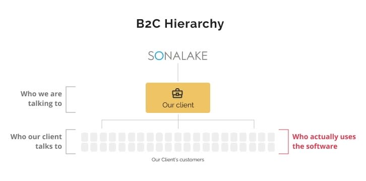
If you step back and look at it; from my clients’ perspective, they’re doing all the right things and being customer-centric; they’re defining requirements collaboratively. But remember, that the client is not the user – and the account manager/vendor manager/business development manager is not the person who spends 8 hours a day using the software.
Everybody thinks that they know what the users need, but they don’t. The ugly truth is that decisions are made based on personal opinion, biases, ease of implementation, and cost factors.
As a software partner, this is challenging. We provide a service to our client – and they provide a service to their clients who, in turn, maybe be providing a service to their customers. The users (employees) that rely on the software are generally not consulted. But they’re the ones best positioned to help improve efficiency, speed or service delivery with their insights.
Investing in up-front user research, and testing throughout the design process, results in a far better product for the actual users. Realistically, there are no shortcuts through design practice, but there are sources of information that can help steer the direction and inform design decisions. The following describe some to consider.
Customer Care Staff
It would be remiss to overlook the role that your support team plays as a source of valuable insight. They are on the front line, answering questions and helping customers and often have the best idea of where users are struggling with the software. A good place to start is to analyse the queries or complaints care staff receive and identify common threads and themes. But remember, not all people who use the software are calling in with problems. So taking the themes from customer care is indicative, rather than diagnostic.
In a similar vein, you could analyse the responses from your Help / Contact us sections of your service; if you can identify a pattern, or patterns, in feedback or complaints then it might point to something that warrants deeper investigation.
Analytics
Your analytics can give you great insights, but its value depends on what you’re measuring. Useful sources include user flows, common errors, time spent by users on steps or tasks. Analysing which form fields are most, and least, used can also be valuable in helping optimise flows.
A/B testing
A/B testing is the practice of randomly providing users with one of two variants of parts of an application user interface. By analysing how users interact with the software it is possible to make an assessment of which variant provides a better user experience. You can measure the interaction in many ways, but speed and accuracy of task completion is common.
Visual Hierarchy and Information Density
Another distinction between B2C and enterprise software is in the way they look, and, in particular, how much information is packed into individual pages. In the non-enterprise world, simplicity is the main aim. Designers strive for clean pages and use white space, not only for aesthetic reasons, but also to prioritise legibility and readability, clarify relationships, draw attention.
Not so in the B2B world. It’s not because we don’t love that aesthetic, but it’s got to do with practicality. A hard lesson I have had to learn designing enterprise software is that everything I valued before – padding, visual hierarchy, focused steps don’t have the same relative importance in enterprise software.
Information Density
Imagine you work with some software and are processing customers daily, many times over. Now imagine that every process is 10 steps long, and within each step there are ten things to do; for example, check, click on, fill in. This isn’t an unusual number of interactions in the enterprise world, and the only thing more annoying than a long process is having to do this over more pages than necessary, or with more clicks.
Counting clicks is not as important in B2C software, because the processes are generally not overly complicated. It’s common practice within B2C to build sparse workflows; think about how many apps you know that filling in your name and your email address are on different pages – it’s a common design pattern.
With enterprise though, there is so much data to capture and process that splitting up the process up into too many steps is frustrating. Enterprise users cannot operate efficiently when only making one choice per screen; between load times and the fact that there are often 100+ choices, it would just take too long to complete an end-to-end process.
So I’ve had to embrace things like “action button bars” that present multiple options, designing for keyboard navigation, and concealed details that, for example, show on rollover for example. I’ve also had to accept that body font can’t be as large as it would be on an app or public website and things need to be closer together, in general.
Navigation and Visual Hierarchy
As you can imagine, when there are multiple tasks to be completed on a screen, the order and flow of those things is very tricky to get right. I’ve been told many times that “there is no particular order” and that’s a strange concept for me to internalise and design around. What it really means is that despite there being a seemingly natural user journey, it can also be used in ad-hoc, difficult-to-predict ways.
At the same time, when the options are all equally weighted – there is virtually no visible hierarchy. Navigation is one of the most important and difficult aspects of any design, and enterprise software just doesn’t (and can’t) play by the same rules – it’s got a different use case, and has to be treated differently.
However, even within pages that have no particular input order, there are small things that can be done to keep the users’ orientation. For example, highlighting or emphasising the panel they’re currently on, and making sure that there is consistency across components helps a lot.
In some cases, you have to push back and/or dig deeper. Remember that just because something has always been done one way, doesn’t mean it can’t be improved. Questioning the necessity of fields or steps can reveal excess, and any trimming down is helpful. For example, capturing a landline, mobile phone and work phone number may not actually be necessary.
Configurability
I’ve not yet met an enterprise client that doesn’t offer different packaging or configurations to their customers. Sometimes this is role dependent, where different user roles have access to different features, but quite often it can be even more complex. For example, where customers can configure almost everything in the interface, to suit their specific needs.
This makes design extra difficult because it means that you have to think of design elements as pieces that can be composed by users in numerous ways. It also means that typical design tropes such as page templates are not really relevant – and without predictable page layouts, consistency is always at risk.
To address this, it helps to break the designs down into their constituent parts, for example text, buttons, icons, colours, cards, panels, making sure that each of these are consistent and can work together in a configurable way. What I’ve found helpful, and necessary, is to consider states for each: empty, error, filled (minimum), filled (maximum) to try and test whether the design of the components will fit into the sections in all their instantiations. Then, placing the various component states alongside other panels/components helps determine how pages will look in different scenarios.
There’s always a “worst case scenario” and a “best case scenario” – most of the time, the realistic use case is somewhere in the middle. All need to be considered though. Of course this means more effort upfront, but it helps down the line when new or previously undiscovered use cases are brought to light.
Conclusion
Enterprise design is unlike B2C design because typical guidelines around navigation, flow, visual hierarchy and density are simply not applicable and would do more harm than good. This comes down the most fundamental design principle: design with the user in mind. It can sometimes be difficult to do that in enterprise scenarios, so we need to find feedback where we can, but the other reason is because enterprise software is generally configurable, and so the user groups often have different expectations and experiences.
While it may be relevant in some products, configurability is often a cop-out. It’s seen easier than putting in the effort into understanding the users and their needs deeply. In reality, making software configurable exponentially increases the development complexity and isn’t always widely used. Investing in user research upfront (and throughout) results in much clearer requirements, like whether configurability is really necessary. Even where it is, the rest of the product strategy will be much more aligned with the users and that’s a win-win for all.

Top comments (0)