
Introduction
Qlik Sense is a complete data analytics platform that sets the benchmark for a new generation of analytics. It is a software developed for business intelligence and data visualization.
Data visualization, deals with the graphic representation of data.
Business intelligence (BI) mainly comprises of the strategies and technologies used by enterprises for data analysis of business information. Common functions of business intelligence technologies include reporting, online analytical processing, analytics, dashboard development etc.
Sources to get started with Development
Let’s get into basic understanding of how Qlik Sense looks, works and start our journey to create the first Qlik Sense application/dashboard.
You can download and install the trial desktop version of Qlik Sense from their official site here.
As an alternative, you could also get started by registering on Learning, which provides an access to Qlik Sense cloud. In both the cases, you would find the same interface as shown below.
Create your first app!
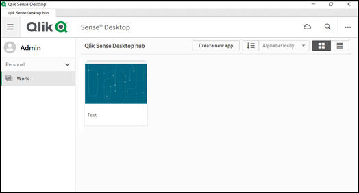
This is how your Qlik Sense hub would look like. You would initially have a “Personal” work space and there could also be another section which represents the “Streams” where individual dashboards could be published for a particular set of end-users’ perusal.
Currently, it contains a single application [interchangeably referred as dashboard] named “Test”. Nevertheless, we will go through from scratch and see how to create a new app.
As we click on the “Create new app” tab on the top right corner, it would provide a pop-up for the user to enter the name of their application.
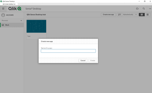
Once you provide a name – in my case I have named it “test_data”, it would re-direct and open the application.
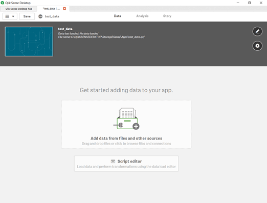
At this point, there are 2 ways to insert data into your dashboard. From my perspective, it is as follows:
You can drag and drop files (.xlsx, .csv, .qvd) or add data from other sources such as databases, it can be done using the Data Manager. Data Manager could be compared to a GUI app such as GitHub desktop, where all the instructions are straight forward and easier to follow. This approach is preferred by business analyst who is interested about the data visualizations rather than how the data is being consumed.
This method helps you write scripts to insert data from various sources, perform some modifications and data manipulations and load the data. Data load editor could be compared to a Git Bash, where syntax is given importance. Being a software developer, I prefer this approach since it gives me a lot of flexibility on how I want to model the data and create specific data connections through joins. All of this might be overwhelming right now, but you would be able to get a hang of it once you start working on the app.
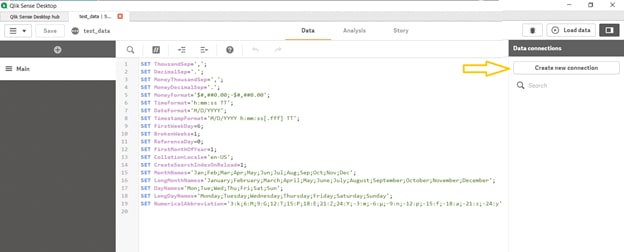
This is how it would look within the “Data Load Editor”. On the left we could have various sections within each of it, we could contain the code for specific data sets.
Currently we have the main section available, here, we have a set of default variables declared. They represent the default format of representation which could further be modified according to the user.
For example, we have the date format as ‘M/D/YYYY’ as default. However, we could change this to ‘DD/MM/YYYY’ too.
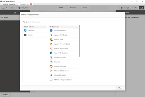
On the right side, we have an option to create new connections. Using this option, we can create connection strings to various data sources. A template of the available data sources options is shown below.
Let’s go ahead and choose the folder file location as our source. By doing so, we get the following window. We could re-direct to any of the local machine path (such as C:/, D:/ etc.) or connect to a network drive path as I have done.
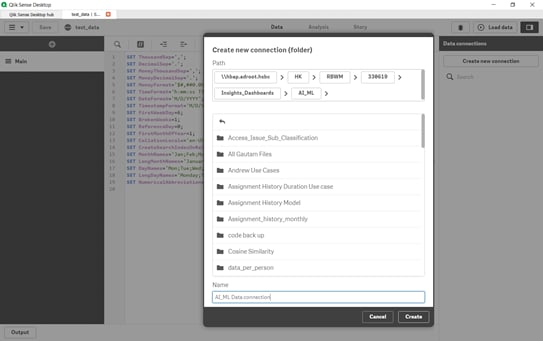
We choose our source data folder and provide a name to this data connection. In our case, I am connecting to the folder which contains AI_ML generated models, hence providing the connection name as “AI_ML Data connection”. In the same manner, we could create different connections to various data sources.
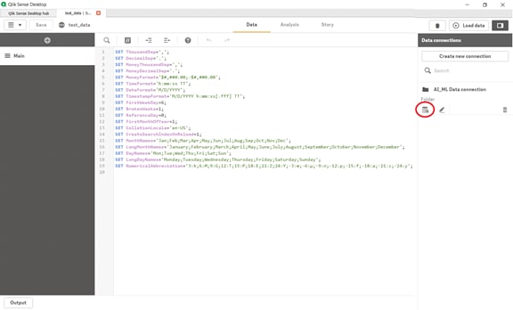
Once the data connection is created, it would be available in a list format. Now, we can go ahead and choose the respective data tables/files from this connection by selecting the following icon.
It would open the same layout as the file explorer would do and we can then choose the data file. Qlik Sense provides a flexibility to choose all the fields within the data or a subset of it. The selections can be done using the checkbox if the number of attributes are lesser, or filter on a particular field by using the filter field option.
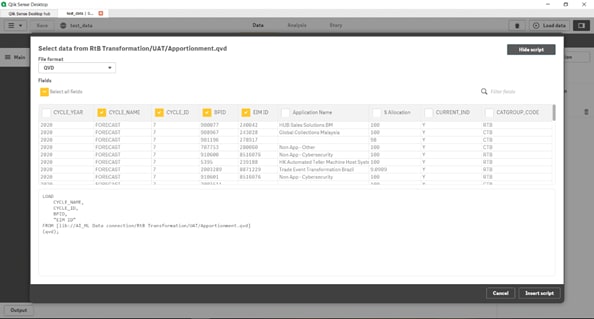
By doing so, Qlik Sense engine generates a script for all the selections that we have made. We can go ahead and insert this script on the data load editor. The same process would be applied to insert data from any source. Although it is not mandatory, it is a good practice to create separate sections for individual table/file’s data.
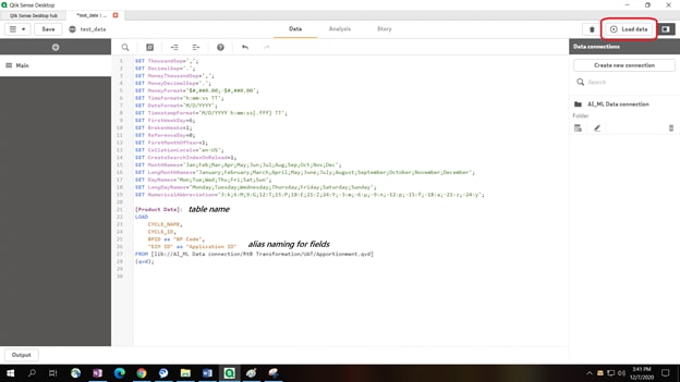
This is where the developer has all the freedom to modify and manipulate data according to the business needs. There is a plethora of options available to perform data manipulation, which I would cover in my upcoming articles.
For now, we can name the table according to our needs (“Product Data” in this instance). We could also rename the field names by aliasing as shown above. Once all the data sets are considered, we go ahead and click on “Load Data” to include this data into the application.
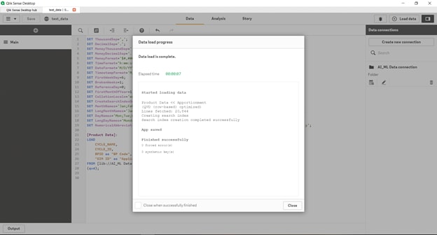
You can track the progress and duration of this data load using the below console. It provides information about which table is being loaded, how many lines of data is present within this file and how long it took to upload the data on this Qlik Sense application.
This console would be the same place to identify if there are any errors within our code too. At the end of a successful load, it would provide the following message.
At this moment, our backend scripting comes to an end and we can now move into the front end data visualization. You would need to click and move to the “Analysis” tab from the “Data” tab.
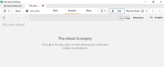
This front end layout is quite simple and easy to follow. Once you select the edit option, you would be provided with the below layout. On the left panel, there are 4 options:
• Fields: It shows a list of all the field names which have been included as a part of this dashboard through the script.
• Master Items: This section lets the developer create their own dimension and measure values. We will discuss on them shortly.
• Charts: They are a set of pre-defined charts available such as Bar Chart, Line Chart, Pie Chart, Table, Pivot table etc.
• Custom Objects: A developer also has an option to create and include their own charts and objects for a particular visualization. These objects would be present within this section. Look into “Qlik Sense Extension” for more information about these custom objects.
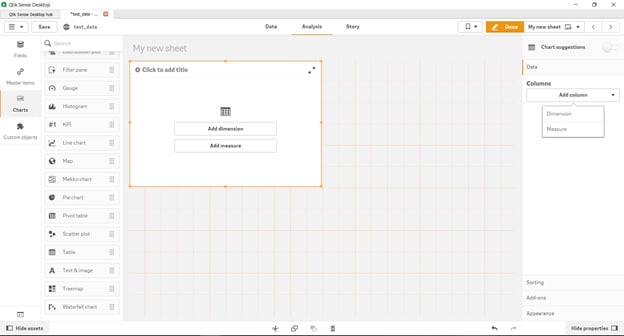
We could drag and drop any of these charts into the sheet section. Since the sheet is represented as a grid structure, it is easier for us to re-size and organize all the chart objects effortlessly. The height and grid spacing of this sheet could be altered using the sheet property option.
Once we place any chart object, the properties panel would come up on the right side. We get an option to add a dimension and/or measure.
- Measures are numerical values that mathematical functions work on. For example, a sales revenue column is a measure because you can find out a total or average the data.
- Dimensions are qualitative and do not total a sum. For example, sales region, employee, location, or date are dimensions.
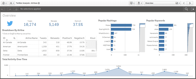
You could play around various types of charts along with different dimension and measures to create a simple dashboard. You may refer to the below visualization as an example and replicate the same with some dummy data.
Here, we are showing the Twitter Analysis of airlines. The different charts considered here are: bar charts, line chart, simple table, KPI (Key Performance Indicator) and a Text/Image chart.
I know it was a very long post. If you have read through until here, I am really grateful to you! Feel free to provide your feedbacks.
Hope this article helped you get a basic understanding on what Qlik Sense is and how we could get started with Qlik sense dashboard development.
I am planning on creating more content for the same topic. Let me know if there is any specific topic you want me to cover.
Peace!

Top comments (0)