
The cumulative flow diagram is one of the most common charts used to track progress for agile teams. You can generate the chart using just a kanban board with tasks being moved across columns. No additional data is required.
What is a Cumulative Flow Diagram (CFD)?
CFDs are simple stacked area charts that show the number of tasks in each column of the kanban. The lowermost line indicates the number of items in the completed state at any point in time. The progress of this line also serves as the burnup graph of the entire process.
Reading a Cumulative Flow Diagram:
Consider a simple CFD for a Kanban board with 4 columns: Backlog, In Development, QA and Deployed.
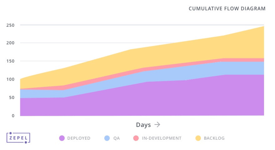
The chart shows the number of items in each stage of the workflow over a period of time. To understand the distribution of work at any point in time, just read the graph for that particular day.
The bottommost section (purple area) of the graph shows the number of completed items in the board. As teams complete more and more items, this section of the graph is expected to keep growing. This section also serves as a burnup graph.
The lines above this indicate the other statuses on the board and the number of tasks in each of them. The topmost line indicates the backlog.
Work in Progress is indicated by the area between the lines that are not the “backlog” or the “deployed” states. This is an important measure as it is the biggest indicator of the performance and direction of the team.
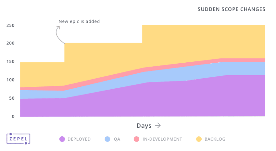
Scope Changes happen when new items are added into the backlog. Many teams are constantly specifying user stories and adding them to the development backlog. It is also very common to see sudden scope changes in steep steps when large epics are specified and tasks are added together.
Common Cumulative Flow Diagram Patterns
The Ideal Cumulative Flow Diagram:
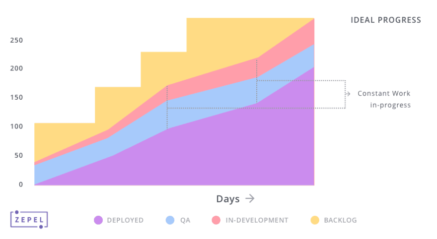
An ideal CFD is one where :
The completed items are growing steadily. This indicates that the team is steadily able to complete tasks and take up new ones.
All the in progress lines are more or less parallel. This indicates that work in the different stages are consistently being finished and moved to the next stage in the workflow.
The backlog is constantly growing. This indicates that the features are being picked and specified at a pace that matches the velocity of the development team. This is rarely the case though. Items tend to be added to the backlog in chunks, especially after meetings.
When a team struggles in any part of their workflow, the chart will deviate from its ideal form. When this happens, you should identify blockers and address them in standup meetings.
Work in Progress is constantly increasing:

This graph shows that the team is taking up more work without completing current tasks. This is a surprisingly common pattern, especially for disorganised teams. A graph like this is usually an indicator that deadlines are not going to be met and targets will be missed.
This trend needs to be identified quickly and corrective measures need to be taken. The best way to prevent this from happening is to set WIP limits for the columns in your Kanban board.
A Single Team is Getting Blocked
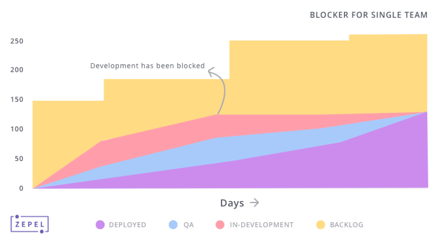
When a single team is blocked, the area under the cumulative flow graph for that team is constantly decreasing. The blocked team is unable to keep up with the other teams who are completing their tasks much faster.
A good indicator that a team might be blocked is the flatlining of a particular status. For instance, in the example above - “In development” starts to flatline as they aren’t able to complete tasks and move them into the next status. It is essential to use standup meetings to resolve blockers and prevent this from happening. Setting and maintaining WIP limits can also help prevent this scenario.
Multiple teams are simultaneously blocked
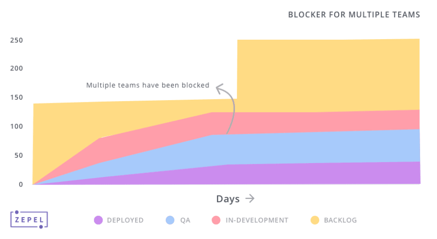
When multiple teams are blocked, their respective statuses are constantly flatlined - leading to a graph like the one shown above. This situation arises when the entire team has stopped progress to work on something different. The most common scenario is when the entire team stops working on new features to fix a major production bug.
Sometimes, your graph may end up looking like this at the end of a long weekend or a team holiday - so be sure to understand the root cause of a flat CFD.
Using Cumulative Flow Diagrams Effectively:
CFDs are a great way to keep your kanban process on track. They are easy to understand visualizations that can be generated from very little data.
Like all other tools in a product owner’s repertoire, following a few best practices can help smoothen processes and improve your team’s efficiency.
- An ideal CFD constantly trends upwards, with a steady number of work-in-progress (WIP) items.
- Setting the right number of columns for your Kanban board makes the graph more readable.
- A constantly increasing WIP will lead to more meetings and missed deadlines.
- The only time WIP should increase is when new members are added to the team.
- Enforce WIP limits to spot and remove blockers before they begin to affect other teams.
- Use the Cumulative Flow Diagram to help track your progress during daily standups.

Top comments (0)