
In order to have good flow in your work, you should optimize all possible operations using a ribbon control. A ribbon control is a tool that allows you to group tasks together so they can be performed in sequence.
We at Syncfusion have developed a Ribbon control for the WinUI platform that allows you to organize an application’s commands and tools into a series of tabs. The Ribbon control for WinUI is now available in our 2020 Volume 4 release.
We have also released five other new controls and 10+ chart types with this release for the WinUI platform. Please do check them out on our what’s new page.
The Ribbon has the following essential features in its initial release:
Let’s look at these features and how to integrate this new WinUI Ribbon control into your application.
Tabs and groups
We can categorize the commands in our application using the ribbon tabs and groups feature. Ribbon groups can host ribbon items and custom items. A ribbon group contains a launcher button that reveals additional tools in the group.
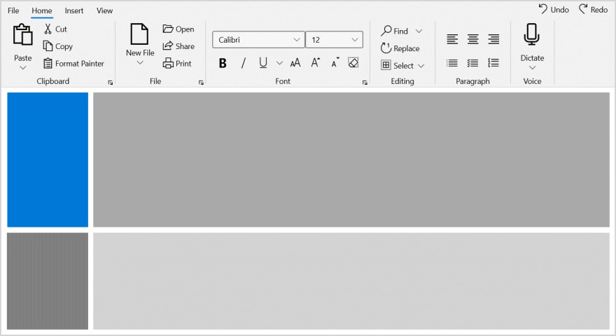
Refer to the following screenshot.

Built-in ribbon items
The WinUI Ribbon control supports built-in command items like buttons, drop-down buttons, and split buttons. These buttons support the following three size modes to fit into the available space:
- Large
- Normal
- Small

Custom ribbon items
A ribbon group can also host and display any kind of custom control, such as combo boxes, text boxes, radio buttons, and check boxes using the Ribbon item host.

Right pane
Frequently used items can be placed in a pane on the right side of the tabs. The content in the right pane will always be shown, irrespective of the currently selected tab.

Backstage
The Ribbon control contains a separate view called backstage. It is used to hold the application’s information and basic settings. This backstage can hold any kind of view, like the navigation view. Also, you can host the default backstage view, which comes with the Ribbon control.
Refer to the following GIF image.

Theming
The Ribbon control is available in both light and dark themes like in the following screenshot.

Getting started with the WinUI Ribbon
Now that we’ve seen some features of the WinUI Ribbon control, let’s cover the steps to add it in your application and use its basic features.
Step 1: Create a WinUI application
First, create a simple project using the instructions provided in the Get started with your first WinUI UWP app documentation.
Step 2: Add the Syncfusion.Ribbon.WinUI NuGet package
Then, add the Syncfusion.Ribbon.WinUI NuGet package to the application from nuget.org or from the installed location “C:\Program Files (x86)\Syncfusion\Essential Studio\WinUI\xx.x.x.xx\NuGetPackages”.
Note: xx.x.x.xx denotes the version of the Syncfusion WinUI Ribbon package.
Refer to the following screenshot.

Step 3: Add namespace
Now, include the ribbon namespace in your XAML file like in the following code.
xmlns:ribbon="using:Syncfusion.UI.Xaml.Ribbon"
Step 4: Initialize the Ribbon
Initialize the Ribbon control and add the ribbon tabs and ribbon groups like in the following code example.
<ribbon:SfRibbon>
  <ribbon:SfRibbon.Tabs>
    <ribbon:RibbonTab Header="Home">
       <ribbon:RibbonGroup Header="Clipboard">

       </ribbon:RibbonGroup>
       <ribbon:RibbonGroup Header="Views">

       </ribbon:RibbonGroup>
    </ribbon:RibbonTab>
    <ribbon:RibbonTab Header="Insert">

    </ribbon:RibbonTab>
    <ribbon:RibbonTab Header="Help">

  </ribbon:RibbonTab>
 </ribbon:SfRibbon.Tabs>
</ribbon:SfRibbon>
Step 5: Add commands
Within the ribbon group, add commands as buttons, drop-down buttons, split buttons, or host any custom control such as a combo box, text box, radio button, or check box on using the RibbonItemHost.
Refer to the following code example.
<ribbon:RibbonGroup Header="Clipboard">
<ribbon:RibbonSplitButton Icon="Paste"
Content="Paste"
SizeMode="Large">
<ribbon:RibbonSplitButton.Flyout>
<MenuFlyout>
<MenuFlyoutItem Text="Paste" />
<MenuFlyoutItem Text="Paste Special" />
<MenuFlyoutItem Text="Set Default Paste" />
</MenuFlyout>
</ribbon:RibbonSplitButton.Flyout>
</ribbon:RibbonSplitButton>
<ribbon:RibbonButton Icon="Cut"
Content="Cut"
SizeMode="Normal" />
<ribbon:RibbonButton Icon="Copy"
Content="Copy"
SizeMode="Normal" />
<ribbon:RibbonButton Content="Format Painter"
SizeMode="Normal">
<ribbon:RibbonButton.Icon>
<FontIcon Glyph="/" />
</ribbon:RibbonButton.Icon>
</ribbon:RibbonButton>
</ribbon:RibbonGroup>
<ribbon:RibbonGroup Header="Views">
<ribbon:RibbonItemHost>
<ribbon:RibbonItemHost.ItemTemplate>
<CheckBox Content="Ruler" />
</ribbon:RibbonItemHost.ItemTemplate>
</ribbon:RibbonItemHost>
<ribbon:RibbonItemHost>
<ribbon:RibbonItemHost.ItemTemplate>
<CheckBox Content="Gridlines" />
</ribbon:RibbonItemHost.ItemTemplate>
</ribbon:RibbonItemHost>
<ribbon:RibbonItemHost>
<ribbon:RibbonItemHost.ItemTemplate>
<CheckBox Content="Navigation Pane" />
</ribbon:RibbonItemHost.ItemTemplate>
</ribbon:RibbonItemHost>
</ribbon:RibbonGroup>
The previous code will create the Ribbon with its commands and will look like the following screenshot.

GitHub reference
You can find the WinUI Ribbon demo project in this GitHub location. On executing this sample, you will get output like in the following screenshot.
Coming soon
We are currently working on providing the following features for the WinUI Ribbon control in our upcoming releases:
- Simplified Ribbon.
- Resize Ribbon items support.
- Ribbon gallery control.
Conclusion
I hope you enjoyed learning about the new Syncfusion WinUI Ribbon control and its features. This control is available in the 2020 Volume 4 release. You can find the user guide here. Explore other samples of the WinUI Ribbon control from this GitHub location. Additionally, you can download and check out our demo app in the App Center.
For current customers, the new version is available for download from the License and Downloads page. If you are not yet a Syncfusion customer, you can try our 30-day free trial to check out our newest features.
Also, if you need specific features in our WinUI Ribbon, please let us know in the comments section below. You can also contact us through our support forums, Direct-Trac, or feedback portal. We are always happy to assist you!

Top comments (0)