
Howdy! In this blog, we’ll replicate an online store UI based on this Dribbble design.
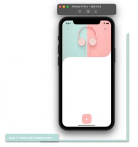
We are going to develop the UI based on the steps specified in the following image.

Before starting, let’s highlight some important points. In this blog post, we will learn to:
- Create continuous rounded edges and a floating button, as shown in the previous image.
- Use the Syncfusion Xamarin.Forms NumericUpDown control.
Let’s code!
Main layout
Let’s start by organizing the main layout of the UI.
I choose the DataGrid in this case, and we will divide the entire screen into two rows:
- Row 1 : Contains the main image.
- Row 2: Contains the frame displaying all the product information and the floating button.
Refer to the following code example.
<!-- Main layout-->
 <Grid RowDefinitions="Auto,*"
       BackgroundColor="White"
       RowSpacing="0">
     <!-- Here you must add the code blocks explained in steps 1 and 2.-->
 </Grid>
Important Note: Here, we have included RowSpacing=”0″ and BackgroundColor=”White” to make the curve layout look smooth and natural.
Step 1: Main picture

Let’s render the following three components:
Left and right buttons: This first block will be contained in a grid with two columns defined with proportional values. We will add a button in each column.
Main image: To render the bottom-right rounded edge, use the PancakeView. Add the image covering both columns of the grid (using Grid.ColumnSpan=”2″).
Refer to the following code.
<!-- 1. Main picture-->
 <PanCake:PancakeView Grid.Row="0" CornerRadius="0,0,0,60">
   <Grid ColumnDefinitions="*,*">
     <Image Grid.Column="0" Grid.ColumnSpan="2" HeightRequest="280" Aspect="AspectFill" Source="MainImage"/>
       <Button Grid.Column="0" ImageSource="Arrow" BackgroundColor="Transparent" Margin="20,40" VerticalOptions="Start" HorizontalOptions="Start" HeightRequest="50" WidthRequest="50" CornerRadius="14" BorderColor="Silver" BorderWidth="1"/>
       <Button Grid.Column="1" ImageSource="Points" BackgroundColor="Transparent" Margin="20,40" VerticalOptions="Start" HorizontalOptions="End" HeightRequest="50" WidthRequest="50" CornerRadius="14" BorderColor="Silver" BorderWidth="1"/>
   </Grid>
 </PanCake:PancakeView>

<!-- You must write here what is explained in the next code block -->
Step 2: Frame and floating button
This second step is necessary to achieve the effect of continuous curves in our design.
Grid to cover the detailed information
We will start by adding a DataGrid control, followed by the PancakeView. Render the upper-left edge as curved in shape so that the continuity with the previous step is noticeable.
The grid has a background color the same as the image has on the left side. This is important to achieve the expected design and the feel of continuity.
Add a DataGrid control inside the PancakeView to add all the product details. Set the BackgroundColor property to white to reflect the division of the curves.
Refer to the following code example.
<!--2. Detail information-->
 <Grid Grid.Row="1" HorizontalOptions="FillAndExpand" BackgroundColor="#c6dad4">
   <PanCake:PancakeView CornerRadius="60,0,0,0">
     <Grid RowDefinitions="*" BackgroundColor="White">
        <!-- You must write here what is explained in the next code block -->
     </Grid>
   </PanCake:PancakeView>
 </Grid>
Floating button
As you can see, we have a square button that floats. Let’s see how to create this.
First, within the grid of the previous code block, add a tag. Within this layout, add another DataGrid control to structure the desired information.
Refer to the following code example.
<ScrollView Grid.Row="0" Padding="0,0,0,90" VerticalScrollBarVisibility="Never">
 <Grid ColumnDefinitions="*,*" RowDefinitions="Auto,Auto,Auto,Auto,Auto,Auto,*" Padding="30">
   <!-- You must write here what is explained from step number 3 -- >
 </Grid>
</ScrollView>
<!-- Add floating button here -->
Now, add the floating button below the ScrollView in the same row that you added the ScrollView. This way, the content will be placed inside the layout, and the button will be placed outside but in the same line. That’s why you see it floating.
Note: For more details, refer to the Simple way to create a Floating Button in Xamarin.Forms blog by Leomaris Reyes.
<!--Float Button-->
 <Button Grid.Row="0" Text="+" FontAttributes="Bold" FontSize="35" BackgroundColor="#fabfbc" BorderRadius="23" TextColor="White" HorizontalOptions="Center" WidthRequest="75" HeightRequest="75" Margin="0,0,20,22" VerticalOptions="End"/>
Step 3: Product details
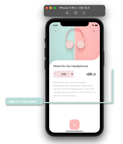
Let’s continue adding the details of the product.
Label
Refer to the following code example to render the label.
<!--Title-->
 <Label Grid.Row="0" Grid.Column="0" Grid.ColumnSpan="2" FontSize="21" FontAttributes="Bold" Text="Wired On-Ear Headphones" TextColor="#665a5a"/>

<!-- You must write here what is explained in the next code block -->
Counter
Let’s add the Syncfusion Xamarin.Forms NumericUpDown control to design the counter.
First, add the Syncfusion.Xamarin.SfNumericUpDown NuGet package to all your projects.
Note: For more details, refer to Xamarin.Forms NumericUpDown control documentation

Then, add the Syncfusion.SfNumericUpDown.XForms namespace in your XAML file.
xmlns:updown="clr-namespace:Syncfusion.SfNumericUpDown.XForms;assembly=Syncfusion.SfNumericUpDown.XForms" x:Class="OnlineStoreApp.Views.DetailPage"
That’s all! To add the NumericUpDown control, you now just have to use the alias given to the namespace like in the following code example.
<!--Counter & price-->
 <updown:SfNumericUpDown Grid.Row="1" Grid.Column="0" Value="3" HeightRequest="50" Margin="0,15" BackgroundColor="#f6e1e1" SpinButtonAlignment="Both" TextAlignment="Center">
  <updown:SfNumericUpDown.IncrementButtonSettings>
   <updown:UpDownButtonSettings BackgroundColor="#f8e7e9"/>
  </updown:SfNumericUpDown.IncrementButtonSettings>
  <updown:SfNumericUpDown.DecrementButtonSettings>
   <updown:UpDownButtonSettings BackgroundColor="#f8e7e9"/>
  </updown:SfNumericUpDown.DecrementButtonSettings>
 </updown:SfNumericUpDown>

<!-- You must write here what is explained in the next code block -->
Price
Let’s render the price details. Use the FormattedText to create the same text with different characteristics in the same label.
<Label Grid.Row="1" Grid.Column="1" VerticalTextAlignment="Center" HorizontalTextAlignment="End">
 <Label.FormattedText>
   <FormattedString>
     <Span Text="$" FontSize="18"/>
      <Span Text="26." FontSize="25" FontAttributes="Bold" />
     <Span Text="99" FontSize="18" />
   </FormattedString>
 </Label.FormattedText>
</Label>

<!-- You must write here what is explained in the next code block -->
Description
Refer to the following code example to render the description section.
<!--Description-->
 <Label Grid.Row="2" Grid.Column="0" Grid.ColumnSpan="2" TextColor="Silver" LineHeight="1.2" Text="Maximizing your personal audio experience has never been easier than with Our Monitor headphones. Built with combat and goodness in mind, there's no need to compromise."/>

<!-- You must write here what is explained in the next code block -->
Step 4: Related products
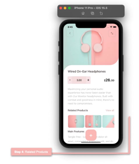
** ** Finally, let’s add the related products.
Titles
Refer to the following code to render the title.
<!--Related Products details-->
  <Label Grid.Row="3" Grid.Column="0" FontAttributes="Bold" Text="Related Products" TextColor="#665a5a" Margin="0,20,0,15"/>
  <Label Grid.Row="3" Grid.Column="1" Text="View all" HorizontalOptions="End" TextColor="#d4acaa" Margin="0,20,0,15"/>

<!-- You must write here what is explained in the next code block -->
Related products list
We use the CollectionView to display the list. We will use a Frame to make the round edges of each image in the list.
<CollectionView Grid.Row="4" Grid.Column="0" Grid.ColumnSpan="2" HorizontalScrollBarVisibility="Never"
                ItemsSource="{Binding products}"
                ItemsLayout="HorizontalList"
                HeightRequest="95">
  <CollectionView.ItemTemplate>
    <DataTemplate>
      <Grid Padding="1,0,5,10">
       <Frame Grid.Column="0" BorderColor="Transparent" HorizontalOptions="Start" VerticalOptions="Start" WidthRequest="110" HasShadow="False" CornerRadius="10" Padding="0" IsClippedToBounds="True">
        <Image Source="{Binding Picture}" Aspect="Fill" />
       </Frame>
      </Grid>
    </DataTemplate>
  </CollectionView.ItemTemplate>
</CollectionView>

<!-- You must write here what is explained in the next code block -->
Main features and description
Refer to the following code example to render the main features and descriptions of the products.
<!-- Main features & description-->
  <Label Grid.Row="5" Grid.Column="0" FontAttributes="Bold" Text="Main Features" TextColor="#665a5a"/>
  <Label Grid.Row="6" Grid.Column="0" Grid.ColumnSpan="2" TextColor="Silver" LineHeight="1.5" Text="Tangle-free - Lorem ipsum dolor sit amet, consectetur adipiscing elit, sed do eiusmod tempor incididunt ut labore et dolore magna aliqua. "/>
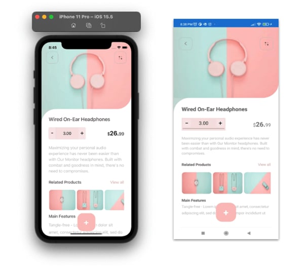
And our UI is done! You can see the full screen we built for both Android and iOS devices.
GitHub reference
To see the complete code, refer to our Online Store UI in Xamarin.Forms demo on GitHub.
Conclusion
Thanks for reading! In this blog, we have seen how to replicate an online store UI in Xamarin.Forms with Syncfusion UI controls. Try out the steps here and build your stunning online store UI!
Syncfusion’s Xamarin suite offers over 150 UI controls, from basic editors to powerful, advanced controls like Charts, ListView, and Rich Text Editor. Use them to build elite applications!
For questions, you can contact us through our support forum, support portal, or feedback portal. We are always happy to assist you!

Top comments (0)