
Introduction
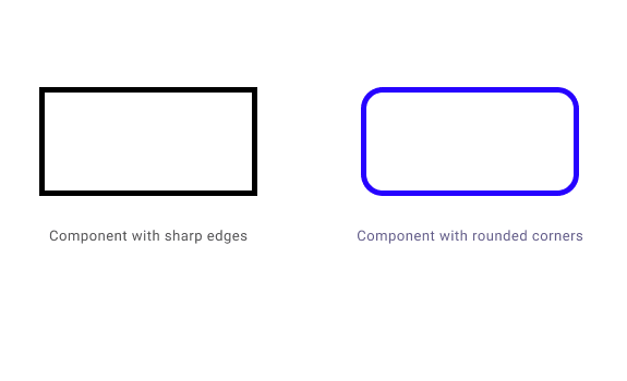
Round corners. Everywhere.
( #teamroundcorners😍 )
Do you love rounded corners on websites? You are not alone. Many web designers prefer to use rounded corners for various elements, from buttons to carousels. But why are rounded corners so popular? Here are some reasons:
User friendly
Rounded corners create a sense of safety, protection, warmth and friendliness. They make us feel comfortable and secure, unlike sharp corners that can trigger a fear of danger or harm. 😊Easy access
Rounded corners guide our eyes towards the center of the shape. They help us focus on the content inside the shape, without being distracted by the edges pointing outwards. They also reduce the visual clutter and make the design more appealing. 👀More effective
Rounded corners enhance the readability and usability of the web elements. They make the content stand out and attract attention. They also create a smooth and natural flow of information, making the user experience more enjoyable and satisfying. 🙌
Material Design 😎
Today, we are going to explore the journey of these corners over the years by looking at the most used design system, Material Design, and its transformation in terms of this trend. 🚀
Material UI is a design language created by Google that serves as a standard reference for UI design. It was first released in 2014, and it has been more than 8 years since then. Things have changed, and so have the components of this extensive design system. Let’s take a trip down memory lane and revisit them. 🕰️
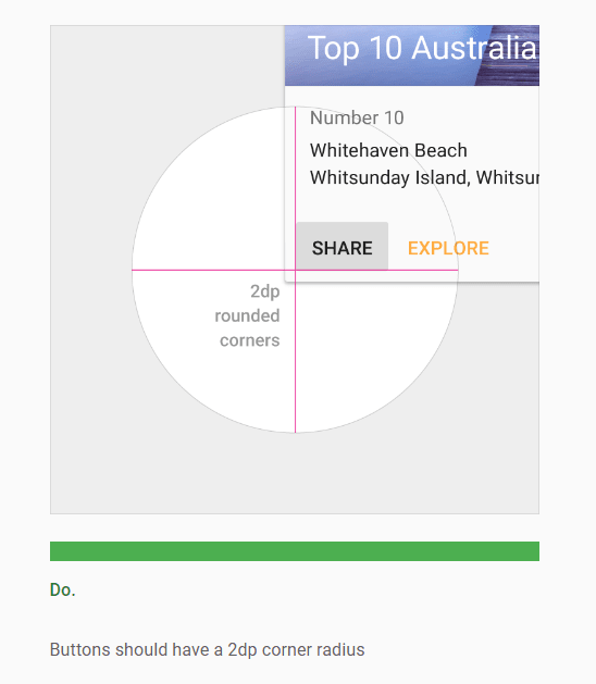
Material Design 1
The first version of Material Design recommended having about 2 dp rounded corners on small components like buttons. 🔘
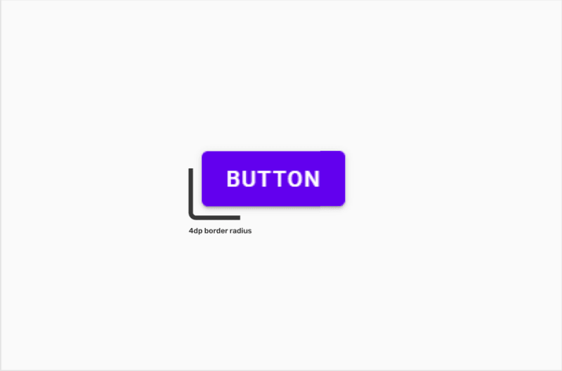
Material Design 2
The next release had a lot more circular corners. The buttons and other elements became more rounded and smooth, creating a softer and friendlier look. 🥰
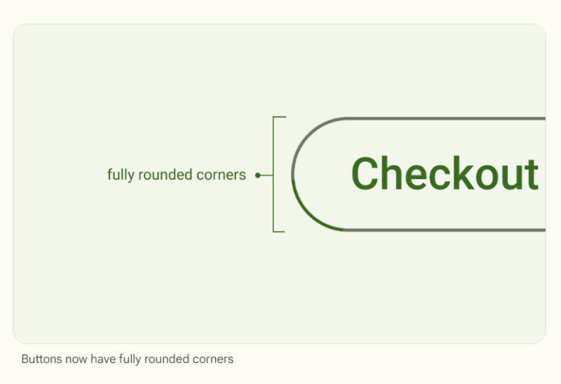
Material Design 3
The latest material design has shifted its buttons from having small border radius to being pill-shaped. The buttons and other elements now have fully rounded edges, creating a sleek and modern look. 🚀
Overall Comparison 🔍
For comparison purposes, we have chosen buttons. The changes can also be observed from other components. The buttons show how the design system has evolved over the years, from slightly rounded to fully rounded corners. 🔄
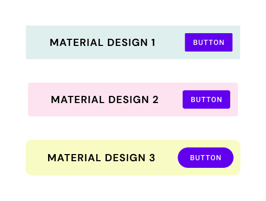
As the pictures speak louder than the words, we can clearly see the choice of border radius being changed to a great extent.
Conclusion 🎓
What was once a choice has now become a fashion. Material design was analyzed as a standard example, but apart from this design system and its principles, we can see that websites in general have learned to include the friendly vibes of corner radius more than ever before. 😊 Only time can tell if this trend is the future or just a fad. ⏳
Don’t forget to share your thoughts in the comments. 💬

Top comments (0)