
Co-authored by @hosseintalebi | Main post
Building reusable design system components is a great way for an engineering team to accelerate delivery, improve communication between designers and engineers, and provide a consistent experience for end-users. When your components act in service of a design system, which in turn acts in service of your product’s UX patterns, a cohesive product can be built even as the number of contributors to the product grows.
As the product evolves and grows, new use cases will emerge that simply don’t exist right now. Your design team will inevitably identify opportunities to extend, enhance, and otherwise evolve the user experience, and so too must the component library evolve.
When it comes to a component library, this constant change becomes challenging. A single component can be used across multiple products thus any change to that component can potentially result in regression in the system.
So with all this in mind, how might we build components that are opinionated enough to drive cohesion in the product, yet flexible enough to adopt future changes without introducing breaking changes and regression?
In this article we look at the Compound Components pattern as one of the patterns for solving this problem. We will show how Separation of Concerns and the Compound Components pattern can help us build a firm, flexible, and resilient component library.
The Saga of Developing a List Component
We are going to demonstrate the Compound Component pattern and the problem that it solves using a contrived example of building a List component. We will use React and TypeScript for building this example. Let's get started!
Initial Attempt to Build a List Component
Our designer, Destin, and our Engineer, Enna are working together to build a component library. They have realized that there is a need for a List component that can be used in different parts of the product.
Destin (the designer): Hey, we need to add a List component to our component library. It's nothing fancy! We just need a list of items like this:

Enna (the engineer): It looks simple. I'm on it!
Enna considers that the List component should be opinionated about how the items are rendered to ensure consistency across the product. She decides to make the List component responsible for rendering the items. In her vision, the items are sent to the List as a prop and the List takes care of rendering them. She starts building the List component with an interface like this:
interface ListItem {
  title: string;
  description: string;
}
interface ListProps {
  items: ListItem[];
}
After a bit of coding, she builds the List component that can be used like this:
const items = [
  {
    title: "item 1",
    description: "description for item 1",
  },
  {
    title: "item 2",
    description: "description for item 2",
  },
  {
    title: "item 3",
    description: "description for item 3",
  },
];
...
<List
  items={items}
/>
It looks elegant, easy to use, and ensures that wherever it's used, the items get rendered exactly the same.
A couple of weeks pass and Destin comes back with a new request.
Destin: Our research has shown that having an icon beside the list items will help people to distinguish between the items more easily. Can we make this happen?

Enna: It should be straightforward. I can 💯% make that happen!
She looks at the List component and decides to add an icon property to each item:
interface ListItem {
  icon: IconName;
  title: string;
  description: string;
}
interface ListProps {
  items: ListItem[];
}
This new change now requires all the instances of the List to receive an icon for each item. But that's not a big deal.
const items = [
  {
    icon: "icon1",
    title: "item 1",
    description: "description for item 1",
  },
  {
    icon: "icon2",
    title: "item 2",
    description: "description for item 2",
  },
  {
    icon: "icon3",
    title: "item 3",
    description: "description for item 3",
  },
];
...
<List
  items={items}
/>
The List component is now in the wild and people are happily using it. But Destin is thinking of new use cases for the component.
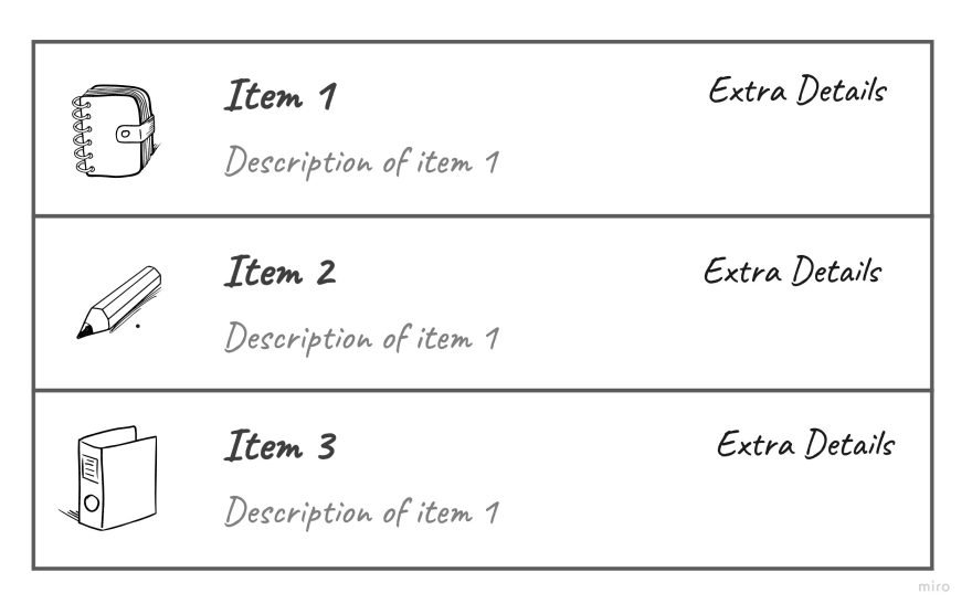
Destin: Hey, we have realized two new use cases for the List component. There are some lists that we would like to have an action button for each item. In some other lists, we would like to have some extra details text in place of the button:

Enna: Interesting... this is going to make the List component complex but let me see what I can do.
Enna realizes that now she has two different types of list items. Some of the properties are shared between the two types (like the title) and some are unique to each item type. She decides to extract the shared properties into a new interface named ListItemBase and define ActionListItem and ExtraDetailListItem that extend the ListItemBase:
interface ListItemBase {
  icon: IconName;
  title: string;
  description: string;
}
interface ActionListItem extends BaseListItem {
  type: "ListItemWithAction";
  action: {
    label: string;
    onClick(event: React.MouseEvent<HTMLButtonElement>): void;
  };
}
interface ExtraDetailListItem extends BaseListItem {
  type: "ListItemWithExtraDetail";
  extraDetail: string;
}
The items in the ListProps now have a new type:
interface ListProps {
  items: (ActionListItem | ExtraDetailListItem)[];
}
The interface looks okay-ish but now there should be a decision statement inside the List component that decides whether to render an ActionListItem or ExtraDetailListItem.
She decides that a single decision statement is not a big deal and she goes on with changing the List component to support the two new types of list items.
One day when Destin is working on designing a feature for communications, he realizes that the List component can be used for rendering a list of messages. He presents the new use case to Enna.
Destin: In this new use case we want to show an avatar instead of the icon. We also want to open the conversation when people click on the message item. I forgot to mention that we need to have a way to indicate if the message is unread. Can you make the List component handle this?

Enna: Hmmm... we can change the List component to handle this use case but it will add a lot of complexity to the component.
There are going to be more and more use cases for new types of list items. Adding those use cases to the List ensures there's a unified way of rendering items which will provide the consistency we would like to have across our products. But with every single change to the List, we increase the chance of regression for all instances of the List. No need to mention that we are also adding more and more complexity to the List which makes its maintenance harder. So what can we do?
How did we end up here?
It all started with the initial List component. In the initial version, the List component had two separate responsibilities:
- Rendering a list of items
- Managing how each item should be rendered
Rendering a list of items is the actual responsibility of the
Listcomponent, but how each item gets rendered could have been extracted into its own set of components.
Separation of Concerns Using Compound Components
Separation of concerns is here to help. By separating every concern of our component into its own component, we can reduce the complexity and make it easier to embrace future changes.
How do we figure out different concerns of the component? One easy way to think about concerns is to think about the reasons that each piece of software has for changing. Huh...? Let me explain more. Imagine the List component. The list items can change depending on the feature we are building and the customer's needs. The requirement for the list itself would not generally change from feature to feature. So the list and list items have different reasons for changing. This means they are different concerns.
Now that we figured out the two concerns of the List component, how can we separate them? Compound Components are the way to accomplish this. The List component can accept its items as children like this:
<List>
  {items.map(({ icon, title, description }) => {
    <ListItem {...{ icon, title, description }} />;
  })}
</List>
There are some immediate advantages to this approach:
- The complexity is broken down into smaller components
- Changes in the
ListItemwould not alter the code in theListcomponent. This helps with less regression over time
Let’s get back to the earlier request we had about rendering a list of Messages. Our first instinct might be to modify our ListItem to be able to handle messages. But wait! Do message items have different reasons for changing than the generic ListItem? Yes! They are representing two different types of information that can have different reasons for change. Hence our message item is a new concern. We can create a new component for the MessageItem:
<List>
  {messages.map((message) => {
    <MessageItem
      thumbnail={messages.thumbnail}
      sender={message.sender}
      content={message.content}
      sentAt={message.sentAt}
      hasBeenRead={message.hasBeenRead}
    />;
  })}
</List>
We can extend the usage of the List component to a variety of use cases without touching anything in the List component!
Separating the List component concerns using the Compound Component pattern helps embracing future changes more easily without causing regression.
So far we separated the concerns of the List component into smaller components that can be passed as children for the List. This made the component less complex, easier to maintain, and flexible to future changes. But now we created a new problem! Any component can be passed as children to the List and we lost control over which types of items we render in the list.
Since any component can be passed as children to the new List component, this might feel like we can't enforce the design system's opinions on the List component. In order to enforce those opinions, we can check the type of each child and ensure they are aligned with the opinion of our design system. Depending on how strict you want to be, you can show a warning message or even not render the items that are not accepted by the design system:
const ACCEPTED_LIST_ITEMS = [ListItem, MessageListItem];
function List({children}) {
  ...
  return React.Children.map(children, (child) => {
    if (ACCEPTED_LIST_ITEMS.includes(child)) {
      return child
    } else {
      console.warn("The List can't render this type of item")
    }
  })
}
🎉 with this final touch we ensured that the List component is firm in allowing only certain types of items.
Conclusion
Change is an inevitable part of any software and UI components are no different. When building UI components, it’s helpful to ask yourself about the possible future changes that the component could expect. This will help you understand different reasons that your component could change and will provide a good way to separate those concerns. The goal is not to build a component that covers all the expected/unexpected future needs, but rather to separate the concerns in a way that future changes can be applied with minimal impact on the whole system.
The Compound Component pattern can be used to break down the concerns of a component into smaller components. This will help reduce the complexity and also decrease the chance of regression as we add new capabilities to the component. It also enables your design team to iterate and expand on the design system with confidence.
What are other techniques you use for building scalable design systems? If you are interested in solving similar problems, we're hiring for remote positions across Canada at all software engineering levels!
Our awesome Jobber technology teams span across Payments, Infrastructure, AI/ML, Business Workflows & Communications. We work on cutting edge & modern tech stacks using React, React Native, Ruby on Rails, & GraphQL.
If you want to be a part of a collaborative work culture, help small home service businesses scale and create a positive impact on our communities, then visit our career site to learn more!

Top comments (0)