Autocomplete is one of those UI elements that feels simple until you try to build one that looks great, feels responsive, and is flexible enough to extend. That’s where shadcn/ui comes in.
Check out the full project here (Still a WIP)
What is shadcn/ui?
shadcn/ui is a component library that brings together the flexibility of headless UI, the utility of Tailwind CSS, and the aesthetics of pre-styled components—all while keeping your codebase in control.
Why Should You Use It?
Here’s what makes it stand out:
- Open Code: You own the top layer. Easily customize anything without hacking around abstraction.
- Composition: Components are built with predictable, composable patterns.
- Distribution: Simple CLI and flat-file system make setup and updates seamless.
- Beautiful Defaults: Clean, modern styles out of the box.
- AI-Ready: Because the code is open and modular, it’s easy for LLMs to analyze and suggest improvements.
Installation (Next.js)
pnpm dlx shadcn@latest init
This sets up the base config and connects the CLI to your project.
The Command Component
This is the core of the autocomplete feature. It’s a dynamic, accessible component designed for fuzzy search and filtering.
Install it:
pnpm dlx shadcn@latest add command
Import the component and structure your layout.
"use client";
import { useState, useCallback } from "react";
import {
   Command,
   CommandEmpty,
   CommandGroup,
   CommandInput,
   CommandItem,
   CommandList,
   CommandSeparator,
} from "@/components/ui/command";
Create the component
<>
<div className="flex flex-col items-center justify-center relative">
<div className="flex justify-center mt-8">
<Command
className="rounded-lg border shadow-md w-[540px] bg-white"
shouldFilter={false}
>
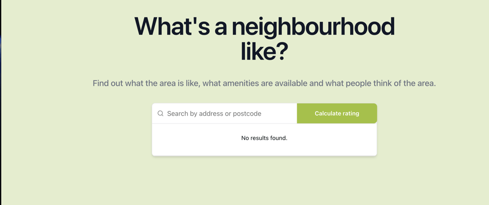
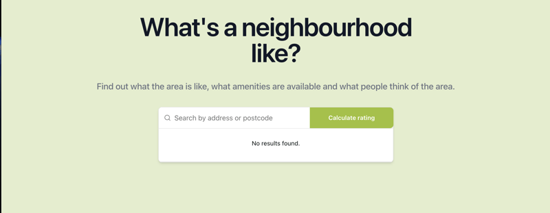
<CommandInput
placeholder="Search by address or postcode"
defaultValue={userInput}
onValueChange={(v) => handleUserInput(v)}
className="block w-[480px] h-[48px] -mr-16 text-base text-gray-900"
/>
<CommandList>
<CommandEmpty>No results found.</CommandEmpty>
<CommandGroup>
{predictions.map((prediction) => (
<CommandItem
key={prediction.placePrediction?.placeId}
value={prediction.placePrediction?.placeId}
onSelect={(value) => handleSelectedPlace(value)}
>
{prediction.placePrediction?.text.text}
</CommandItem>
))}
</CommandGroup>
<CommandSeparator />
</CommandList>
</Command>
<button
type="button"
className="rounded-r-lg h-[48px] -ml-48 w-48 bg-roofone-green-primary mt-[0.75px] px-4 py-2.5 text-sm font-semibold text-white shadow-sm focus-visible:outline focus-visible:outline-2 focus-visible:outline-offset-2"
>
Calculate rating
</button>
</div>
</div>
</>
I used the CommandInput to handle user input and the CommandList to render results from the API call. It is important to not that Shadcn\ui handles state changes for you.
Tip: Use the
shouldFilterprop to control search behavior—great for more advanced use cases like server-side filtering or custom ranking.
Create event handlers to handle user input and rendering the results.
   const [predictions, setPredictions] = useState<
      google.maps.places.AutocompleteSuggestion[]
   >([]);

   const handleUserInput = useCallback(
      debounce((input: string) => {
         setUserInput(input);
         fetchPredictions(input);
      }, 1000),
      []
   );

   async function fetchPredictions(input: string) {
      const queryBody = {
         input: input,
         includedRegionCodes: ["uk"],
         includeQueryPredictions: true,
      };
      try {
         const res = await PlacesApi.post("places:autocomplete", queryBody);
         const data = await res.json();
         if (!res.ok) throw new Error("Failed to fetch predictions");
         console.log("received suggestings ->", data.suggestions);
         setPredictions(data.suggestions ?? []);
      } catch (error) {
         console.log(error);
      }
   }

   const handleSelectedPlace = (placeId: string) => {
      const selectedInput = predictions.filter(
         (prediction) => prediction.placePrediction?.placeId === placeId
      );
      setUserInput(String(selectedInput[0].placePrediction?.text.text));
      handleGetSelectedPlaceRating(placeId);
   };
Here's a simple explanation of my code.
- The
predictionstate stores the response from the Google Maps API -
handleUserInputhelps rate limit the user input by using the debounce helper function. -
fetchPredictionstakes a string and uses the PlacesApi helper function to GET the predictions and sets the array of predictions into state. -
handleSelectedPlaceuses theCommandItemvalue which is theplace Idto get the text the user selected and then calls a function prop from the parent component.
Key challenged faced: Google Autocomplete Types
I initially found it tricky to properly type Google Maps results but after pair programming with my friend @opeadeyomoye, we were able to find the DefintelyTyped Google Maps Types and it was a live saver!

Top comments (0)