After the fragmentation effect, I am going to tackle another interesting animation: The Blob! We all agree that such effect is hard to achieve with CSS, so we generally reach for SVG to make those gooey shapes. But now that the powerful Paint API is available, using CSS is not only possible, but maybe even a preferable approach once browser support comes around.
Here’s what we’re making. It’s just Chrome and Edge support for now, so check this out on one of those browsers as we go along.

Live demo
Building the blob
Let’s understand the logic behind drawing a blob using a classic <canvas> element to better illustrate the shape:
When talking about a blob, we’re also talking about the general shape of a distorted circle, so that’s the shape we can use as our base. We define N points that we place around a circle (illustrated in green).
const CenterX = 200;
const CenterY = 200;
const Radius = 150;
const N = 10;
var point = [];

for (var i = 0; i < N; i++) {
  var x = Math.cos((i / N) * (2 * Math.PI)) * Radius + CenterX;
  var y = Math.sin((i / N) * (2 * Math.PI)) * Radius + CenterY;
  point[i] = [x, y];
}
Considering the center point (defined by CenterX/CenterY) and the radius, we calculate the coordinate of each point using some basic trigonometry.
After that, we draw a cubic Bézier curve between our points using quadraticCurveTo(). To do this, we introduce more points (illustrated in red) because a cubic Bézier curve requires a start point, a control point, and an end point.
The red points are the start and end points, and the green points can be the control points. Each red point is placed at the midpoint between two green points.
ctx.beginPath(); /* start the path */
var xc1 = (point[0][0] + point[N - 1][0]) / 2;
var yc1 = (point[0][1] + point[N - 1][1]) / 2;
ctx.moveTo(xc1, yc1);
for (var i = 0; i < N - 1; i++) {
  var xc = (point[i][0] + point[i + 1][0]) / 2;
  var yc = (point[i][1] + point[i + 1][1]) / 2;
  ctx.quadraticCurveTo(point[i][0], point[i][1], xc, yc);
}
ctx.quadraticCurveTo(point[N - 1][0], point[N - 1][1], xc1, yc1);
ctx.closePath(); /* end the path */
Now all we have to do is to update the position of our control points to create the blob shape. Let’s try with one point by adding the following:
point[3][0]= Math.cos((3 / N) * (2 * Math.PI)) * (Radius - 50) + CenterX;
point[3][1]= Math.sin((3 / N) * (2 * Math.PI)) * (Radius - 50) + CenterY;
The third point is closest to the center of our circle (by about 50px) and our cubic Bézier curve follows the movement perfectly to keep a curved shape.
Let’s do the same with all the points. We can use the same general idea, changing these existing lines:
var x = Math.cos((i / N) * (2 * Math.PI)) * Radius + CenterX;
var y = Math.sin((i / N) * (2 * Math.PI)) * Radius + CenterY;
…into:
var r = 50*Math.random();
var x = Math.cos((i / N) * (2 * Math.PI)) * (Radius - r) + CenterX;
var y = Math.sin((i / N) * (2 * Math.PI)) * (Radius - r) + CenterY;
Each point is offset by a random value between 0 and 50 pixels, bringing each point closer to the center by a slightly different amount. And we get our blob shape as a result!
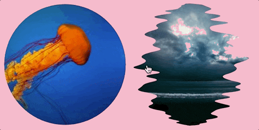
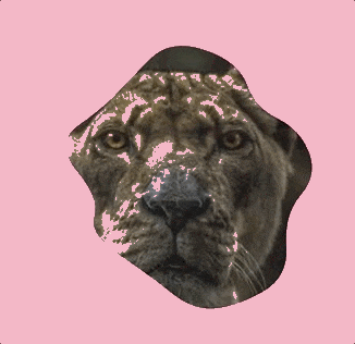
Now we apply that shape as a mask on an image using the CSS Paint API. Since we are dealing with a blobby shape, it’s suitable to consider square elements (height equal to width) instead, where the radius is equal to half the width or height.
Here we go using a CSS variable (N) to control the number of points.
I highly recommend reading the first part of my previous article to understand the structure of the Paint API.
Each time the code runs, we get a new shape, thanks to the random configuration.
Let’s animate this!
Drawing a blog is good and all, but animating it is better! Animating the blob is actually the main purpose of this article, after all. We will see how to create different kinds of gooey blob animations using the same foundation of code.
The main idea is to smoothly adjust the position of the points — whether it’s all or some of them — to transition between two shapes. Let’s start with the basic one: a transition from a circle into a blob by changing the position of one point.

Live demo
For this, I introduced a new CSS variable, B , to which I am applying a CSS transition.
@property --b{
  syntax: '<number>';
  inherits: false;
  initial-value: 0;
}
img {
  --b:0;
  transition:--b .5s;
}
img:hover {
  --b:100
}
I get the value of this variable inside the paint() function and use it to define the position of our point.
If you check the code in the embedded linked demo, you will notice this:
if(i==0)
  var r = RADIUS - B;
else
  var r = RADIUS
All the points have a fixed position (defined by the shape’s radius) but the first point specifically has a variable position, (RADIUS - B). On hover, The value of B is changing from 0 to 100, moving our point closer to the middle while creating that cool effect.
Let’s do this for more points. Not all of them but only the even ones. I will define the position as follow:
var r = RADIUS - B*(i%2);

Live demo
We have our first blob animation! We defined 20 points and are making half of them closer to the center on hover.
We can easily have different blobby variations simply by adjusting the CSS variables. We define the number of points and the final value of the B variable.
Now let’s try it with some random stuff. Instead of moving our points with a fixed value, let’s make that value random move them all around. We previously used this:
var r = RADIUS - B*(i%2);
Let’s change that to this:
var r = RADIUS - B*random();
…where random() gives us a value in the range [0 1]. In other words, each point is moved by a random value between 0 and B . Here’s what we get:
See that? We get another cool animation with the same code structure. We only changed one instruction. We can make that instruction a variable so we can decide if we want to use the uniform or the random configuration without changing our JavaScript. We introduce another variable, T, that behaves like a boolean:
if(T == 0)
  var r = RADIUS - B*(i%2);
else
  var r = RADIUS - B*random();
We have two animations and, thanks to the T variable, we get to decide which one to use. We can control the number of points using N and the distance using the variable V. Yes, a lot of variables but don’t worry, we will sum up everything at the end.
What is that random() function doing?
It’s the same function I used in the previous article. We saw there that we cannot rely on the default built-in function because we need a random function where we are able to control the seed to make sure we always get the same sequence of random values. So the seed value is also another variable that we can control to get a different blob shape. Go change that value manually and see the result.
In the previous article, I mentioned that the Paint API removes all of the complexity on the CSS side of things, and that gives us more flexibility to create complex animations. For example, we can combine what we have done up to this point with keyframes and cubic-bezier():
Controlling the movement of the points
In all the blobs we’ve created so far, we considered the same movement for our points. Whether we’re using the uniform configuration or the random one, we always move the points from the edge to the center of the circle following a line.
Now let’s see how we can control that movement in order to get even more animations. The idea behind this logic is simple: we move the x and y differently.
Previously we were doing this:
var x = Math.cos((i / N) * (2 * Math.PI)) * (Radius - F(B)) + CenterX;
var y = Math.sin((i / N) * (2 * Math.PI)) * (Radius - F(B)) + CenterY;
…where F(B) is a function based on the variable B that holds the transition.
Now we will have something like this instead:
var x = Math.cos((i / N) * (2 * Math.PI)) * (Radius - Fx(B)) + CenterX;
var y = Math.sin((i / N) * (2 * Math.PI)) * (Radius - Fy(B)) + CenterY;
…where we’ve updating the x and y variables differently to makes more animations. Let’s try a few.
One axis movement
For this one, we will make one of the functions equal to 0 and keep the other one the same as before. In other words, one coordinate remains fixed along the animation
If we do:
Fy(B) = 0
…we get:
Live demo
The points are only moving horizontally to get another kind of effect. We can easily do the same for the other axis by making Fx(B)=0 (see a demo).
I think you get the idea. All we have to do is to adjust the functions for each axis to get a different animation.
Left or right movement
Let’s try another kind of movement. Instead of making the points converging into the center, let’s make them move into the same direction (either right or left). We need a condition based on the location of the point which is defined by the angle.

We have two group of points: ones in the [90deg 270deg] range (the left side), and the remaining points along the ride side of the shape. If we consider the indexes, we can express the range differently, like [0.25N 0.75N] where N is the number of points.
The trick is to have a different sign for each group:
var sign = 1;
if(i<0.75*N && i>0.25*N)
  sign = -1; /* we invert the sign for the left group */
if(T == 0)
  var r = RADIUS - B*sign*(i%2);
else
  var r = RADIUS - B*sign*random();
var x = Math.cos((i / N) * (2 * Math.PI)) * r + cx;
And we get:

Live demo
We are able to get the same direction but with one small drawback: one group of the points are going outside the mask area because we are increasing the distance on some points while decreasing the distance on others. We need to reduce the size of our circle to leave enough space for all of our points.
We simply decrease the size of our circle using the V value that defines the final value for our B variable. In other words, it’s the maximum distance that one point can reach.

Our initial shape (illustrated by the grey area and defined with the green points) will cover a smaller area since we will decrease the Radius value with the value of V:
const V = parseFloat(properties.get('--v'));
const RADIUS = size.width/2 - V;

Live demo
We fixed the issue of the points getting outside but we have another small drawback: the hover-able area is the same, so the effect starts even before the cursor hits the image. It would be good if we can also reduce that area so everything is consistent.
We can use an extra wrapper and a negative margin trick. Here’s the demo. The trick is pretty simple:
.box {
  display: inline-block;
  border-radius: 50%;
  cursor: pointer;
  margin: calc(var(--v) * 1px);
  --t: 0;
}

img {
  display: block;
  margin: calc(var(--v) * -1px);
  pointer-events: none;
  -webkit-mask: paint(blob);
  --b: 0;
  transition:--b .5s;
}
.box:hover img {
  --b: var(--v)
}
The extra wrapper is an inline-block element. The image inside it has negative margins equal to the V variable which reduces the overall size of the shape’s box. Then we disable the hover effect on the image element (using pointer-events: none) so only the box element triggers the transition. Finally we add some margin to the box element to avoid any overlap.
Like the previous effect, this one can also be combined with cubic-bezier() and keyframes to get more cool animations. Below is an example using my sinusoidal curve for a wobbling effect on hover.

Live demo
If we add some transforms, we can create a kind of strange (but pretty cool) sliding animation:

Live demo
Circular movement
Let’s tackle another interesting movement that will allow us to create infinite and “realistic” blob animations. Instead of moving our points from one location to another, we will rotate them around an orbit to have a continuous movement.

The initial location of our points (in green) will become an orbit and the red circle is the path that our points will take. In other words, each point will rotate around its initial position following a circle having a radius r.
All we need to do is make sure there is no overlap between two adjacent paths so the radius need to have a maximum allowed value.

I will not detail the math but the max value is equal to:
const r = 2*Radius*Math.sin(Math.PI/(2*N));

Live demo
This is the relevant part of the code:
var r = (size.width)*Math.sin(Math.PI/(N*2));
const RADIUS = size.width/2 - r;
// ...

for(var i = 0; i < N; i++) {
  var rr = r*random();
  var xx = rr*Math.cos(B * (2 * Math.PI));
  var yy = rr*Math.sin(B * (2 * Math.PI));
  var x = Math.cos((i / N) * (2 * Math.PI)) * RADIUS + xx + cx;
  var y = Math.sin((i / N) * (2 * Math.PI)) * RADIUS + yy + cy;
  point[i] = [x,y];
}
We get the max value of the radius and we reduce that value from the main radius. Remember that we need to have enough space for our points so we need to reduce the mask area like we did with the previous animation. Then for each point we get a random radius rr (between 0 and r). Then we calculate the position inside the circular path using xx and yy. And, finally, we place the path around its orbit and get the final position (the x, y values).
Notice the value B which is, as usual, the one with the transition. This time, we will have a transition from 0 to 1 in order to make a full turn around the orbit.
Spiral movement
One more for you! This one is a combination of the two previous ones.
We saw how to move the points around a fixed orbit and how to move a point from the edge of the circle to the center. We can combine both and have our point move around an orbit and we do the same for the orbit by moving it from the edge to the center.
Let’s add an extra variable to our existing code:
for(var i = 0; i < N; i++) {
  var rr = r*random();
  var xx = rr*Math.cos(B * (2 * Math.PI));
  var yy = rr*Math.sin(B * (2 * Math.PI));

  var ro = RADIUS - Bo*random();
  var x = Math.cos((i / N) * (2 * Math.PI)) * ro + xx + cx;
  var y = Math.sin((i / N) * (2 * Math.PI)) * ro + yy + cy;
  point[i] = [x,y];
}
As you can see, I used the exact same logic as the very first animation we looked at. We reduce the radius with a random value (controlled with Bo in this case).
Live demo
Yet another fancy blob animation! Now each element has two animations: one animates the orbit (Bo), and the other animates the point in its circular path (B). Imagine all the effects that you can get by simply adjusting the animation value (duration, ease, etc.)!
Putting everything together
Oof, we are done with all the animations! I know that some of you may have gotten lost with all the variations and all the variables we introduced, but no worries! We will sum everything up right now and you will see that it’s easier than what might expect.
I want to also highlight that what I have done is not an exhaustive list of all the possible animations. I only tackled a few of them. We can define even more but the main purpose of this article is to understand the overall structure and be able to extend it as needed.
Let’s summarize what we have done and what are the main points:
The number of points (N): This variable is the one that controls the granularity of the blob’s shape. We define it in the CSS and it is later used to define the number of control points.
The type of movement (T): In almost all the animations we looked at, I always considered two kind of animations: a “uniform” animation and a “random” one. I am calling this the type of movement that we can control using the variable
Tset in the CSS. We will have somewhere in the code to do an if-else based on thatTvariable.The random configuration: When dealing with random movement, we need to use our own
random()function where we can control the seed in order to have the same random sequence for each element. The seed can also be considered a variable, one that generates different shapes.The nature of movement: This is the path that the points take. We can have a lot of variations (From the edge of the circle to the center, a one axis movement, a circular movement, a spiral movement and many others…). Like the type of movement, the nature of the movement can also be made conditional by introducing another variable, and there is no limit to what can be done here. All we have to do is to find the math formula to create another animation.
The animation variable (B): This is the CSS variable that contains the transition/animation. We generally apply a transition/animation from 0 to a certain value (defined in all the examples with the variable
V). This variable is used to express the position of our points. Updating that variable logically updates the positions; hence the animations we get. In most cases, we only need to animate one variable, but we can have more based on the nature of the movement (like the spiral one where we used two variables).The shape area: By default, our shape covers the entire element area, but we saw that some movement require the points to go outside the shape. That’s why we had to reduce the area. We generally do this by the maximum value of
B(defined byV), or a different value based on the nature of the movement.
Our code is structured like this:
var point = [];
/* The center of the element */
const cx = size.width/2;
const cy = size.height/2;
/* We read all of the CSS variables */
const N = parseInt(properties.get('--n')); /* number of points */
const T = parseInt(properties.get('--t')); /* type of movement  */
const Na = parseInt(properties.get('--na')); /* nature of movement  */
const B = parseFloat(properties.get('--b')); /* animation variable */
const V = parseInt(properties.get('--v'));  /* max value of B */
const seed = parseInt(properties.get('--seed')); /* the seed */
// ...

/* The radius of the shape */
const RADIUS = size.width/2 - A(V,T,Na);

/* Our random() function */
let random =  function() {
  // ...
}
/* we define the position of our points */
for(var i = 0; i < N; i++) {
   var x = Fx[N,T,Na](B) + cx;
   var y = Fy[N,T,Na](B) + cy;
   point[i] = [x,y];
}

/* We draw the shape, this part is always the same */
ctx.beginPath();
// ...
ctx.closePath();
/* We fill it with a solid color */
ctx.fillStyle = '#000';
ctx.fill();
As you can see, the code is not as complex as you might have expected. All the work is within those function Fx and Fy, which defines the movement based on N,T and Na. We also have the function A that reduces the size of the shape to prevent points overflowing the shape during the animation.
Let’s check the CSS:
@property --b {
  syntax: '<number>';
  inherits: false;
  initial-value: 0;
}

img {
  -webkit-mask:paint(blob);
  --n: 20;
  --t: 0;
  --na: 1;
  --v: 50;
  --seed: 125;
  --b: 0;
  transition: --b .5s;
}
img:hover {
  --b: var(--v);
}
I think the code is self-explanatory. You define the variables, apply the mask, and animate the B variable using either a transition or keyframes. That’s all!
I will end this article with a final demo where I put all the variations together. All you have to do is to play with the CSS variables
You want to support me?


Latest comments (11)
Great article and had a good read! I have been following and going through you work for some time now. How do you suggest on where to start learning css the right way, as in knowing what we are doing clearly and create some amazing work out of it?
Also is Josh W. Comeau's course worth taking up spending that much money or is there is different approach ?
What I always suggest to correctly learn CSS is to practice and practice. I suggest you to set goals and try to achieve them. Like for example re-building some templates you find online, trying to draw some illustration using CSS-only, creating some fancy animation, etc. If you do this regularly you will improve you CSS level. If each day you spend one hour trying and learning a new thing then it should be enough. In addition to this, pick up some good CSS Website where you can read new articles (like DEV, CSS tricks, Smashing Magazine) and try to follow a few folks on twitter that share some of their CSS works.
I have no idea about Josh Course or any other courses but I don't think you need to spend money to learn. Maybe such courses will give human support that can help you if you struggle but if you have time you can learn by yourself.
Excellent article, and fantastic examples!
This is pretty cool, I've recently done an app with some animations using clip path and blobs.app/ but this looks way cooler!
yes why not, good idea 😉
Detailed and well explained article 😉
Also, didnt know you write for CSS tricks 👀
I have to. CSS Tricks is one of the best CSS-related website to showcase your work. I cannot ignore such opportunity 😁
Agree on this 💯😉
Also, Smashingmagazine is awesome, quality content there 😉
Yes, smashing magazine is the next on my list. I have to first get closer to the top of the authors page: css-tricks.com/authors/ 😜
Best of luck with that 😉
With your CSS knowledge it should be no problem ✨💯
This looks so interesting to play with.
I can imagine combining this with the SVG trick of Gaussian blur + high contrast (but now in CSS) we could make some super interesting gooey effects as this seems way more manageable than SVG.
As always a really well explained article! ❤️