
Back when our college life was coming to a close, all of us were tasked to create a thesis or a research. As to what our professor said, "It must contribute or add something new to the current knowledge that the world has". That really got me thinking. I started thinking of possible automated technologies that can be done with artificial intelligence that would make people say "wow".
So together with my team and our thesis adviser, we brainstormed on possible topics that we can explore for our thesis. Somehow due to our previous research on building an air guitar using Myo Armbands, we shifted our focus on creating or composing music. So our problem at that time was...
"How can we contribute something new to composers that would benefit them and at the same time, adding something new to the knowledge base of Computer Science?".
Ideation Phase
It took us about an hour or two to come up with an idea that is possible with today's technology. That idea was creating melodies with gesture-based controls. It was like the swiping gesture found in smartphones' keyboards, but instead of producing words, it would produce notes. When the gesture slides upwards, it would produce a melody upwards, same thing for downwards. We even thought of varying gestures like drawing a zigzag or twirling pattern would produce different types of melodies.

Definitely it would look cool while composing music (which was our second priority, just kidding!), but we came to a theory that it may be able to benefit composers who get stuck when they reach creative block. Thus making it a solution for them to explore what the computer can generate for them and tweak or edit it to their liking.

After landing on that idea, we started reading journals and papers that could help giving a computer the ability to create music. We read about various genetic algorithms that generate music through a lot of iterations, and also Markov Chains.
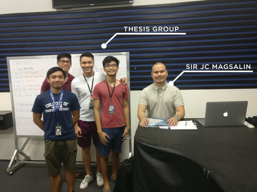
After some time, one of us became worried that it might cause composers to revolt against our idea due to the fact that we're somehow automating their craft through our software. That worry led us to interview a professional composer. Lucky for us, my brother graduated as a music major in a near university so he knew some professors that are really good composers. So he gave us a few composers that we could contact and one of them was Sir Juan Carlo Magsalin (we call him Sir JC). We contacted and scheduled an interview with him. Soon enough, we were happy that he accepted to meet with us.
We asked him various questions that would help prove if our idea was helpful. The interview turned out great and to our surprise, our future isn't a bad idea as we thought. As long as we keep in mind that it should aid the composer instead of replacing him or her. After we came back to our research lab, we were then tasked by our thesis adviser to formulate a research framework.

Creating and Testing the Mid-Fidelity Prototype
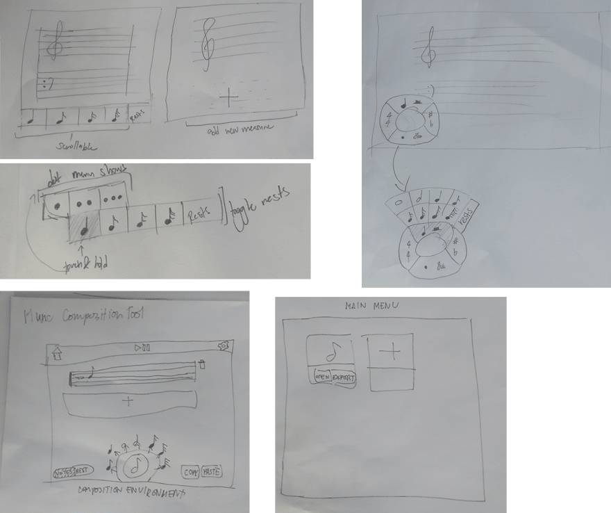
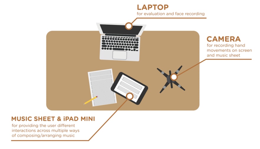
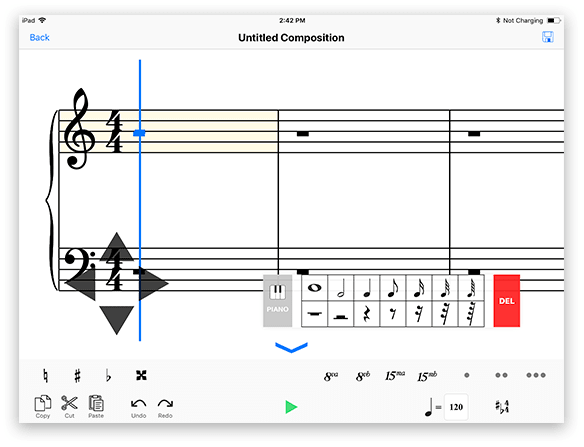
Inline with our research framework, we started drawing our sample user interfaces on paper. This is a good strategy in the early process of prototyping or designing since everything done on paper is easily changeable if there are needed changes. We proceeded to present to each other our drawings and ideas. As we went on with the meeting, we supported each other's ideas and suggested changes to some ideas presented. After that, we formed our mid-fidelity prototype using Gravit and InVision based off the drawings and ideas we fixed and formulated. We made the designs to fit an iPad Mini to be used for our testing.
After creating the prototype, we wanted to test it to a number of composers. This is the part where we would stay calm when testers say that "the design is bad" because normally in the first few phases, that would occur most of the time. Instead of being angry or panicking, we ask them why. In that way we could get insightful comments from them that can help us improve the design. If there were no comments, usually we try to solve the problem by easing the interaction that the users had a hard time in using.
With several data in our hands, we proceeded to improve our prototype based on those data. We tested it again with Sir JC and other composers. The data we got from there were improved compared to before but some interactions were still hard to do.
On top of that, Sir JC caught some errors in our prototype which conflicts with the rules of music theory. He suggested a few books that we could read and borrow from their library for us to educate ourselves with music theory. I was the one who got tasked to get familiar with music writing (and I also appreciated it since I wanted to learn how to read music sheets!). Educating myself with music theory wasn't an easy task. It was a new field for me to discover, but I tried my best to understand it. This was an important step because it really helped a lot when we were developing the app in the iPad since there are plenty of rules and math to keep in mind.
Moving to High-Fidelity Prototypes
Soon enough we moved to coding the application in the iPad ecosystem using Swift 4.0 (For you questioning why not 5.0? Because Swift 5.0 wasn't available at that time yet. You hater.). This was also our first time learning and using Swift, but we didn't let that discourage us to develop this app. We gladly learned Swift and all its benefits compared to other programming languages (can't forget about Swift's null safety and awesome variable observer methods).

After learning basic music notation, we tried to put it into code and create a good basic prototype that involved adding, selecting, deleting, and editing notes. We also created a procedure or a set of tasks for composers to follow during testing and a post-testing questionnaire for them to answer. The testing procedure contained steps like "Add a note", "Delete a note", "Recreate Little Little Star", and more. The questionnaire was there to measure the difficulty per task or feature. Each task had a Likert scale which would let the composer rate the feature with four (4) being easy to one (1) being difficult. We did this so that we can review the scores which would eventually lead us to revamp the feature.
Throughout our research we did a total of four phases or iterations to improve the application. So here starts our journey to studying users or composers.
"But wait! Where's the swiping gesture that would generate a melody?"
Oh right! Midway in developing the app we decided to focus more on the user experience aspect of the application. Since there are no music composition apps that we can edit or code a plugin on, we decided to create a music composition app that has good usability first before tackling the melody suggestion feature. The generating of music would be future work (hopefully!). But don't close this article yet! The user research journey that I'm about to tell was still fun. Let's proceed with the article.
Testing our High-Fidelity Prototypes
We did a total of four (4) testing phases for our app which consists of varying participants per phase. Throughout each phase, we try to implement new features and fix design issues based on previous iterations. We also let our testers compose using traditional pen and paper, and use existing iPad apps that are currently in the app store (specifically Notion and komp) so that we can also learn from the traditional way and the existing apps, and benchmark our app if it's better or worse than those methods.
I'll be going through each iteration briefly. So, here it goes.
First Iteration

For the first iteration, just like the mid-fidelity prototype, we implemented a movable cursor (for pointing the selected location in the music sheet), and adding, editing, deleting, and highlighting of music notes. We let various music composers test our prototype.
Here are the ratings from the post-testing assessment:
List of features with high average scores:
- Moving the indicator/cursor (3.6)
- Moving the line/space selector (3.3)
List of features with low average scores:
- Highlighting/Selecting Notes (2.5)
- Delete a Note (2.3)
- Edit a Note (2.2)
- Add Note/s (2.8)
- Editing a group of notes (2.2)
- Deleting a group of notes (2.2)
Average Score: 2.6
Yep, we messed it up on our first prototype. But this was due to two (2) main reasons:
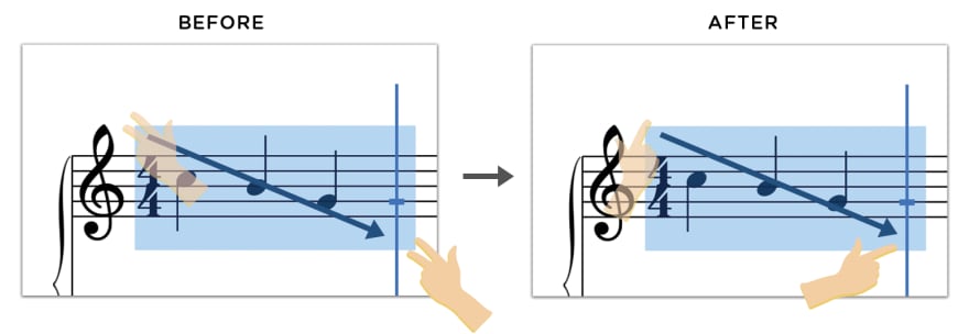
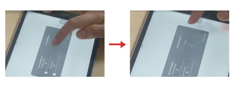
- The highlighting feature was assigned to a two-finger drag along the music sheet. This made it hard for the composers to execute since they were trying a one-finger drag instead of a two-finger drag.

- The buttons were too small which hindered some composers in tapping them. This is due to us always testing it on the iPad simulator provided in Xcode. It didn't simulate a real iPad interaction since we used a mouse cursor to tap/click on the buttons.
Improvements from the First Iteration
Due to the highlighting feature hindering majority of the usability. We changed the two-finger drag to a one-finger drag.
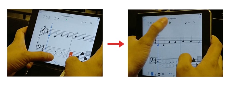
We also made the buttons bigger for a human finger to tap/touch. This made me realize that testing usability for mobile devices must really be tested on a mobile device, not from a simulator or any form of emulating the screen size in a desktop.
Second Iteration
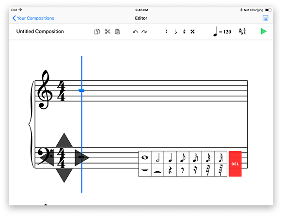
In the second iteration, we added more features into our app. These features are:
- Changing Time/Key Signature
- Adding/Removing an accidental to a note or a group of notes
- Zooming In/Out
- Cut/Copy/Paste a note or a group of notes
- Selecting a single note via hovering (not just higlighting)
- Music Playback
- Redesign of the delete button
The said features were also included in the testing of our application to composers. Here are the results:
List of features with high average scores:
- Add a Note (3.5)
- Delete a Note (3.2)
- Edit a Note (3.6)
- Moving the indicator/cursor (3.6)
- Moving the line/space selector (3.4)
- Highlighting/Selecting Notes (3.8)
- Editing a group of notes (3.6)
- Deleting a group of notes (4.0)
- Scrolling thru the music sheet (3.5)
- Change Time Signature (3.2)
- Change Key Signature (3.5)
- Add an Accidental to a Note (3.8)
- Zooming In/Out (3.5)
- Cut/Copy/Paste a Single Note (3.0)
- Select a single note (3.7)
- Add an Accidental to a group of notes (3.3)
- Music Playback (4.0)
List of features with low average scores:
- Remove an Accidental to a Note (2.6)
- Cut/Copy/Paste a a group of notes (2.7)
- Remove an Accidental to a group of notes (2.7)
Average Score: 3.4
Several features improved and the new features also had high scores that we didn't expect. However, don't let the high scores fool you. There were comments from the users that made us redesign some of the features that had high scores.
Some features can be improved better based on the comments we received. Those comments are:
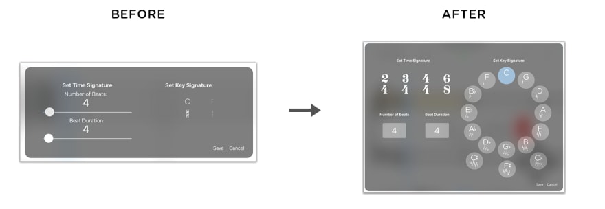
- The slider in changing the time signature made it hard to select a specific number.

The slide selection for the key signature was not clear in showing all the possible options.
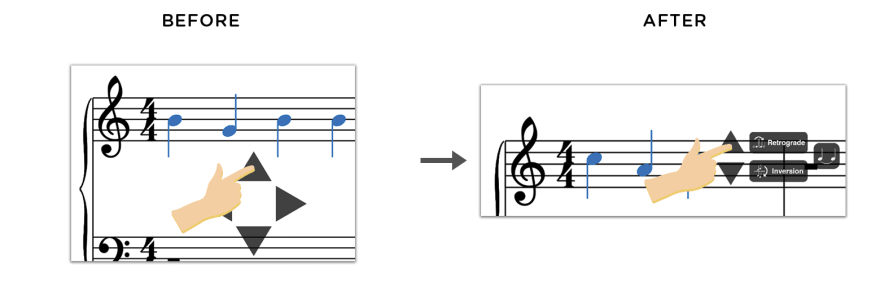
Transposing note/s weren't evident or obvious enough for users to do.
The comments from the features that had a low score was:
- The Cut/Copy/Paste lacked feedback or a notification when they tap the buttons for those features. The buttons for those features were also small.
- Removing an accidental of a note or a group of notes was not intuitive for composers that have knowledge in music theory. The buttons for the accidentals were also small, but the main reason why they scored it low was because the interaction didn't follow music theory. According to them, removing an accidental should be done by "naturalizing". With that in mind, composers kept tapping the naturalize accidental button when they were trying to remove a sharp or flat from a note or a group of notes.
Improvements from the Second Iteration
- With the time/key signature controls being hard to use led us to implement a complete overhaul of it.
- We moved the transpose controls from the visible arrow keys, to a new control panel that shows when the user selects a note.
Third Iteration
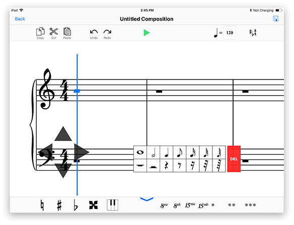
In the third iteration, we implemented new features that would let composers further customize their compositions. These features are:
- Putting ottava (8 va) & quindicesima (15 va) symbols for possible higher or lower pitches than before.
- Putting 1 to 3 dots for dotted notes.
- The ability to create chords.
- A keyboard style input for people that are used to using MIDI keyboards as their input controls.
We also narrowed down the type of scores that we had so that we can focus more on the base actions of the application (instead of per feature). These are the scores:
- Select/Highlighting of Notes (3.7)
- Add Notes/Chords (3.7)
- Edit Notes/Chords (3.3)
- Delete Notes/Chords (3.7)
- Cut, copy, & paste Notes/Chords (3.3)
- Undo/Redo an action (3.8)
- Music Playback (3.1)
Average Score: 3.5
Several improvements from the second iteration really helped in improving the scores even more. But there are still a few problems we noticed when we were watching the composers use our application.
- Composers were having a hard time switching their fingers to the top and bottom menus.
The toggling of the keyboard input was not evident.
They also suggested that a guiding line should show when playback is happening. This would let them know which note is currently being played.
Improvements from the Third Iteration
- We joined the top and bottom menus to make it more friendly for the composers' fingers.
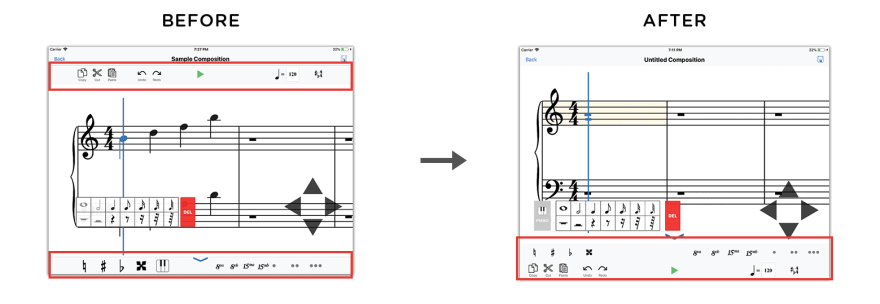
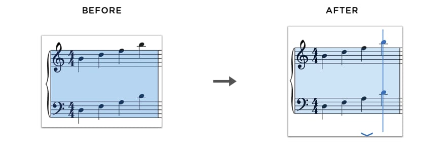
- Music Playback now shows a line to show which note is currently playing.
Fourth Iteration
For the fourth iteration, our testers were majority professionals (composers that compose for famous artists, a professor that lead a chorale, and students from the conservatory of music). Because of that, the score became lower than the previous iteration. They told us that our app still lacked more features and modifiers for them to further customize their composition. However, they were happy with the interaction with our app especially because of the cursor/line. They even told us that it's beginner friendly because its straightforward enough.
The Scores:
- Select/Highlighting of Notes (3.4)
- Add Notes/Chords (3.2)
- Edit Notes/Chords (3.0)
- Delete Notes/Chords (3.4)
- Cut, copy, & paste Notes/Chords (2.9)
- Undo/Redo an action (3.6)
- Music Playback (2.9)
One composer even had a hard time performing the highlight feature, which also led him to not perform the cut, copy, and paste feature. That composer told us that he was not used to using mobile apps so its possible that that is the reason he is not accustomed using mobile applications.
Another composer also rated the music playback low because a bug occurred while that feature is being used. The tempo became slower and slower every time the composition is being repeatedly played. This made the composer disappointed because that composer is an avid user of playback to check the composition if its according to what he or she wants. This was entirely our fault because in our code, we forgot to dispose the previous instance of the playback when the playback stopped. That caused multiple instantiations to exist that began to slow down the app due to memory leaks.
Final Words
Unfortunately we stopped at the fourth iteration, this isn't because we became demotivated, but our time in the university has come to a close. A lot of testers really wanted to get our app after they tested it and I feel sorry, up until to this day, for those people because we won't be publishing this app anytime sooner (very sorry). This is due to the fact that it's still unfinished work. Maybe in the future, new researchers in our research lab might continue this UX adventure that we started.
I enjoyed this experience because I got to learn a part of music theory and also attempt to develop and design a user-centered tool that they can use to produce their craft with ease. With that said, this research taught me to put myself in the shoes of the user in order to design an interaction suited for them.
P.S. Thank you to Sir Jordan Deja for being a good mentor in user experience research and to all composers that tested our app (you all helped us graduate college).

Top comments (0)