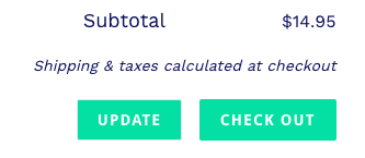
Whether or not we realize it, we are often given multiple options for what action to take on a page. We are constantly being guided through a hierarchy where each action is on a predetermined scale of importance. A simple example of this can be seen at the Dev shop cart!
Using the example above, we can see that our primary action is the most obvious button. The checkout button! We consider this our primary action, because the user clicking checkout is what is most anticipated in this situation. This is achieved by setting the background-color property to #00e4ad and setting our color property to white. Our secondary action is less apparent with the transparent background. The update button. The secondary action is the less obvious choice of the two.
If we take the same example, but fill both buttons we are unable to determine which button holds higher importance, because it is unclear which button is more obvious. The two properties, background-color and color add such an importance to these buttons!
Don't make the mistake of having the two buttons compete with each other! As you can see, neither of these button are obvious which is the primary action and the secondary action. One tactic to avoid this is to deemphasize the secondary action with a transparent background.
Another real world example of this can seen on the React website. The hero image contains two buttons, but the “Get Started” is clearly holding a greater importance over the “Take the Tutorial” button with the transparent background.
Although this is just one approach to display primary and secondary buttons to our user, we can see how important the two CSS properties background and color help us guide the user.


Top comments (0)