
WTF is information architecture?
Information architecture, what is it? Not simply put, it's how the information on your site is organized so that it makes sense and the viewer can logically find what they are looking for. So why, as a UX girl, am I writing about information architecture? Why would anyone in the UX world care about IA? Because it plays into how a user interacts and relates to the information presented on the website. You spend an extraordinary amount of time creating a wonderfully functioning, beautiful site; it would be a shame if visitors had difficulty finding what they were looking for.
According to usability.gov, there are four components to IA.
- Organization Schemes
- Labeling Systems
- Navigation Systems
- Search Systems
Why should I care?
First, we will explore the Navigation Systems piece of the IA landscape. I think it is the best one to start with because it is easier to understand and make a meaningful impact. Navigation systems mean how a person clicks around and finds information on your website. A person rarely types the exact page web URL to get to a specific page on your site. Most web visitors type in your main website address and then uses a menu to get to the information they are looking for. Ensuring your navigation system or navigation menus make sense and are intuitive goes a long way in creating that seamless user experience.
Imagine, if you will, you're shopping for a new pair of fuzzy slippers, and you go to the site fuzzyslippersforme.com, and you're looking for the perfect pair. Once you get there, you see the navigation, and you can choose between adult and kid sizes; that's fine; most people will be shopping for one or the other. You click adult, and the choices from there are small, medium, and large. So you think, "am I small or medium? What size would a small be?" You expect the sizes to be comparable to shoe sizes, not shirt sizes, when shopping for slippers. Researching the IA for the fuzzy slipper shopper would show you what most shoppers expect to see when using the navigation menu.
Okay, I care... Now what?
So, how do you go about determining the information architecture design for the navigation of your site? Card sorting. Card sorting is when you present all your navigation items to people and allow them to group them as they see fit. The goal is not to influence the sorting in any way; observe and record how others would group your information. It is also key to note if any cards take longer to sort, that may indicate the need to simplify that card. Smashing Magazine has a great article if you want to read even more.
How do you get started with card sorting? Great question! For this post, I used the Navigation System related to the #VetsWhoCode site. I used card sorting to determine if there is a better way to present the site's navigation items. I found a free tool (for small sample sizes) from Optimal Workshop that let me run a card sorting exercise with all the items from the site. The cards I included were all navigation items and any external links that were important to the site.

I set up the study with categories that I thought made sense already presented but left the sorter the option to create new categories.
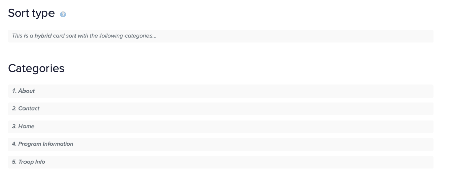
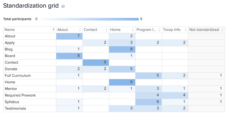
The free tool allowed 10 people to complete the study, and I was lucky enough to get 9 people to sort the cards and provide valuable information on how they think the items go together. The most interesting result is that people did not have a consistent thought of how things should go together. There were two cards that 100% agreed went with the category, and those were Home and Contact. Not surprising. The survey creates an interesting chart; it's called a standardized grid, showing how often each card falls into each category.
I went into this experiment hoping to find a better way to structure the site's navigation menu. Still, the way the sorting was set up and the small number of results that were so varied didn't provide a clear idea of there being a better way to structure the navigation.
What would I do differently next time?
- Be more descriptive on the cards. I left them vague this time because I didn't want to influence other than the actual word. It would help participants categorize the cards better if they knew what they meant, not just the word.
- I would not offer categories next time. I would like to see how, with no input, the cards were put together.
- I would provide better instruction in that there can be as many or as few categories as you want.
- I would try to persuade more people from Twitter to participate. This time, I had many people already familiar with the content sort the cards, and I think it would be interesting to see people's thoughts not familiar.
In summary
Information architecture is important to the UX community because it ensures all of our beautifully designed and implemented content is put where it makes sense for the viewer to see it.

Top comments (0)