
Portals provide a first-class way to render children into a DOM node that exists outside the DOM hierarchy of the parent component. - React Docs
In simple terms - portals allow you to render the component’s content into an element that’s outside of where the component’s content is rendered normally.
In the real world, they allow us to implement tooltips, dropdowns, modals, and overlays that are not affected by positioning and overflow rules of other elements.
In this post I’ll show:
- how portals work through an example;
- an example of a tooltip with a problem that portals may help solve;
- an example of such a tooltip implemented using portals.
ℹ If you’re a beginner, who’s just starting out, don’t worry about portals. You most likely won’t need to use them for a long time. Just keep building your app and if you’re faced with problems implementing modals, toasts, dropdowns, overlays, or tooltips - come back to read this post.
How do React portals work?
Let’s say we have a yellow disc and two boxes - blue and green:
function YellowDisc() {
  return (
    <div
      style={{
        width: 50,
        height: 50,
        background: "yellow",
        borderRadius: "50%"
      }}
    />
  );
}

function BlueBox() {
  return (
    <div
      style={{
        width: 100,
        height: 100,
        background: "blue"
      }}
    />
  );
}

function GreenBox() {
  return (
    <div
      style={{
        width: 100,
        height: 100,
        background: "green"
      }}
    />
  );
}

function App() {
  return (
    <div>
      <YellowDisc />
      <BlueBox />
      <GreenBox />
    </div>
  );
}
Here's the resulting yellow disc, blue box, and green box.

If we wanted to add the yellow disc into the blue box, the simplest way to do that is to have the blue ball render the disc:
function BlueBox() {
  return (
    <div
      style={{
        width: 100,
        height: 100,
        background: "blue"
      }}
    >
      <YellowDisc />
    </div>
  );
}

function App() {
  return (
    <div>
      <BlueBox />
      <GreenBox />
    </div>
  );
}
The yellow disc is in the blue box:

The blue box now owns the yellow disc.
Let’s say that the green box wants to borrow the yellow disc, but the blue box won’t simply let the green box render it. The blue box wants to “own” the disc and stay informed about what happens with it, but it will allow the green box borrow it.
Portals allow the blue box to render the yellow disc into the green box, without the green box owning the yellow disc:
import { useEffect, useState } from "react";
import ReactDOM from "react-dom";

function BlueBox() {
  const [element, setElement] = useState<HTMLElement>();

  useEffect(() => {
    const el = document.getElementById("green-box");
    if (el) {
      setElement(el);
    }
  }, []);

  if (!element) {
    return null;
  }

  return (
    <div
      style={{
        width: 100,
        height: 100,
        background: "blue"
      }}
    >
      {ReactDOM.createPortal(<YellowDisc />, element)}
    </div>
  );
}

function GreenBox() {
  return (
    <div
      id="green-box"
      style={{
        width: 100,
        height: 100,
        background: "green"
      }}
    />
  );
}
The yellow disc is now in the green box:
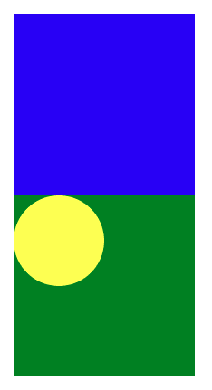
Here’s what happened:
- I gave the green box an
idattribute so that I could query the DOM element for the portal to render into. - The blue box uses the portal to render the yellow disk inside the green box.
- I used the state to keep track of the reference to the green box and useEffect to find the element after both boxes have been rendered. If I tried to find the green box by id outside of
useEffect, then I might not find it. Depending on the nesting and element order, the green box might not be rendered yet. However, in the real world, we usually render intodocument.bodywhich always exists and we can query it directly without theuseEffect.
React event propagation using portals
Well, rendering the element is not something special. In fact, you may achieve the same result without using portals, by using refs.
However, portals give us one advantage - they allow the React events to bubble up the React component tree to their parent React elements.
This is what allows the blue box to keep tabs on the events from the yellow disc, even though it’s rendered inside of the green box.
In fact, to observe this behavior, add onClick={() => console.log("blue clicked!")} to the blue box div and onClick={() => console.log("green clicked!")} to the green box div.
You will notice that the click event on the yellow disc bubbles up and triggers a click event handler on the blue box. But it doesn’t trigger it on the green box. That’s what I mean when I say that the blue box owns the yellow disc.
See it in action here:
If you inspect the DOM now, you will see that the green box now contains the disc even if the blue box owns it:

How come the blue box receives the events and not the green box?
There is no magic here. This is simply because React uses its own event system which works in parallel with the DOM event system. React events bubble up the React component tree, and DOM events bubble up the DOM tree.
$ What problems do portals solve?
At this point, you may understand how portals work, but how do you know when to use them?
You won’t need to use portals often. If you’re a beginner, you most likely won’t need to use them at all for a long time. Even in the above example, if we just let the green box render the circle, we’d have no problems. However, there are some cases where portals can be life-savers.
Tooltips in the real world
Let’s say you’re building a tooltip:
import React, { useState } from "react";

interface Props {
  text: string;
  children: React.ReactNode;
}

function Tooltip({ text, children }: Props) {
  const [isVisible, setVisible] = useState(false);

  const handleMouseOver = () => setVisible(true);
  const handleMouseOut = () => setVisible(false);

  return (
    <div
      style={{ position: "relative" }}
      onMouseOver={handleMouseOver}
      onMouseOut={handleMouseOut}
    >
      {children}
      {isVisible && (
        <div
          style={{
            top: "100%",
            left: 0,
            position: "absolute",
            paddingTop: 5,
            zIndex: 10
          }}
        >
          <div
            style={{
              background: "black",
              color: "white"
            }}
          >
            {text}
          </div>
        </div>
      )}
    </div>
  );
}

function App() {
  return (
    <div>
      <Tooltip text="Clicky clicky">
        <button>Button</button>
      </Tooltip>
    </div>
  );
}

export default App;
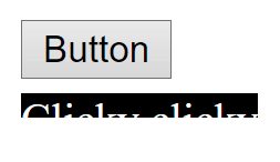
If you hover the button, you get a tooltip below that says Clicky clicky. It’s basic but works fine. That’s how I would start out building a simple tooltip.

However, what if at some point we need to use it in a container, that hides the overflowing content? To see the problem, add style={{ height: 35, overflow: "hidden" }} to the div in App component. Our tooltip gets cut off.
That’s a real-world issue that portals can help us solve. Also, you may have noticed that the tooltip component wraps its children with a relatively positioned div. This can make it difficult to use such tooltips in practice because you’d need to put extra effort to ensure they don’t mess up the layout.
See it in action:
How do portals help to implement tooltips?
The general way to solve the clipping issue is:
On hover, determine the anchor point for the tooltip on-screen, normally using getBoundingClientRect or offsetLeft and offsetTop properties on the element.
Render the tooltip as close to <body> element as possible.
Use fixed position on the tooltip and position it near the anchor element using the anchor point coordinates we got previously.
Whoa, this quickly got a lot more complex. And because the tooltip is now a free-floating element on the screen, we may need to handle edge cases, such as:
- The tooltip position may need to update when we scroll;
- The tooltip should re-position itself near the screen edges if it goes out of the screen.
- The tooltip should work well with other free-floating elements such as modals.
None of these issues are trivial to solve, that’s why we have libraries whose sole purpose is to manage the positioning of floating elements, like react-laag and popperjs. In fact, you’re probably better off not building a custom tooltip solution of your own. Been there, done that…
Here’s what such a tooltip implementation may look like in the real world:
import React, { useState } from "react";
import ReactDOM from "react-dom";

interface Props {
  text: string;
  children: React.ReactNode;
}

function Tooltip({ text, children }: Props) {
  // Position of the bottom edge of the anchor element.
  // Doubles as isVisible state: null means hidden
  const [position, setPosition] = useState<{
    x: number;
    y: number;
  } | null>(null);

  const handleMouseOver = (
    e: React.MouseEvent<HTMLElement>
  ) => {
    // Place the tooltip near the anchor's bottom edge on the screen
    const bounds = e.currentTarget.getBoundingClientRect();
    setPosition({
      x: bounds.x,
      y: bounds.y + bounds.height
    });
  };

  const handleMouseOut = () => setPosition(null);

  const anchorProps = {
    onMouseOver: handleMouseOver,
    onMouseOut: handleMouseOut
  };

  // Clones the child element to remove the div wrapper around it.
  // Child node must accept or forward mouse events.
  // We can't set even handlers on text, so we wrap it with <span>.
  const anchor = React.isValidElement(children) ? (
    React.cloneElement(children, anchorProps)
  ) : (
    <span {...anchorProps}>{children}</span>
  );

  // We use react portal to render the tooltip into document.body.
  // To place it near the button, we use the position from the event.
  // The position is "fixed" so it won't be affected by overflow rules.
  return (
    <>
      {anchor}
      {position &&
        ReactDOM.createPortal(
          <div
            style={{
              top: position.y,
              left: position.x,
              position: "fixed",
              paddingTop: 5,
              zIndex: 10
            }}
          >
            <div
              style={{
                background: "black",
                color: "white"
              }}
            >
              {text}
            </div>
          </div>,
          document.body
        )}
    </>
  );
}
Here’s what I did:
- I’ve replaced
isVisiblewith the tooltip’s position on the screen. If the position is set, it means the tooltip is visible, otherwise, it’s hidden. - I changed the hover event handler to get the button’s height and position on the screen. Then I use them to place the tooltip at the bottom edge of the button.
- I assigned the event handlers to the anchor, by cloning it first. This allows me to remove the
divwrapper from the tooltip, so it doesn’t affect the layout in any way. You could leave the wrapper and pass it the event handlers, but I don’t like it when commonly used components, such as tooltips, make me think about how they will affect layouts. - Finally, I used a React portal to render the tooltip into
document.body, so that it’s not affected by the parent elements’ layout rules. Then I changed its position tofixed, and set its coordinates on the screen to be at the bottom of the button.
If you test it now, you will see that the tooltip works exactly the same, but it’s not affected by the overflow: hidden that we set on the button’s container div. If you implemented dropdowns, modals, and toasts in a similar fashion, they would also be unaffected by the layout rules.
However, it is important to realize the tradeoffs of this implementation:
- The code is now harder to understand.
- We need to do more work because we need to sync the tooltip's position with its anchor element. It can be hard:
- If the anchor or the tooltip is animated or change sizes frequently.
- When we scroll the page we should reposition or hide the tooltip.
- If the tooltip is near the edge of the screen, we may want to adjust its placement to stay inside the screen.
Here’s the final implementation in action:
Conclusion
The problems and solutions, where we may apply React portals, follow a similar pattern:
- An element is affected by the parent element’s positioning or overflow rules.
- Using portals, we render the component in another place, where it’s no more affected by those rules.
Here are some common real-world use cases for portals: tooltips, dropdowns, modals, overlays, and toasts.
Portals often make the implementation more complex and introduce edge cases, so I would only use them if no simpler method is available. Honestly, I don’t see much wrong with the original implementation of the tooltip in my example, and I would start with that.
In the real world, when faced with the above use cases, it’s probably simpler to use a reliable UI component for modal, dropdown, or tooltip instead of building your own.
Nevertheless, it’s a worthwhile exercise to try to build your own implementation to get familiar with the problems. Solving them will make you a better developer, no matter what skill level you’re at.
Though it’s probably best if you do that in your own sandbox project...
This article is republished from my programming blog. Follow me on Twitter to learn how to build real-world web applications using React.
If you want to master Promises, the best way to do that is by implementing them from scratch. I explain how in this article: Asynchronous Javascript - Learn Promises From Scratch.

Top comments (0)