
As a web developer, I love to provide users with good UX. In my opinion, this means, at the minimum, to have consistent pages, layouts, and consistent widgets within pages. When I can’t find the right widget in the toolkit provided, I create my own to be sure I can build a UX I can be proud of. As a side benefit, having widgets tailored to my needs saves my time and effort and allows me to be more efficient at my work.
In this article, I am going to explain how to create a custom search widget in Bonita UI Designer. This article has 2 parts. The first part explains how to create a search widget and change the appearance of the widget when we drag and drop it onto the whiteboard in Bonita UI Designer.
The second part explains how to add some CSS to make the search widget functional to the end-users.
Part I: Define the appearance of your custom widget
Step 1
- Go to the Bonita UI Designer home page.
- Click on the Create button.
- Choose Custom widget in the Type section.
- Give a proper name to the widget (eg. searchWidget).
- Click on Create.

The custom widget editor window will appear. A custom widget is composed of six different sections: Description, Template, Controller, Assets, Required angular modules, and Properties. As we are creating a custom widget, we will make some modifications in the Template, Assets, and Properties sections.

Step 2
- Remove everything from all the sections. We are going to create our widget from scratch.
- Now, our widget editor window looks like this:

Define the Properties section
Step 3: Property 1: Value
- Click on the Create button.
- A "Create new property" dialog box will appear.
- Set the properties:
- Name = value
- Label = Value
- Treat value as = Bidirectional bond
- Click on Create.
Note: The value property saves the value we type in our widget.

Step 4: Property 2: Placeholder
- Click on the Create button.
- A "Create new property" dialog box will appear.
- Set the properties:
- Name = placeholder
- Label = Placeholder
- Treat value as = Interpolation
- Click on Create.
Note: This property sets a custom placeholder for our widget.

The Template section
In the template section, we will write some internal CSS as well as HTML codes, which means the code applies to change the look and feel of a widget that appears on the whiteboard.
Step 5
In the template section, write the following HTML and internal CSS codes:
HTML
<div ng-if="environment">
    <input class="search-input" />
    <span class="icon-container"><i class="glyphicon glyphicon-search"></i></span>
</div>
Note: in the HTML code above, ng-if="environment" detects that the widget is displayed within the UI Designer whiteboard. It allows us to define how the widget is displayed to the developer within the UI Designer (as opposed to now the widget displayed to the user within a web page at runtime).
CSS
<style>
.search-input {
    padding: 0 15px;
    height: 35px;
    border: 1px solid rgba(11,67,97,1);
    border-radius: 35px;
    outline: none;
    color: rgba(11,67,97,1);
    width: 100%;
    opacity: 1;
    background: #fff;
}

.icon-container {
    position: absolute;
    right: 17px;
    padding: 9px;
    height: 35px;
    width: 35px;
    border: 1px solid rgba(11,67,97,1);
    border-radius: 50%;
    z-index: 5;
    background: rgba(11,67,97,1);
}

.icon-container .glyphicon {
    font-size: 16px;
    color: #fff;
}
</style>
Note: All the CSS codes must be written inside the tag. Since Bootstrap is embedded by default in the UI Designer, we can easily use the bootstrap glyphicons.
Now, the widget editor looks like this:

- Click on the Save button.
- Bravo!!! We have created our search widget successfully.
Step 6 (optional)
Pro tip - Defining the widget icon
Since Bonita will ultimately provide an easy way for Bonitasoft users to define the widget icon as per their need, Step 6 is not mandatory. Nevertheless, to give a real look and feel to the custom search widget icon, you can try this pro tip:
- Open the “customSearchWidget.json” file located inside your Bonita workspace (eg. /workspace/My project/web_widgets/customSearchWidget/customSearchWidget.json).
- Copy and paste the given code below after the “template” line inside the “customSearchWidget.json”.
"icon" : "<svg xmlns='http://www.w3.org/2000/svg' viewBox='0 0 512 512' fill='#fff'><g transform='translate(0.000000,512.000000) scale(0.100000,-0.100000)' fill='#fff' stroke='none'><path d='M1905 4794 c-512 -79 -967 -381 -1234 -817 -297 -485 -342 -1053 -124 -1570 160 -381 476 -715 848 -897 485 -237 1024 -237 1510 0 55 27 134 72 177 100 42 27 80 512 85 50 4 0 310 -301 678 -670 l670 -670 142 142 143 143 -667 667 c-665 665 -666 666 -650 690 9 13 48 66 87 118 124 169 241 432 284 641 79 384 26 776 -153 1127 -261 512 -751 865 -1312 947 -130 18 -361 18 -484 -1z m403 -195 c349 -38 647 -171 895 -399 390 -360 562 -928 445 -1469 -119 -555 -550 -1003 -1095 -1142 -169 -43 -265 -52 -463 -46 -307 10 -554 88 -801 252 -459 306 -709 829 -667 1399 58 801 700 1401 1511 1415 43 0 121 -4 175 -10z'/> </g> </svg>",

- The SVG code generates a magnifying glass icon for our search widget.
- Save the file and close it.
Hurray!!!!!!!! We have now successfully changed an icon of the widget. Now, it's time to use our custom widget inside an application page.
Step 7
- Go to the Bonita UI Designer home page.
- Click on the Create button.
- Choose Application page.
- Give a name to the page (eg. searchApplication).
- Click on Create.
- Now, in the page editor window, click on the Custom widgets tab on the left.
- We can see now that the searchWidget appears on the list and has a magnifying glass as an icon.
- Drag and drop the search widget onto the whiteboard.
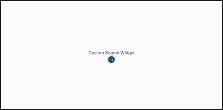
Output
The widget on the whiteboard will be shown the same as in the image below;

We have completed the definition of the custom search widget, and now we are going to make the search widget functional to end-users.

The implementation steps that follow are based on a large device screen resolution (i.e., screen width >= 1200px). You can change the responsiveness of the page by clicking on the different device screen size icon that appears on the top right corner in Bonita UI Designer.
Part II: Implement the custom search widget controller
Step 8
- Click and select the custom search widget on the whiteboard.
- Click on the “...” button next to the widget name on the right.
- Click on Edit.

- The widget editor window will appear.
Step 9
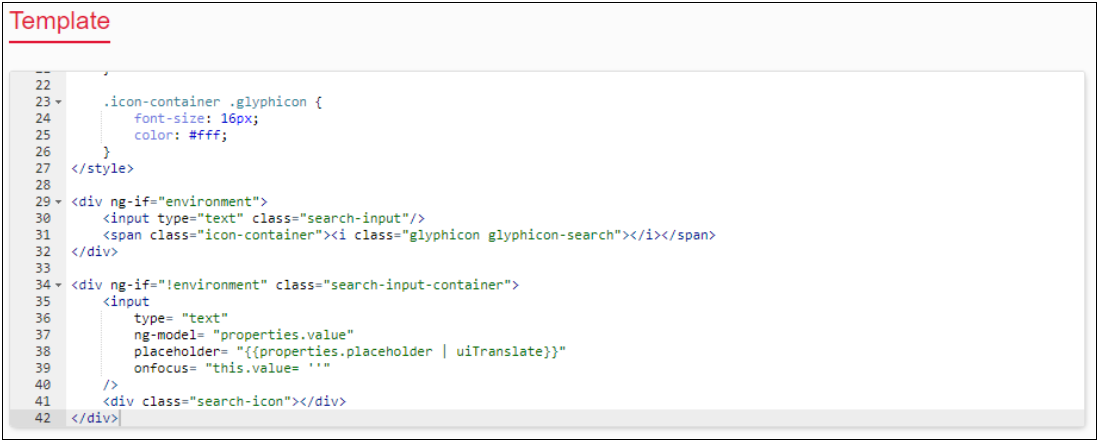
- In the Template section after the end of
<div ng-if="environment"></div>tag, write the following HTML code:
HTML
<div ng-if="!environment" class="search-input-container">
<input
type= " text "
ng-model= " properties.value "
placeholder= " {{properties.placeholder | uiTranslate}} "
onfocus= " this.value= '' "
/>
<div class="search-icon"></div>
</div>
```
**Note:** In the HTML code above, `ng-if="!environment"` detects that the widget displayed to the user within a web page at runtime. Additionally, `ng-modal="properties.value"` stores the value entered in the widget, and `placeholder="{{properties.placeholder}}"` defines the placeholder for the widget.
- Now the Template section looks like this:
#### Step 10 ####
- Create a CSS file somewhere on your computer (e.g., D:\search-wideget.css) and copy the following CSS code into it:
*CSS*
```
.search-input-container {
width: 100%;
height: auto;
}
.search-input-container .search-icon {
position: absolute;
top: 30px;
right: 0;
bottom: 0;
left: 0;
margin: auto;
width: 35px;
height: 35px;
background: rgba(11,67,97,1);
border-radius: 50%;
transition: all 1s;
z-index: 5;
box-shadow: 0 0 15px 0 rgba(0,0,0,0.4);
}
.search-input-container .search-icon:hover {
cursor: pointer;
}
.search-input-container .search-icon::before {
content: "";
position: absolute;
margin: auto;
width: 8px;
height: 3px;
background: #fff;
top: 12px;
right: 0;
bottom: 0;
left: 12px;
transform: rotate(45deg);
transition: all .5s;
}
.search-input-container .search-icon::after {
content: "";
position: absolute;
margin: auto;
height: 15px;
width: 15px;
border: 2px solid #fff;
border-radius: 50%;
top: -5px;
right: 0;
bottom: 0;
left: -5px;
transition: all .5s
}
.search-input-container input {
position: absolute;
margin: auto;
padding: 0 60px 0 15px;
width: 35px;
height: 35px;
top: 30px;
right: 0;
bottom: 0;
left: 0;
border: 1px solid rgba(11,67,97,1);
border-radius: 35px;
background: #fff;
outline: none;
color: rgba(11,67,97,1);
z-index: 6;
opacity: 0;
transition: all 1s;
}
.search-input-container input:hover {
cursor: pointer;
}
.search-input-container input:focus {
width: 90%;
opacity: 1;
cursor: text;
}
.search-input-container input:focus ~ .search-icon {
right: calc(-90% + 35px);
background: rgba(11,67,97,1);
z-index: 6;
}
.search-input-container input:focus ~ .search-icon::before {
width: 15px;
top: 0;
left: 0;
}
.search-input-container input:focus ~ .search-icon::after {
height: 3px;
width: 15px;
border: none;
border-radius: 0;
transform: rotate(-45deg);
background: #fff;
top: 0;
right: 0;
left: 0;
}
```
**Note:** You can define the vertical and horizontal positioning properties such as; top, bottom, left, and right as you wish. In the CSS code above, `“.search-input-container .search-icon::before”` and `“.search-input-container .search-icon::after”` creates a magnifying glass icon. Similarly, `“.search-input-container input:focus ~ .search-icon::before”` and `“.search-input-container input:focus ~ .search-icon::after”` creates an “X” icon.
- Now, save the CSS file and close it.
#### Step 11 ####
- In the widget editor window in the Bonita UI Designer, click on the *Add* button in the **Assets** section and upload the CSS file we created in the previous step.
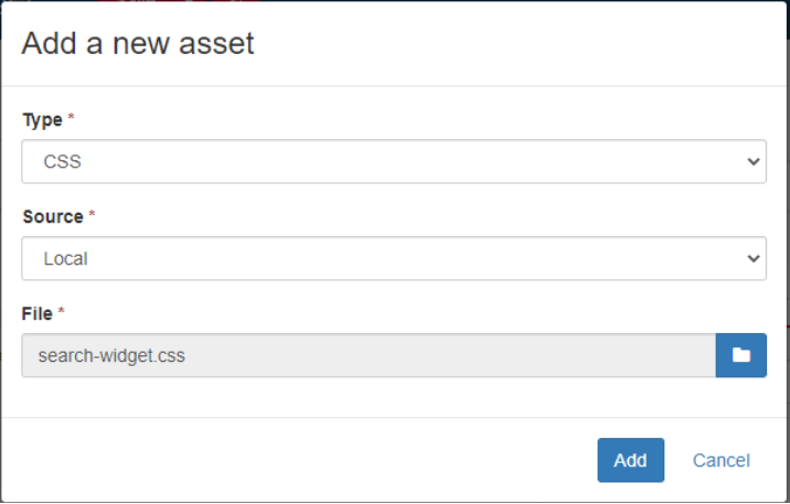
- After uploading the CSS file, the Assets section should show the file in the list as shown below:
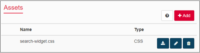
- Click on the *Save* button to save all the modifications applied to the widget.
#### Step 12 ####
- Go back to the Bonita UI Designer home page.
- Click on *searchApplication* (the page we created in part 1).
- Clean the page if there is already a widget on it.
#### Step 13 ####
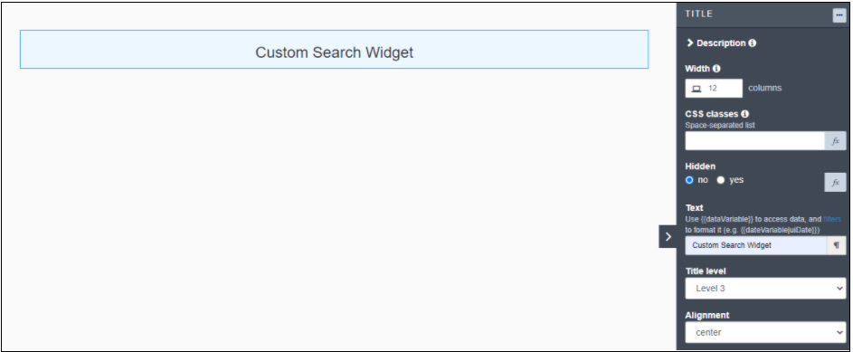
- Drag and drop a title widget to the whiteboard and set the properties:
- Width = 12
- Text = Custom Search Widget
- Title level = Level 3
- Alignment = center
#### Step 14 ####
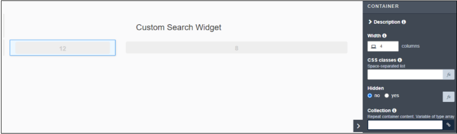
- Drag and drop a container widget below the title and set the width property = 4.
#### Step 15 ####
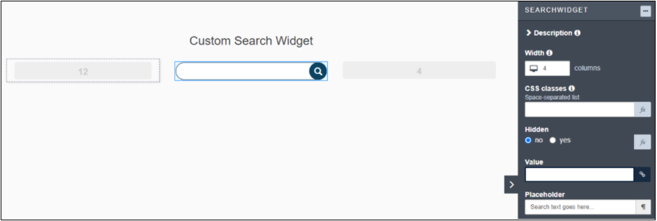
- Click on the *Custom widget* tab on the left.
- Drag and drop the searchWidget next to the empty container and set the properties:
- Width = 4
- Placeholder = Search text goes here...
#### Step 16 ####
- Drag and drop another container widget right to the search widget and set the width = 4.
- Finally, save the page and see the preview.
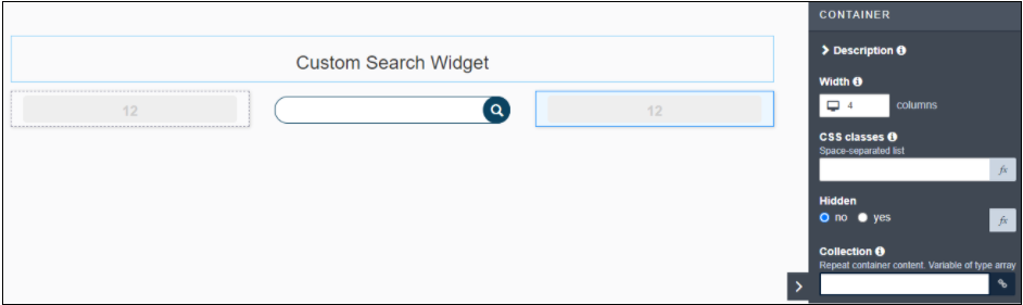
#### Output ####

I would love to know what other kinds of custom widgets you would like to implement with Bonita UI Designer. Please share your tips and examples.
Have fun with **Bonita!**

Top comments (0)