Written by Timi Omoyeni
When building a web app, one of the most common features developers will be building and managing is forms. They can be crucial to the success of a business, which is why it’s so important that your forms are intuitive for users to complete, well validated, and easy for developers to maintain.
This is where a tool like FormKit comes in, which provides not just UI elements to deliver high quality forms, but offers built-in validation, and support for more advanced features like schema-driven forms and more.
Join me as we explore how FormKit can save us time, energy and maintenance for use in our Vue.js projects.
You can find all the code examples used in this tutorial on [_GitHub](https://github.com/Timibadass/formkit-app)._
Introduction to FormKit
According to their official documentation, FormKit is a comprehensive form-building framework designed for Vue developers. It enables faster and more accessible authoring of high-quality production-ready forms, with improved DX, UX, and reduced code.
Naturally, when building out forms in projects, regardless of the framework, it’s common to use libraries that assist with validation in addition to UI libraries for the required form components.
From there, building out the form schema becomes your responsibility. Depending on the complexity, it can be a tedious task. FormKit is unique because it’s a one-stop shop that enables developers to efficiently build all of the necessary features without relying heavily on other libraries.
FormKit’s underlying architecture exists to make the process of obtaining data from your form more straightforward, regardless of how complex the structure may seem.
Here are some of the features the FormKit framework provides:
- Form UI elements : The element accepts a type prop for the form element type you need. This component translates to the default HTML tag in the browser, while also providing additional features beyond the default elements.

2. Form Configuration: FormKit provides additional attributes/props like validations, prefix-icon, help, and many more that further enhance the behavior of our form and also help provide a better UX for users.

3. Form Schema : FormKit also provides a powerful schema to store and generate forms. Under the hood, the FormKit element is powered by this schema, a JSON-serializable data format for storing DOM structures and implementations.
FormKit has other exciting features, some of which include:
- Styling
- Accessibility
- Extensibility
FormKit is particularly useful in form building because it embodies all the necessary features needed when building out a form. This comes in handy when thinking about performance and the maintenance of your codebase because you can set up validation, a beautiful UI, and also generate forms using JSON schema using only FormKit. This reduces the number of libraries needed to get your project running, thereby reducing your application’s bundle size and ultimately improving your app’s performance.
Getting Started with Formkit
To use FormKit in our project, we’ll need the following:
- Node.js v 14.18.0, 16.12.0, or higher.
- Vue 3 or Nuxt 3.
- A terminal to run our commands.
For Nuxt 2 or Vue 2 users looking for a library that offers the same benefits as FormKit, you can check out VueFormulate. VueFormulate is a predecessor to FormKit. It includes all the features and supports older versions of Vue and Nuxt.
To install FormKit in a new project, you can use any of the package managers like npm or yarn using the following commands:
npm
// Nuxt 3
npm install @formkit/nuxt

// Vue 3
npm install @formkit/vue
yarn
// Nuxt 3
yarn add @formkit/nuxt

// Vue 3
yarn add @formkit/vue
FormKit also offers an installation command for setting up a project from scratch with FormKit.
npx formkit@lates create-app
// or
npx formkit@latest create-app //latest formkit version
This command is followed by a series of prompts that guide you on how to set up your new project.
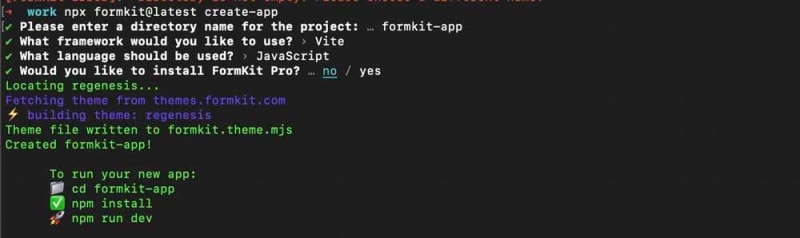
For this tutorial, we are going to create a Vue 3 project using the npx formkit@latest create-app command and follow the setup prompt that follows.
npx formkit@latest create-app
Once this setup is complete, we can install FormKit in our app.
After this installation is complete, along with the other instructions provided, when we visit the link our app is hosted on, we should see a default FormKit page.
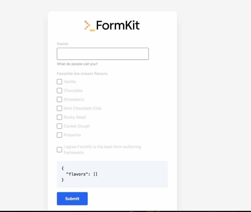
The code powering this page can be found in App.vue and it looks like this:
<script setup>
async function submit() {
  await new Promise(r => setTimeout(r, 1000))
  alert('Submitted! 🎉')
}
</script>

<template>
  <div class="bg-white rounded-xl shadow-xl p-8 mx-auto my-16 max-w-[450px]">
    <img
      src="https://pro.formkit.com/logo.svg"
      alt="FormKit Logo"
      width="244"
      height="50"
      class="mx-auto mb-8 w-48"
    >
    <FormKit
      type="form"
      #default="{ value }"
      @submit="submit"
    >
      <FormKit
        type="text"
        name="name"
        label="Name"
        help="What do people call you?"
      />
      <FormKit
        type="checkbox"
        name="flavors"
        label="Favorite ice cream flavors"
        :options="{
          'vanilla': 'Vanilla',
          'chocolate': 'Chocolate',
          'strawberry': 'Strawberry',
          'mint-chocolate-chip': 'Mint Chocolate Chip',
          'rocky-road': 'Rocky Road',
          'cookie-dough': 'Cookie Dough',
          'pistachio': 'Pistachio',
        }"
        validation="required|min:2"
      />

      <FormKit
        type="checkbox"
        name="agree"
        label="I agree FormKit is the best form authoring framework."
      />
      <pre class="font-mono text-sm p-4 bg-slate-100 mb-4">{{ value }}</pre>
    </FormKit>
  </div>
</template>
In this file, we can see the FormKit component being used in four places, with the name prop accepting three different values:
- form: used for binding all values from all form elements as one.

name.
checkbox.
We also have a formkit.theme.mjs, which is shipped by default when you set up your project using the npx command. This theme is known as Regenesis which, under the hood is a Tailwind theme that can be useful in styling your form components.
We are going to learn about all the possible values that the FormKit element can accept and how we can make the best out of all the features FormKit has to offer.
The FormKit Element
Now that we have successfully set up our project to use FormKit, it is time to look at what the component can do. FormKit ships with only this component, which is capable of serving all intended purposes related to building a complete form. This is possible because the component includes a few props that are used for accessibility and general form logic.
Let’s take a look at some of these props.
FormKit type property
The FormKit component accepts a type prop that is used to set the behavior of the component. This prop accepts a handful of values, most of which are native input element types (text, email, date, password) and are used to determine the type of input to render. By default, this prop has a value of text.
<template>
  <div>
    <FormKit />
  </div>
</template>
If we inspect our code in the browser, we can see what the component translates to:

The type prop also accepts a type form that is used to group fields as well as make the process of validation much easier.
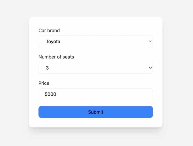
Here’s an example of what that would look like:
<FormKit type="form">
   <FormKit label="Car brand" type="select" name="cars" />
   <FormKit label="Number of seats" type="select" name="numberOfSeats"/>
   <FormKit label="Price" type="number" name="price" />
</FormKit>
FormKit name property
The name property is used to bind input values to their corresponding property. If this prop is not set on your form, a default value of type + ‘_n’ is set where type is the input type passed to the component and n is the number of input elements you have in your form.
For example, if we do this:
<FormKit type="text" name="address"/>
It translates to the following in the DOM:
- Create an input element of type ”text”.
- Give it a name of “address”.
- Bind every value in this form to the property address in our imaginary form object.
The name prop comes in handy when you group your input elements using the type value of form. This automatically binds the value in all the input fields in your form to their respective name values without the need for v-model.
Other FormKit component props include:
- id
- label
- placeholder
- help
- plugins
- validation-visibility
While we are already familiar with some of these properties, we’ll explore the others and see them in action in a later section.
Building a simple form with FormKit
When building a login form using plain HTML, it usually looks like this:
<form action="">
  <label for="email">Email</label>
  <input type="email" name="email" id="email">
  <label for="password">Password</label>
  <input type="password" name="password" id="password">
  <button>Login</button>
</form>
Here, we have a login form that consists of email and password fields, each with their respective labels, as well as a submit button.
When viewed in the browser, we’d get a form that looks something like this:

But we can recreate this form with fewer lines of code using FormKit.
Let’s create a new component called LoginForm , which will use three types:
- form : This type helps us group all the values in our input field under one form.
- email : We use this to inform FormKit that we expect an email address to be entered in the input. Thus, it should apply the default email validation to the given value.
- password : We also use this value to specify that we want a password input field.
LoginForm.vue
<FormKit type="form">
  <FormKit type="email" name="email" label="Email" />
  <FormKit type="password" name="password" label="Password" />
</FormKit>
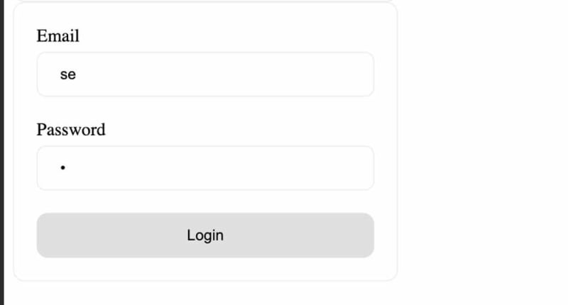
When we check this out in the browser, we should see a simple login form being displayed.
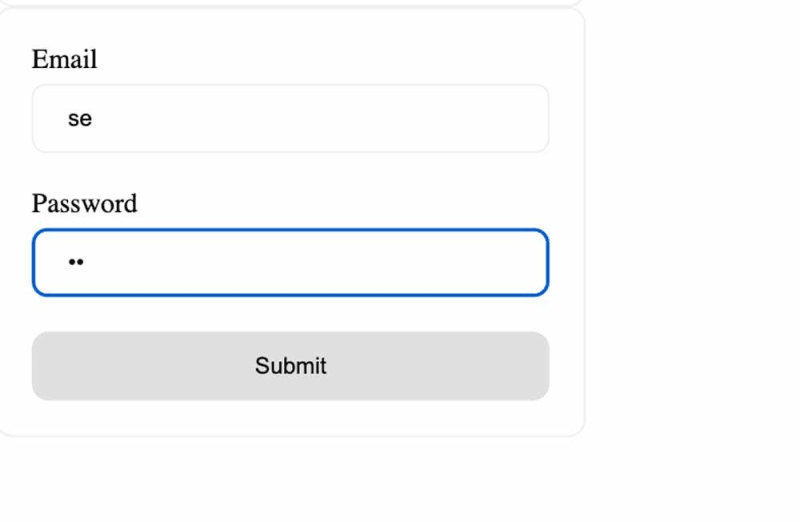
Also, we can see that a submit button is automatically added to this form. This is part of the benefits that come with wrapping our form inside a . This input type comes with several benefits like error handling, form submission, loading states, and more. We can change the text of this button using the submit-label prop.
LoginForm.vue
<FormKit type="form" submit-label="Login">
  <FormKit type="email" name="email" label="Email" />
  <FormKit type="password" name="password" label="Password" />
</FormKit>
Now when we save this change and view it in the browser, we should see that our form button now has the text “Login”.
As discussed earlier, another benefit of grouping our form elements using the type form is being able to access the values of every field inside this form.
To see this in action, we are going to modify our LoginForm.vue component.
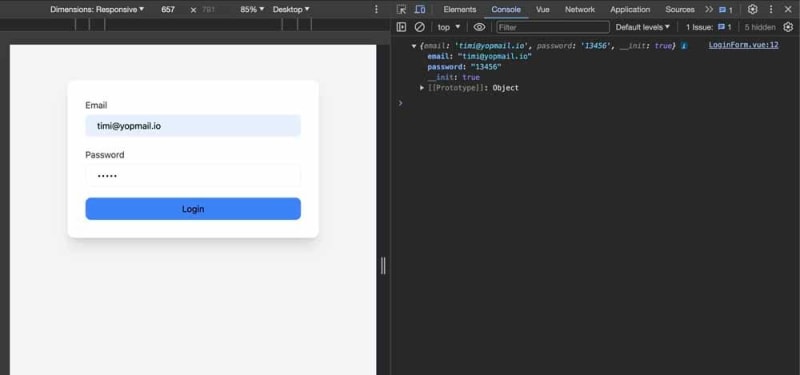
In this code snippet, we have added a @submit event with a logDetails function. This event is the same as the native submit event we are used to; it returns an argument that contains all the values of the inputs in the form.
To demonstrate this, let’s log the values in our console to show that they are correct. With this approach, we do not need to use v-model in our input fields to get their values.
<template>
  <div>
    <FormKit type="form" submit-label="Login" @submit="logDetails">
      <FormKit type="email" name="email" label="Email" />
      <FormKit type="password" name="password" label="Password" />
    </FormKit>
  </div>
</template>

<script>
//log values to the console
const logDetails = (v) => {
  console.log(v);
}
</script>
We can see the values of our form being logged after submitting the form.
At the moment, we can submit the form without filling in the form, which is not how most production-ready forms work. To fix this, we are going to add a validation prop to both the email and password fields and set it to required.
<FormKit type="form" submit-label="Login" @submit="logDetails">
  <FormKit type="email" name="email" label="Email" validation="required" />
  <FormKit type="password" name="password" label="Password" validation="required" />
</FormKit>
At this point, if we try to add and delete any property from either field, this is what we see in the browser:
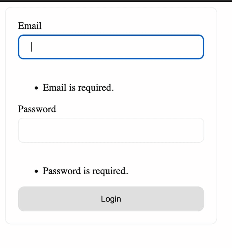
It also adds another error when you attempt to submit the form.

For this form, simply passing a required value for validation meets our current needs. As we proceed, we’ll explore additional validation options for more intricate forms.
FormKit Configuration
As we continue building our forms, we may need further configurations, such as custom validation and data manipulation. Since FormKit aims to be the “form framework” for every project and JavaScript framework on the web, it includes everything you are likely to need to build a form. Let’s take a look at some of the available configurations.
Validations
In the Vue.js ecosystem, libraries such as Vuelidate are available for form validation and validation messages. These tools simplify the complex task of validation, allowing us to concentrate on the UI and overall application logic.
As we saw above, with FormKit we can achieve this task using the validation prop.
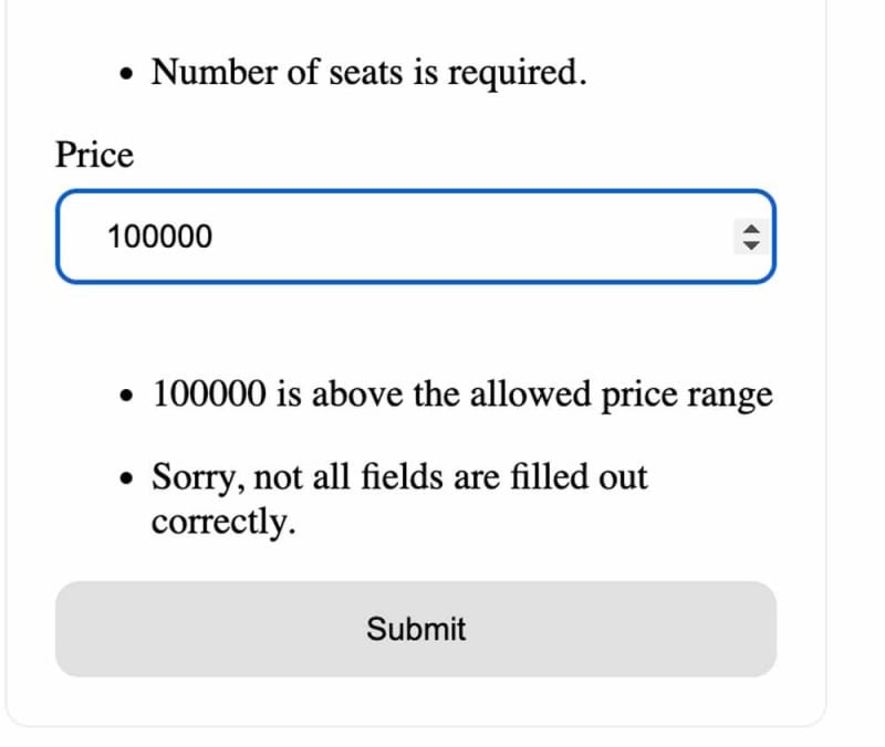
In the code snippet below, we are using two types of inputs: select for “cars” and “numberOfSeats”, and number for “price”.
To handle validation, we can make use of the validation prop which is attached to all fields. With FormKit, we can use multiple validation rules for one input field by separating the rules with a pipe (|) as used in our “Price” field: validation="required | min:10000 | max:50000"
For this input, we make use of three validation rules:
- required: This field is required.
- min: The value entered for our price cannot be less than 10,000.
- max: The value entered for our price cannot exceed 50,000.
FormKitExample.vue
<template>
 <div>
  <FormKit type="form" submit-label="Submit" @submit="validateForm">
   <FormKit label="Car brand" type="select" :options="cars" name="cars" v-model="state.car" validation="required" />
   <FormKit label="Number of seats" type="select" :options="seats" name="numberOfSeats" v-model="state.numberOfSeats" validation="required" />
   <FormKit label="Price" type="number" v-model="state.price" name="price" validation="required | min:10000 | max:50000" />
  </FormKit>
 </div>
</template>
You can find the full list of validation rules in FormKit here
In addition to validation, FormKit provides a validation-messages prop that allows you to customize the error messages for your validations.
<FormKit label="Price" type="number" v-model="state.price" name="price" validation="required | min:10000 | max:50000" :validation-messages="{
    max: ({ node: { value } }) => `${value} is above the allowed price range`
   }" />
Here, we added the validation-messages prop which accepts an object of the validation rules we intend to customize. Each rule returns a function that takes the node as an argument, this node has access to the form element (input, form, group) and the value for them (depending on the type). This allows us to make use of the value inside the input field in our custom message.
Error Handling with FormKit
The use of input fields and form validations has become standard practice on the frontend, regardless of backend validation. Despite these precautions, submission errors can still occur due to various reasons such as server downtime or validation errors. With FormKit, we can display these errors to the user with any of the following methods:
- Using the errors prop on the element.
- Displaying errors using node.setErrors()
- Using the FormKit Vue plugin method $formkit.setErrors()
Using the errors Prop in Formkit
This approach necessitates the grouping of your form using the component. This component has access to the @submit event and the values of all fields within your form.
Consequently, we can utilize this event to decide when to display these errors to the user.
<template>
  <FormKit type="form" submit-label="Submit" @submit="createUser" :errors="errors">
    <FormKit
      name="fullName"
      id="fullName"
      type="text"
      label="Full Name"
      validation="required"
    />
    <FormKit
      name="email"
      id="email"
      type="email"
      label="Email"
      validation="required"
    />
    <FormKit
      name="address"
      id="address"
      label="Address"
      type="textarea"
      validation="required"
    />
  </FormKit>
</template>

<script setup>
import { ref } from "vue";
const errors = ref([""]);
const createUser = (v) => {
  setTimeout(() => {
  errors.value = ['Something happened']
 }, 2000);
};
</script>
In this example, we have a form with three inputs, fullName, email, and address. We group this form using the and add an errors prop. We pass an errors ref to this prop so we can set the errors dynamically after submitting the form. This is our way of mimicking a network request to the server that fails and returns errors that must be displayed to the user.
Displaying errors using node.setErrors() in FormKit
When a method is passed to the @submit event, it automatically receives value and node as arguments. The node provides us with all the information about the form while the value contains the values of all fields inside the form in an object.

With this approach, we can handle errors that are specific to both the input fields and the general form. We can achieve this by using the submit event on the form and the setErrors method.
The setErrors method takes two arguments:
- An array for form-specific errors.
- An object for setting input field-specific errors.
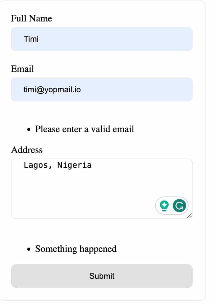
Using the same form from above, let’s modify the createUser function to check if the email has “yopmail” in it. If this condition is met, we’ll use the node.setErrors method to set the errors from this form.
First, we’ll pass a form error with the text “Something happened” and then another error specifically related to the email field that prompts the user to enter a valid email:
const createUser = (v, node) => {
 if (v.email.includes("yopmail")) {
    node.setErrors(["Something happened"], {
      email: "Please enter a valid email",
    });
  }
};
In addition to displaying form-related messages at the bottom of your form, FormKit also provides you with other ways to handle validation and errors related to your form, such as , , and APIs available in @formkit/vue when using the Composition API.
Internationalization in FormKit
Internationalization (i18n) is an important aspect of configuring FormKit. With support for multiple languages, FormKit allows you to provide a localized experience to your users using the @formkit/i18n package, which provides support for 43 languages.
By configuring internationalization in FormKit, you can create forms that cater to users from different language backgrounds, enhancing the usability and accessibility of your application.
To configure i18n in FormKit, let’s create a formkit.config.js file in the root folder of our application. In this file, we can import the desired language from the @formkit/i18n package and add it to the locales object.
Finally, we can set this language as the default language for our app by passing it as a string to the locale property.
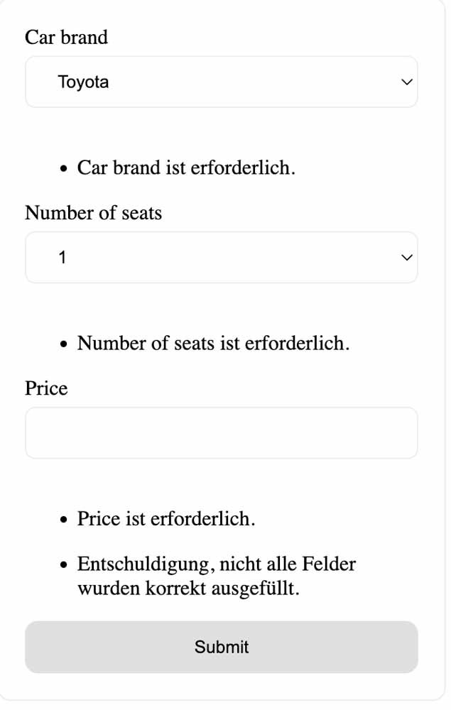
Let’s set our default language to German in our config file:
formkit.config.js
import { de } from '@formkit/i18n'

export default {
  locales: { de },
  locale: 'de',
}
If we save these changes and submit our form again (with validation errors) our default language should change from English to German.
Note that by default, ‘en’ is passed as the locale for your app when it is not otherwise set, and you can customize it, just as we have done. We can also change this value programmatically using any of the following
- $formkit.setLocale(newLocale) where newLocale is any of the supported languages on FormKit when using the Options API.
- config: With the Composition API, we do not have access to the $formkit plugin. Instead, we make use of the configuration object, which is globally available and can be injected by calling inject(Symbol.for('FormKitConfig')).
The FormKit Schema
Under the hood, the FormKit element is powered by the FormKit schema. The FormKit Schema is a JSON-serializable data format for storing DOM structures and component implementations, including FormKit forms. This schema is capable of generating forms using their respective input types by passing an array of inputs to the component.
In this example, we create a login form using FormKit’s schema by passing an array of three objects to .
These objects contain the following:
- $el: short for element.
- $formkit: which is short for in which the value passed here (e.g. email) is assigned as the form type.
- name, label, and validation: standard props for FormKit.
SchemaExample.vue
<template>
  <FormKitSchema :schema="schema" />
</template>

<script setup>
import { FormKitSchema } from "@formkit/vue";
import { ref } from "vue";
const schema = ref([
  {
    $el: "h1",
    children: "Login",
  },
  {
    $formkit: "email",
    name: "email",
    label: "Email",
    validation: "required|email",
  },
  {
    $formkit: "password",
    name: "password",
    label: "Password",
    validation: "required|length:5,16",
  },
]);
</script>
When we check this in the browser, we should get this result:

Although this schema was initially designed for building and implementing forms, it can also be used successfully for other DOM elements and components.
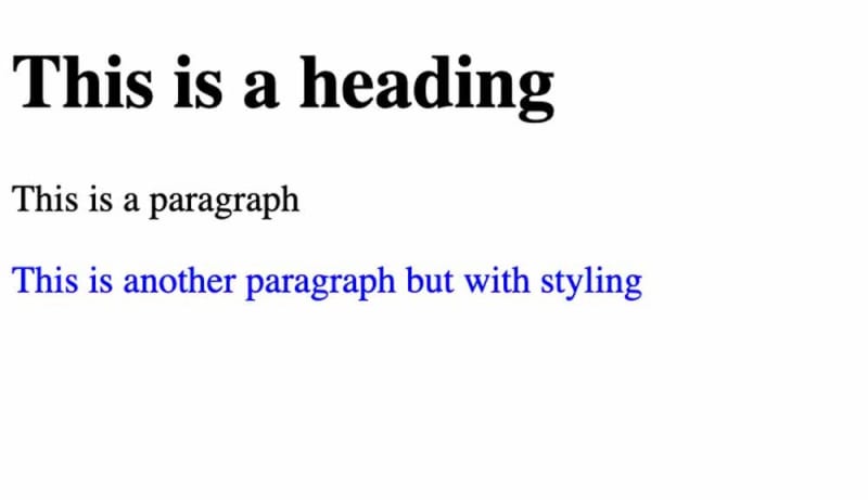
For example, we can utilize the schema to create a div element with multiple nested paragraphs, as shown below:
const schema = ref([
 {
  $el: 'div',
  children: [
   {
    $el: 'h1',
    children: 'This is a heading',
   },
   {
    $el: 'p',
    children: 'This is a paragraph',
   },
   {
    $el: 'p',
    children: 'This is another paragraph but with styling',
    attrs: {
     style: {color: 'blue'}
    }
   }
  ]
 }
])
In this code snippet, we use a div element and add a children property which takes an array of objects. These objects are also elements with properties we have seen earlier excluding the attrs property. The attrs property (an abbreviation for “attributes”) is utilized to set both native HTML and custom attributes on elements. In this instance, we use it to assign the style attribute to the second paragraph element, setting its color to blue.
When we open the app in our browser, we should see our changes being applied correctly:
Using Plugins With FormKit
Out of the box, FormKit ships with a couple of plugins that can improve the general experience of your forms. These plugins include the following:
- AutoAnimate: useful for adding animations to your application (or forms).
- Barcode input: allows scanning of a variety of 1D and 2D barcode types using cameras connected to your browsing device.
- Auto-height textarea: Allows you to give textarea a height that adjusts based on its content.
- Floating labels: useful for creating floating labels in your input fields.
- Multi-step input: makes the process of breaking forms down into steps easy.
- Save to localStorage: makes it easy to save input/form values to local storage
- Zod validation: This plugin allows you to enable validation on your forms and input using Zod schema.
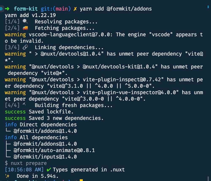
These plugins are included in the @formkit/addons package that has to be installed separately.
Let’s install this package in our project using this command:
yarn add @formkit/addons
After installation, we can import the plugin we need in our formkit.config.js file.
For this example, we are going to utilize the createLocalStorage plugin.
import { de } from '@formkit/i18n'
import { defaultConfig } from '@formkit/vue'
import { createLocalStoragePlugin } from '@formkit/addons' //import plugin here

const config = defaultConfig({
  plugins: [
    createLocalStoragePlugin({
      prefix: 'vuemastery',
      maxAge: 1000 * 60 * 60 * 4, // 4 hours
      debounce: 500,
    }),
  ],
  locales: { de },
  locale: 'de',
})
export default config
Coming from our existing formkit.config.js code, we import defaultConfig from the @formkit/vue package and also the createLocalStoragePlugin from @formkit/addons.
To configure the behavior of this plugin, we add the createLocalStoragePlugin to the plugins array and pass three properties:
- prefix : This is a string that is going to be prefixed to the key in the browser’s local storage. In our case, we’re using ‘vuemastery’ and this means we can identify the value of our form in local storage by checking for a key that starts with ‘vuemastery’. The default is formkit.
- maxAge: This works the same way caching and headers that are set in the backend work. We have set our example to 4 hours, which means that the values in the form become stale and invalid after 4 hours have elapsed. The default value is 1 hour (**1000 * 60 * 60**).
- debounce : We use this value to set a time the plugin has to wait before saving the changes in our form to local storage. This is done to reduce (or increase) the frequency at which the local storage is updated. The default value is 200.
After completing the configuration, we need to specify which forms should use this plugin. To do this, we add the use-local-storage attribute to the forms where we want to persist the data. This will ensure everything works as expected.
<template>
 <div>
  <FormKit type="form" submit-label="Submit" @submit="validateForm" use-local-storage>
   <FormKit label="Car brand" type="select" :options="cars" name="cars" v-model="state.car" validation="required" />
   <FormKit label="Number of seats" type="select" :options="seats" name="numberOfSeats" v-model="state.numberOfSeats" validation="required" />
   <FormKit label="Price" type="number" v-model="state.price" name="price" validation="required | min:10000 | max:50000" :validation-messages="{
    max: ({ node: { value } }) => `${value} is above the allowed price range`
   }" />
  </FormKit>
 </div>
</template>

<script setup>
import { reactive, ref } from "vue";
const cars = ref(["Toyota", "Lexus", "Honda", "Ford", "Chevrolet"]);
const seats = ref([1,2,3,4]);
const state = reactive({
  numberOfSeats: "",
  car: "",
  price: "",
});
const validateForm = async () => {
  console.log(state.value);
};
</script>
In this code, we added the use-local-storage to the form wrapper. When we fill out this form after adding this plugin and refresh our browser, we will see all the existing data.
This plugin allows additional configuration options such as beforeLoad, an optional asynchronous callback that receives the form data. It enables modification of the localStorage data before applying it to the form. Another option is key, which lets us include an optional key in the localStorage key name. This is useful for associating data with a specific user, among other things.
For a complete list of configuration options for this plugin and other plugins, refer to the official FormKit documentation.
Wrapping up
FormKit enhances the native HTML form experience with its user interface and customizable features. It offers a range of essential tools for our form-building process.
FormKit’s styling configuration makes it easy to customize your input’s appearance. This is particularly useful when working with a project’s theme or style guide. Moreover, FormKit provides icons as visual cues for your form’s purpose.
FormKit also allows building custom inputs that utilize its features. If you prefer creating your components, you can read more about custom inputs here.
To understand the technical aspects of the FormKit library and learn how to use it effectively, refer to the configuration and architecture documentation. These resources provide detailed information about node and the form layout and structure with FormKit.Originally published at https://www.vuemastery.com on March 22, 2024.

Top comments (0)