What I Built
I created Kendo React Component Playground, a web application designed to allow developers to write, test, and preview React components in real-time, with a focus on showcasing KendoReact’s free components.
I created this web app both as a learning tool and a creative sandbox, to be able to
quickly test React components and see immediate results.
Key features include:
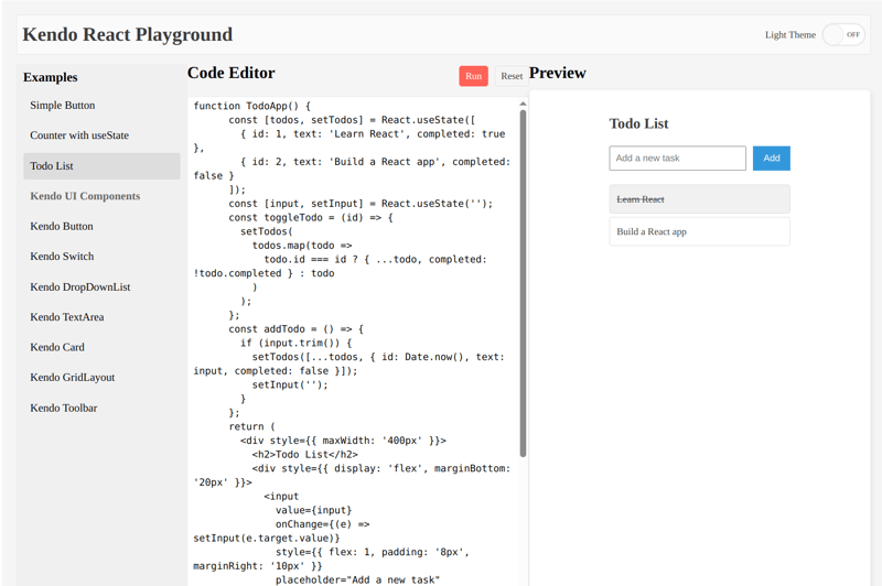
- A list of example snippets (e.g., simple buttons, counters, and KendoReact-specific components) that users can load into the editor.
- A code editor where users can write or modify React code.
- A live preview pane that renders the code output, with loading states and error notifications.
- Theme toggling between light and dark modes.
- Responsive design and accessibility considerations.
Live Demo: Kendo React Playground
Kendo Components Usage
I used more than 10 Kendo React free components to build the React Component Playground. Here’s how I used each component:
- Button: Used for the "Run" and "Reset" actions in the editor toolbar, providing clear calls-to-action with the themeColor prop for styling (e.g., primary for Run, base for Reset).
- Switch: Implemented in the top toolbar to toggle between light and dark themes, enhancing user customization and accessibility.
- DropDownList: Initially considered for example selection, but replaced with a custom list for styling flexibility; still explored in example snippets to demonstrate its utility.
- TextArea: Serves as the code editor, allowing users to input and edit React code with a monospace font and flexible sizing.
- Card and CardBody: Wraps the preview area, providing a clean container for rendered components with subtle shadows for depth.
- Notification and NotificationGroup: Displays success, error, or info messages (e.g., "Component rendered successfully!" or error details) in a fixed bottom-right position, enhancing user feedback. Loader: Shown in the preview area during code execution, using the infinite-spinner type to indicate processing.
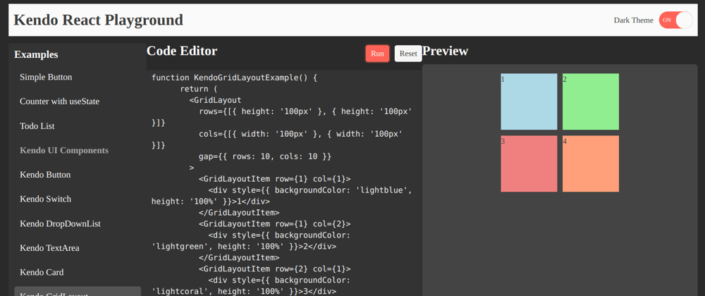
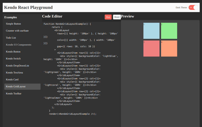
- GridLayout and GridLayoutItem: Structures the entire UI into a responsive three-column layout (examples, editor, preview), with precise row and column definitions for consistency across screen sizes.
- Toolbar and ToolbarItem: Creates a top navigation bar with the app title and theme switch, and an editor toolbar with action buttons, ensuring intuitive navigation.
- ToolbarSpacer: Adds spacing in the toolbar to align items aesthetically.
Here is how i used the components:
- Toolbar: Houses the Playground title, theme toggle, and primary actions.
- GridLayout: Provides a responsive 3-column layout for examples, code editor, and preview.
- Card: Contains the preview window, giving it a clean, modern look.
- Nptification & Loader: Offers user feedback (i.e., success/error messages, loading spinner).
The KendoReact library simplified the development process by providing many components, allowing me to focus on functionality and design.

Top comments (0)