1. Preface
This article will help you develop your first Android app and learn some basic concepts of Android UI. By the end of this article, you will be able to write simple and some complex Android application UI.
If you don’t understand all the knowledge in this article, don’t worry, this article introduces a magic tool at the end. Using this tool, you can quickly generate code for platforms such as Android and even iOS from the Figma design draft.
Referring to popular applications and implementing your own version is a good way to learn Android development. This method has a very clear purpose.
Starting today, we start to imitate the twitter application, starting with the Home page.
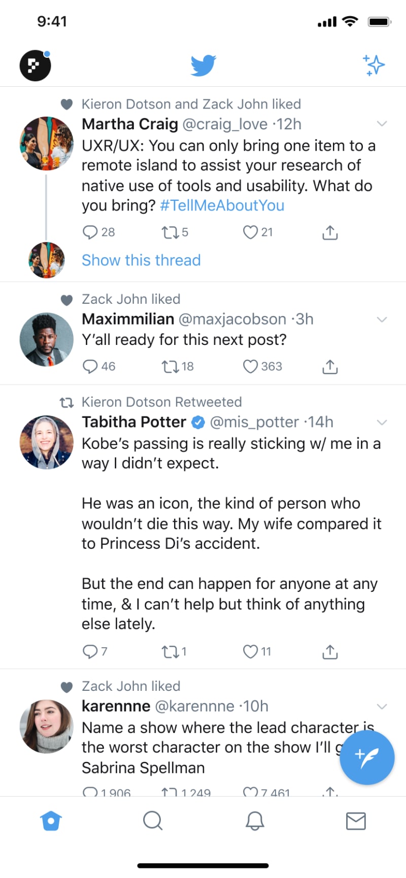
You can see that this page is very complex, so we need to learn some basic knowledge of Android UI development first.
2. Android UI development basics
2.1. Activity
First, let’s introduce Activity. As one of the four major components of Android, the first program you create when learning Android development will come into contact with Activity.
Activity can be understood as a window that draws the user interface. This window can fill the entire screen or float above other windows.
Our default Activity is generally called MainActivity, and the code is as follows. R.layout.activity_main is a layout in xml format, which is used to describe what the interface looks like.
public class MainActivity extends AppCompatActivity {

    @Override
    protected void onCreate(Bundle savedInstanceState) {
        super.onCreate(savedInstanceState);
        //The R file sets a hexadecimal index for each resource file by category,
        // It is a final static inner class, which can operate the corresponding resources through R.classname.resourcename.
        setContentView(R.layout.activity_main);
    }
}
Why MainActivity can be opened directly when the application is started is because the intent-filter of the corresponding Activity is set in AndroidManifest.xml. After we create the Activity, Android Studio will automatically create the corresponding configuration information in the manifest file.
<activity
    android:name=".MainActivity"
    android:exported="true">
    <intent-filter>
        <!-- There is only one startup entrance-->
        <action android:name="android.intent.action.MAIN" />
        <!--To set the startup icon in the application list-->
        <category android:name="android.intent.category.LAUNCHER" />
    </intent-filter>
</activity>
2.2. View and ViewGroup
In Android UI development, View and ViewGroup are two very important classes, and the main difference between them lies in their functions and uses.
2.2.1. View
View is the most basic UI component in Android and it is the base class of all UI components. It provides basic drawing, event handling and other functions. For example, TextView, Button, ImageView, etc. are all subclasses of View. View’s main features include:
- Drawing: The View class contains the logic for drawing itself. You can customize the drawing logic by inheriting the View class and overriding the onDraw method.
- Event processing: The View class also provides event processing functions, such as click, long press, sliding, etc. You can customize event processing logic by overriding the corresponding event processing methods (such as onClick, onLongClick, onTouchEvent, etc.).
In this article, we mainly focus on the Drawing part of View, which is directly related to how View is displayed.
2.2.1.1. View common properties
First, let's take a look at the common properties of View. These are also the most commonly used properties of each subclass of View, eg. ImageView or TextView.
| Attributes | Optional values | Meaning |
|---|---|---|
| android:layout_gravity | center_horizontal, center_vertical, center, left, right, top, buttom | The gravity bias of the control relative to the parent container |
| android:gravity | center_horizontal, center_vertical, center, left, right, top, buttom | The gravity bias of the control's own content |
| android:visibility | visible, invisible, gone | gone is invisible and does not retain position |
| android:id | @id/valName @+id/ValName | Use existing id by default,+Add new id |
If you encounter a situation where the background color of Button cannot be changed, the system actually uses the Material theme. We only need to change the Button component to android.widget.Button.
2.2.2. ViewGroup
ViewGroup is a subclass of View, which is used to accommodate and manage other UI components. The main functions of ViewGroup include:
- Layout: ViewGroup provides a variety of layout methods, such as LinearLayout, RelativeLayout, etc. These layout methods determine the position and size of its subcomponents.
- Manage subcomponents: ViewGroup provides methods to add, delete, and find subcomponents, allowing you to easily manage UI components.
- Event delivery: ViewGroup is also responsible for event delivery. When an event occurs on a ViewGroup, it passes the event to its child components until it finds the trigger point for the event.
In summary, the main difference between View and ViewGroup is that View is a UI component used for drawing and event handling, while ViewGroup is a container used to accommodate and manage other UI components.
2.3. TextView
TextView is the most commonly used widget, a user interface element that displays text to the user. To provide user-editable text, see EditText.
Below is a demo of TextView. Based on this demo, we will look at the most commonly used properties of TextView.
    <TextView
        android:id="@+id/txtOne"
        android:layout_width="200dp"
        android:layout_height="200dp"
        android:gravity="center"
        android:text="TextView_Content"
        android:textColor="#EA5246"
        android:textStyle="bold|italic"
        android:background="#000000"
        android:textSize="18sp" />
The above TextView has the following properties:
- id: Set a component id for TextView. Based on the id, we can obtain the object through the findViewById() method in the Java/Kotlin code, and then set the relevant properties.
- layout_width: the width of the component, usually written as: wrap_content or match_parent, the former is the size of the control as much as the content displayed by the control, and the latter will fill the parent container where the control is located; of course, it can also be set into a specific size, for example, here I set it to 200dp for display effect.
- layout_height: the height of the component, the content is the same as above.
- gravity: Sets the alignment direction of the content in the control.
- text: Set the displayed text content. Generally, we write the string into the string.xml file, and then obtain the corresponding string content through @string/xxx. For convenience, I will write it directly into "" here. It is not recommended to write like this...
- textColor: Set the font color, the same as above, reference it through the colors.xml resource, don't write it directly.
- textStyle: Set the font style, three optional values: normal (no effect), bold (bold), italic (italic)
- textSize: font size, the unit is usually sp.
- background: The background color of the control, which can be understood as the color that fills the entire control, which can be a picture.
2.4. ImageView
Displays image resources, for example Bitmap or Drawable resources. ImageView is also commonly used to apply tints to an image and handle image scaling.
The following XML snippet is a common example of using an ImageView to display an image resource:
 <LinearLayout
     xmlns:android="http://schemas.android.com/apk/res/android"
     android:layout_width="match_parent"
     android:layout_height="match_parent">
     <ImageView
         android:layout_width="wrap_content"
         android:layout_height="wrap_content"
         android:src="@drawable/my_image"
         android:background="@drawable/my_image_background"
         android:contentDescription="@string/my_image_description"
         />
 </LinearLayout>
We focus on the following attributes:
- layout_width: the width of the component, usually written as: wrap_content or match_parent, the former is how large the content displayed by the control is, and the latter will fill the parent container where the control is located; of course it can also be set into a specific size.
- layout_height: the height of the component, the content is the same as above.
- src: Sets a drawable as the content of this ImageView.
-
android:background: A drawable to use as the background.
2.4.1. The difference between src attribute and background attribute:
In the API documentation, we found that ImageView has two attributes that can be used to set images, namely: src and background.
- background usually refers to background, and src refers to content.
- When using src to fill in a picture, it will be filled directly according to the size of the picture and will not be stretched. When using background to fill in the picture, it will be based on the size given by the ImageView. Width to stretch.
2.5. FrameLayout
2.5.1. Why are various Layouts needed?
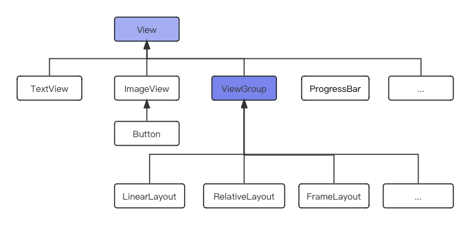
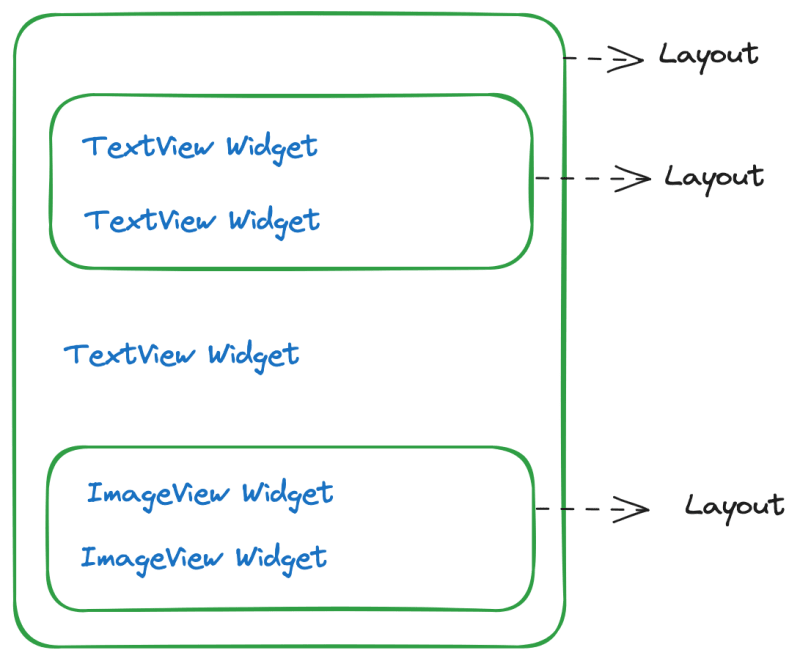
A rich ui is composed of many controls, so how can we make each control placed on the ui in an orderly manner instead of being messy? This needs to be achieved with the help of layout. Layout is a kind of place that can be used to place a container for many controls, it can adjust the position of the internal controls according to certain rules, thereby writing a beautiful interface. Of course, in addition to placing controls, layouts can also be placed inside the layout. Through the nesting of multi-layer layouts, we can complete some more complex interface implementations, the following figure shows the relationship between them well.
Layout can contain Layout and Widget, and control their layout. Widget only displays content.
2.5.2. Default layout method of FrameLayout
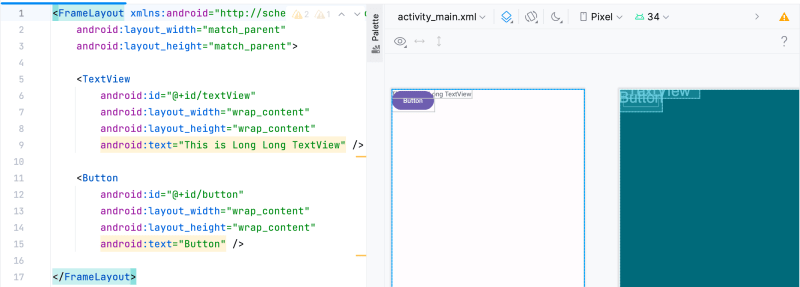
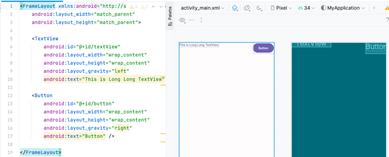
There are six major layouts in Android, namely: LinearLayout, RelativeLayout, FrameLayout, TableLayout, AbsoluteLayout, GridLayout. Among them, FrameLayout can be said to be the simplest layout. This layout directly opens up a blank area on the screen. When we add controls to it, they will be placed in the upper left corner of this area by default, but this layout method does not have any positioning method; the size of the frame layout is determined by the largest sub-control in the control. If the controls are the same size, then only the top component can be seen at the same time! Subsequently added controls will overwrite the previous one! Although the control will be placed in the upper left corner by default, we can also specify other locations through the layout_gravity attribute!
<FrameLayout xmlns:android="http://schemas.android.com/apk/res/android"
    android:layout_width="match_parent"
    android:layout_height="match_parent">

    <TextView
        android:id="@+id/textView"
        android:layout_width="wrap_content"
        android:layout_height="wrap_content"
        android:text="This is Long Long TextView" />

    <Button
        android:id="@+id/button"
        android:layout_width="wrap_content"
        android:layout_height="wrap_content"
        android:text="Button" />

</FrameLayout>
2.5.3. FrameLayout layout_gravity
In addition to this default effect, we can also use the layout_gravity attribute to specify the alignment of the control in the layout, which is similar to the usage in LinearLayout. Follows is a example:
<FrameLayout xmlns:android="http://schemas.android.com/apk/res/android"
    android:layout_width="match_parent"
    android:layout_height="match_parent">

    <TextView
        android:id="@+id/textView"
        android:layout_width="wrap_content"
        android:layout_height="wrap_content"
        android:layout_gravity="left"
        android:text="This is Long Long TextView" />

    <Button
        android:id="@+id/button"
        android:layout_width="wrap_content"
        android:layout_height="wrap_content"
        android:layout_gravity="right"
        android:text="Button" />

</FrameLayout>
2.5.3.1. The value of layout_gravity
There are many values for layout_gravity. You can explore more in practice and try different values.
    <!-- Standard gravity constant that a child supplies to its parent.
         Defines how the child view should be positioned, on both the X and Y axes, within its enclosing layout. -->
    <attr name="layout_gravity">
        <!-- Push object to the top of its container, not changing its size. -->
        <flag name="top" value="0x30" />
        <!-- Push object to the bottom of its container, not changing its size. -->
        <flag name="bottom" value="0x50" />
        <!-- Push object to the left of its container, not changing its size. -->
        <flag name="left" value="0x03" />
        <!-- Push object to the right of its container, not changing its size. -->
        <flag name="right" value="0x05" />
        <!-- Place object in the vertical center of its container, not changing its size. -->
        <flag name="center_vertical" value="0x10" />
        <!-- Grow the vertical size of the object if needed so it completely fills its container. -->
        <flag name="fill_vertical" value="0x70" />
        <!-- Place object in the horizontal center of its container, not changing its size. -->
        <flag name="center_horizontal" value="0x01" />
        <!-- Grow the horizontal size of the object if needed so it completely fills its container. -->
        <flag name="fill_horizontal" value="0x07" />
        <!-- Place the object in the center of its container in both the vertical and horizontal axis, not changing its size. -->
        <flag name="center" value="0x11" />
        <!-- Grow the horizontal and vertical size of the object if needed so it completely fills its container. -->
        <flag name="fill" value="0x77" />
        <!-- Additional option that can be set to have the top and/or bottom edges of
             the child clipped to its container's bounds.
             The clip will be based on the vertical gravity: a top gravity will clip the bottom
             edge, a bottom gravity will clip the top edge, and neither will clip both edges. -->
        <flag name="clip_vertical" value="0x80" />
        <!-- Additional option that can be set to have the left and/or right edges of
             the child clipped to its container's bounds.
             The clip will be based on the horizontal gravity: a left gravity will clip the right
             edge, a right gravity will clip the left edge, and neither will clip both edges. -->
        <flag name="clip_horizontal" value="0x08" />
        <!-- Push object to the beginning of its container, not changing its size. -->
        <flag name="start" value="0x00800003" />
        <!-- Push object to the end of its container, not changing its size. -->
        <flag name="end" value="0x00800005" />
    </attr>
2.6. LinearLayout
A layout that arranges other views either horizontally in a single column or vertically in a single row.
The following snippet shows how to include a linear layout in your layout XML file:
<LinearLayout xmlns:android="http://schemas.android.com/apk/res/android"
   android:layout_width="match_parent"
   android:layout_height="match_parent"
   android:paddingLeft="16dp"
   android:paddingRight="16dp"
   android:orientation="horizontal"
   android:gravity="center">

   <!-- Include other widget or layout tags here. These are considered
           "child views" or "children" of the linear layout -->

 </LinearLayout>
In this section, we will analyze each important attribute of LinearLayout in detail.
2.6.1. Important attributes of LinearLayout
- Common properties
- orientation: The arrangement of components in the layout, horizontal/vertical.
- gravity: controls the alignment of child elements contained in the component, and can be combined in multiple values, such as
left|buttom - layout_gravity: controls the alignment of the component in the parent container
- layout_width: the width of the layout, usually do not write the number directly, use wrap_content (actual size of the component)/match_parent (fill the parent container)
- layout_height: the height of the layout, the parameters are as above
- id: Set a resource id for the component. The component can be found through findViewById(id) in the java/kotlin file.
- background: Set a background image for this component, or directly cover it with color
- weight: This attribute is used to divide areas equally proportionally
- divider line: used to set dividing line pictures for LinearLayout, through showDividers
- divider: Set the dividing line image
- showDividers: Set the position of the dividing line, there are four optional values: none/middle/begining/end
- dividerPadding: Set the padding of the dividing line
The layout_gravity of LinearLayout is the same as that of FrameLayout, so I won’t explain it in detail here. We mainly talk about its unique attr: weight.
2.6.2. weight attribute usage
<?xml version="1.0" encoding="utf-8"?>
<LinearLayout xmlns:android="http://schemas.android.com/apk/res/android"
    xmlns:tools="http://schemas.android.com/tools"
    android:id="@+id/LinearLayout1"
    android:layout_width="match_parent"
    android:layout_height="match_parent"
    android:orientation="horizontal">

    <LinearLayout
        android:layout_width="0dp"
        android:layout_height="match_parent"
        android:layout_weight="1"
        android:background="#ADFF2F" />

    <LinearLayout
        android:layout_width="0dp"
        android:layout_height="match_parent"
        android:layout_weight="2"
        android:background="#DA70D6" />
</LinearLayout>
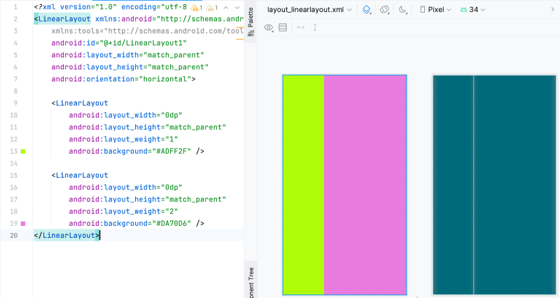
To achieve the effect of 1:2, you only need to set the android:width attribute of the two LinearLayouts to 0dp and change layout_weight to 1 and 2 respectively.
2.6.3. Simple example of LinearLayout
Here is a simple LinearLayout example, you can refer to it:
<LinearLayout xmlns:android="http://schemas.android.com/apk/res/android"
    xmlns:tools="http://schemas.android.com/tools"
    android:id="@+id/LinearLayout1"
    android:layout_width="match_parent"
    android:layout_height="match_parent"
    android:orientation="vertical"
    tools:context=".MainActivity">

    <TextView
        android:layout_width="wrap_content"
        android:layout_height="wrap_content"
        android:text="Please enter the phone number:" />

    <EditText
        android:layout_width="match_parent"
        android:layout_height="wrap_content" />

    <LinearLayout
        android:layout_width="match_parent"
        android:layout_height="wrap_content"
        android:gravity="right"
        android:orientation="horizontal">

        <Button
            android:layout_width="wrap_content"
            android:layout_height="wrap_content"
            android:text="save" />

        <Button
            android:layout_width="wrap_content"
            android:layout_height="wrap_content"
            android:text="clear" />
    </LinearLayout>
</LinearLayout>
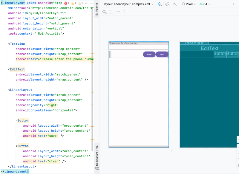
You can also refer to the examples on the Android official website: Create a linear layout
2.7. RelativeLayout
A Layout where the positions of the children can be described in relation to each other or to the parent.
RelativeLayout is a view group that displays child views in relative positions. The position of each view can be specified as relative to sibling elements (such as to the left-of or below another view) or in positions relative to the parent RelativeLayout area (such as aligned to the bottom, left or center).
Note that you cannot have a circular dependency between the size of the RelativeLayout and the position of its children. For example, you cannot have a RelativeLayout whose height is set to WRAP_CONTENT and a child set to ALIGN_PARENT_BOTTOM.
In this section, we will analyze each important attribute of RelativeLayout in detail.
2.7.1. Important properties of RelativeLayout
We divide them according to 'Basic properties'/'Position based on parent container'/'Position based on sibling components'/'margin'/'padding'. This will make it easier for everyone to understand and remember.
- Basic properties
- gravity: Set the alignment of components within the container
- ignoreGravity: Components that set this attribute to true will not be affected by the gravity attribute.
- Position based on parent container
- layout_alignParentLeft: left aligned
- layout_alignParentRight: align right
- layout_alignParentTop: top alignment
- layout_alignParentBottom: bottom alignment
- android:layout_centerHorizontal: horizontally centered
- android:layout_centerVertical: vertical centering
- android:layout_centerInParent: middle position
- Position based on sibling components:
- layout_toLeftOf: refers to the left side of the component
- layout_toRightOf: refers to the right side of the component
- layout_above: reference component above
- layout_below: refers to below the component
- layout_alignTop: aligns the top border of the reference component
- layout_alignBottom: aligns the lower border of the reference component
- layout_alignLeft: aligns the left edge of the reference component
- layout_alignRight: aligns the bounded reference component
- margin: Set the offset between the component and the parent container
- layout_margin: Set the offset value of the component's top, bottom, left and right
- layout_marginLeft: Set the offset value of the component from the left
- layout_marginRight: Set the offset value of the component from the right
- layout_marginTop: Set the offset value of the component from the top
- layout_marginBottom: Set the offset value of the component from the bottom
- padding: Set the margin between elements inside the component
- android:padding: Padding a certain margin to the top, bottom, left and right of internal elements
- android:paddingLeft: pad a certain margin to the left of the internal element
- android:paddingRight: pad a certain margin to the right of the internal element
- android:paddingTop: Padding a certain margin above the internal elements
- android:paddingBottom: pad a certain margin below the internal element
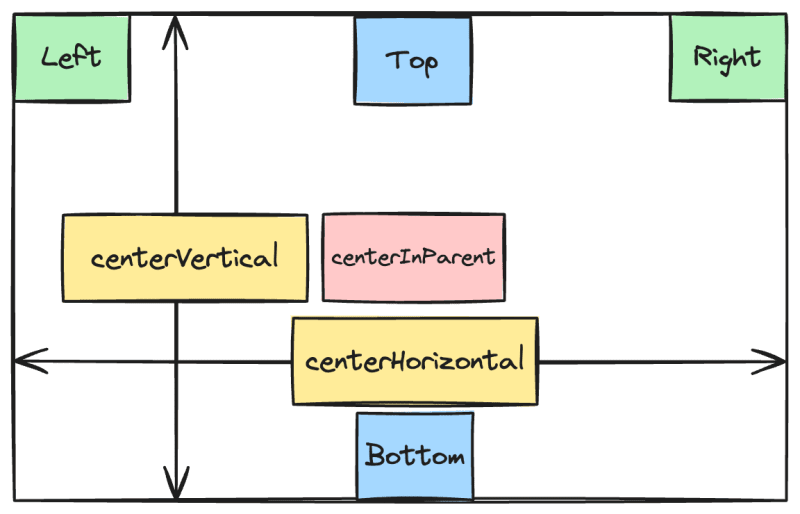
2.7.2. Position based on parent container
When an element is positioned according to its parent container, the following diagram can be used to describe the meaning of each attribute.
2.7.3. Position based on sibling components
Well, let’s first talk about what sibling components are. The so-called sibling components are components in the same level container, as shown in the figure:
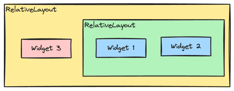
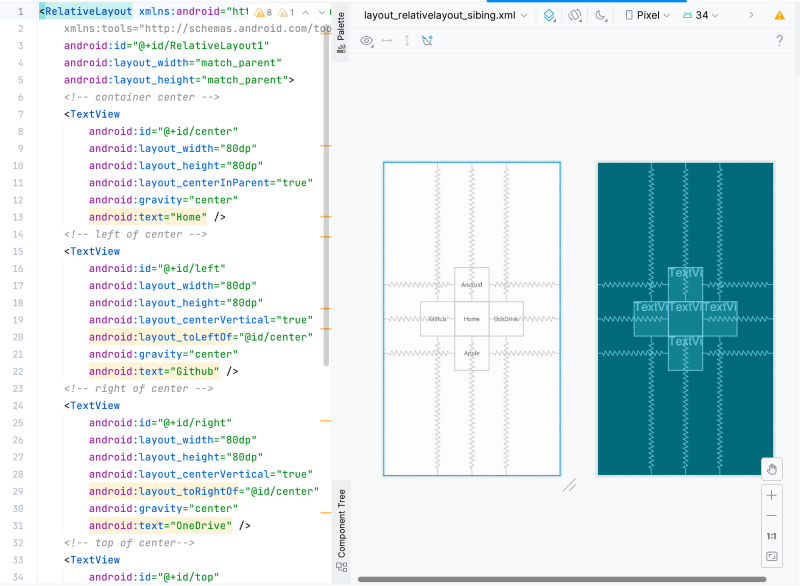
Widget 1 and 2 in the picture are sibling components, and widget 3 is not a sibling component to widget 1 or widget 2, so widget 3 cannot be positioned through widget 1 or 2. For example, layout_toleftof = "widget 1" will report an error. . Remember. The most classic example of the positioning of this sibling component is the "+ layout". The following code implements it:
<RelativeLayout xmlns:android="http://schemas.android.com/apk/res/android"
    xmlns:tools="http://schemas.android.com/tools"
    android:id="@+id/RelativeLayout1"
    android:layout_width="match_parent"
    android:layout_height="match_parent">
    <!-- container center -->
    <TextView
        android:id="@+id/center"
        android:layout_width="80dp"
        android:layout_height="80dp"
        android:layout_centerInParent="true"
        android:gravity="center"
        android:text="Home" />
    <!-- left of center -->
    <TextView
        android:id="@+id/left"
        android:layout_width="80dp"
        android:layout_height="80dp"
        android:layout_centerVertical="true"
        android:layout_toLeftOf="@id/center"
        android:gravity="center"
        android:text="Github" />
    <!-- right of center -->
    <TextView
        android:id="@+id/right"
        android:layout_width="80dp"
        android:layout_height="80dp"
        android:layout_centerVertical="true"
        android:layout_toRightOf="@id/center"
        android:gravity="center"
        android:text="OneDrive" />
    <!-- top of center-->
    <TextView
        android:id="@+id/top"
        android:layout_width="80dp"
        android:layout_height="80dp"
        android:layout_above="@id/center"
        android:layout_centerHorizontal="true"
        android:gravity="center"
        android:text="Android" />
    <!-- bottom of center -->
    <TextView
        android:id="@+id/bottom"
        android:layout_width="80dp"
        android:layout_height="80dp"
        android:layout_below="@id/center"
        android:layout_centerHorizontal="true"
        android:gravity="center"
        android:text="Apple" />
</RelativeLayout>
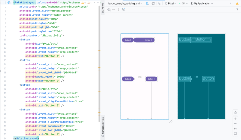
2.7.4. The difference between margin and padding
Beginners may be a little confused about these two properties, let’s distinguish them here: First, margin represents offset, for example, marginleft = "5dp" means that the component is offset by 5dp from the left edge of the container; while padding represents padding, and the padding object is for the elements in the component. For example, if the text in TextView is set to paddingleft = "5dp" for TextView, 5dp space will be filled to the left of the element in the component. The margin is for the component in the container, and Padding refers to the elements in the component and needs to be distinguished.
The following is a simple code to demonstrate the difference between the two:
<RelativeLayout xmlns:android="http://schemas.android.com/apk/res/android"
    xmlns:tools="http://schemas.android.com/tools"
    android:layout_width="match_parent"
    android:layout_height="match_parent"
    android:paddingLeft="10dp"
    android:paddingTop="30dp"
    android:paddingRight="50dp"
    android:paddingBottom="320dp"
    tools:context=".MainActivity">
    <Button
        android:id="@+id/btn1"
        android:layout_width="wrap_content"
        android:layout_height="wrap_content"
        android:text="Button 1" />
    <Button
        android:layout_width="wrap_content"
        android:layout_height="wrap_content"
        android:layout_toRightOf="@id/btn1"
        android:paddingLeft="100dp"
        android:text="Button 2" />
    <Button
        android:id="@+id/btn3"
        android:layout_width="wrap_content"
        android:layout_height="wrap_content"
        android:layout_alignParentBottom="true"
        android:text="Button 3" />
    <Button
        android:layout_width="wrap_content"
        android:layout_height="wrap_content"
        android:layout_alignParentBottom="true"
        android:layout_marginLeft="100dp"
        android:layout_toRightOf="@id/btn3"
        android:text="Button 4" />
</RelativeLayout>
2.7.5. A very common point: margin can be set to a negative number
I believe many friends don’t know this. We are usually used to using positive numbers when setting margins. In fact, we can use negative numbers, which can be very useful in some scenarios.
2.8. Material Design
In fact, for a long time, most people may think that the UI of the Android system is not beautiful, at least not as beautiful as the iOS system. Therefore, the standard Android interface design style is not particularly accepted by the public. Many companies feel that they can design something more beautiful. The interface style of the Android platform has been difficult to unify for a long time. In order to solve this problem, Google also used its trump card and launched a new interface design language - Design Material at the 2014 Google I/O conference.
2.8.1. What is Material Design
Material Design is a new interface design language developed by Google's design engineers based on traditional excellent design principles, combined with rich creativity and science and technology. It includes visual, motion, interactive effects and other features. So why does Google think that Can Material Design solve the problem of inconsistent interface styles on the Android platform? In a word, it looks good.
In order to set an example, Google has designed all built-in applications using the Material Design style starting from the Android 5.0 system.
However, after its heavy launch, the popularity of Material Design is not particularly ideal. Because this is only a recommended design specification, mainly for UI designers, not developers. Many developers may not be able to do it at all. It is clear what kind of interface and effects are called Material Design. Even if you understand it, it will be very difficult to implement, because many Material Design effects are difficult to achieve, and Android almost does not provide corresponding API support. It is basically necessary to It's up to the developers themselves to write it from scratch.
Google is certainly aware of this problem, so it launched a Design Support library at the 2015 Google I/O conference. This library encapsulates some of the most representative controls and effects in Material Design, allowing developers to Once you understand Material Design, you can easily make your own applications Material. Later, the Design Support library was renamed the Material library, which is used to provide Material Design support for Google's full platform products.
Taken together, Material Design is an adaptable system of guidelines, components, and tools that supports best practices in user interface design. Powered by open source code, Material Design simplifies collaboration between designers and developers, and help teams build beautiful products quickly. Material Design gives us a guide to deal with UI/UX for Android, Flutter, and the Web.
Currently, the latest version of Material Design is 3.
Material Design official website
Material abstracts various commonly used components and provides documentation material components.
For example, we will use Material Design Android BottomNagigation below.
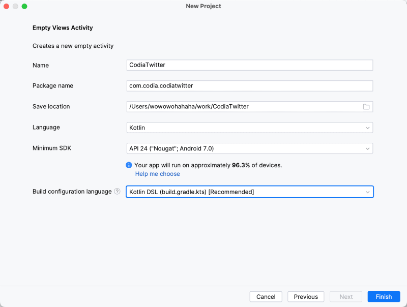
3. Start implementing Home
We use Android Studio to create an Empty Views Activity to get started.

The project configuration is here, you can do whatever you want. The following is the configuration I use.
3.1. How to implement 'top bar'
We use FrameLayout to restore the top bar. This may not be the most suitable for actual production use, but it is the simplest and makes it easier for us to understand how to write Android XML to restore the layout.
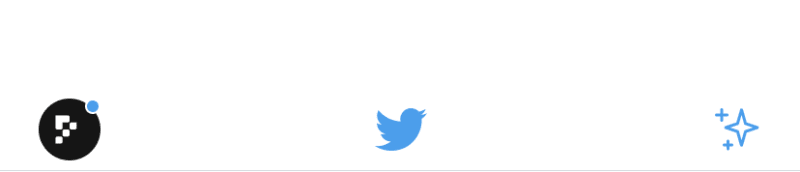
Three icons are arranged in a row. The account on the left android:layout_gravity="start" means arranged on the left, android:layout_marginStart="20dp" from the left boundary constraint, which is a common writing method.
The middle logo, android:layout_gravity="center_horizontal", is centered horizontally.
The feature icon on the right android:layout_gravity="end" means arranging to the right, plus android:layout_marginEnd="20dp" constrains the distance to the right.
start and end here are abstract generalizations of left and right, because text not only exists left to right, but also exists right to left.
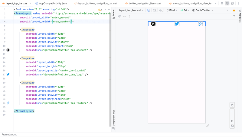
The left side of the picture below is our code, and the right side is the running effect. Android Studio has a Design view, which can easily see the actual running effect of xml.
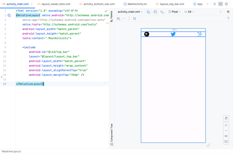
Because the top bar is a relatively independent interface, we put it in layout_top_bar.xml and reference this layout through include in activity_main.xml, adding android:layout_marginTop="20dp" android: layout_alignParentTop="true" means aligned with the top of the parent layout, 20dp from the top.
Run the app at this time and you will see the effect on the right side of the picture above.
3.2. How to implement the 'bottom Navigation Bar'
Next, let’s implement the bottom navigation bar.
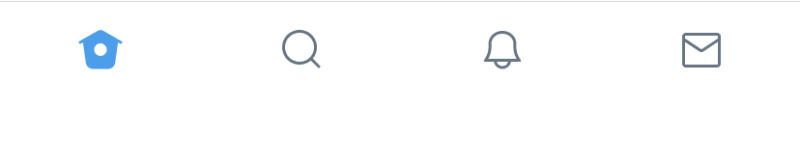
For the bottom navigation bar, in the material design specification, a high-order component BottomNavigationView is specially extracted, so we use this component directly here.
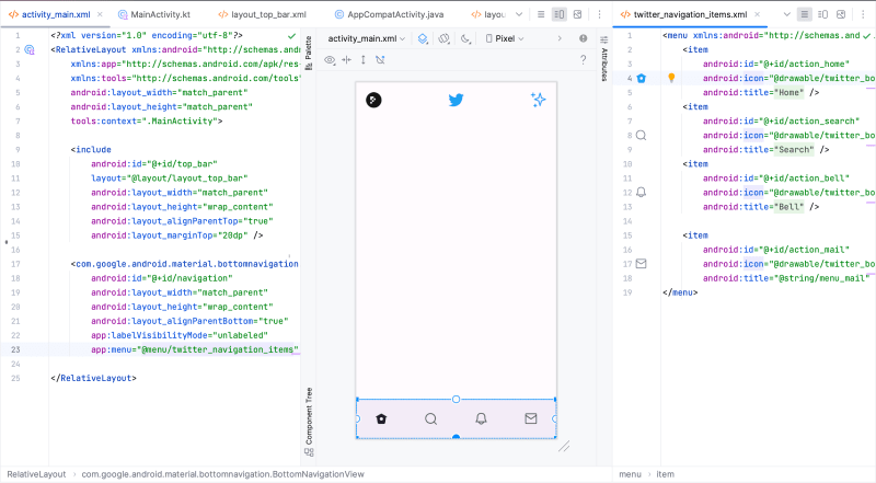
By introducing BottomNavigationView and simply configuring the menu, we can display the Navigation Bar above.
BottomNavigationView supports rich configurations, as shown above, and its supported configurations are as follows:
- (1) Container
- (2) Icon
- (3) Label text
- (4) Active indicator
- (5) Small badge (optional)
- (6) Large badge (optional)
- (7) Large badge number For details, please refer to BottomNavigationView.
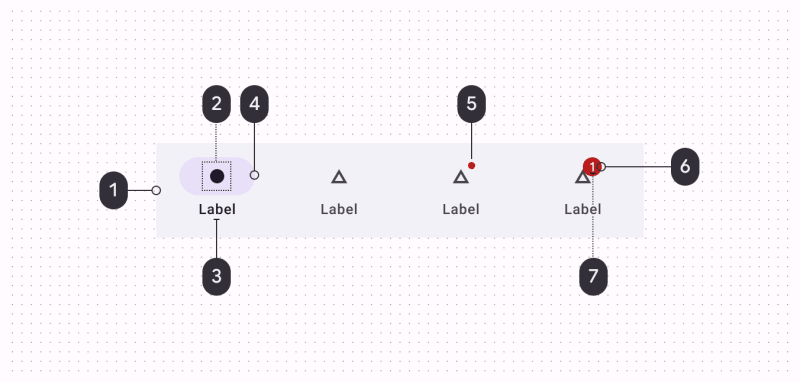
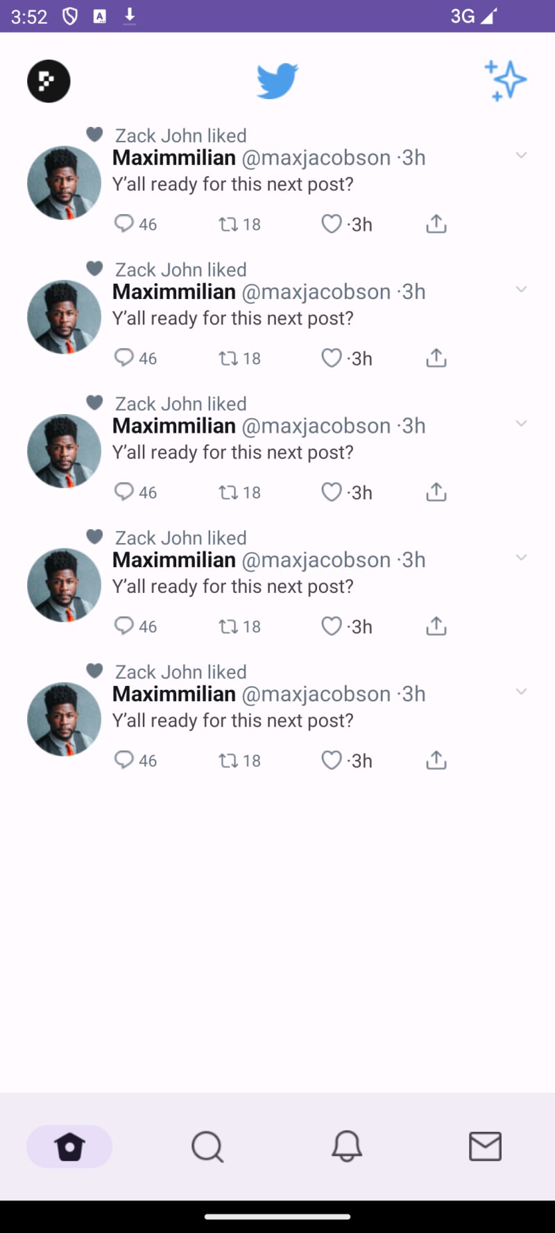
3.3. How to implement 'Tweet Item'

This is the most complex page we have encountered so far. Let’s first try to split this into familiar components.
In this way, we divide the complex interface into modules that we are familiar with.

We implement this interface according to the idea of splitting. We can see that it takes 135 lines to implement this uncomplicated interface. Moreover, our xml only considers interface restoration, and there are many details that have not been implemented. It can be seen that writing UI is a a complex and time-consuming work.
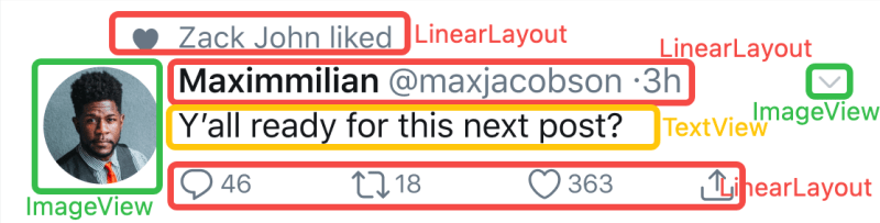
3.4. Multiple Tweet Item + Top + Navigation are spliced together to form a complete page
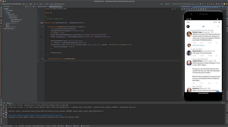
At this point, we try to integrate our previous work into an complete interface.
As shown in the picture above, we use LinearLayout to display multiple tweet items. In the actual project, RecyclerView should be used here, but expanding too much will be too complicated and dampen everyone's enthusiasm, so here we first use LinearLayout to indicate multiple tweets.
Run the App, the effect is as follows:
As you can see, at this point, we have restored a part of the design draft, about 5% (╥╯^╰╥)
There is still 95% of the work that needs to be done. We also need to implement different Tweet styles, ScrollView scrolling, RecyclerView lists, etc. Have you ever found that restoring a page is so complicated and workload-intensive?
I am not going to continue with the remaining content in this article, otherwise putting too much content into one article will greatly dampen everyone’s interest in reading and learning.
Next, I will introduce a magic tool that can quickly restore the UI interface.
4. Magic tool - Codia quickly generates code
I won’t go into details here, you can go to their official website to learn more.
figma to android
Their plugins support code generation for multiple platforms including Web/Android/iOS.
figma codia plugin
Select the Figma design draft, simply click to generate the code, and run it locally to see the generated effect.
You can see that the restoration is very good. It can save everyone a lot of restoration time.
5. Android Development Study Guide
That ends the content about Twitter page restoration. Finally, we provide an Android development learning route guide to facilitate everyone from getting started to becoming proficient.
5.1. Phase 1: Java Basics
- Basic computer knowledge, computer basics, JDK environment installation and configuration, environment variable configuration, etc.
- Object-oriented abstraction, encapsulation, inheritance, polymorphism, classes and objects, object initialization and recycling; constructor, this keyword, method and method parameter passing process, static keyword, inner class, Java garbage collection mechanism.
- Introduction to common classes and regular expressions.
- Introduction to Java collections: Collection, Set, List, ArrayList, Vector, LinkedList, Hashset, TreeSet, Map, HashMap, TreeMap, Iterator, Enumeration and other common collection APIs.
- Android exception handling, capture of various exceptions, principles of exception mechanism and custom exceptions.
- Java I/O input and output streams: File and FileRandomAccess classes, byte streams InputStream and OutputStream, character streams Reader and Writer, and corresponding implementation classes, IO performance analysis, byte and character conversion streams, and the concept of packaging streams, As well as commonly used packaging categories, computer coding.
- Multi-threading principle: how to create multi-threads (Thread, Runnable) in the program, thread safety issues, thread synchronization, communication between threads, and deadlock.
- Socket network programming.
- Reflection
5.2. Phase 2: Android core foundation
- Basic concepts and key points of Android programming, Android project structure analysis, file system, data storage and access, Intent and IntentFilter
- Android's four core components include monitoring ContentProvider data, Sqlite database addition, deletion, modification and transaction management, and ListView to implement data list display.
- Android network programming, Apache Commons toolkit introduces the method of using the Get method to submit data to the server, the method of parsing the server response data, the method of using the POST method to submit data to the server, the method of submitting non-text data to the server, and the use The Http protocol implements multi-thread downloading and uses the Http protocol to implement breakpoint resume downloading.
- Multimedia programming, playing music and videos, introduction to audio and video coding, operating cameras, photo albums, etc.
- New features, attribute animation, ViewPager, ActonBar, theme style internationalization, etc.
- Code version management, Git.
5.3. The third stage: android UI programming
- Android development environment setup: Android introduction Android development environment setup first Android application Android application directory structure
- Usage of Android primary controls: Use of TextView control How to use Button control How to use the EditText control How to use ImageView How to use RadioButton How to use Checkbox How to use Menu
- Usage of Android advanced controls: How to use Autocompletion How to use ListView How to use GridView How to use Adapter How to use Spinner How to use Gallery How to use ScrollView
- Use of dialog boxes and menus: Basic concepts of Dialog How to use AlertDialog How to use DatePickerDialog How to use Menu How to implement custom Menu
- Layout method of controls: How to use linear layout How to use relative layout How to use table layout
- Multiple Activity Management: The role of AndroidManifest.xml file How to use Intent How to pass data using Intent How to start Activity How to use IntentFilter How to use Activity Group
- Custom control implementation method: Implementation method of custom ListView How to use collapsible ListView Implementation method of custom Adapter Implementation method of custom View How to implement dynamic control layout
5.4. Phase 4: Android Project Advanced
- Internet client projects, push, data refresh, dynamic interaction of html and javascript, demand analysis, etc.
- Electronic application market project, overall project framework design, observer mode, factory mode, version mode, third-level image cache, memory optimization, attribute animation, compatibility processing of various packages, View principles and measurement of touch events, Distribution of View events, etc.
- Advanced use of development tools and use of features and permissions of various versions of Android, etc.
- Open source framework collection, understanding and using various latest open source frameworks can maximize development efficiency.
5.5. Phase 5: android mobile phone hardware management
- Map and positioning technology: Introduction to GPS; how to use LocationManager; how to add markers on Google Map; how to query buildings near a place; use Google Map to achieve point-to-point navigation.
- How to use sensors: Use of sensors such as direction, acceleration (gravity), light, magnetic field, distance, temperature, etc.
- Near field communication technology: Introduction to NFC technology; NFC technology is introduced using scenarios; NFC technology implementation methods.
- Media management technology: How to use MediaPlayer.
- Touch screen technology: gesture recognition; multi-touch technology.
5.6. Phase 6: Android Graphics Programming Technology
- Graphics processing basics: 2D graphics programming basics;
- Drawing methods of basic graphic elements such as points, lines, and surfaces;
- Introduction to Android animation framework;
- Implementation method of displacement animation;
- How to implement fade-in and fade-out animation;
- How to implement rotation animation;
- How to use the Matrix.
5.7. Phase 7: Android Game Development
- Android game development: Overview of Android game development;
- How to use SurfaceView;
- Physical ball technology;
- Collision detection technology;
- How to use resources such as pictures, text, and background music;
- Basic concepts of game engines;
- How to use OpenGL ES;
- How to use Unity engine.
At the same time, you can learn to use various plugins and tools such as Codia to quickly improve your development efficiency.
This article ends here. In the new year, I hope everyone will gain more knowledge and advance in their career.
6. Links
working with the textview in android
Develop your app's layout

Top comments (1)
Plugin(codia.ai/s/YBF9).
I tried the plug-in mentioned in the article and the experience was quite good.