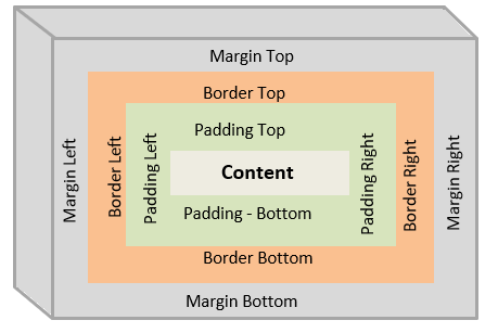
Box Model
- Every element in html is a box
- CSS Box Model have majorly Four properites
- Content
- Padding
- Border
- Margin
-
Content : This holdes the actual data of element and area that content takes is called content area
- Padding : The space that we give around the content is called padding and area that takes this space is called Padding area
- Border: As name suggets it covers the padding area
- Margin: It is the space that we give around element and area that margin takes is called Margin area
- example:
<p> This is an element </p>
p {
   padding: 1px 2px 1px 2px;
   border: 2px solid black;
   margin: 2px 1px 2px 1px;

}

- As shown in figure and above code things inside 'p' tag is called content
- In the above css snippet, we have given padding using short hand property as follows padding : top right bottum left ;
- we can use same short hand property for margin also
- we have given border width to be 2px , border type as solid and colored it as black
-
finally we have given margin of top and bottom as 2px , left and right as 1px
- Width of box calculated as width = border + padding + width of the content
- Height of box calculated as height = border + padding + height of the content
- However we can mannualy specify the width and height of element
Inline Elements vs Block Elements
-
Inline Elements : Elements which does not block the entire screen width or parent element's width is called inline elements
- These elements will take up the width that is only required
-
It will not start new line
Examples :
<span> span element </span>
<a href="#"> Anchor tag </a>
<strong> makes bold text </strong>
<b> bold element </b>
<input type="text">
<label> Label </label>
<button type="submit"> Submit </button>
-
Block Elements : Elements which takes up the entire width of viewport or parent element is called Block Elements
-
This will start a new line each time we use them
Examples :
<h1>All the header tages from h1 to h6 are block elements</h1>
<p> Paragraph Element</p>
<div> div element which acts as a container</div>
<section> section element</section>
<article> article element</article>
<footer> Footer element </footer>
<header> header tag</header>
<aside> aside bar</aside>
<nav> Nav bar</nav>
-
Positioning: Absolute and Relative
- Absolute and relative are the general values that we give to position property of any element
- There are other four properties that we use along with position property, they are top, bottum, right and left
- these properties decides the position of a element e.g if we give left: 2px; it will make element start from 2px from it's position but from where that 2px space should be given is decided by relative and absolute property
- Relative : If we give position property as relative, it will not break the flow of page and it will move element relative to its normal postion
- Absolute : This property will make the element break from it's flow and check for immediate relative element according to which it will position.
-
If no element is found it will position according to body of page
example :
<div id="parent">
    <p id="relative-ele">This is relativly positioned element</p>
    <p id="absolute-ele"> This is absolutly positioned element </p>
</div>
```css
    #parent {
        position: relative;
    }
    #relative-ele {
        position: relative;
        left: 3px;
    }
    #absolute-ele {
        position: absolute;
        right: 3px;
    }
```
Explanation :
- In the above example, there is a parent container and two paragraph tags with their unique id's.
- Paragraph tag with id as relative-ele will be placed 3px away from it's normal flow or normal position
- As soon as you keep absolute property in second paragraph tag you can see element breaking from its flow
- Now, If you don't keep parent element as relative position , since no parent element of p-element is relative, it will be placed 3px away from right of body tag of html page
- If we keep parent element relative, this will make second p-element position according to parent element.
Common CSS Structural Classes
- These are sudo classes in css which will help us to select the elements more conveniently and effectively without giving class and id to every element
- Some of the comman classes are listed below
Example:
<div  id="container">
    <div  class="div">div 1</div>
    <div  class="div">div 2</div>
    <div  class="div">div 3</div>
    <div  class="div">div 4</div>
    <p> paragraph 1</p>
    <div  class="div">div 5</div>
    <p> paragraph 2</p>
    <div  class="div">div 6</div>
    <p> paragraph 3</p>
    <div  class="div">div 7</div>
    <div  class="div">div 8</div>
</div>
-
:nth-child(n): It will select the element which is the nth child of parent element
#container :nth-child(3) {
    /* Selected the third child of container */
}
-
:first-child: This will select the first child of a parent element
#container  :last-child{
    /*first child of container is selected*/
}
-
:last-child: This will select the last child of parent element
#container  :last-child{
    /*Last child of container is selected*/
}
-
:nth-of-type(): This will select every nth element of it's type
#container :nth-of-type(2){
    /*This will select the div 2 and paragraph 2 elements, since they 2nd elements of their type*/
}
-
:last-of-type: This will select every last element of it's type
#container :last-type{
    /*This will select the div 8 and paragraph 3, since they are the last elements of their type*/
}
-
:first-of-type: This will select every first element of it's type
#container :last-type{
    /*This will select the div 1 and paragraph 1, since they are the first elements of their type*/
}
-
nth-last-of-type(): This will select the every nth last element of their type
#container  :nth-last-of-type(2) {
    /* This will select div 7 and paragraph 2, they are the 2nd elements from last in their type*/
}
Common CSS Styling Classes
.container- Used to define a container element that holds the main content of a webpage. It is often used to center and control the layout of the page..header- Applied to the header section of a webpage, that usually contains the site's logo, navigation menu, or other introductory content..footer- Applied to the footer section of a webpage, that usually contains information such as copyright, contact details, or links to other pages..nav- Applied to a navigation menu element, such as an unordered list (<ul>) containing navigation links..button- Used to style buttons on a webpage, applying properties such as background color, text color, padding, and border..input- Applied to input fields, such as text fields, checkboxes, radio buttons, or dropdown lists..card- Used to create a card-like component, typically containing a combination of text, images, and other elements. Cards are commonly used to display content in a visually appealing and organized manner..alert- Applied to an element that displays important messages or notifications to the user, often styled with contrasting colors to grab attention..active- Applied to indicate the active state of an element, such as a selected navigation link or a highlighted item in a list.
CSS Specificity
- When we try to apply different styling to the same element, CSS specificity comes handy
- Because css will give priority based on type of selector
- Given is the priority order of selectors
- Inline Styling: This will have the highest specificity, it will override any other selectors.
- This is useful for quick styling of elements
- ID Selector: This have the highest specificity in external styling, This will override any other styling done using any selectors
- ID selectors are helpfull to override styling
- Class Selector, Atribute Selector, Sudo Selectors : All these have the specificity lower than id selector and have similar specificity amoung themselves
- So, whichever selector is written last will be applied
- Type Selector: This have lower specificity than class selectors and these can be easily overrided
- Universal Selector(*): This have lowest specificity compared to any other selector
Major use case for CSS Specificity is that we can use it for ovverriding properties by using id selectors
CSS Media Queires
- Media queries are used in css to make web page responsive to the size of viewport (screen)
Basic Syntax:
@media media-type and (media-feature){
/*Styles go here*/
}
- In the above syntax
media-typehave different options to give depending on reqirement like screen, all, print and speach -
media-featurecan take various values likemin-width,max-width,aspect-ratioetc - This media query can be understood as a if conditional statement in any programming language
- If media-type and media-feature matches then apply the given styling
Example:
@media screen and (min-width: 300px) {
  body {
    background-color: black;
  }
}
- In the above example, If the media-type is screen and screen width is greater than or equal to 300px, then it will change background-color of body to black
- This way we can make a web page responsive to the media-type
FlexBox / Grid
- FlexBox and Grid are the common techniques used when designing a web page for easy positioning of elements
FlexBox:
some commonly used properties of FlexBox
we will activate flexbox by giving display property as flex
flex-direction: row | column | row-reverse | column-reverse
- The above property makes the flex items float depending on flex direction
justify-content: start | end | center | space-around | space-between | space-even
- This will move the items horizantlly if flex-direction is row or row-reverse and it will move flex items vertically if flex-direction is column or column-reverse
align-items: start | stretch | end | center
- If flex-direction is row or row-reverse, Flexitems will vertically. If flex-direction is column or column-reverse then Flexitems will move horizantally
- stretch property will make element to take entire height available
order: . . -2 | -1 | 0 | 1 | 2 . .
- Positive number will push element order forward with respect to current position(rank)
- Negitive number will decrease the rank by given number
- Zero will not change the rank of element
Grid:
- Grid is a table like structure having both columns and rows of specified size
- CSS grid is a powerfull tool since we can navigate grid items both horizantally and vertically which is not possible using flexbox.
- However with little more effort we can achieve evrything possible in grid using flexbox but grid makes it a bit easier.
- Grid feature in css is enabled by giving display property as grid
grid-template-columns:
- This takes the values that represents the size of columns and creates the number of columns
grid-template-rows:
- Similar to above property, creates rows of specified sizes
justify-content:
- This property will move the grid items horizantally in side grid
align-self:
- This property will move the grid item vertically inside grid space
- This is a grid item property
grid-column:
- This is also grid item property which takes two values seperated by ' / '
- first value represents the start number of column and second number represents the end of column
- e.g : grid-column: 2/3;
grid-column:
- This is also grid item property which takes two values seperated by ' / '
- first value represents the start number of row and second number represents the end of row
- e.g : grid-row: 2/3;
grid-area:
- This is also grid item property which takes four values seperated by ' / '
- grid-area: start-row-number/start-column-number/end-row-number/end-column-number
- grid-area: 2/3/3/4;
row-gap :
- This is a grid property that gives the space between rows
column-gap :
- This is a grid property that gives the space between columns
CSS Meta Tags
- Meta tags provide information regarding webpage that currently using
- some of the majorly used meta tags are
<meta charset="UTF-8">: This meta tag specifies the character encoding for the webpage.<meta name="viewport" content="width=device-width, initial-scale=1.0">: The viewport meta tag is used to control how the webpage is displayed on different devices and screen sizes. Thewidth=device-widthensures the page width matches the device's width, andinitial-scale=1.0sets the initial zoom level to 1.0.<meta name="description" content="Description of the webpage">: The description meta tag provides a brief summary or description of the webpage's content. It is often displayed in search engine results and can influence the page's ranking.<meta name="keywords" content="keyword1, keyword2, keyword3">: The keywords meta tag specifies a comma-separated list of relevant keywords or phrases related to the webpage's content.<meta name="author" content="Author Name">: The author meta tag indicates the author or creator of the webpage.
References

Top comments (0)