
State.of.dev
Today I released State.of.dev, a project that visualizes the current state of development split by key topics. It's great, amazing, you will love it…
I love visualisations of data. It provides a quick overview at first glance, but also a deeper meaning between relations when zoomed in. One of my favourite visualisations is the Gartner Hype Cycle:
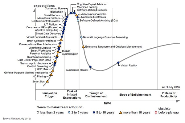
Gartner, a IT consultancy, has been creating them for decades now. They try to
capture the state of emerging technologies, by separating hype from productivity.
It places topics from VR, AR, Machine Learning, IoT and Quantum Computing in one visual representation. A chart. Its horizontal axis indicate the techs' phase, while the vertical axis indicates expectations.
What makes this visualisation so attractive, is that it provides you with a
starting point for understanding and exploring a certain market and it's key technologies.
That information can help you decide whether to either invest your time and money into an emerging technology, or wait for the hype to pass.
Another example is Forrester, another consultancy, who made the following graph to capture the state of Big
Data Hadoop cloud players:

Personally it holds a bit too much information (strategy quality, product offering depth, and market presence) but provides an interesting overview of the positioning of the players in the market.
From that foundation the idea behind stateofdev.com evolved. It provides a broad range of expert topics, specific market chart types, and identifies relevant (emerging) technologies by positioning them in the phases they are in.
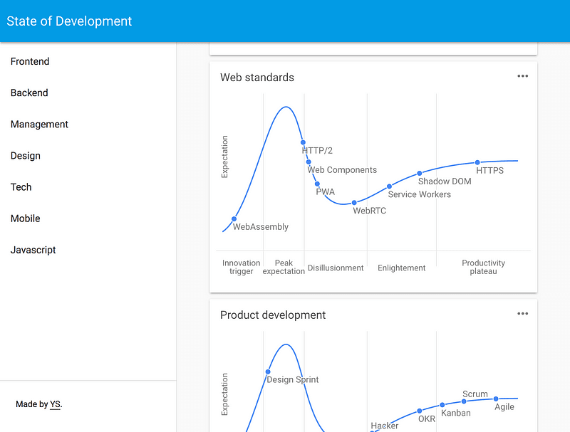
State.of.dev has interactive graphs representing the current state of development in the topics: technology, javascript frameworks, web standards, design trends, SEO and over 15 more, grouped by specific expertises like frontend, startups or
mobile.
What it solves
- Helicopter overview of what's happening (innovation, adoption, trends) within a market without having to extract that individually from news sites, newsletters, forums, et al.
- Learn about the latest emerging technologies, paradigms, trends and tools.
- Foundation to make actionable decisions on the maturity and adoption lifecycle of key trends.
What it should evolve into
- Resource for the latest on technology innovation.
- Visualisation of the state of an (expert) topic, identifying the current relevant trends and their state.
- Starting point for more in-depth research.
- Expert and/or community input on every release.
- Timeline of how trends evolve within a technology.
- Broad range op topics (beyond web dev).
What it is now
- A very early beta release, with a first version of the charts and background information.
- State of web development, based on my own expertise (no external contributions yet).
PS: If you want to contribute ping me @yvoschaap.

Top comments (10)
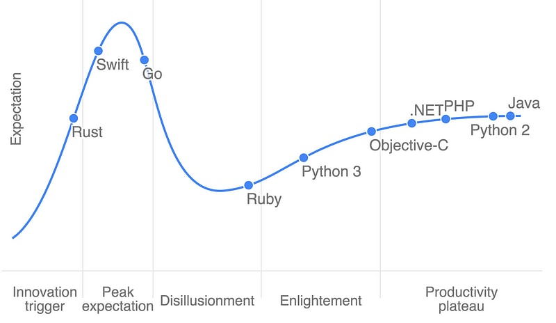
I'm not sure about any graph that puts python 3 as more enlightened than Ruby, and .net as more productive :p
You're misinterpreting the graph. It's not an attempt to quantify them in the ways you seem to think they are.
if a graph is not a attempt to quantify things i really don't know what they are
It is an attempt to quantify something. It's not an attempt to quantify the merits of any particular language.
Holy crap guys it's right there. It doesn't say "Enlightenment" it says "Expectation". That all being said I think that plateau actually is actually a slowly decreasing slope for php.
What happens to languages after they stop being mainstream and industry-standard? Shouldn't there be "Niche" and "Obsolete" after the productivity plateau?
e.g. i don't think anyone learns smalltalk anymore, unless they are working on backend systems for JP Morgan.
And where would you put C and C++ on that graph?
i think this kind of visualisation is powerful and useful, so thanks for that.
I think these would land firmly in the plateau of productivity, however an "industry" dimension would certainly be useful. For example, C++ was used for back-end web services many years ago, but would be considered completely obsolete in that industry now, while in other industries C++ is still the industry standard.
Tying to gartner and others style's is interesting. Who looks to the Gartner's for advice on development vs. say Redmonk?
redmonk.com/blog/2016/11/22/the-re...
I really like this idea.
Here are my suggestions:
Although you have a complete section for Javascript, it should still has a place in the Programming Languages chart
Also for the programming languages, I would add Erlang/Elixir somewhere in the Innovation Trigger part.
Definitely R must be in the programming languages chart.
In editors you might have mistakenly put Visual Studio in stead of VS Code. VS Code is a different product and it is gaining popularity among developers. Or they can both be in the chart, they are just different products I believe.
Adding "flask" to some chart ?
Adding Distributed or Parallel computing related libs and languages to some chart ? ZMQ, openCL etc.
And the chart with TensorFlow should be much more crowded :) I believe torch is gaining more popularity with PyTorch, there is of courseTheano, and higher level Keras (Which google announced that is going to be officially supported on top of Tensorflow)
Very good idea indeed, let us keep this updated without getting too opinionated
BG
Loved the Text Editor chart. I always knew VIM is better and, ahem, more mature ;)