Original cover photo by Bruno Emmanuelle on Unsplash.
Introduction
Images are found on most websites we have on the internet today in one form or the other from the website icon, infographics, and images that could make up part of the core website content. Just like anything on a web page, they can be manipulated in one way or the other using several techniques.
We'll discuss some techniques in this article and I'll encourage you to make further research.
Let's begin.
We'll discuss 7 manipulation techniques which are listed below, we'll go into detail on how they work and browser support for every CSS property that is used therein:
- Diamond images
- Blurred images
- Two image overlay with
mix-blend-mode - Black and white image
- Rounded corners with
border-radius - Curved corner images
- Side-by-Side alternate image
Diamond images
What I termed diamond images are images which are displayed in the form close to the shape of a diamond. The images will have four sides and if you are familiar with isometric angles, they'll align like objects in a 30 degreeor 45 degree plane.
The main ingredient here is the clip-path CSS property.
What is the clip-path property?
The clip-path property creates a region called a clipping that dictates what part of an element is shown on screen. It can accept the name of the following shapes as a value:
- polygon
- ellipse
- circle
The shape accepts parameters which dictates the final output of the element. For this article, we are interested in the polygon shape which is written as polygon() when used as a value of the clip-path property.
The following code will get us the desired effect.
.image-selector {
    clip-path: polygon(50% 0, 100% 50%, 50% 100%, 0 50%);
}
How it works
The values passed to the polygon() function are coordinates that tells clip-path which part of the image should be chopped off. Each comma separated values are x and y coordinates along each four sides of the image.
To understand what I am saying, have a look at the image below:

From the image it is evident that the coordinates in a clockwise manner are the following:
- x:0, y:0
- x:100, y0
- x:100, y:100
- x:0, y:100
Therefore, our clip-path value: polygon(50% 0, 100% 50%, 50% 100%, 0 50%) can be translated to:
- Move 50% along the x-axis, this will align at the center.
- While the top x-axis is at 100%, move 50% on the right y-axis, this will take us to the middle of the right y-axis.
- Then move to 50% of the bottom x-axis, this will be the center of the bottom x-axis.
- Then move back to the center of the left y-axis at 50%.
The steps above becomes complex depending on the shape you want to create.
Expected output
Following the steps above, you should get an output similar to the diamond image below:

Mind you, I added a blue border to the image container to show the points where the clipping occurs.
As an exercise and to test if you understand the entire process, try to replicate the image below.

Developers love tooling and you should not be surprised someone already made a tool to generate some commonly used shapes. The tool is called Clippy.
Browser support
| Chrome | Firefox | Safari | Edge | Opera |
|---|---|---|---|---|
| 55.0, 23.0 -webkit- | 54.0 | 9.1, 6.1-webkit | 12.0 | 42.0, 15.0 -webkit- |
Blurred images
If you'll like to achieve a blurred image effect, all you need is one line of code.
.image-selector {
    filter: blur(5px);
}
How it works
Mozilla Developer Networks explains how filter works perfectly:
The
filterCSS property applies graphical effects like blur or color shift to an element. Filters are commonly used to adjust the rendering of images, backgrounds, and borders.
Expected output

Browser support
| Chrome | Firefox | Safari | Edge | Opera |
|---|---|---|---|---|
| 53.0, 18.0 -webkit- | 35.0 | 9.1, 6.0-webkit | 13.0 | 40.0, 15.0 -webkit- |
Two image overlay with mix-blend-mode
CSS positioning allows developers to place element anywhere on the web page, even on another element. With the addition of the mix-blend-mode property we can create a stunning effect.
The trick is to place an image over another, and then we'll apply a mix-blend-mode to the image on top.
Your HTML should be similar to the following:
<div>
    <img src="img/the-name-of-your-image.jpg" />
    <img src="img/the-name-of-your-image.jpg" />
</div>
And your CSS will be:
img {
    width: 100%;
}

img:first-child { /* Grab the first image */
    position: absolute;
    mix-blend-mode: soft-light;
}
How it works
Mozilla Developer Network explains it nicely:
The
mix-blend-modeCSS property sets how an element's content should blend with the content of the element's parent and the element's background.
Expected output

The two images used are from Unsplash. Search for sunset and download the laptop image from Dell XPS official account.
Browser support
| Chrome | Firefox | Safari | Edge | Opera |
|---|---|---|---|---|
| 41.0 | 32.0 | 8.0 | Not supported | 35.0 |
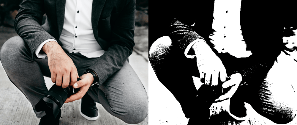
Black and White image
The title of the manipulation says it all, we'll take a normal image and convert it to a black and white photo using a combination of CSS filters.
In my opinion, the code is easy to understand.
.black-and-white-image {
    filter: grayscale(1) contrast(20);
}
How it works
The filter converts the image to a grayscale and we set the contrast to 20. This creates the desired effect.
Expected output

Mind you, in the image above I placed the original image beside the edited image for easy comparison.
Browser support
| Chrome | Firefox | Safari | Edge | Opera |
|---|---|---|---|---|
| 53.0, 18.0 -webkit- | 35.0 | 9.1, 6.0-webkit | 13.0 | 40.0, 15.0 -webkit- |
Rounded corners with border radius
The border-radius property is used to change the radius of an element on a web page. An appropriate candidate is an image. It's also a shorthand for four other properties namely:
border-top-left-radiusborder-top-right-radiusborder-bottom-right-radiusborder-bottom-left-radius
The code to generate our weird looking image (shown later) is given below:
/**
 * We apply a radius to all four sides of the
 * image.
 */
.image-selector {
    border-radius: 130px 160px 90px 220px;
}
How it works
I think the code is self-explanatory.
Expected output

Browser support
| Chrome | Firefox | Safari | Edge | Opera |
|---|---|---|---|---|
| 5.0, 4.0 -webkit- | 4.0, 3.0 -moz- | 5.0, 3.1-webkit- | 9.0 | 10.5 |
Curved corner images
To get our curved corner images, we will revisit the clip-path property discussed earlier in this post. The logic behind the generation of the corners is the same as detailed under the section titled "Diamond images" with one addition, the calc function.
The calc function is used to make the arithmetic calculation along the top x-axis and the bottom x-axis easier.
Since the axis is equal to 100% and we start clipping on the x-axis at 20px, the clip-path function is used to deduct 20px on each side of the top x-axis and bottom x-axis.
.image-selector {
    max-width: 100%;
    clip-path: polygon(20px 0,
                       calc(100% - 20px) 0,
                       100% 20px,
                       100% calc(100% - 20px),
                       calc(100% - 20px) 100%,
                       20px 100%,
                       0 calc(100% - 20px),
                       0 20px);
}
How it works
This is detailed in the last paragraph. If you need further explanation, let me know in the comments section.
Expected output

Browser support
| Chrome | Firefox | Safari | Edge | Opera |
|---|---|---|---|---|
| 55.0, 23.0 -webkit- | 54.0 | 9.1, 6.1-webkit | 12.0 | 42.0, 15.0 -webkit- |
Side-by-Side alternate image
What I termed as side-by-side alternate images is when half of an image is colored and the other half is not or in a different color.
Now, you might wonder how we are going to this, but if you have read this article up to this point you'll realize we have almost everything to achieve our aim. They are:
clip-pathfilter
I said almost which means we will need additional CSS properties which are:
z-indexmargin-left
How do they fit together? I'll save you some time, the HTML and CSS code is given below and the explanation follows it.
<div class="img-container">
    <img src="img/the-name-of-your-image.jpg" class="un-altered" />
    <img src="img/the-name-of-your-image.jpg" class="altered" />
</div>
.image-selector {
    max-width: 100%;  /* This is necesary for Chrome browsers. */
}

.img-container {
    display: flex;
    width: 70vw;
    margin: 0 auto;
}

.un-altered {
    clip-path: polygon(50% 0, 50% 100%, 0 100%, 0 0);
    z-index: 1;
}

.altered {
    margin-left: -100%;  /* Pull the image to the left */
    filter: grayscale(1) contrast(1);
}
How it works
First, we will need two images (in this case, the same image of the same size) to pull this off.
The images will be differentiated by the following:
- The original image will have a class attribute of
un-altered. - The image that will be edited with CSS filters will have a class attribute of
altered.
Second, we need to display the image side-by-side, this is easy to achieve with a Flexbox layout. All we need is display: flex .

Next, we have to reduce the size of the image with the un-altered class using the clip-path property. What we will do is this: the image will be clipped into half, later, we will join this half to the image with the altered class.

Moving forward, we will have to pull the image with the altered class towards the clipped image. This is possible by reducing its margin-left property to -100%. This creates a problem.
Both images are of the same size, therefore, when we move the image with the altered class it will definitely cover the other image with the un-altered class and they will now appear to be a single image, but they are not.

Next, we need to add a grayscale and contrast filters to the image with the altered class. The entire image is now grayscale, this is not what we want.

What we really want is for half of the image with the altered class to slide under the image with the un-altered class. This means the image with the un-altered class that we clipped earlier has to be on top of the image with the altered class.
Thanks to the z-index property, this is super easy.
The image that with the un-altered class will have a higher z-index than the image with the altered class.
This creates the desired visual effect where the original image is on one side and the edited image is another side. In the end the image appears to be a single image with two different colors. That is awesome!.
Expected output

The image is courtesy of Reza Biazar on Unsplash.
Browser support
Check the support table for filter and clip-path discussed in different sections of this article.
Side note
Kindly note the following:
This technique fails when you reduce the browser zoom level to
30%. At the point it becomes evident that the image is indeed not a single image 🙃.It does not work in Internet Explorer 😉 .
Conclusion
We have barely scratched the surface of image manipulation in CSS, I'll encourage further research and if you find anything interesting kindly share it in the comments.
References
- 📹 AwesomeCSS #1 | Apply Image Filters Just Using CSS
- 📹 Image manipulation with CSS Mix blend mode
- 📚 Clip-Path Polygons Explained
- 📚 CSS border-radius Property
- 📚 CSS filter Property
- 📚 CSS clip-path
Further reading
Explore the following article:
Credits
All browser support table is courtesy of W3Schools.
Updated August 15, 2020: Updated browser support tables.


Top comments (1)
WOW! 😮 That is awesome. CSS Border-Radius Can Do That really blew my mind. Your shot on Dribbble is even more awesome.
Thanks for sharing!. In addition, I just followed you on Dribbble.