
Data Analysis and Visualization plays a major role in computer science fields such as Data Analysis, Big Data and Data science etc. In which they are required to analyze raw data input and try understanding patterns, co-relations and trends to create an output.
This article should help readers learn different ways to represent data in different basic visual forms and what to understand from them.
Common Tools used for Data Analysis are:
- R Programming
- Python Programming
- SAS
- Microsoft Excel
This article will be explained using Python as it is a high level language and it offers a lot of libraries for visualization such as:
- Matplotlib
- Panda Visualisation
- Seaborn
These libraries can be used to import data from file formats such as Excel and convert Random Raw data into Graphs, pie charts, Scatterplots etc.
Adding Important Libraries in Python
import pandas as pd
import numpy as np
import matplotlib.pyplot as plt
import seaborn as sns
Importing Datasets
The dataset used in this article is the 2008 Swing state US elections.
The dataset file was taken from https://www.kaggle.com/aman1py/swing-states
Note: Make sure the CSV file(Excel) is locally downloaded in the system.
The following code is mentioned in the downloadable code block and as well as executed using Jupyter Notebook.
The screenshot of the output is also attached for your understanding.
The data can be imported in Python using panda read_csv method
The first 5 columns of Data can be represented by head() method.
To practice and implement the following dataset must be copied onto a notepad and must be saved as 2008_Election.csv
state,county,total_votes,dem_votes,rep_votes,dem_share
PA,Erie County,127691,75775,50351,60.08
PA,Bradford County,25787,10306,15057,40.64
PA,Tioga County,17984,6390,11326,36.07
PA,McKean County,15947,6465,9224,41.21
PA,Potter County,7507,2300,5109,31.04
PA,Wayne County,22835,9892,12702,43.78
PA,Susquehanna County,19286,8381,10633,44.08
PA,Warren County,18517,8537,9685,46.85
OH,Ashtabula County,44874,25027,18949,56.94
OH,Lake County  121335,60155,59142,50.46
PA,Crawford County,38134,16780,20750,44.71
OH,Lucas County 219830,142852,73706,65.99
OH,Fulton County,21973,9900,11689,45.88
OH,Geauga County,51102,21250,29096,42.23
OH,Williams County,18397,8174,9880,45.26
PA,Wyoming County,13138,5985,6983,46.15
PA,Lackawanna County,107876,67520,39488,63.1
PA,Elk County,14271,7290,6676,52.2
PA,Forest County,2444,1038,1366,43.18
PA,Venango County,23307,9238,13718,40.24
OH,Erie County,41229,23148,17432,57.01
OH,Wood County,65022,34285,29648,53.61
PA,Cameron County,2245,879,1323,39.92
PA,Pike County,24284,11493,12518,47.87
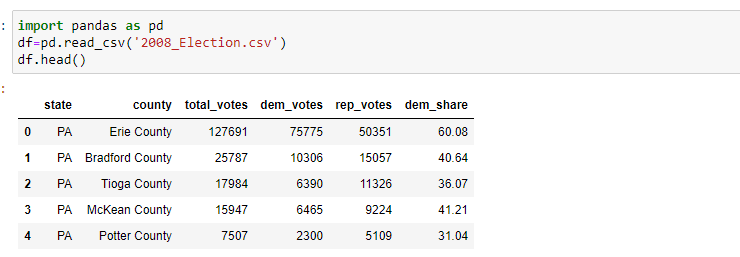
Import code
import pandas as pd
df=pd.read_csv('2008_Election.csv')
df.head()
To display description of mean, standard deviation, maximum and minimum values can be done by describe() method.

Plotting Histograms
Histograms are univariate Analysis and can be used to represent data to understand relations.
Histograms can be represented using matplotlib plt.hist()
Labeling of the Histogram:
-
plt.xlabel()- for x-axis -
plt.ylabel()- for Y-axis.
Note: Always label your graph
Import matplotlib.pyplot library for the code to execute.
import matplotlib.pyplot as plt
h=plt.hist(df['dem_share'])
_=plt.xlabel('percentage of vote for Obama')
_=plt.ylabel('number of counties')
plt.show()

Setting Seaborn Styling
Seaborn is a styling package in Matplot library this styling is preferred by many professionals because it has a high-level interface for drawing attractive and informative statistical graphics
import seaborn as sns
sns.set()
h=plt.hist(df['dem_share'])
_=plt.xlabel('percentage of vote for Obama')
_=plt.ylabel('number of countries')
plt.show()

Plotting Box Plot
Box plot shows us the median of the data, which represents where the middle data point is. The upper and lower quartiles represent 75 and 25 percentile respectively
Boxplots are represented with sns.boxplot()
import matplotlib as plt
import seaborn as sns
_=sns.boxplot (x='east_west',y='dem_share',data = df_all_states)
_=plt.xlabel('region')
_=plt.ylabel('percentage of votes for Obama')
plt.show()

Generating a Bee swarm plot
Bee swarm plot is generally used on relatively small data. The primary use of this is to group data with similar function
Bee Swarm plot is represented with sns.swarmplot
_=sns.swarmplot(x='state',y='dem_share',data=df)
_=plt.xlabel('state')
_=plt.ylabel('percentage of vote for Obama')
plt.show()

Making an ECDF
ECDF stands for Empirical cumulative distribution function (ECDF)
ECDF is an estimator tool which allows a user to plot a particular feature from lowest to highest, it is considered as an alternative to Histograms.
ECDF is generated using plt.plot()
import numpy as np
x=np.sort(df['dem_share']) #sorts data
y=np.arange(1, len(x)+1)/len(x) #arranges data
_=plt.plot(x,y,marker='.', linestyle='none')
_=plt.xlabel('percentage of vote for Obama')
_=plt.ylabel('ECDF')
plt.margins(0.02) #Keeps data off plot edges
plt.show()

Conclusion
Thus using Data Analysis and Visualization we converted random numbers and data to understand facts such as
- East U.S voted more for Obama compared to the West U.S
- In 75% of counties close to 50% have voted for Obama.
- In 20% counties only 36% or less voted for Obama
These facts could not be directly understood just from looking at CSV dataset, just by using a few lines of code we have a good understanding of the data and it can be explained to others with Visual proof such as Histograms, ECDF etc.

Top comments (0)